
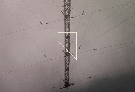




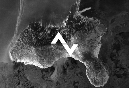
Astronaut Design is graphic designer Slava Kirilenko based in Almaty, Kazakhstan.
I really love how well paired his designs and photography are. Take a look at more of his work here


Astronaut Design is graphic designer Slava Kirilenko based in Almaty, Kazakhstan.
I really love how well paired his designs and photography are. Take a look at more of his work here
Comments are closed.
Very cool, and strong typography.
that microcosmos logo is siiiiick…
Beautiful work. I always wondered what it would be like to work at a company that embraced design and typography in a practical way. Meaning, what would it be like to work for a company hose letterhead and cardspace had the same attention to detail as the Filthy project? I wonder what impact it would have on the corporate culture…….?