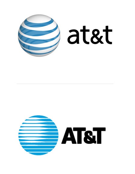
While digging up facts for the recent Saul Bass branding post, I came across an interesting analysis of the AT&T logo redesign on Speak Up today. As you probably know, a few years back AT&T axed their original, Bass-designed mark in favor of a new, more modern version. Check out the comments of the article for an earful of various opinions on the transition.
AT&T Logo Redesign Discussion
09.08.2008


My problem with the new logo is it doesn’t make any sense. The changing thickness of the bands in the original logo created stylized shading and highlights, making it sort of 3-D. The new logo is 3-D in a completely different way, yet it still kept the changing thickness in the bands, which now serve no functional purpose at all.
This comment echoes my sentiments perfectly:
“I’m repulsed by it, and yet strangely at the same time attracted to it. Much like an obese woman in a bikini.”
I think (probably) the Saul Bass first idea was “We make the informations travel in our wires (around the globe)”
But now there’s too much globe, and the wires just turn to the atmosphere.
Just my point of you…
The comments are pretty hilarious, but you have to agree with the responses they are making. To me its just another attempt at trying to be all web 2.0, it just looks like an icon from a icon library you’d find on a icon stock site. Sadly it fails for me also.
I think it was the obvious transition if u want to modernize a logo. But I don’t think it was well achived. And the lettering somehow seams a bit lost in there.
Funny thing is, I don’t think I’ve ever seen a discussion about a logo redesign where the majority of posters have thought it to be a good change.
Designers strike me as a bunch of conservative whiners. 🙂
I have to agree with Corby and Mike.
Hi wanted to say hello to members of this helpful site which I have been browsing for some time and glad to be part of your wonderful website. Im sure there is a lot of great stuff I will be able to learn from you all.
I disagree with Isak. There are many redesigns and refreshments that actually worth it. Even if some designers don’t think alike, there are many awesome new works. Sadly at&t logo is not one of them. It’s very weird.
gotta love Saul Bass, man.