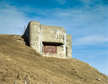
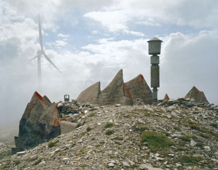


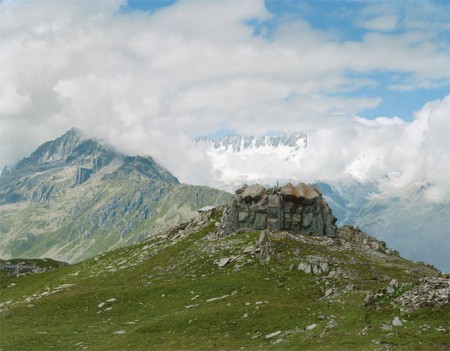

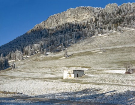
Great shots of some Swiss fallout shelters. Very artful the way they were designed to blend in with the landscape. More info and pics below.
Via Polar Intertia


Great shots of some Swiss fallout shelters. Very artful the way they were designed to blend in with the landscape. More info and pics below.
Via Polar Intertia
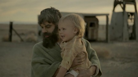
httpvhd://www.youtube.com/watch?v=nVSiwMVaKe4
I don’t usually go too deep trying to interpret films and videos simply for the fact that I’m not good at it. Can you really ever truly determine the intentions of an artist? True, some are pretty forthright and wear it on their sleeves as a sort of art-form in and of itself, but for the most part art and expression are purely personal exercises, the products of which can’t be expected to be faithfully interpreted by others. And that’s the beauty; that others are free to take the form and mold it to their own experience, to derive a more personal meaning from it. I for one hope that the majority of people who consume my work perceive it in a completely different way than I do. I know that by and large that’s not the case, but I’d like to think it could be if properly framed.
But this video struck a chord with me as an artist and as a human being in general. How can we reconcile our passions and goals with the biological imperative and our desire to find true meaning in life? Is our work the true meaning? On your death bed will you praise yourself for the things you’ve achieved as an artist, be fulfilled because you followed your “dream”. Or will you be thankful for the the relationships you’ve forged and the lives you’ve touched? Hopefully both. But as I grown older and learn more of myself and my work, I begin to fear these goals are mutually exclusive in some respects.
Curious to hear other’s thoughts. And I’m not missing the lighter side of this, it’s downright hilarious in it’s own way. But on a more serious note I think this is outlines some conflicts we all must face as artists striving towards our self-oriented goals.
Electric Guest – This Head I hold Directed by Keith Schofield
Via Dusty Brown
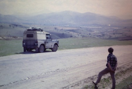
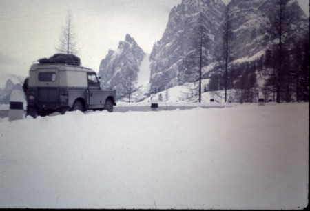
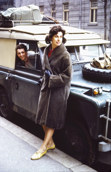
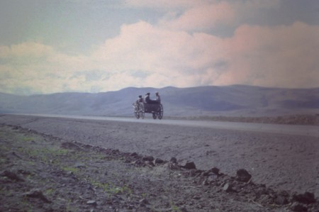
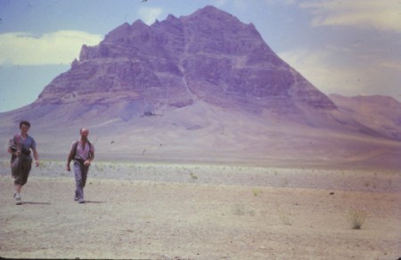
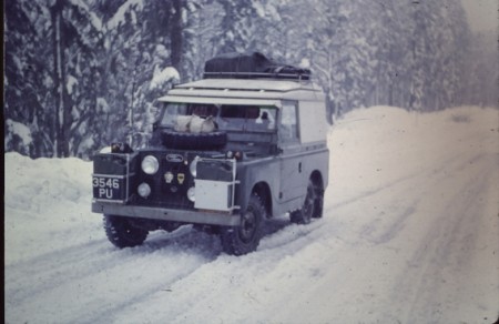
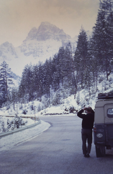
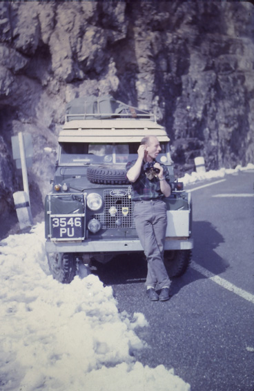
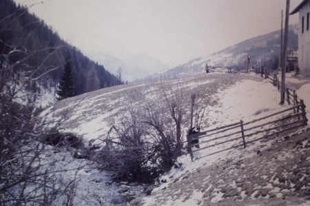
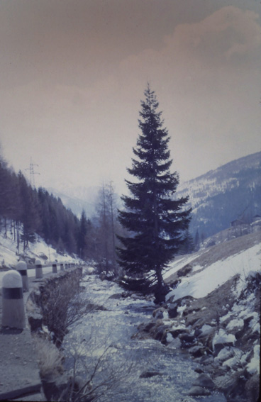
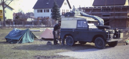
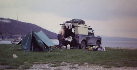
While doing a completely unrelated search for “Dinaric Alps” I came across this wonderful collection of vintage photos from an “overland trip” made by Tony Stead from England to NZ in 1962. Stead’s son has posted the images along with excerpts from his father’s written account of the journey.
In 1962, my father travelled from England to NZ. He wrote a diary (B5, hardcover, blue) and shot his first rolls of colour film.
The slides sat alongside the journals in the attic for the last few decades before being digitised.
The details of the trip are fascinating, the Intro portion is a must read. Love the tone and exposure of these. And that Land Rover makes pretty much any picture amazing.
More pictures and info at Wallasey to Waitaki


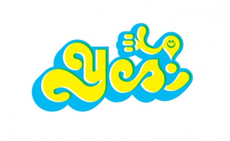


Matt Lehman is really good at logos, and illustrations. It’s been a long time since I’ve seen such a fun and well executed branding portfolio. There are some straight up classics in there, and that Warner Nashville one, wow. I’d love to see this guy get more into poster work, but simplified. I feel like some of his illustrations tend to get a little busy while minimalism seems to be his strong suit. The two included above are good examples of a nice balance of clean lines and texture.
More good stuff over at Matt’s Portfolio


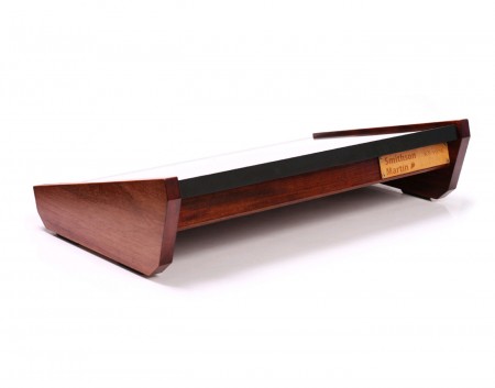
You may remember Smithson Martin as the guys who made a splash a while back with this crazy monstrosity touchscreen DJ controller which smacked of vaporware.
Well apparently that thing was real and now it’s even realer because they have released a beautifully designed desktop version that’s infinitely more practical. Unfortunately it’s like $5000 so it’s not happening. But one can dream. Personally, I still haven’t figured out whether touchscreens are my thing for live performance. I got an iPad with the hopes of incorporating it into my live workflow but it still hasn’t happened. I personally don’t like having to be constantly looking down at gear the whole time and I need the tactile feedback of knobs and sliders.
Still not sure if I’d dig the Emulator for live music, but I think it would be great in the studio. And not just for music either, I think this would make a great Photoshop or Lightroom controller if set up properly.
httpvhd://www.youtube.com/watch?v=yg7iktvYOY4

Another day, another poster. I usually just do one poster for longer tours but this time around I wanted to do something specific for a couple of the shows this summer. First was the Troubadour print and now it’s this one for the July 14th Tycho show at Webster Hall in NYC.
Tickets just went on sale and you can purchase yours here
The Webster Hall print is available exclusively at the ISO50 Shop


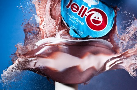
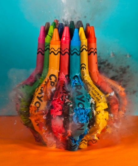
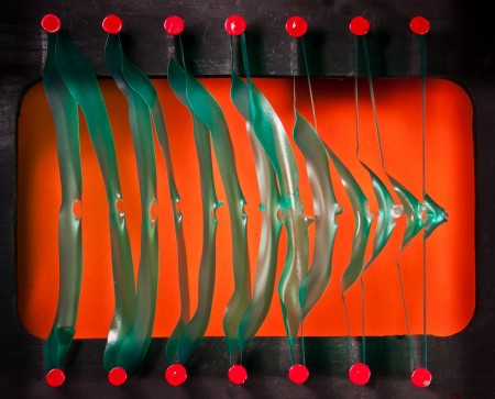
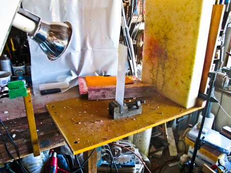
Alan Sailer creates beautiful imagery using high speed photography techniques he developed. While we’ve all seen high speed stuff like this before but I for one have never seen it treated in such an artistic way. It’s amazing how he captures just the right moment in these (the pony head about to burst is impossibly well timed). The color composition is spot on too.
If you dig through his flickr portfolio you’ll also find a lot on his process and equipment. Here are a few highlights: Some shots of his failed flash project, a flash interface diagram sketch, and his test bench setup.
More in this Scientific American article (sorry, PDF) and this Wired piece
Conjures up memories of the end sequence from Zabriskie Point

I’ve very happy to announce that Tycho will be playing at The Troubadour in Los Angeles on June 1st, 2012. To commemorate the occasion I created a poster for the show using photos shot on my recent trip to Baja. Prints are available now at the shop. I’m planning on doing a process post on this one as soon as I get some time.
Several other Tycho live dates have just been announced (see below or check the Tycho tour page), really excited to be making it out to some new cities this time around. See you this summer!
All dates are full live band w/ visuals
5/24 Portland
5/25 Vancouver
5/27 Sasquatch Festival
5/30 San Francisco
5/31 Solana Beach
6/01 Los Angeles
6/25 Reno
6/27 Salt Lake City
6/28 Fort Follins
6/29 Denver
6/30 Colorado Springs
7/02 Lawrence, KS
7/03 St. Louis
7/05 Minneapolis
7/06 Chicago
7/07 Pontiac
7/08 Cleveland
7/10 Toronto
7/11 Montreal
7/12 Camp Bisco, NY
7/14 New York City

ISO50 Playlist 14 – Compiled By Heathered Pearls & SV4
Track Listing
Tanlines – Brothers
Phantogram – Don’t Move
Cinnamon Chasers – Luv Deluxe
Porcelain Raft – Tip Of Your Tongue
Elite Gymnastics – Here, In Heaven 2
Destroyer – Kaputt
Teen Daze – The Future
Gardens & Villa – Black Hills
School of Seven Bells – Scavenger
Bear in Heaven – World of Freakout
Space Dimension Controller – Tiraquon’s Return (A New Home)
Jai Paul – Jasmine
John Maus – Molly
The Drums – Days (Trentemoller Mix)
Doldrums – Endless Winter
Shigeto – Please Stay
Hundred Waters – Wonderboom
Roman Flugel – How To Spread Lies
SBTRKT – Atomic Peace
Fort Romeau – Some Of Us Want For Nothing
Matthew Dear – Around A Fountain
Magazine – The Visitor’s Bureau (Magazine edit)
Dauwd – Acireams
Knxwledge – Ovrmyne
Clams Casino – I’m God (instrumental)
Grimes – Genesis
Benoit & Sergio – Everybody
Julio Bashmore – Well Wishers
Lower Dens – Lion in Winter Pt. 2
Madi Diaz – Trust Fall (Jensen Sportag Remix)
Tomas Barfod – Broken Glass (Shlohmo Remix)
Teebs – Verbena Tea with Rebekah Raff
Nils Frahm – Keep
Orcas – Arrow Drawn
Steve Hauschildt – Already Replaced
The Host – Summer Solstice At Cape Canaveral
Oneohtrix Point Never – Sleep Dealer
Todd Terje – Swing Star Pt 1
Past playlists are available in the Playlist Archive
Cover image by Jon Wong
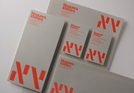
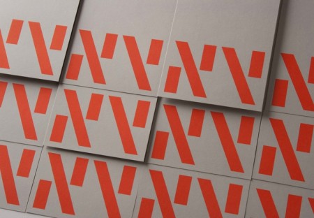
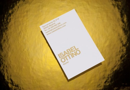


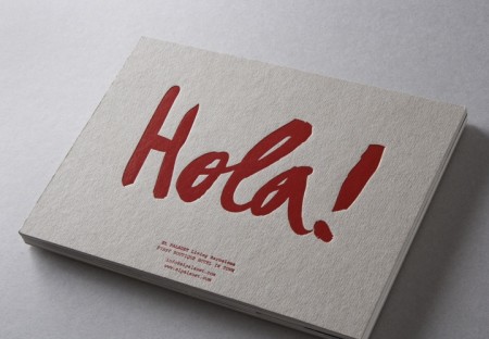
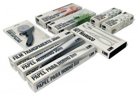
Classic branding and packaging design by Barcelona-based firm Marnich Associtates. The stuff for Noguera & Vintro is incredible. Interestingly enough — and despite that excellent branding — they’re apparently the “exclusive distributor of Hello Kitty in Spain”. Good thing you have this incredible, minimalist branding, because we all know Hello Kitty retailers and very concerned with modernist graphic design.
All joking aside, this seems like a very strange choice of branding considering the product / market. It also just plain looks weird on the site with all that garish Hello Kitty stuff going on in the middle. Do you think the client asked for this seemingly incongruous style of branding or was it foisted upon them by an overzealous design shop? Judging from a lot of the playful work on Marnich’s site, I’d bet on the former as I could see them treating this right. Odd.
Via Aisle One