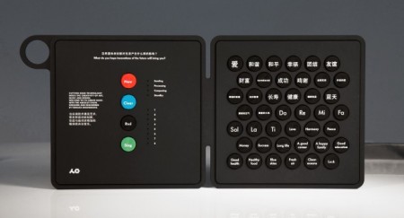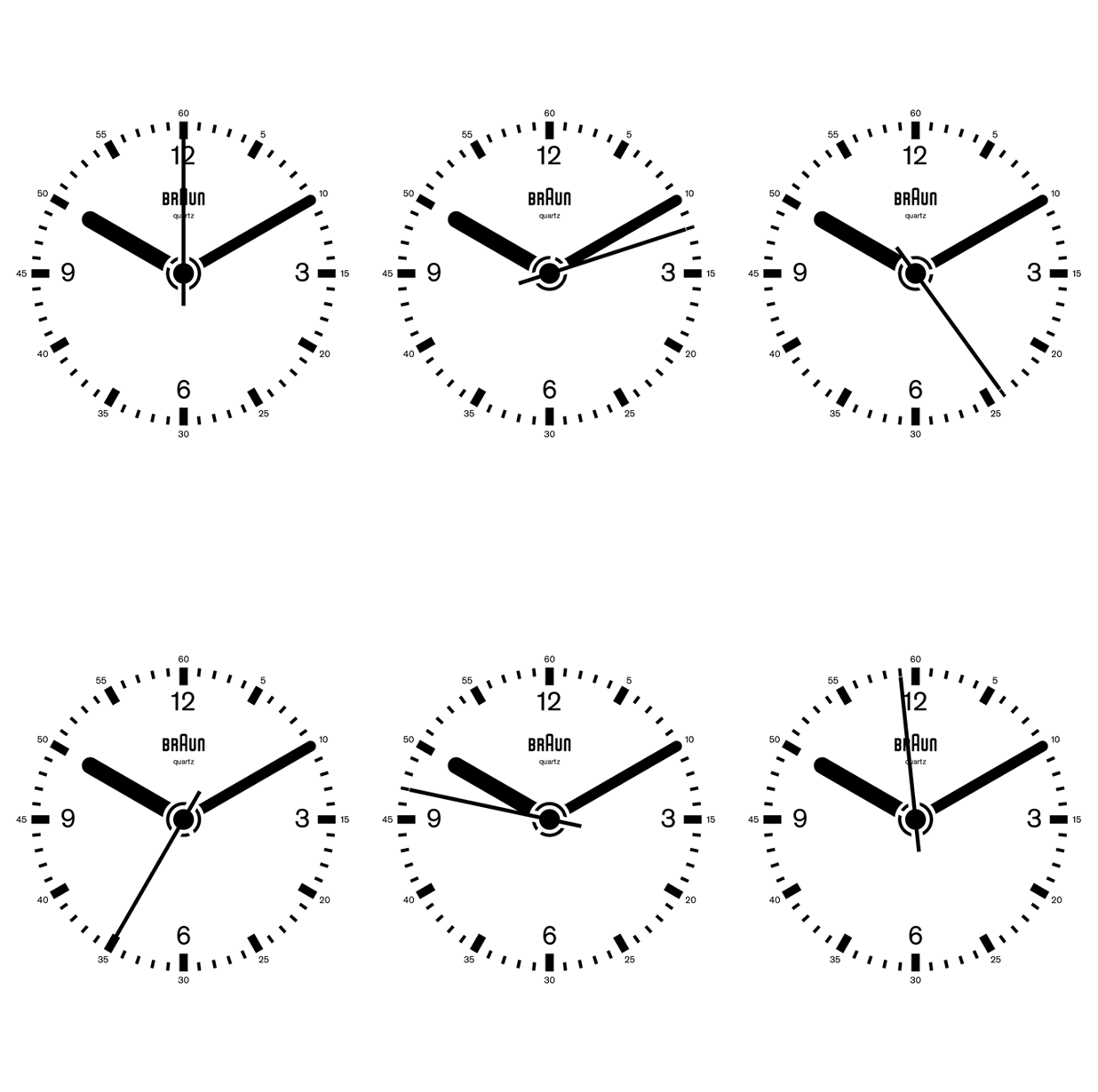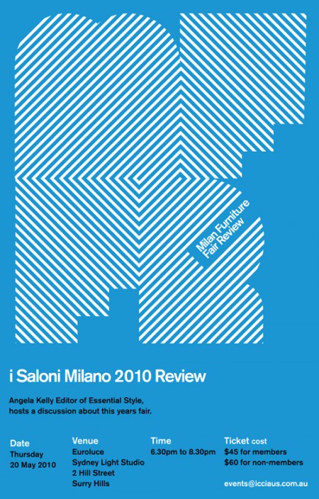

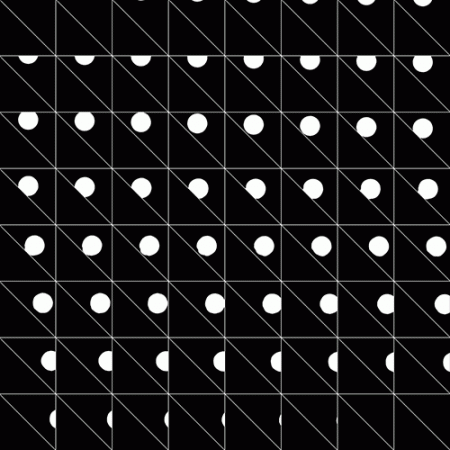
OUT THERE designed this very nice “e-invite” flyer for the Design Institute of Australia’s annual Milan Furniture Fair Review. At first glance I was sure this was some vintage poster but on further inspection realized, not only was it not old and not a poster, it was an animated gif…. You know, just in case the David Ope stuff wasn’t enough for you. The comeback continues, next stop, Geocities 2!
Posts by Scott
Milan Furniture Fair Review
Above Everything Else

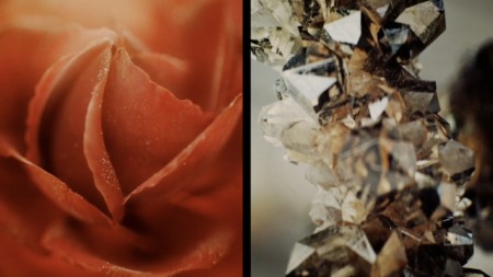
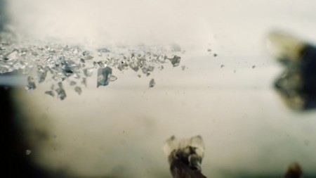
This entire video — a TV spot for Silestone, apparently some sort of space-age counter top material which shatters all of your fruits and vegetables on contact — is CGI. Incredible. If I could do video like this I’d spend all my time recreating sets from 2001.
Title: ‘Above Everything Else’
Brand: Silestone
Production company: The Mushroom Company
Director/DoP/Art direction/Post/Editor: Alex Roman
Original idea/Concept: Alex Roman
Additional CGI: Juan Ángel García Martinez
Music: ZipZap Music
Spot TV 60″
Vintage Synthesizer Ads
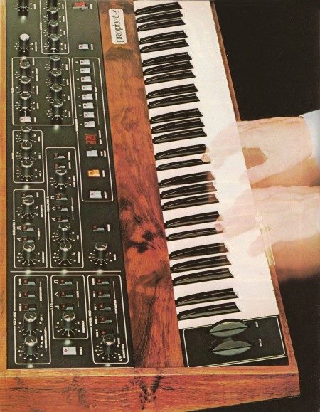
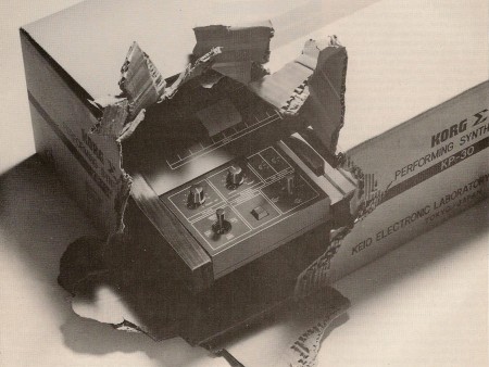
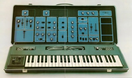
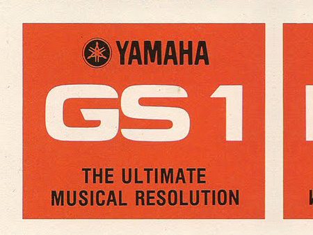
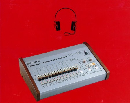
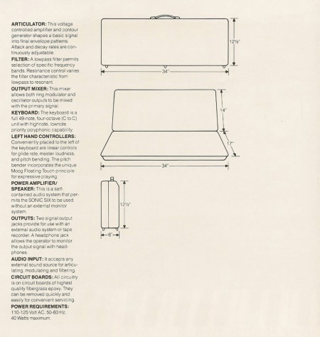
Retro Synth Ads has some great scans of various electronic music equipment from the 70’s and 80’s. It’s interesting to observe how the sophistication of advertising design in niche industries — like music technology — predictably lags behind that of the mainstream. These are pretty far along and represent output from some of the biggest names of the day, but examples like this and this are fascinating in their simplicity. I’m guessing the engineers who built the machines were moonlighting as their own designers in these cases. Loving the TL-12, makes me wish I had a MSQ-700.
Source Retro Synth Ads
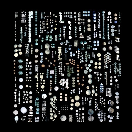
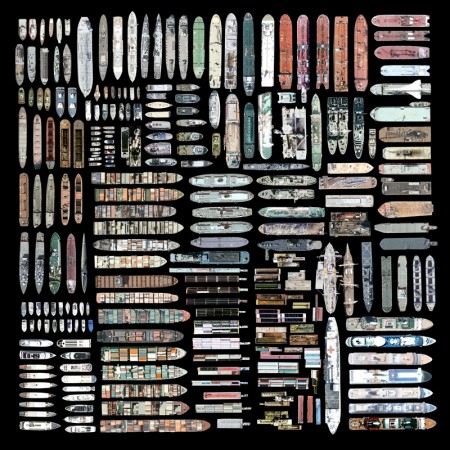
Jenny Odell Satellite Prints
Rich Brilliant Willing
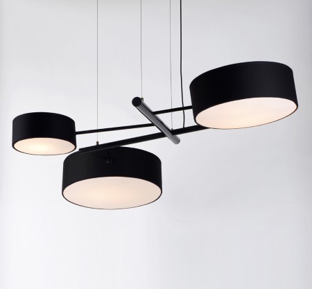
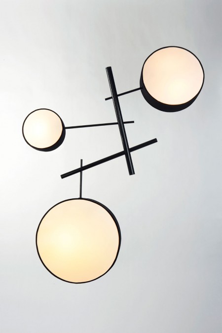
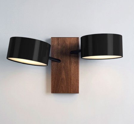
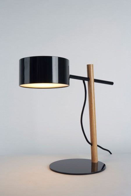
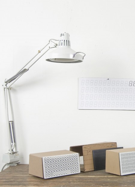
Some excellent product design going on over at Rich, Brilliant, Willing. Indeed, I’m guessing you need to be all three of those things to own any of their products. I think that’s the last thing I’d spend money on, lighting. Even though it’s probably one of the more important factors in making a room look good and feel comfortable, it’s so hard to justify these $1,000 lamps and fixtures. Forever Ikea.
Source Rich, Brilliant, Willing via DVDP
P33 2
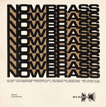


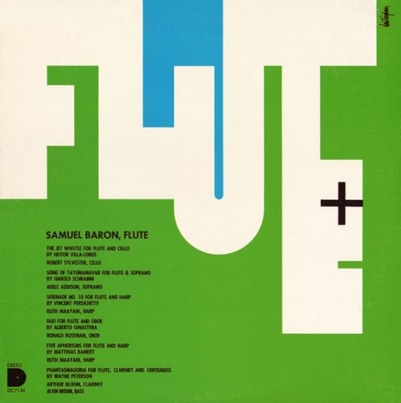
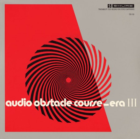
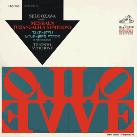
Project 33 has added some very inspirational pieces since we last checked in. Every time I see this kind of thing I want to sit down and design.
Source Project 33
104 / Le Cent Quatre
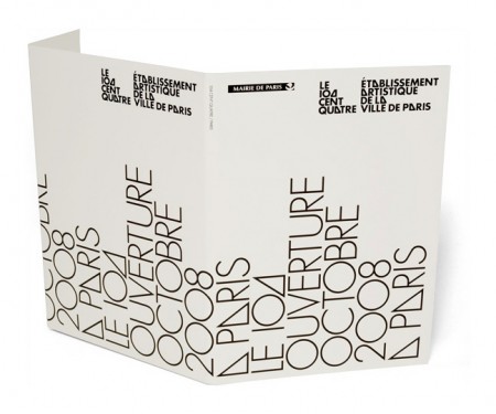
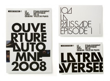
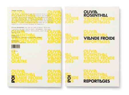
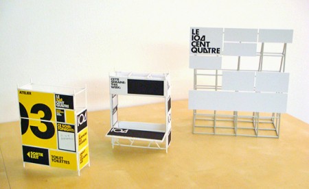
Experimental Jetset are without a doubt one of the most talented and consistent design studios working today. Every time I visit their site I am awestruck by some project or another that I missed the last time around. 104 / Le Cent Quatre is one such project. As with much of their work, there’s something so familiar about the typography and layout yet it remains fresh and engaging. These guys are the masters of subtle perfection.
Be sure to check out our interview with them from earlier this year.
Skateboard Art
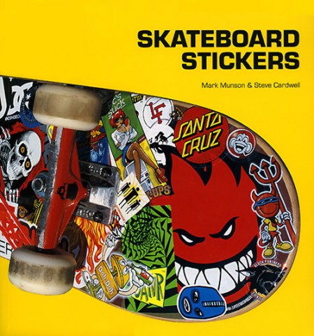
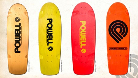
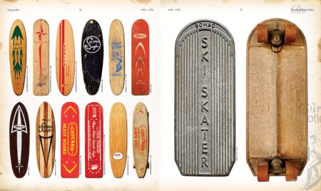
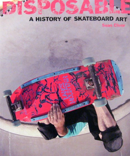
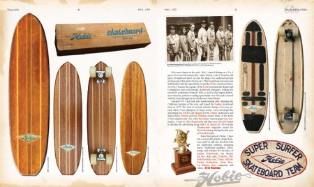
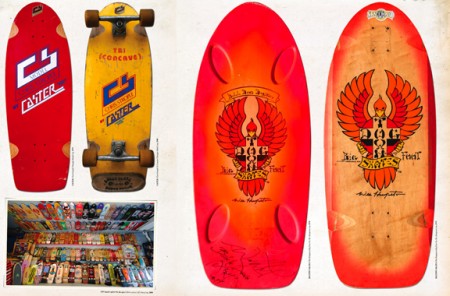
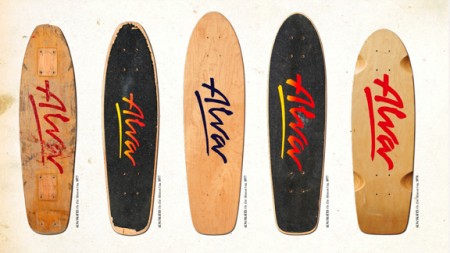
I spent a good chunk of my youth destroying my knees in the name of skateboarding; first during the 80’s as a kid and later in college. The contrast between these two distinct stylistic periods was stark to say the least. Decks went from the curvy whale-tail style with garish neon graphics to the simplified, unidirectional kind you see more often today. The graphics changed a lot with the shape, but each era had a huge influence on my visual tastes. The stickers, the shirts, the decks; I was obsessed with the imagery. I guess it was one of the few instances where a suburban kid could be exposed to non-traditional art and design created by outsiders.
While digging around for some interesting graphics I came across this article at Unodos covering a few books that feature some classic skateboarding designs. There are some old favorites in there (the Powell branding is still about as good as it gets), but I missed Hook-Ups (which you’ll catch a brief glimpse of on the Skateboard Stickers cover) and Alien Workshop (two of my 90’s era favorites). Most of the images are from The Disposable Skateboard Bible which definitely looks worth picking up. The publishers have an online gallery featuring decks from various designers and artists featured in the book.
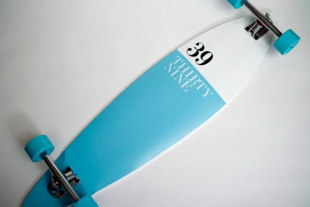
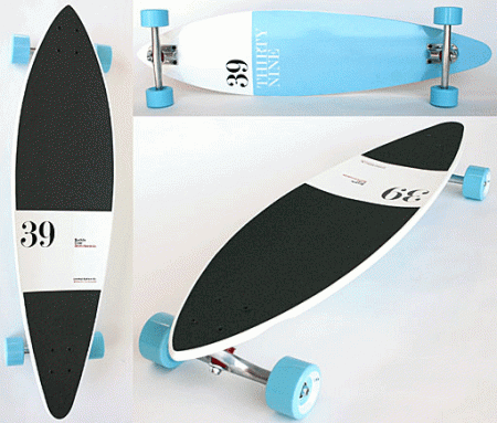
I also came across this Buddy Carr Pintail designed by Antonio Carusone (thanks for the heads up Derek. A great example of a contemporary design.
Teenage Engineering Syricon
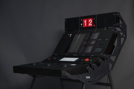
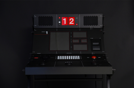
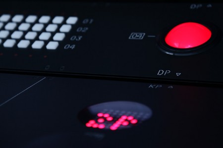
You may remember Teenage Engineering as the Swedish ID firm that’s developing the gorgeous OP-1 sythesizer. But while digging through their blog I came across another incredible design, something called the Syricon.
I can only guess what this beast is for; TE are tight-lipped about it except for what little info they divulge in this interview with Shift:
It’s a defense training machine! It’s a quite massive machine, built in water-jet cut aluminum sides, stainless steel top-plates, custom cnc’d plastics & alu details. We wanted it to look very custom and were inspired by pro line-array speaker systems + instrumentation seen in the air/space-biz.
We did everything from design, actual construction & building it, development of vector/3d graphics libraries, game development, circuit-boards etc. Crazy project, it was built in 1 month.
Not sure whether to take “defense training machine” as a joke or not. Either way I want one modified to function as a DAW controller.
Oh and then there’s this. These guys are killing it.
David Ope

httpvhd://www.youtube.com/watch?v=T710a9aADyA
Photosensitivity, Epilepsy, Seizure Warning: Some of the imagery in this post may trigger seizures or blackouts in affected individuals.
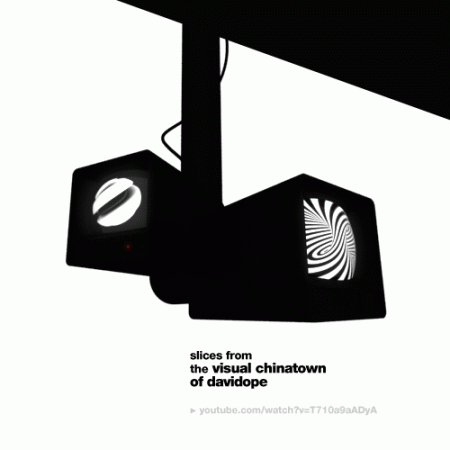
David Ope is a “Animated GIF Artist”, something I’ll admit I didn’t even know existed. He creates various mesmerizing, if not a little eye-straining, animated GIFs. Many are his own designs — mostly black and white striped compositions — but others are found media pieces featuring everything from himself as a baby to solar flares. I’ve included stills of some of his work above, click each to view the animated version — didn’t want to get all Geocities on you.
Be sure to check out his blog, where you’ll find all sorts of interesting work beyond his own portfolio, like this superb example below (possibly the best animated GIF ever made). Amazing to see people pushing a near-dead medium in such interesting directions.
David Ope via Changethethought via Sam Valenti

