Posts by Scott

Jubulani: How They Make The Ball To Hate


httpvh://www.youtube.com/watch?v=B88iSdBNoik
I’m not following the World Cup (sacrilege, I know!). Partly because I’m American and not much of a sports fan to begin with, and partly because I just can’t seem to muster the strength to pretend I like a sport every four years and then watch a bunch of guys roll around on the pitch holding their knee in agony only to pop up a few moments later and sprint around like a fucking gazelle (seriously, what’s the deal with that? I swear that’s the number one thing holding me back from appreciating football, this theater of feigned injury). I’ve honestly tried to like it, my friend Jorge Calleja took me to a FC Barcelona game while I was there a few summers back. I had a blast and Ronaldhino even scored a goal (which is apparently sort of rare these days). The crowd was amazing; every movement of the ball (even movements that, to my untrained eye, didn’t seem to have any kind of significance) was met with a rush of electricity that filled the entire stadium. Sadly, this feeling has yet to carry over to the TV viewing experience for me.

But I digress, this isn’t about sports, or football, or even pretending your leg has been amputated at the hip when a stiff breeze from the guy running by ruffles your jersey. This is about the fact that despite having watched exactly zero World Cup games, I somehow have an intimate knowledge of the ball used in them. This is because no one will stop talking about it (or those plastic horns for that matter). I found it rather intriguing that it’s being roundly panned by the players — both the winners and the losers. It made me think about all the R&D that must have gone into designing this ball only to have it be put on center stage and incessantly ridiculed. Designing high performance sports equipment has to be the most difficult gig in industrial design. It’s a sort of alchemy of engineering, physics, and craftsmanship that, to fulfill it’s intended purpose, must perform equally well for an extremely diverse range of end users. Just designing a jersey probably involves a few parts rocket science, so imagine designing the central element of play for a game, the results of which can make or break the hopes of entire countries. I don’t envy these designers.

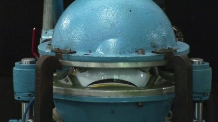
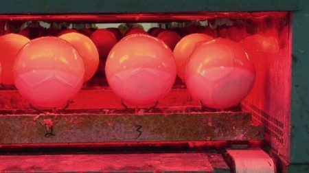
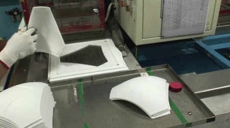
So after hearing about this ball for the better part of a month, my interest was piqued when I came across this video detailing the ball’s construction on Abitare. I’m always a sucker for manufacturing videos and this one is exceptionally well done. I really enjoy the style and tones and it’s always amazing to see these giant, purpose-built machines doing such specific tasks. It always makes me wonder how mechanized manufacturing is ever cost effective.

So I know we have a pretty internationally diverse readership (hence the fact I haven’t used the word soccer once, until now), who are you rooting for? Also be sure to remind me of what a terrible human being I am for not liking soccer (yes, after the disclaimer earlier in this paragraph, via an obscure UN sanction, I am now legally entitled to call it soccer).

Also, the first year I moved to San Francisco some guy with a bus put up a gigantic LED screen (seriously, like stadium sized) in Dolores Park and played the World Cup on it. There were like 30,000 people at the park and it was completely awesome. If that guy comes back this year I will watch soccer.

Expo 67 Passport


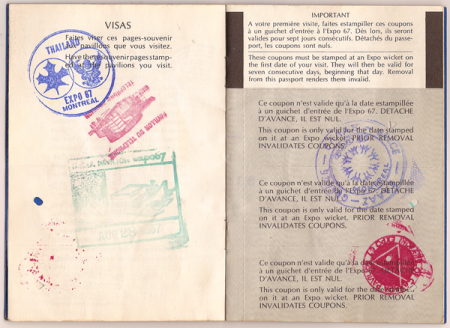
As evidenced by the various posts I’ve made on the subject, I’m quite fond of all things surrounding the World’s Fair Expositions. So when I found this gem on Ian Henry Smith’s Blog, Smallcano, I was pretty blown away. For someone who has fetishized all manner of official documentation since childhood, seeing an artifact that somehow combines the ideas of a passport and a 60’s-era World’s Fair Expo was pretty much the holy grail. The stamps send this thing over the top; it really doesn’t get any better. And check out the Habitat 67 stamp on the last image! I swear I’m going to get a tattoo of one of these.

According to Ian from Smallcano, he found this thing while “rooting around in [his] parents’ basement”. For me, this is basically the equivalent of those old stories about digging up a cigar box with a Honus Wagner in it. My only gripe is that the images are scans and not photos; scans don’t do objects like this justice. So Ian, if you’re reading this (I found the link through a comment he left here), thanks so much for posting these, but please shoot the passport on a nice wood table or something, a’la Insect54. That is, if you have the time, we’ll all thank you!

Via Smallcano

Thomas Scholes


Thomas Scholes is a digital artist out of Seattle who uses Photoshop to create painterly landscapes sort of in the vein of Roger Dean and more recently, Dan McPharlin. I love his color use and the texture; it’s really incredible that this is all being done within software.

Thomas also does a lot of process videos showing how he works with various imagery and textures to get these effects. I particularly enjoyed this one which shows him modeling a landscape from a photo of a woman (see video below). I love the idea of incorporating unrelated imagery into a composition as texture or distressing — or, in this case, as a framework.

httpvh://www.youtube.com/watch?v=3f9D9Fvh2pM

You can check out more of Thomas’ work and videos at his blog

Yours Tru.ly


Yours Truly is a sort of video collective out of San Francisco who’s mission statement is to “discover and document” the bands and artists that inspire them (link to their full mission statement). They essentially craft short films about interesting bands; some are in-studio alternate takes of songs, others are live footage interspersed with interviews. All are thoroughly engrossing a must watch for fans of any of the bands they cover or anyone wanting to discover new music.

My favorite short of theirs has to be the Toro Y Moi in-studio of him recreating an instrumental version of You Hid from his last full length (see video below). Hearing the song in this new way was really something to behold; I have to say I’m partial to this version now. Another highlight is a session they taped of The Morning Benders. They filled up a studio with a bunch of local musicians and recorded a version of Excuses; the result is incredible and once again rivals the album version. Check both videos out below and check out a ton more at Yourstru.ly (do URLs get better than that?).

New Dusty Brown EP Free + ISO50 Artwork

Shang Tse Wizard Kafka

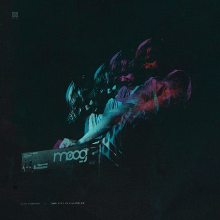
Dusty Brown - This City is Killing Me - Artwork by S.Hansen/ISO50


I’m very pleased to announce that the new Dusty Brown EP, This City is Killing Me, is now available. I’m even more pleased to announce that Dusty was generous enough to give it to us for free. If you like it (which I am sure you will, just have one listen to “Back to Back” and you’ll be hooked), please consider supporting his music by making a donation.

For the uninitiated, Dusty Brown is an insanely talented Sacramento-based producer and musician who, along with his eponymous band, creates a sort of beat-centric clash between raw ambient-electronic and synth-driven indie rock. Dusty got me into the live music scene when I was starting out in Sacramento and over the years we’ve collaborated on all sorts of projects. I’ve learned more about music from Dusty than anyone else; his production style and methods are truly awe inspiring. People who have been following along for a while might also remember that Dusty did all the flash work for both the original versions of the ISO50 portfolio.

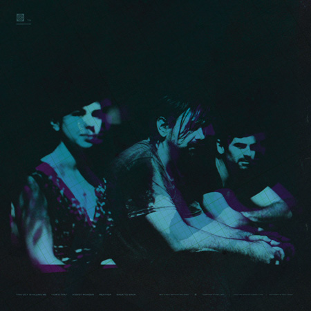
I’ve really been anticipating this EP so it was great to also be able to create the album artwork for the release. The artwork is based on the photography of another incredible talent from Sacramento, photographer Raoul Ortega. The front and back covers feature various images from this set which Raoul shot with the Canon 5D at Dusty’s Harlow’s show last week. It’s so inspiring as a designer to work with talented photographers; images like this are just begging to be treated and make the whole process such a pleasure. The EP download includes print sized versions of the front and back covers.

Enjoy! And please thank Dusty for hooking us up in the comments!

Dusty Brown – This City is Killing Me Download | Donate

Tycho Live In San Francisco July 9th


I’ll be playing a Tycho set in San Francisco at Mezzanine on Friday, July 9th, 2010 as part of this year’s Ghostly Showcase. It’s a great lineup and last year’s show at Mezzanine was incredible so this one is not to be missed. I’ll be debuting some new material from the upcoming album and should have a couple other surprises and guests in store. Should be a great night, I hope to see you out there.

Details:
Ghostly Live A/V Showcase
Featuring live audio and visual performances.

Friday July 9th 10pm

Tycho
Solvent
The Sight Below
Shigeto
Mux Mool

@ Mezzanine
444 Jessie Street
San Francisco, CA

Tickets $20ADV $25DOOR

Buy Tickets Here

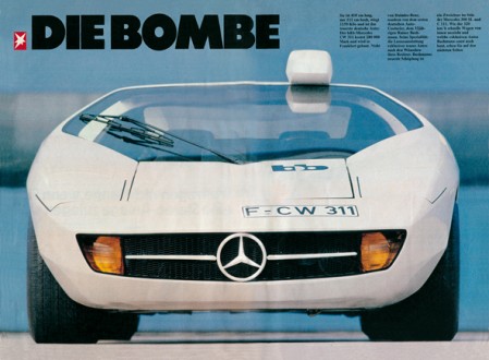
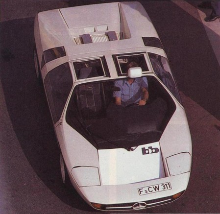
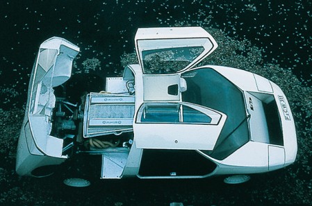
1978 Mercedes-Benz Study CW311


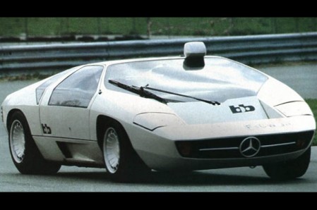
I’ve been on a car kick lately. Not only are they excellent examples of functional design, there’s something about the quality of 60s-70s concept car photography that always gets me. This latest entry is the 1978 Mercedes-Benz Study CW311. Designed solely as a concept by Eberhard Schulz Isdera for Mercedes Benz, it was later put into production as the Isdera Imperator 108i. You may recall the post on the Mercedes Benz C111, a concept which Shulz also developed.

I feel like this was the era right before everything started looking like alien technology or some sort of bird. It seems like in high end conceptual situations like with supercars, the designers are always trying to envision some object from the near future. I guess I prefer the near future imagined in the 1970’s over that of today.

I love the lines, really aggressive but the overall vibe is softened by the sort of roundness of the thing. I’m definitely getting an Italdesign/DeLorean vibe off the windows. Also, picture kicking it with a Lufthansa airliner? Classy. And I’m loving the roof mounted rear-view; something very utilitarian about that. On a side-note, I feel like if a car could be a typeface, the CW311 would be Trade-Gothic Bold Extended.

And to top it off, a very VHS-ish video featuring the CW311 (with poor choice of substitute wheels):

httpvh://www.youtube.com/watch?v=IELHeVXm0cg

Special thanks to AJJB for turning me on to Shulz’s work back in the C111 post. AJJB also pointed out that Shulz is now “selling cheesy oil paintings out of a small town in Germany”. Interesting and sort of sad too…

Images via Carstyling.ru

Tycho: Past Is Prologue iTunes Reissue


Past is Prologue — my first album as Tycho to be released on a label — has been reissued by Ghostly International and is now available on iTunes (and, as always, at the ISO50 Shop). the reissue includes an exclusive remix by Mux Mool of From Home.

I often get asked about the lineage of this album, which has taken on many forms, so I thought I’d lay it out here. The original release was entitled Sunrise Projector and was self-released. Later, Merck records picked it up and released it as Past is Prologue. The Merck version featured new artwork, two new original songs, and two new remixes — but was missing one of the tracks from the Sunrise Projector release. Merck also released a 12″ vinyl sampler featuring 5 tracks from the album. Now, ghostly has released this digital reissue which features the new Mux Mool remix. Hope that clears it up!

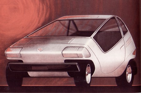
Fiat City Car (1972)


Designed by Centro Stile Fiat, the 1972 Fiat X1/23 City Car concept was an all electric concept far ahead of it’s time. I can’t even explain how hard I would roll this thing all over San Francisco if I could get my hands on one and the battery lasted longer than 5 minutes (assuming they weren’t very efficient given that we still haven’t gotten the whole thing right 40 years later). I see a lot of those Smart Cars all around the city and get jealous when I see them park perpendicular. Does anyone have an ultra-compact like this? Did it live up to the hype?

Via ConceptCars.it

Academy of Art Spring Show: Tonight


Just a quick reminder that tonight is opening night for the Academy of Art 2010 Spring Show. I’m going to be judging this year so I’ll be headed down a bit early to get things started. All the info is here and if you’re not near San Francisco you can check out a live blog of the event here.

See you there.