Posts by Scott

Jake Sargeant


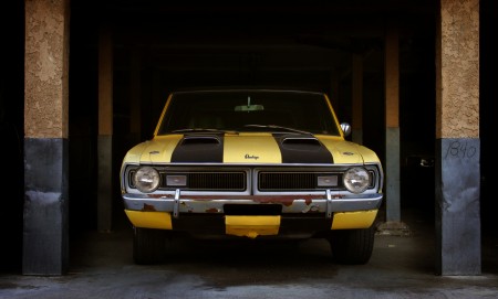
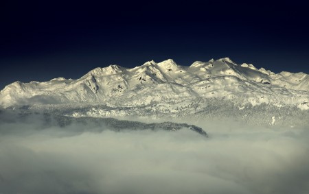
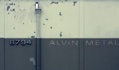
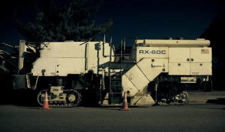
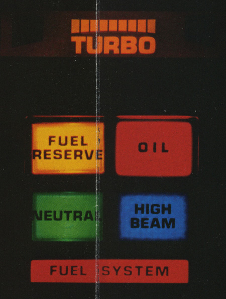
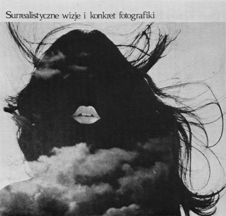
Above are some beautiful examples of Jake Sargeant’s photography. I’ve been following Jake’s work for a while now; you may recall that I used some of his textures in the Analog Visions print. At the time he said he had just purchased a Canon 5DMKII so I was really interested to check back in after a while to see what he’d come up with. He didn’t disappoint. His Flickr is full of breathtaking imagery that shows what a skilled artist can do with proper hardware. One caveat: I’m not entirely certain that all of these photos were taken with the 5D, but most seem to have that feeling. Jake, if you’re reading this perhaps you can fill us in on how things are going with the 5D in the comments.

Update from Jake in the comments:

Hey Scott & all….I’ve been shooting with the Canon 5DMII for just under a year now and really love it for still shooting and need to keep shooting more video with it. Everything over a year old on my Flickr was shot with a Canon 40D.

My main go-to lens is the Canon EF 24-105 f4 L IS. I also love shooting macro with my Canon 100mm Macro 2.8L IS.

Jake Sargeant on Flickr | MN8 Studio (Jake’s portfolio)

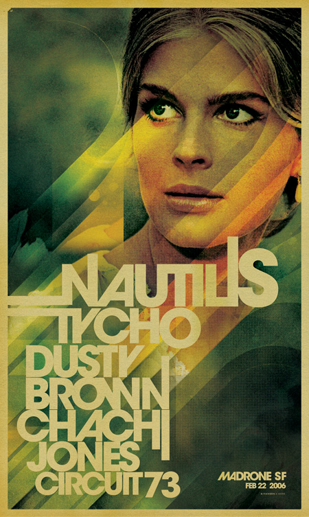
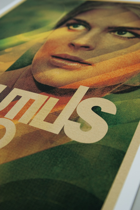
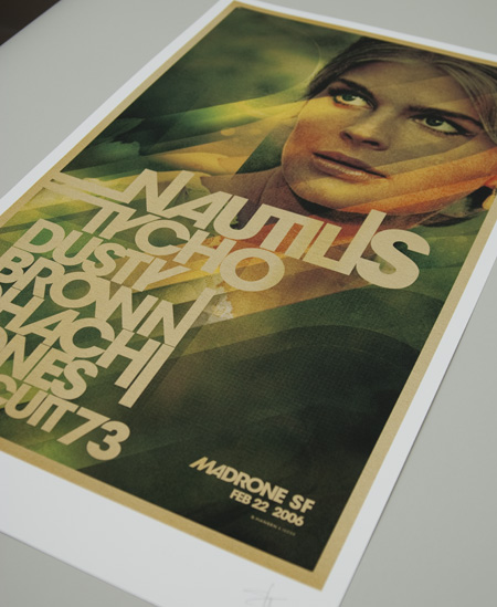
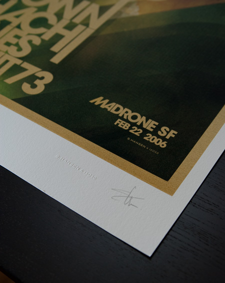
ISO50 Madrone Studio Giclee Released


ISO50 Studio Edition #008, Madrone, is now available through the ISO50 Shop. This print features updated artwork from the original poster for the Madrone show in San Francisco. Four limited edition formats are available: 14×24″, 18×30″, 24×40″, and 36×60″. All are printed on Hahnemühle German Etching 310 gsm (120# cover, 100% alpha-Cellulose white mould-made) using the Epson 9900 10 color UltraChrome HDR™ pigment-based ink system.

You can view the Madrone print here and view other Studio Editions here.

Dusty Brown Live in Sacramento Friday


Dusty Brown will be playing live this Friday (May 28th, 2010) at Harlow’s in Sacramento. Their shows are always worth checking out — few can match the intensity and raw emotion they exude on stage — but this one promises to take things a step further. They’ve put together a full band and reworked all the songs with fully live arrangements for this set. It’s always interesting to hear how predominantly electronic music works in a live context, particularly with a drummer. I saw Caribou and Toro Y Moi last night here in San Francisco and that was certainly a treat to hear how the songs had changed between the studio and the stage (more so with Toro Y Moi as Caribou’s records are essentially rock at this point anyways). I’m looking forward to the same from Dusty and co. on Friday. Hope to see you out there.

More Info here

Awesome photos by RA OUL – Check out the rest of the set on his Flickr

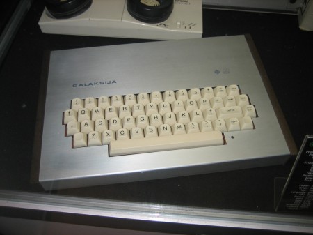
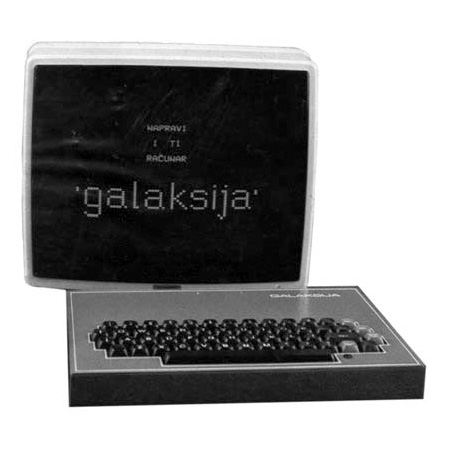
Galaksija Computer


I came across this gem the other day but haven’t been able to find any better shots of it. The Galaksija was an early 80’s Yugoslavian DIY computer kit designed by Voja Antonić. I found the top shot — which I believe was taken at some sort of computer museum — at Avian’s Blog. Given that this was a DIY kit, the external appearance of each unit differed and most weren’t all that interesting. But that top one is incredible; I don’t know what I’d do with it, but I want it in my studio. Anyone have any other shots of this particular one?

Bonus: “High Resolution Graphics” on the Galaksija
httpvh://www.youtube.com/watch?v=2IhIGAo21JY
httpvh://www.youtube.com/watch?v=lkQ5yS2HIpM

Tycho Album Progress

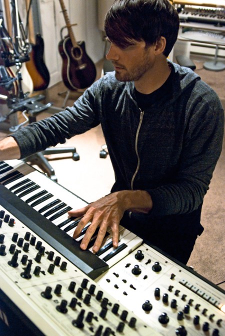
Me on the Oberheim Four Voice
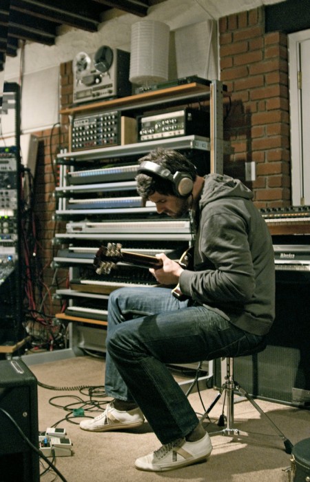

Zac Brown on electric guitar
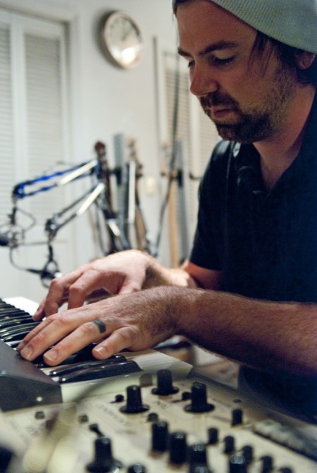

Dusty Brown
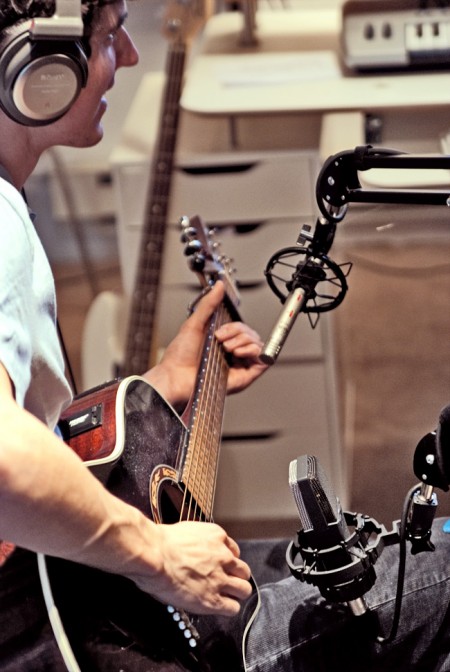

Alex Cornell lending some acoustic takes
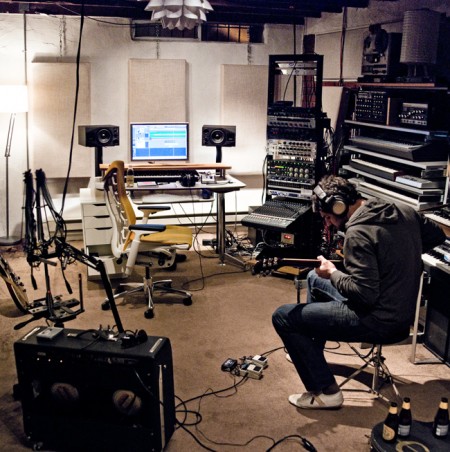

Zac Brown in the studio


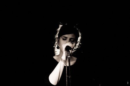
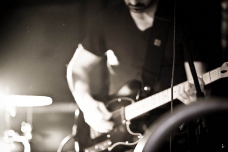
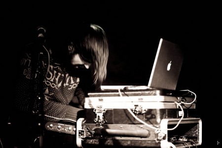
I’ve sort of had my head down for the past couple months really digging into the recording of my next album so I thought I’d post up some shots from various sessions. Recently, guitarist Zac Brown (of Dusty Brown and DoomBird) has been coming in and contributing parts to some songs. It’s one of the first times I’ve collaborated with another musician and it’s been a great experience. It’s also been fun to wrap my head around recording guitar amps, something I had limited experience with before as most of my songs are written and recorded on my acoustic guitar with the keyboard and drum parts added later. It’s always exciting to find a new sonic texture to work with and it’s definitely an inspiring process to see your vision for a song expanded on by someone else.

If you’ve been following along with the album’s progress, you might have noticed the somewhat protracted nature of the whole thing. It’s been a test to say the least trying to keep on track with music while staying on top of the ISO50 side of things. There was definitely a long period where all I wanted to do was write new songs but not finish them, which is the hardest part for me. The good news is that because of this I now have a few albums of solid material, but the bad news is that it delayed the process of this one getting out. But that’s all behind me now and the past couple months have been the most productive of my musical life. The only problem is that I now have this self-imposed feeling that I’m behind and when I’m feeling that way I can sometimes forget to relax and enjoy the process of creating. It’s funny how much design and music differ in this way for me. While I see the processes of creating both as very similar, I don’t feel I can really sit down and just get music done in the same way as my visual work. It’s easy to say I’m going to devote three nights to a poster and be pretty confident it will get done and I’ll be happy with it. With music it’s always a much longer and drawn out process with more intangible milestones along the way.

The beauty of this entire process and the time devoted to it is that I’ve been allowed the luxury of perspective, something that’s very hard for me when I have to be neck-deep in a project from beginning to end with no breaks. The time has allowed me to continually reevaluate what the work is supposed to be and how best to do the material justice. Most of my songs start out as very small sketches, usually a guitar part and a keyboard part recorded quickly. I then set it aside and move on to something else. When I finally come back to an idea to develop it into a full composition my biggest fear is that I will somehow lose the meaning or the soul of it in the process. The problem is that as I’m adding new parts I start to go on tangents and the song can become something completely different. Sometimes this can be a good thing, but in other cases it takes time to be able to look back and realize that the original idea has been muddled in some way by the initial excitement of discovery. Problems like this tend to disappear when I allow myself to revisit work over time.

Overall, I feel close to wrapping up the production/arrangement phase but then comes mixing and mastering which can be time consuming. My goal is to have things sewn up by, at the very latest, end of summer. But putting time-lines on things doesn’t exactly serve the artistic process, at least not mine anyways, so I’m trying my best to pretend that goal doesn’t exist.

I’ll try to post some more pics / videos as things progress. And on a related note, Yourstru.ly has been filming a piece on the making of the album so there should be some interesting stuff by the time that’s done.
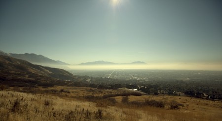
Vintage Magazine Scans


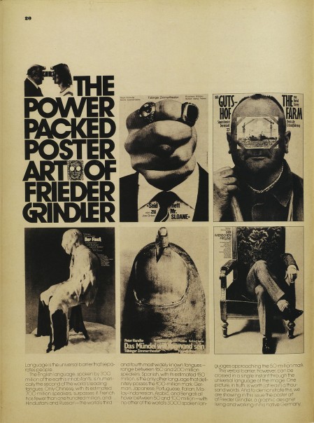
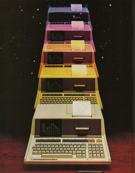
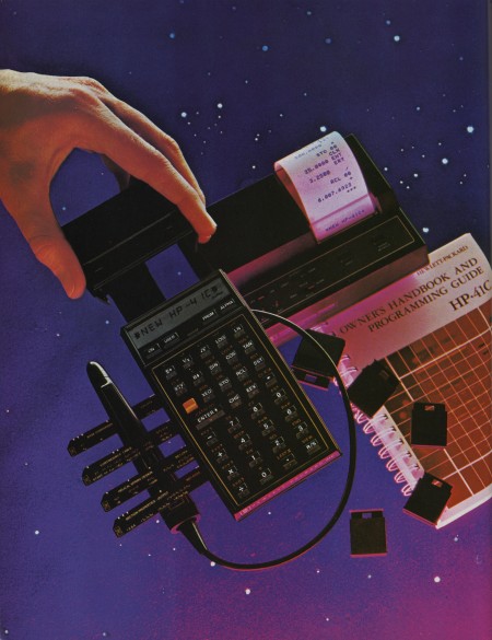
Eric Carl (who also brought us these vintage sci-fi book covers and these classic logos) has a beautifully scanned set of vintage ads from magazines up. They’re all high res so it’s a goldmine for textures and overlays. I love how magazine print breaks up at high resolution. The moire patterns are very useful when blown up in compositions; I use them a lot for posters.

Vintage Ads on Flickr by Eric Carl

FITC Toronto Reel / Music by Tycho


FITC just released the highlight reel from this year’s festival in Toronto. The video was done by Stock Archive and features the most recent Tycho single, Coastal Brake as the soundtrack. I’m pretty sure the whole thing was shot with the Canon 5D MK2. I did an interview for the Stock Archive guys and they had a couple setups, one of which was the 5D on one of those body-mounted steady cam rigs. It was insane; the guy looked like a robot. Some of the panning shots definitely look like they were using it.

I’m really impressed with the editing, I’m not sure what I was expecting but this certainly exceeded it. I think as the quality of the 5D becomes ubiquitous people will stop being so blown away by the visual aspects alone and elements like editing and narrative will become much more important. Right now I feel like you could record a dumpster for 30 minutes with the 5D and it would be watchable.

Video Link

On a side note, I will be speaking at FITC San Francisco this summer. I’ll be posting more on that next week, but just a heads up if you want to score some tickets before they go up in price (May 28th I believe).

Expo’70 Ephemera


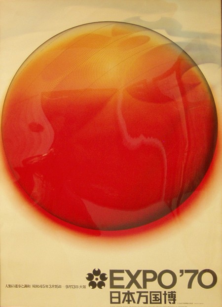
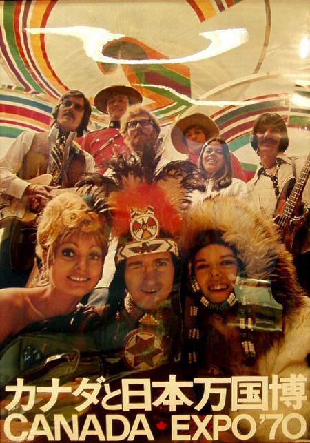
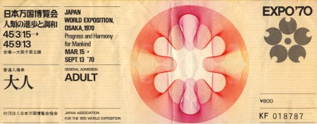
A nice collection of posters and tickets from the Expo’70 in Osaka Japan. I’ve been looking for proper scans of these posters forever but I settled on these corrected versions from this flickr set. Anybody know where you can score some copies of these? I found this one on eBay, but not really the style I’m looking for. Nothing I love more than 70’s phtography blow-up with bold Helvetica over top. It’s always a little sad to see stuff like this and realize how rare it is; it’s a shame there isn’t some sort of high res vintage poster repository.

On a side note, Canada: you always have great design instincts but I have to say, you really blew it on this one. Winking Caucasian Indian? Also, what’s with the attempted Geddy Lee up in the corner? Couldn’t you get the actual guy to be in your poster? But I guess not all 70’s Canadian bassists were in Rush. You saved it with the type lockup on the bottom though.
Images via Sanue and Lilakanarie

The Secret Navy SEAL Nikon


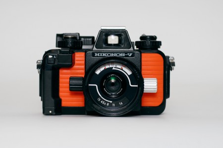
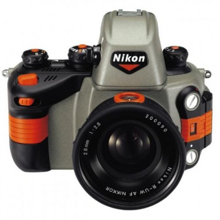
The normal, non-secret Nikonos RS


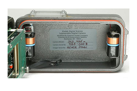
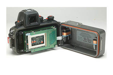
Gizmodo has an interesting piece up about a top-secret digital version of the now discontinued Nikon Nikonos waterproof camera that was developed for use by Navy SEALs.

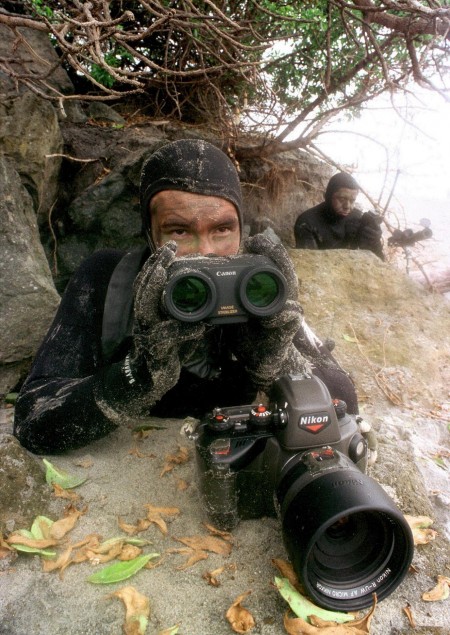
This Nikonos was a total mystery. A secret that not many people knew about until recently. In fact, its existence was repeatedly denied by the manufacturer, even after the US Navy published this photo, showing a member of SEAL Team One equipped with one and the following caption:
980608-N-3236B-003 NAVAL AIR BASE CORONADO, California (June 8, 1998) — Navy SEALs attached to SEAL Team One, Naval Air Base Coronado, CA, conducts training using the Nikon/Kodak DCS 425 underwater digital camera which can send real time digital images to decision makers, and an LPI LPD tracking device uses brevity codes to send both mission status and precise longitude/latitude. U.S. Navy photo by Photographer Mate 2nd Class Ted Banks. (RELEASED)
Gizmodo

Pretty interesting stuff and kind of odd to see the branding intact on the model used by the SEALs. The Gizmodo article makes a good point that it’s a shame the consumer version was discontinued; even if you don’t do underwater photography, it would make for an excellent no hassle all weather setup. More info and links can be found in the original article.

Apparently there’s a pretty good used market for these; all you aspiring SEALs can start planning your beach assaults with a nice rig like this. I’d like to see a digital model, but aesthetically I’m still partial to the original 35mm version:

Image via Dive Matrix

Via Gizmodo

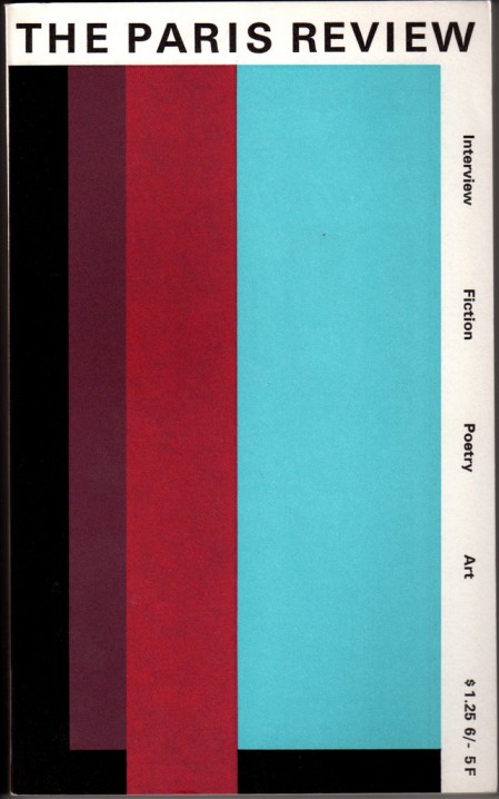
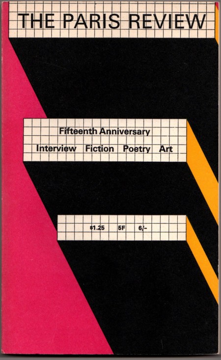
The Paris Review


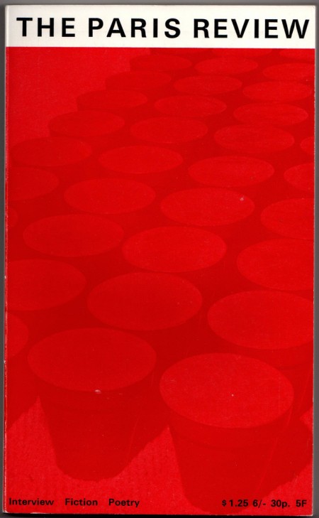
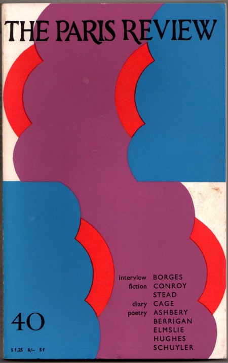
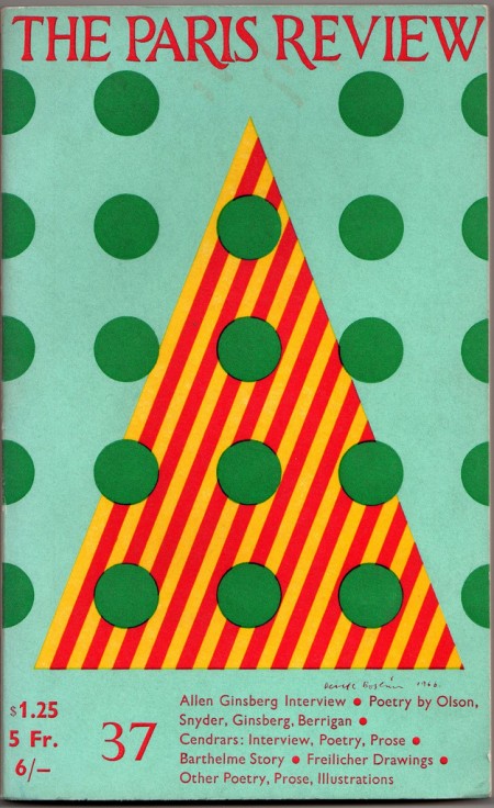
I came across a beautiful set of The Paris Review covers over at Belacquashua’s Flickr today. The Paris Review is still around (see current site here) but apparently they fired their art director around 1970, because this isn’t exactly moving design. Just another casualty of the age of desktop publishing I guess. I have two theories relating to this sort of phenomenon: either quality design has just become too expensive for smaller publications to employ or the owner’s son downloaded Photoshop and he decided to “do everything himself because those designers never listened to me anyways”.

What’s most interesting is that the modern covers seem to be sort of cheap ripoffs of their own 50’s era covers. Another culprit in this mess might be digital photography. You’ll notice that a lot of the newer ones (example) aren’t bad at all design-wise but they have a completely raw, coldly digital photo where the beautiful, hand-drawn illustrations used to be. I guess illustrators are pretty expensive these days too.

Has anybody here studied this phenomenon in depth? I know this is a somewhat isolated case, but from my own subjective observations, the decline of quality design in magazines and books seems to be a constant across the board. Please let us know in the comments if you have any thoughts on this trend. I’d love to know what’s driving this.

Images via Belacquashua