Posts by Scott

Modern Analog Consoles


Neve 5088


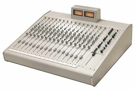
Speck LiLo


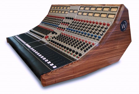
Wunderbar Console


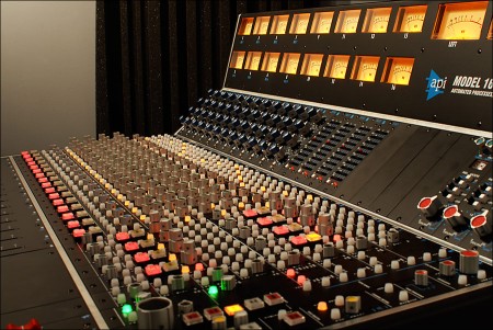
API 1608


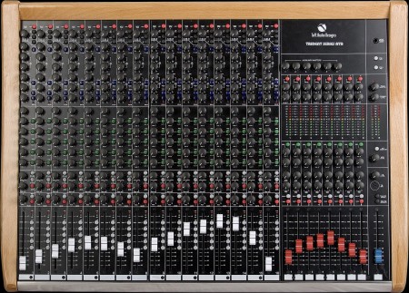
Toft ATB Series


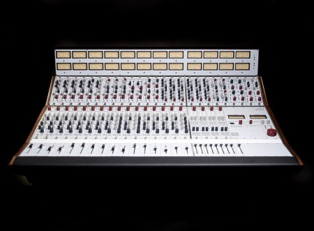
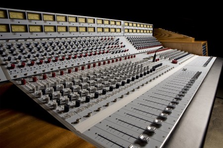
All I’ve ever wanted was an analog desk. Since I started recording it was my goal to someday have a 24 track analog mixer to work with. I’m still not there yet, but the stuff you see above keeps me dreaming. These are some examples of a new type of analog console that a few boutique manufacturers have been releasing in recent years. Most are compact, relatively inexpensive ($30-40k instead of $500k+) analog consoles. They tend to be scaled down versions of classic large format consoles from the pre-digital age (the Toft ATB, for example, is a mini Trident, which was also designed by Malcolm Toft)

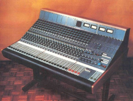
As a designer I find myself obsessing over the visual aspects of my musical equipment. Sometimes I wonder which I love most, how the machines look, or what they do. While I do think these newer machines are beautiful, I miss the old style interfaces which have shifted quite a bit from their original forms (see an example of an older Neve below).

Neve 5315


This got me thinking about how little these machines have changed over the years and how I dislike even the most minor of those changes. I’m always amazed at how a subtle order has emerged over the years in pro audio interface design. It’s sort of like the mouse on PCs; the metaphors and interaction models have remained essential unchanged since inception yet no one seems to mind. I guess it’s a testament to how thoughtful the designers who pioneered these systems really were. Either that or we’re just slaves to habit.

At any rate, it’s all just fun to think about. The reality is that I don’t really need a desk like this. I’m rarely recording more than two tracks at a time so I have four channels of Neve clones and a patchbay — it sort of acts like a modular 4-track console (minus the faders and cool meter bridge). The only thing these would really come in handy for would be as a summing bus during mixdown and I have places I can get that done (although I do prefer having everything in-house).
Joakim Faxvaag


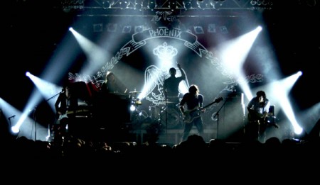
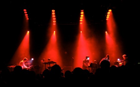
Joakim Faxvaag is a Norwegian lighting designer and visualist. He’s been traveling with Phoenix for the past year while constantly evolving the visual aspects of their shows. Joakim is using (among other things) the excellent modular video app VDMX — the same software that I use for visuals during the Tycho shows. To see what he’s been able to do with it is inspiring to say the least.

He lists his setup as follows: “custom quartz patches, 15000 ansi front projector, 6 x dl.2s, 6 x mac 700s, 10 x mac 2000s, 6 x atomics, mac pro running vdmx, kineme artdmx + grandma fullsize ++”. You can see some more examples at Joakim’s site.

Wim Crouwel Archives


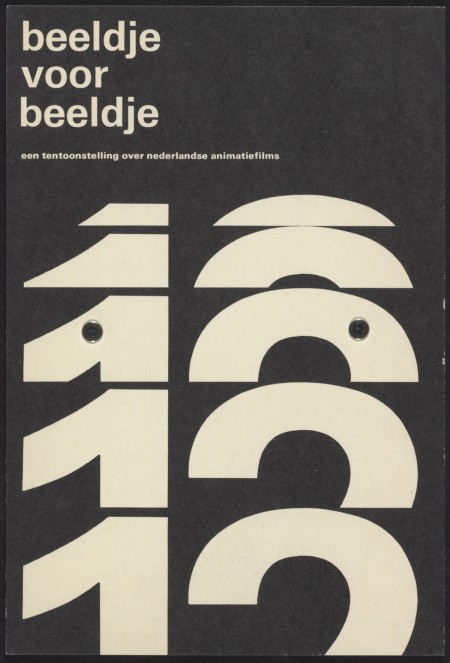
Aisle One posted earlier on this incredible Wim Crouwel Archive. The Het Geheugen van Nederland has generously archived over 500 of the Dutch master’s works. Break out your printers, you could probably get some decent prints out of some of these. I have his book but a lot of these are completely new to me.

Via Aisle One

Terrabyte Studio Print


Over the past year I’ve been going through the process of scaling some of my posters for large format (e.g. the Knitting print: Old | New). Most of these were originally designed for 12×18″ format so they had to be re-created from scratch. It’s been a painstaking process at times, but it has also allowed me a chance to approach some of the designs from a fresh perspective. Something about stripping a design down to nothing and building it back up again gives you a clearer view of the essential nature of the piece allowing for more objectivity when making design decisions.
The latest print to be scaled up is the poster for the Terrabyte music festival (pictured above — view original). As you can see, I’ve made some changes and cleaned a few things up. I’ll be posting a process piece detailing the various earlier versions of the print and the transition from small to large format next week. The print is currently available as a giclee from the ISO50 Shop.

On a side note, if you’re partial to any of the older designs in the small formats now would be the time to grab some, they will not be reprinted. They can be viewed in the prints section at the shop.

ISO50 Studio Edition #007: Terrabyte

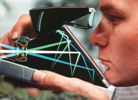
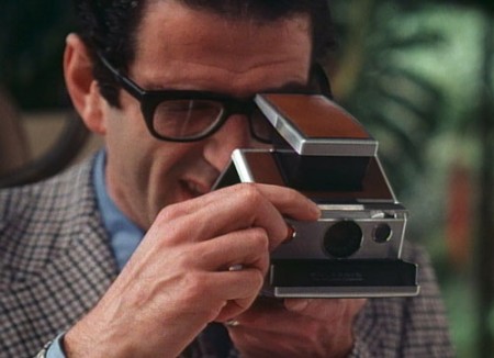
Polaroid SX-70 Ad


httpvh://www.youtube.com/watch?v=5jaiq_ZZ_eM
With all the recent talk about The Impossible Project I thought I’d post this beautifully shot ad for the Polaroid SX-70 camera.

“This ad from the 70’s describes the Polaroid SX-70, a Land camera with complex optics and advanced features that brought immediate-results photography via the Polaroid system.”

Anyone got an SX-70 they’re going to dust off now that film is available again?

Video Link

German Matchbox Labels


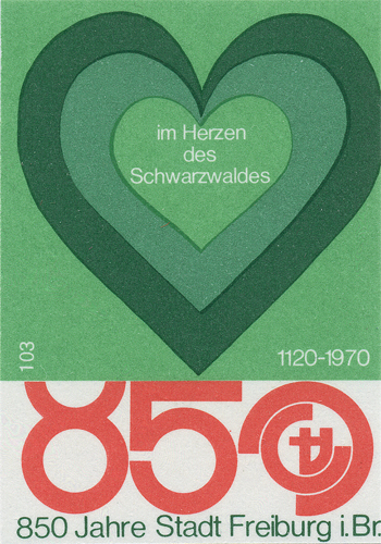
Shailesh Chavda has a beautiful collection of matchbox labels up on Flickr. I have a book of Czech labels but I’ve never seen these German ones. Dave from Grain Edit originally turned me on to matchbox labels when he showed me his collection (I think they were mostly Czech). They’re so incredibly detailed considering the format; most of these would do fine as posters. I think the most striking part to me is the printing, when blown up you can really see that nice grain and spacing in the ink.

Many more great examples can be found here

Content-Aware Fill Sneak Peek

httpvh://www.youtube.com/watch?v=NH0aEp1oDOI
Update: The Real Uqbar has a post discussing GIMP resynthesis and how it makes this particular feature completely possible. Via Kevchenko

This is absolutely insane. In the video, Photoshop product manager Bryan O’neil Hughes walks us through a new feature they’re working on: “Content-Aware Fill Sneak Peek”. I can’t tell you how much time this would have saved me. To be honest I thought this might be an early April Fools joke (a’la Google’s hoaxes) but this appears to be legit.

Bryan doesn’t say when/if this new feature will show up in the product, but judging from it’s performance in the video I wouldn’t be surprised if it shows up in CS5 at some point (coming April 12th, 2010). Let’s just hope it works as well in the real world as it does in the lab because that’s downright incredible.

Video Link

Milk Desk


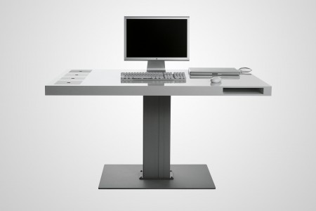
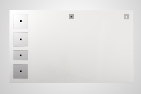
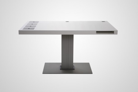
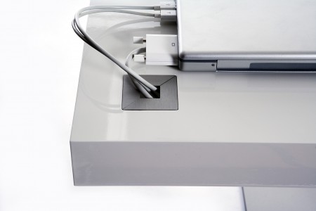
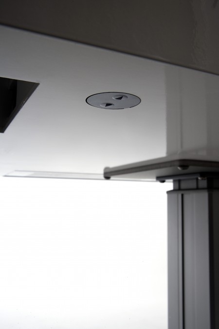
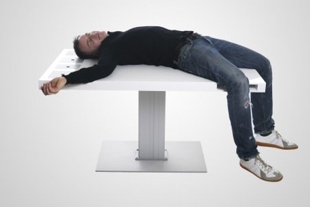
The Milk desk by Holmris Hansen (the guy laying on it I presume) makes the Novanta workstation I posted last week look downright homely. They call it “the Lamborghini of desks” but I think “the Mac of desks” would be more apt. At any rate the thing is beautiful and seemingly functional with various gadgetry, compartmentry, and height adjustability (I know 2/3 of those aren’t even words). I would definitely be very happy with this as my primary desk. You can find more info and a lot of high res pics of the Milk at the product site: http://milk.dk. Also, it’s probably like $15,000. The designer’s other work at Soren Rose Studio is worth a browse as well; some very cool pictures of their space.

I recently built a new desk (sneak preview here via a terrible iPhone shot) so I had been researching for a while trying to scrounge around for materials and hardware. I ended up sourcing most of it from Ikea and cannibalized an old board room table someone gave me. I’ll post more on that once I get some proper pictures.

Via Jason in the comments of the Novanta post

Chris Borchert x Canon 5D


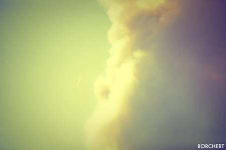
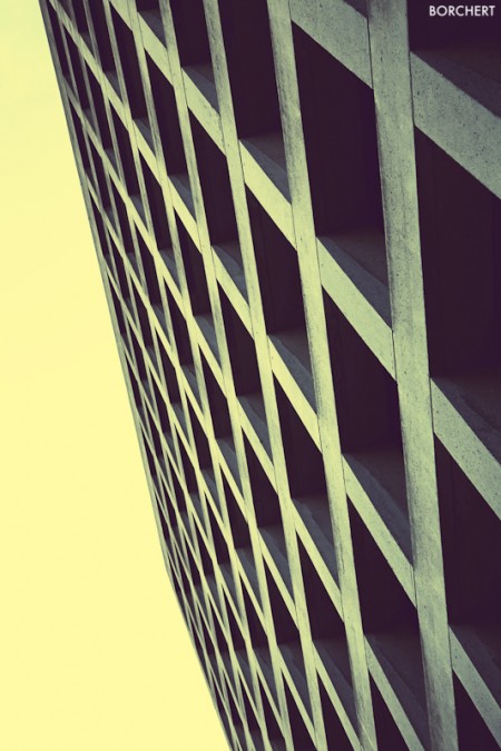
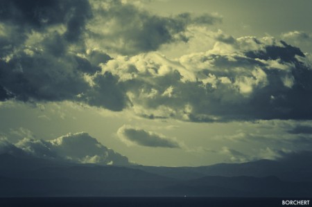
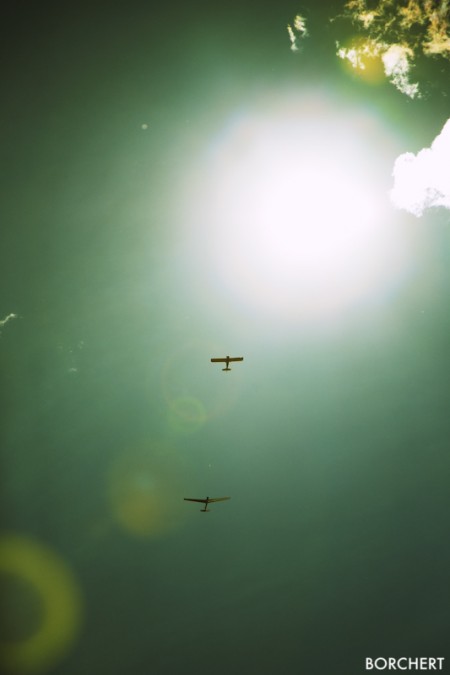
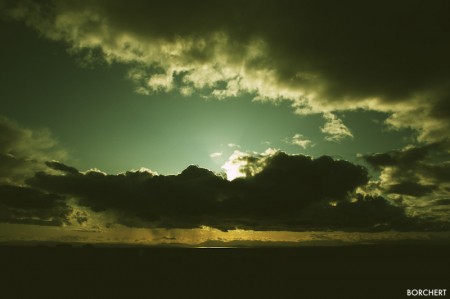
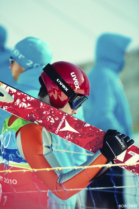
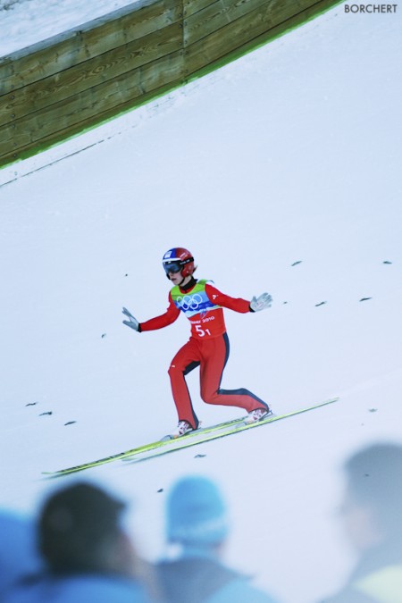
Chris Borchert is a lucky guy. According to the Exif on these files he shoots a Canon 5D and he was at the Winter Olympics in Vancouver. I’m assuming the camera is an MK1 version based on the Exif and this shot (he also has great taste in clothing) but I’m Nikon so I can’t be sure. Perhaps Chris can fill in the blanks (I found his work through a comment he made on this blog so I’m guessing he might read this). These shots really have a beautiful tone to them and that second ski jumper is just begging to be a poster. So yeah, I’m definitely falling for Canon; especially after Alex’s recent acquisition.

I’ve pretty much made up my mind that — barring any major developments on the Nikon side (which I suppose are relatively likely) — my next camera will be a 5D MK2/3. But I’ve put photography aside for a while to focus on some other things so this is a ways off. It’s nice to see stuff like this in the meantime to tide me over.

Check out his site for more photos

P.S. I’m curious, how many of you have taken the plunge with the 5D MKII? I feel like I’ve been seeing them a lot lately which is pretty interesting considering the price. I guess it’s a testament to the quality of the camera; people feel it’s worth it.

Novanta Workstation


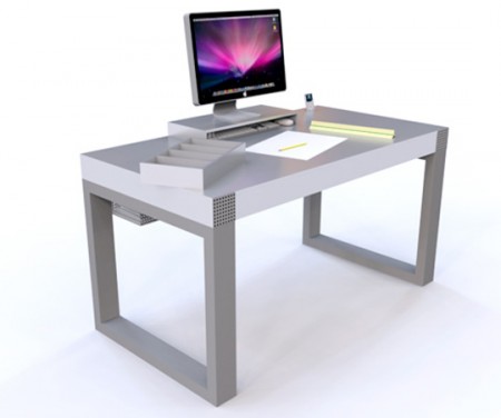
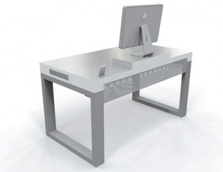
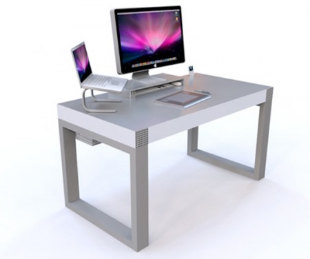
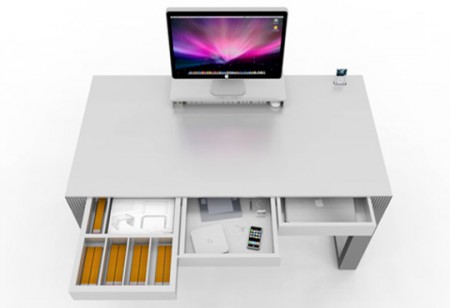
Came across this workstation concept over at Unplggd. The Novanta was designed by Luke Riggall and features — among many other things — Speakers, a USB and Audio Hub, Monitor Stand, and iPod Dock. It’s definitely eye catching and a logical extension of your Mac setup, but it seems a little bulky to be practical. The apparent lack of adjustability would be a big problem for me too. But the cable management system looks very useful and the whole thing has a very utilitarian vibe that I’m liking. I don’t think this could be my main work desk but it would make a great secondary for the print room or a smaller office space.

On that note I’ve been really geeking out on desks lately. My last desk was a little too wide for my needs and the surface was pretty thick. It was getting in the way of my outboard rack and I figured something a bit more svelte would open up the space a little. I’ll try to post some pics next week.