Posts by Scott

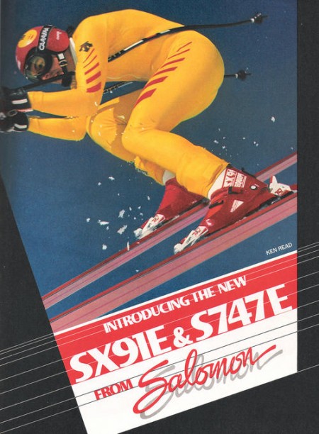
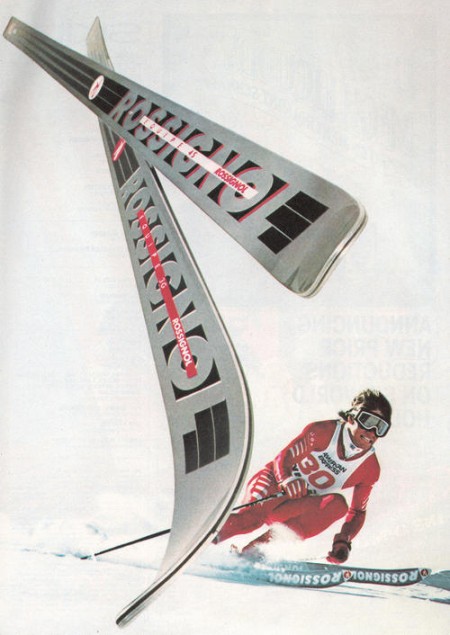
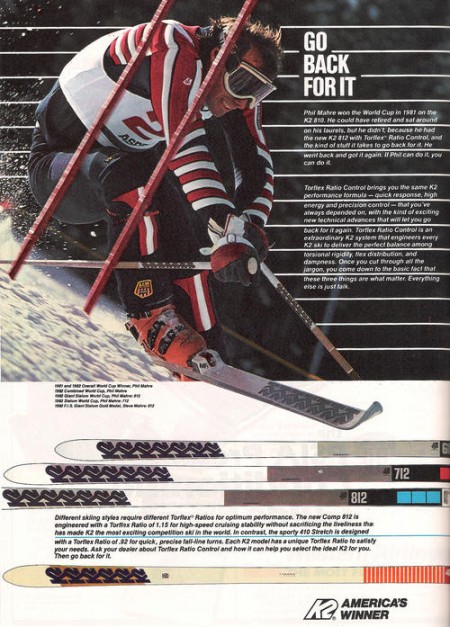
Vintage Ski Ads Pt.1: Racing

1000x500px-LL-ROSSONE
1000x600px-LL-Fisher 83
1000x500px-LL-Sal SX91E
1000x500px-LL-ROSSI 1984
1000x500px-LL-K2 Sept1982
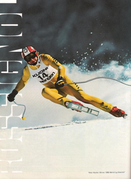
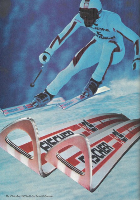
I got my first couple days of skiing for the season in last week right after some nice snow up at Heavenly. Skiing always reminds me of being really young and going up with my parents, Sacramento is only an hour from the Sierras so we’d get up a few times a year. I loved all the design associated with ski equipment and I found that when I first started out in design I was always trying to emulate that style in my work.

My latest trip got me thinking about vintage ski graphics so I set out to track down some good examples. Most of what I found were from magazine ads, this first set focuses on racing imagery. I’ll be posting some more in the days to come, hope you enjoy this first batch.

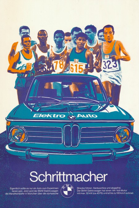
Vintage BMW Ads

bmw_schrittmacher_ad_72
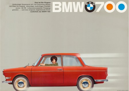
bmw_700_ls-luxus_ad4
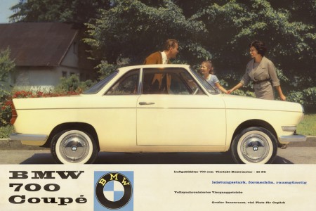
bmw_700_ls-luxus_ad2
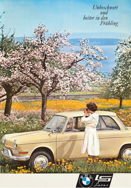
bmw_700_ls-luxus_ad1
In keeping with my recent car kick I thought I’d post these vintage BMW ads. The first one — created as part of BMW’s affiliation with the 1972 Munich Olympics — is vaguely reminiscent of Otl Aicher’s posters. I’m assuming this was no accident. It’s also a big enough file that you could probably get a pretty good print out of it off a nice inkjet (click image to view full size). I really wish more vintage posters like this were available in higher resolutions. With most of this advertising stuff, the owners of the copyrights have no intention of ever printing them again, it’s a shame they can’t be reproduced and enjoyed by more people.

Via CarType

1972 BMW Turbo & The Munich Olympics

iso50-bmw-turbo1
iso50-bmw-turbo8
iso50-bmw-turbo7
iso50-bmw-turbo5
iso50-bmw-turbo9
iso50-bmw-turbo6
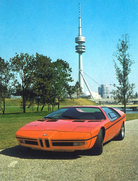
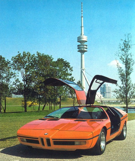
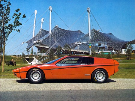
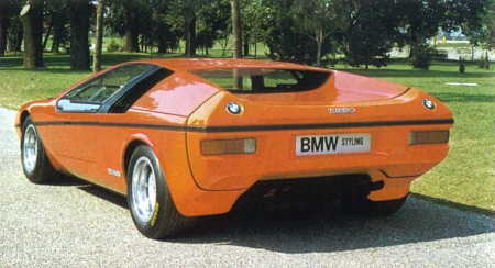
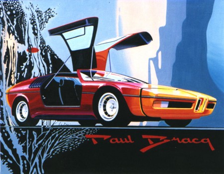
I’ve been geeking out on ’70s supercars lately and came across these gems depicting a BMW concept from 1972. The “E25 BMW Turbo” was commissioned to celebrate the 1972 Munich Olympics. BMW tasked famed automotive designer Paul Bracq to create the concept of which only two were ever built. Honestly, I love the front angles, but not really feeling that rear end. It feels very hatchback/kit-car-ish and the doulbe logos are killing me. Thankfully some of the finer points made it into production in the form of the M1 and some others.

That first shot is just off the charts; in the background you can see BMW’s Munich headquarters which was designed by architect Prof. Karl Schwanzer shortly before his death in 1975. In the other shots you can catch the games tent and the communications tower providing apt backdrops for the Turbo.

Christmas = Linn Sondek LP12

Sondek_LP12_Retro
LP12_SE_FINAL_e-brochure-4 copys
linnkeelmain
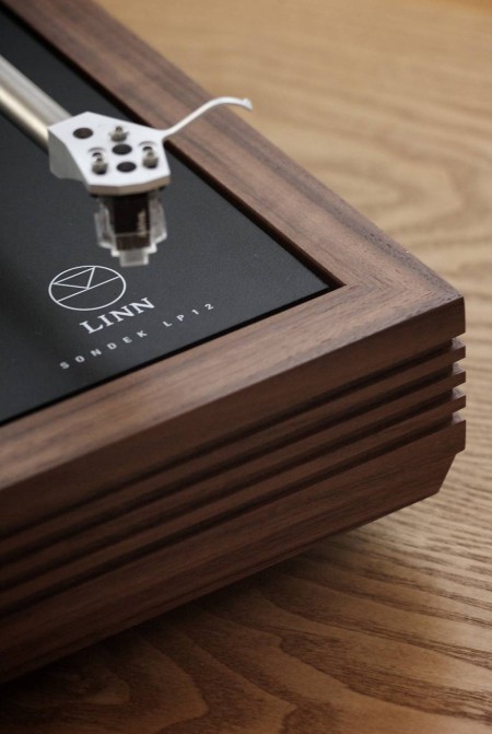
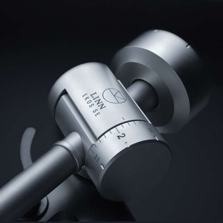
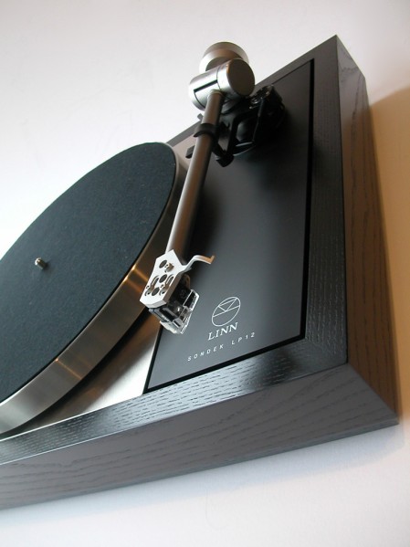
Every year around this time I like to pretend I have a rich uncle or something and then think about what they would get me for Christmas. This year rich uncle would get me a Linn Sondek Limited Edition Retro LP12 with the walnut finish. I’ve been thinking a lot about home stereos lately, I really want to build a solid system for listening. For a long time I’ve lived by a rule that I’d only spend money on things related to making music or graphic design. This means I have a great set of monitors in the studio, but in my living room I listen to music on a $200 set of Logitech speakers. For some reason I never really thought about how ridiculous this was, especially considering how much enjoyment I get out of listening to music.

So I was walking down Market street the other day and stumbled in to San Francisco Stereo & Theater Systems where they had a pair of B&W 683’s on the floor. I plugged in my iPhone (I know, MP3 is not worthy of a hi-fi system, but it’s all I had), cued up Beyond the Wizard’s Sleeve’s rendition of Midlake’s Roscoe and proceeded to melt into the seat. I’ve never heard sound like this. Yes, I have Adam’s in the studio, but that’s a near-field system designed for professional use. They’re meant to sound very flat and honest, they’re not necessarily supposed to sound pretty and warm and they’re certainly not designed to fill up a large room.

So this all got me thinking, I need to build a proper hi-fi. I have an old (but powerful) Denon hand-me-down amp in storage that I could dust off, just add some B&W’s and I’m set. But then I started thinking that I couldn’t bring myself to play MP3’s through a system like that so I would have to start rebuilding my music collection based on FLAC and WAV, which could take some time. Finally I realized this would still involve D/A conversion at some stage (which I was thinking could be handled by a spare MOTU 828MKII) so it still wouldn’t be ideal. This is when it finally occurred to me that I need to get a proper turntable and expand my vinyl collection.

Enter the Linn Sondek LP12, which apparently sounds incredible and — as you can see from the photos above — is absolutely gorgeous. Unfortunately it’s about $2500 so it’s never going to happen. There’s got to be some less expensive alternatives out there, guess I’ll have to dig around a little. At any rate, if my long-lost, wealthy second cousin is reading this, you can ship it all direct or I’ll take a personal check.
Movie Posters of the Decade

1_FunnyGames_500
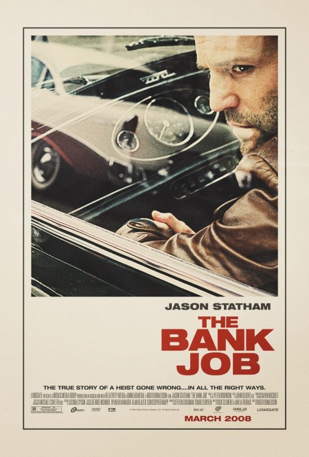
thebankjob
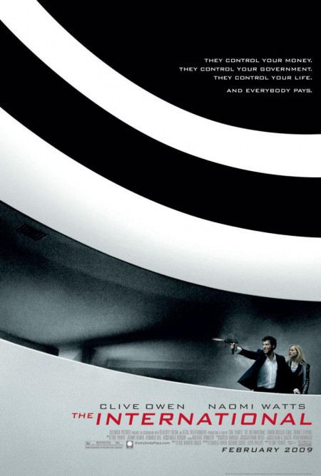
The_International_poster
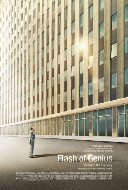
flash-of-genius-os-810
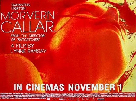
9_Morvern_callar_535
6_AnythingElse_500

The Auteurs has a post on their picks for the top movie posters of the decade. Considering that the vast majority of modern movie posters fall short of the standards set in heyday of film, this must have been a difficult list to assemble and a boring task to complete. Nevertheless, they have managed to dig up a few gems. Good to see The Bank Job in there — always a favorite — but I was pleasantly surprised by Funny Games, hadn’t seen that one.

Can you think of any obvious omissions from this list? Let us know in the comments

For some background, more good movie posters from years past can be found in these older posts: 50 Beautiful Movie Posters, 100 Greatest Movie Posters, and, of course, SOLARIS!.

Via The Auteurs

Alex Roman: Hyperreal CGI

11_germanpav1
11_forestrefuge3
11_2forestrefuge1
11_1forestrefuge2_v2
11_mam1
10_furn7-4
10_furn10
10_furn9


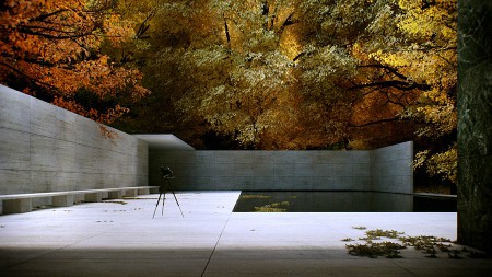
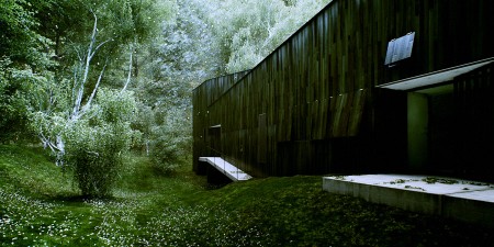
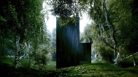
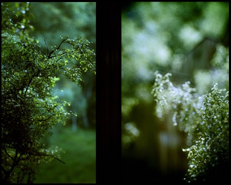
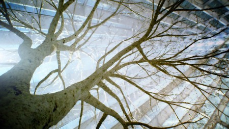
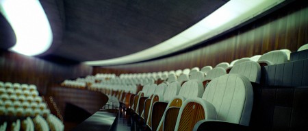
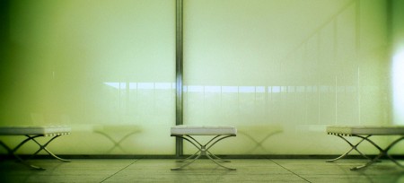
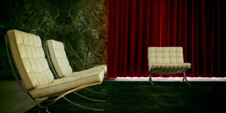
Everything you see in these stills and videos by Alex Roman is 100% computer generated. This is certainly the best CGI I’ve ever seen; I would normally say “virtually” indistinguishable from reality, but in this case the “virtually” doesn’t belong. The videos were created using 3dsmax, Vray, After Effects, and Premier. But what amazes me here isn’t just the execution, Roman crafts truly beautiful images with impeccable taste, something often missing from highly technical productions such as this. The man perfectly rendered a Mies van Der Rohe and an Eames, give him a medal! Maybe I can get some VR googles and map his work to the interior of my house and pretend to live in some modernist paradise.

I thought I had a bad workload trying to finish this new album, I can’t even imagine the man hours that went into just one minute of these videos. More videos at Roman’s Vimeo page and lot’s of stills and info at his portfolio site.

Via Seth Weisfeld

Lamborghini Countach Concept & LP400

Lamborghini_Countach_LP400_02
Lamborghini_Countach_LP400_01
Lamborghini_Countach_LP400_Prototype
Lamborghini_Countach_LP500
Lamborghini_Countach_Prototype
Supercars_Lamborghini_Countach
Lamborghini_LP500_Prototype
1976_Lamborghini_CountachLP4002
1973-Countach-LP-400
lamborghinicountachp2c
lamborghinicountachp2d
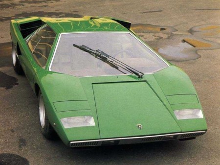
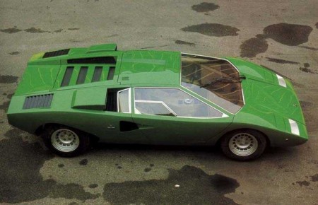
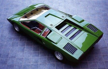
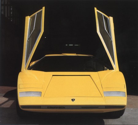
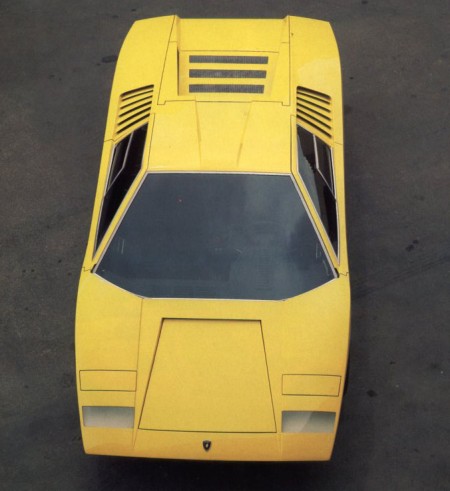
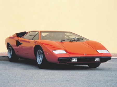
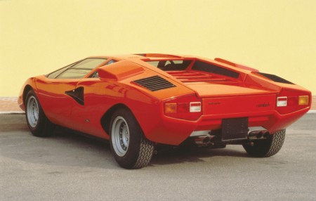
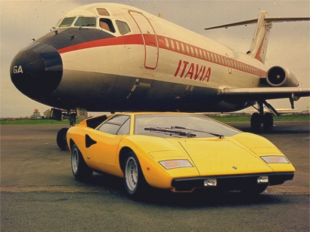
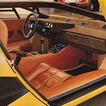
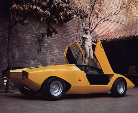
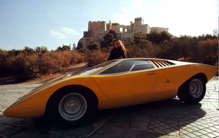
Beautiful shots of the original LP400 and concept models of the Lamborghini Countach before Crockett and Tubbs got back from Kragen with all the wings and spoilers. You may recognize some of the lines from the Bertone post, that’s because Bertone designer Marcello Gandini also designed the original Countach concept in 1971.

This is such a beautiful design, shame they had to go and muck it up with all the over the top junk. Although I guess if it didn’t have all that stuff we wouldn’t have such a perfect cliche ’80s car as a reference point in video games and movies.
Via Lotus Esprit Turbo

Grain Edit ISO50 Interview

iso50-studio-14
I did an interview for the excellent Grain Edit blog recently and they’ve posted it up today. We covered a lot of ground from coffee shops and design to music production. There’s also a couple bonus shots of the studio in there. Check it out at the link below.

Grain Edit ISO50 Interview

LPR NYC Wrap Up

4185691564_881df6dedb_b
4184932163_1ef53330c5_b
4184931827_5ca199f217_b
httpv://www.youtube.com/watch?v=54Hjn45Yh7E
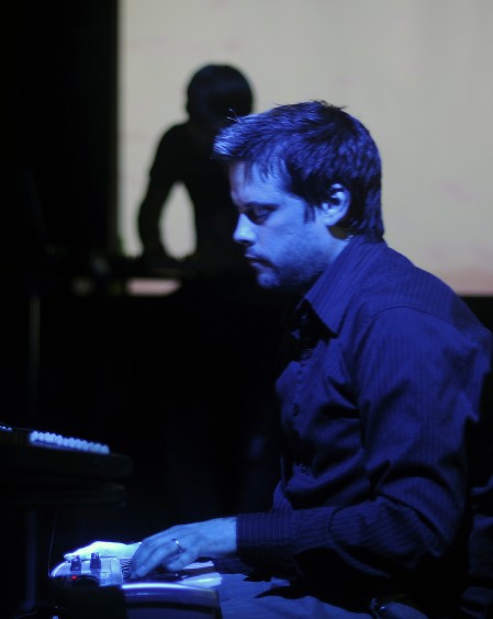
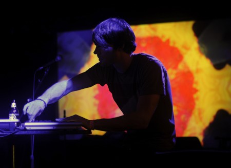
Thanks to everyone who made it out last night, I had an incredible time and the energy was great. I really appreciate you all sticking around until 2:30am on a sunday night, you’re probably hating me this morning though, wish I could buy you a coffee. It was great to be able to check out the other bands too, I’ve been meaning to see all of them live for a while now.

Shigeto turned in an amazing performance with his drums with some great backing visuals by Alex Headup, Adam Hunt, and Martin Thoburn. A Sunny Day in Glasgow came with some really dreamy stuff and they were a perfect counterpoint to the decidedly electronic vibe of the other acts on the bill. The highlight of the night for me was Casino Versus Japan’s set. He very rarely plays shows (I think the last one was like 6 years ago?) so it was a rare treat to say the least. I had the honor of doing visuals for him during his set which was really a great experience. I rarely get to just do visuals for other artists so it was nice to be able to focus on that side of things. As you might imagine, his set was super mellow and ambient. The energy ebbed and flowed perfectly and made for a very moving experience. Hopefully he starts playing more shows because I doubt you’ll see anything like that again any time soon.

All in all it was a great time, I hope to be back again soon. This was my last show for a while as I’ll be focusing on wrapping up the new album through the early part of the year but as soon as that’s ready I’ll be getting back out.

Photos by Kyle Moriwaki | Video of Casino Versus Japan by Raffi Asdourian

Albert Exergian: Minimalized TV

3359
3366
3356
3353
3344
3352
3343

Update: Thanks Wilamagamid for pointing me over to Blanka, where you can purchase these prints.

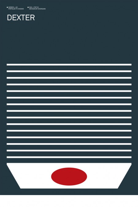
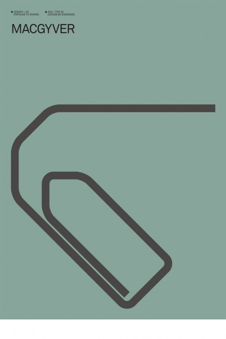
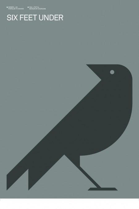
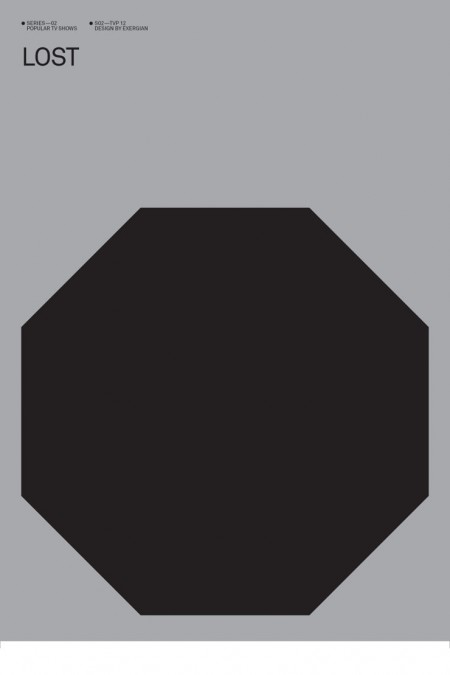
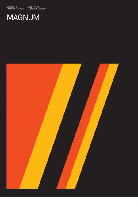
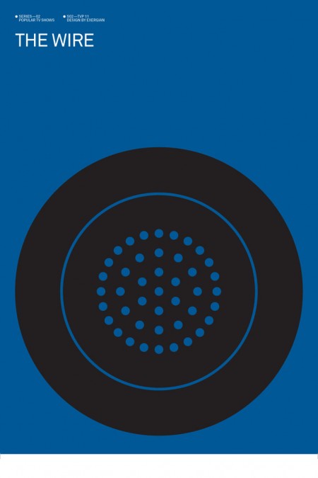
Albert Exergian created this series of posters depicting popular television shows boiled down into their most simplified forms. He describes them as “A HUMOROUS VIEW ON TV CULTURE” but they don’t strike me as being particularly humorous. Intriguing is a better word, Exergian’s sense of efficiency is uncanny. This would make a great set of screen prints, if only he were selling them. I guess he might have some legal issues though. Although, he’s only really putting words on a page; does writing “Dexter” (my favorite poster by the way) constitute copyright infringement? I hope not. Anyways, if anyone knows where to get prints of these, please let me know.

More posters at Albert Exergian’s portfolio (scroll down)

Update: Found better images over at Blanka, but the following gripe still stands! Major tangent here: Sorry for the white lines around the edges, I got these directly from Exergian’s site and that’s how they came. This brings up a HUGE gripe I have with Photoshop: If you don’t flatten a file before you resize it, the edges tend to show through to the transparent background so when you save as JPEG, it ends up with these annoying white lines. I have no idea why this is so, but it is. I guess it’s time for another “Dear Adobe” post.