Posts by Scott

TCHO Chocolate

tcho17_540x367
tcho14_540x360
ed04
tcho_1-1

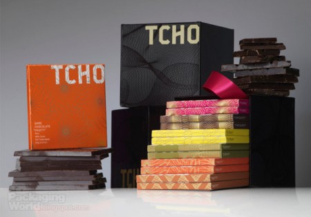
I’ve noticed these high end chocolate companies springing up left and right over the past few years. The paper-made thing seems to be the prevailing aesthetic of retail chocolate branding; employing one-color screened ink on kraft paper along with things like wax seals and cardboard hang-tags to give off that organic, handmade vibe I guess. It’s usually done to good effect but it’s nice to see a fresh take every once in a while.

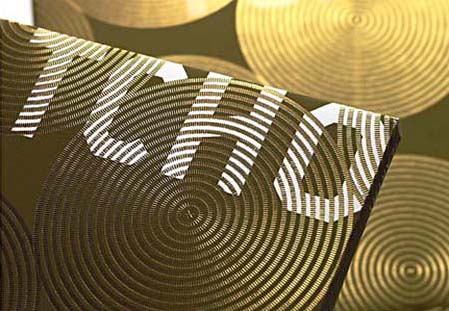
When I first saw San Francisco-based Tcho Chocolate I was struck by the name (no, I didn’t trade my studio for a chocolate factory down by the pier) and then by the design. I regrettably couldn’t find many decent pictures of the actual packaging, but suffice it to say you need to hold it in your hand to really appreciate the finer points. The letterpress and gold leaf inlay are a very nice touch that I don’t think is really captured properly in the above shots.

The video above goes over the concepts that informed the TCHO branding. I particularly like the central idea of chocolate as currency; design firm Edenspiekerman’s implementation of that concept is well executed. The result is a striking design which vaguely conjures the notion of European currency whithout making you forget you’re supposed to eat it. I don’t really enjoy chocolate on it’s own but they still had me wanting some just from the packaging.

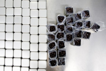
First two images from CNET’s tour of the Tcho factory at Pier 17.

» Tcho Chocolate – San Francisco, CA

Modern Publicicty

Modern Publicity 40 – 1970-71
Modern Publicity 40 – 1970-71-fd0000
2199237519_eae45ecc31_o
Modern Publicity 42 – 1972-73-fd0008
Modern Publicity 40 – 1970-71-fd0010
Modern Publicity 40 – 1970-71-fd0009
Modern Publicity 40 – 1970-71-fd0008
Modern Publicity 40 – 1970-71-fd0006
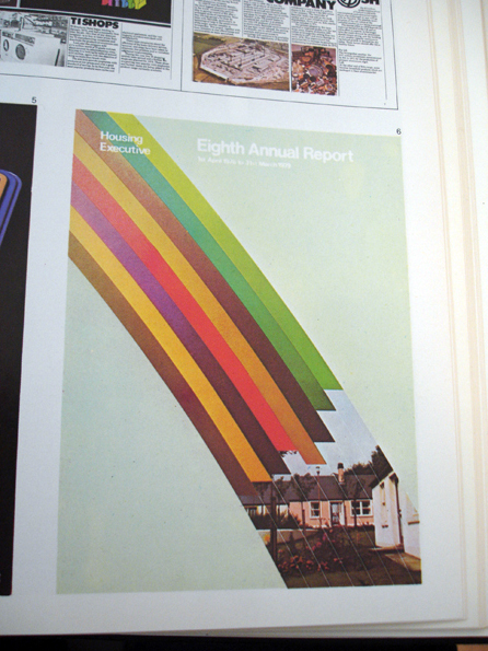
Insect54 has a great Flickr set of 70’s and 80’s Modern Publicity issues. Still waiting to find a stack of something like this in an old closet or at a garage sale, not holding my breath. Where do you find stuff like this anyways? I suppose at this point it’s down to going to shows and swap meets, I doubt there are many gems like this just floating around anymore.

Published Annually by Studio VIsta. Showcasing the best work submitted by designers from around the world.

Shown here are:
Number 40 –– 1970/71
Number 42 –– 1972/73
Number 50 –– 1981

Link

The World From Above

Alex sMaclean_3
ch2
vinc
uh
sky
oo
obl
lak2
la2
aur
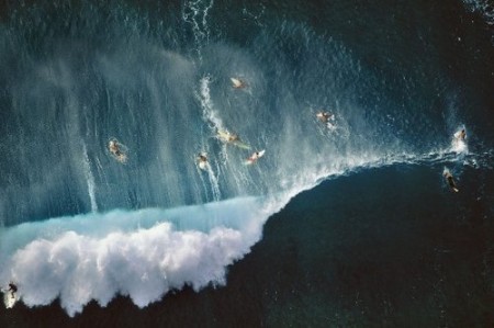
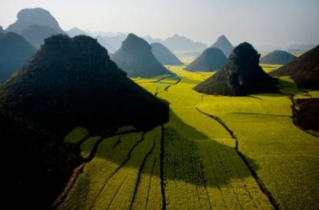
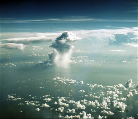
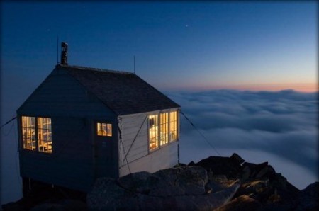
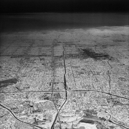
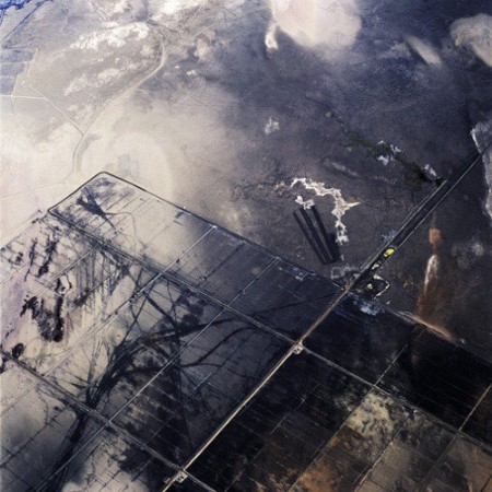
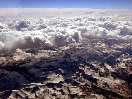
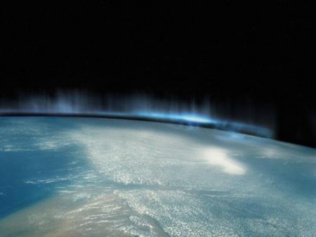
Happy 11/11! For us in The States it’s Veterans Day (Armistice Day for much of Europe), I’m not sure if anyone besides students and librarians get the day off, but it’s a good opportunity to reflect on the state of affairs in our world and to show our appreciation (regardless of political stance) for the men and women who walk the line for us every day of the year. Although not all that related, Smashing Magazine’s piece on aerial photography seemed like a fitting post. Seeing shots like this always seems to give some perspective on things.

Aerial photography has always fascinated me, unfortunately it’s prohibitively expensive. You pretty much have to be a pro to even get near these sorts of photo ops. I always have my D80 close at hand when I fly just in case something presents itself, but it seems like polarization or a random overhead light always ruins the moment. I think this is the closest I ever got to anything halfway decent.

Anybody here have any experience with aerial stuff? I’ve heard they rent ultralights out in Davis, CA. Seems like it would be worth it just to go up with a decent camera.

More photos and all credits for above images can be found here

Alex Cornell Desktop For Kitsune Noir

Desktop by Alex Cornell

Desktop by Alex Cornell


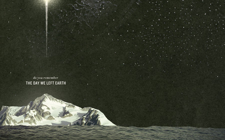
Our very own Alex Cornell created a wallpaper for the Kitsune Noir Desktop Wallpaper Project. Loving this one, they need to start printing these as posters! More info and downloads here »

Patrick Daughters for Grizzly Bear

veck1
veck3
veck4
httpvhd://www.youtube.com/watch?v=tjecYugTbIQ
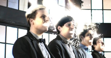
Grizzly Bear’s last album, Veckatimest, has been on constant rotation over here for a while now but I had somehow missed this Patrick Daughters directed video for “Two Weeks”. It’s been haunting me ever since, I can’t stop watching it. At first it’s seems a little strange, but it’s just so beautifully shot and somehow very fitting for the vibe of this song. I love effects like these (the big eyes, etc) where you can’t really tell what’s going on for a while, it’s so clean and subtle. Warp has a full HD version posted up on Youtube here that really highlights the attention to detail. I love seeing such simple compositions that are so moving. This is all essentially one shot and it’s got me glued to the screen. The rest of Daughters’ videography reads like a who’s who of indie music, with work for bands like The Shins, Feist, Snow Patrol, and Interpol among many others.

Link

Snansen: Norwegian Outlet

nor1
47_nor05
47_nor02

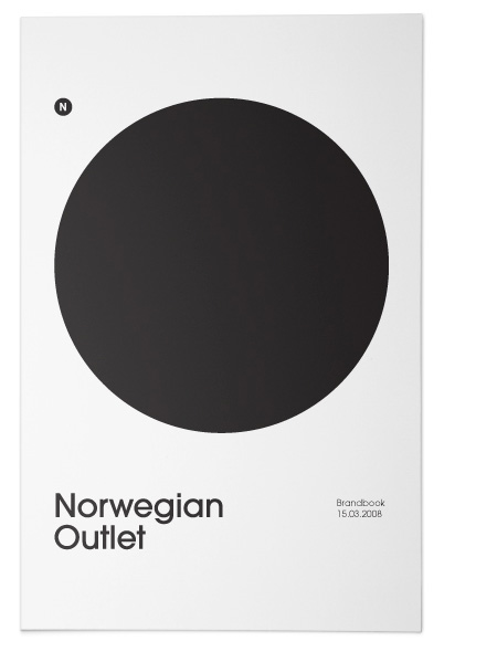
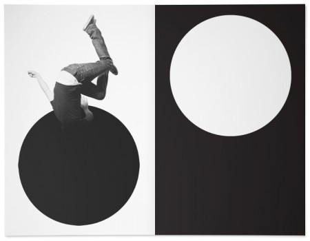
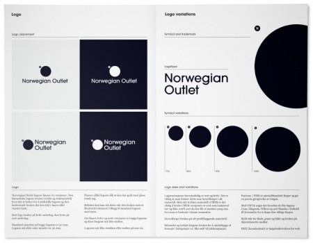
Excellent project by Norwegian firm Snansen for Norwegian Outlet.

Link

Tycho Live In Toronto / New Poster

ISO50-Nocturne-blog
I just wrapped up the poster for the upcoming Tycho show in Toronto (shown above) which can also be purchased at the ISO50 Studio shop. I’m doing a solo art exhibition at Function 13 Gallery and then a live Tycho performance afterward at Nocturne on Friday, November 20th, 2009. I’ll be posting the gallery show poster tomorrow with all the info, for now you can find all the details for the Tycho (music) show here and details for the Function 13 Gallery Show here.

This poster is sort of an alternate take on the gallery show poster (which will be released tomorrow), they are both based on the same subject but have very different aesthetics. This is the first time I’ve worked directly with a live model for a project — I shot her against a light bouncer with a flood light coming from the back to get the silhouette. Although rather time consuming, it was a pretty fun process and I learned a lot. You may notice that this piece in similar to the Coastal Brake cover in it’s use of negative space. I’ve employed this concept in various ways throughout my career (the Past is Prologue cover [2004-2005], for example) but have only recently found the time to truly explore it to the extent that I have with these recent pieces as compositions in this style are the most time intensive of all my work. When creating these, I treat the process more like painting than graphic design and so things can become much more complex. This particular piece is not quite as complex as some of the others, it’s a composite of about 20 image layers overlayed using various blending modes and masked by the silhouette image, the negative space was then filled with photographed paper which was colored using color balance. It will be on display at the Function 13 ISO50 Gallery show on the 20th.

Tycho Show Details
ISO50 Toronto Art Show After Party

TYCHO (Live Audio / Visual Performance)

With Guest DJ’s
Aarnio (Ghostly/Moodgadget, New York)
Noah Pred (Thoughtless Music, Toronto)

Nocturne
550 Queen Street West Toronto
ON MSV 285
$10 Advance / $15 Door
Doors: 9PM

Purchase Advance Tickets
Purchase Poster

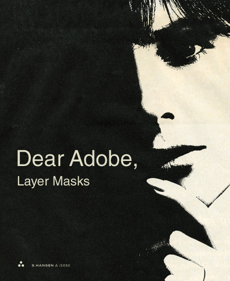
Dear Adobe: Layer Masks

ISO50-Dear_Adobe_Layer_Masks
Dear Adobe,

I’ve decided to start a new category on this blog called “Dear Adobe” for the purpose of writing open letters to you. I don’t really expect you to listen, I just want to put some ideas and open-ended questions out there for people to consider. This will never be meant to bash or criticize, just some friendly suggestions from someone who’s used your software for a while.

My first letter concerns one of my favorite features in Photoshop: the layer mask. I chose this feature mainly because it’s central to my process, but also because I feel it could be so much more powerful with only a little tweaking. So here goes, my suggestion for additional layer mask functionality in Photoshop CS5 (or 6, or 7, or just someday).

I propose a feature called “masking groups”. Why do layer masks have to be flat? Why can’t a layer mask be a composite of multiple layers in a group or even the result of a smart object which contains many layers? For instance, a masking group could contain many layers which are freely editable and independent of one another. The layer to be masked would see this group as a single, flattened mask and change it’s opacity according to the sum total of all layers in this masking group. At any time I would be able to go back into the masking group and move elements around, scale them, delete them, etc.

My workaround for this has been to nest the image to be masked within successive groups, each with their own mask attached. But due to the group depth limitation in Photoshop, this system only works for up to 5 layers. Also, it does not truly behave in the same way as the “masking group” I envision. With the current workaround, each successive group and mask can only be subtractive (black). If you try to put an additive layer mask (white) over the same space as a subtractive mask on a group nested anywhere below it, it will not reveal the underlying image. This is because the groups and their respective masks are not seen as a single, flattened image by the underlying layer to be masked. In the proposed masking groups, the sum total of all masks would be treated as one. The best analogy for this would be the Smart Object. While a smart object may have many layers within it, only the layers that are actually showing will be visible in the document in which they are placed.

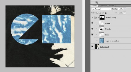
I’ve included a mock-up of how these masking groups might work. Masking groups are just like any other group except that they are linked as a mask to another layer or normal group, sort of like a layered version of the clipping group. In fact, this concept could be accomplished simply by allowing multiple layers to be used as the base for a clipping group. Notice in the example below how the Square, Triangle, and Circle are all separate layers in the masking group, but that their flattened state is reflected in the composite thumbnail image at the top of the group. This is the true layer mask that will effect the “layer to be masked” below it. This composite is constantly updated as layers are edited within the masking group. Also note how the white (additive) square sits above the black (subtractive) triangle, effectively masking part of the triangle and subsequently revealing part of the underlying “layer to be masked”. This is the key to the whole concept, and it’s something that is not possible using the workaround I described earlier. A masking group could be applied to a single layer, or to another regular group containing many layers to be masked at once.
iso50-masking_group-example

An example of how a masking group might work (click to enlarge)

I hope this all makes sense. I think a feature like this could unlock all sorts of new possibilities. If this is, in fact, already possible, please let me know how to accomplish it. When I worked for you I walked over to XD one day and asked a guy about this and he said it wasn’t possible, so for now, I’m going with that assumption.

Sincerely,
-Scott

P.S. The shower head upstairs has been leaking, could I get some help with that too?

If anyone else has any suggestions concerning masking functionality in Photoshop or just want to second the notion, sound off in the comments.

Photoshop Question / Problem

personpitch
Edit: James solved it, thanks a lot!

I am trying to accomplish something in Photoshop and am having a hard time getting it to work. I was hoping maybe someone could shed some light. Here’s some background on the problem:

I have 30 instances of a single smart object in a composition. They are scaled to various sizes and are placed in various positions. The smart object contains a raster image that is about 1500x1500px wide. I used that size to keep things small when creating the composition but now I want to scale everything up to poster size. The image inside of the smart object is not big enough for poster size so I need to replace its contents with a higher resolution version (around 3000x3000px). The problem is that when I replace the contents of the smart object with the higher resolution image, all of the placed instances of it in the original composition scale up accordingly.

So here’s my question: Is it possible to replace the contents of a smart object with a higher resolution version while maintaining the scale of it’s instances in the composition? Meaning if there is a smart object instance in the composition that measures 900px wide, it will stay 900px wide no matter what size image I replace it’s contents with.

Putting another smart object containing the higher resolution version inside of the original smart object did not work, it seems to rasterize the inner smart object at the smaller scale before placing the outer one in the composition. Doing a Layer > Smart Object > Replace Contents did not work either.

Any ideas would be greatly appreciated in the comments.
Helly Hansen Annual Report

1115121255290724
1115121255290970
1115121255291327
1115121255291206

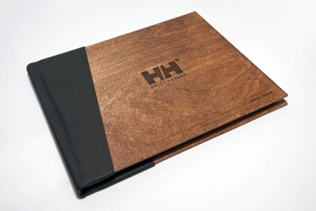
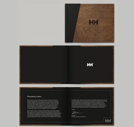
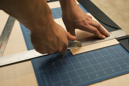
Awesome class project with process by Shelby White. I’m always a sucker for engraved wood. More pics and making of here.