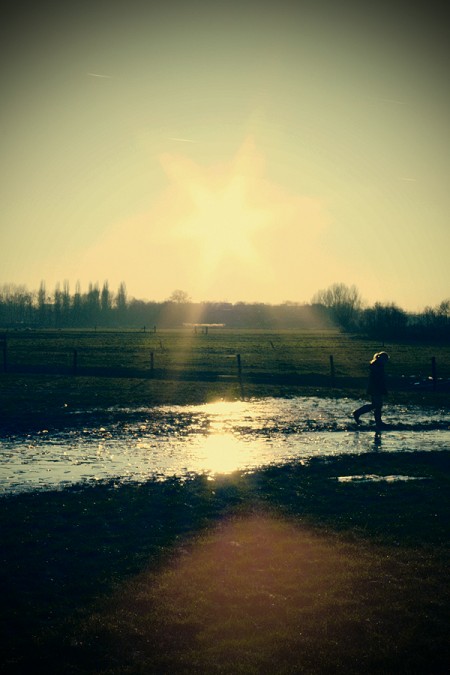
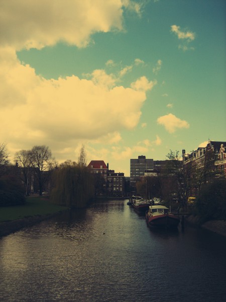

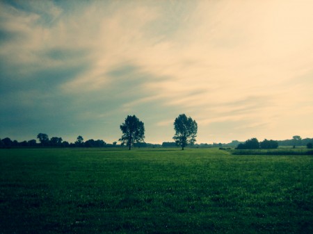
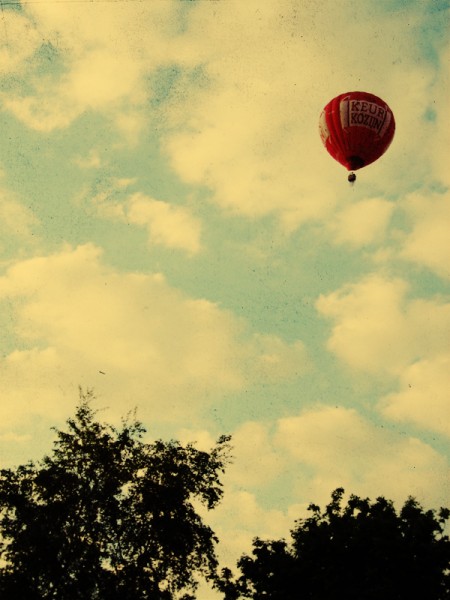
I came across Dutch photographer GoWithTheFlowEnzo’s work (not sure of his real name, only says “Robin” on the page) the other day and I’m really enjoying the color and style. According to the EXIF data he used a Canon EOS 450D for most of the shots. The crazy part is that he took a couple of them with a little Canon IXUS. See if you can spot which ones without looking at the EXIF.
Posts by Scott
GoWithTheFlowEnzo
Mig Reyes: Blog Wars Poster
Designing Armageddon
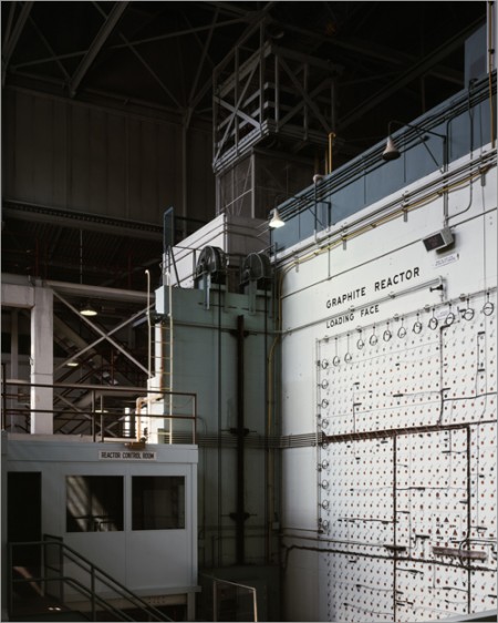
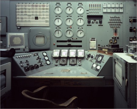
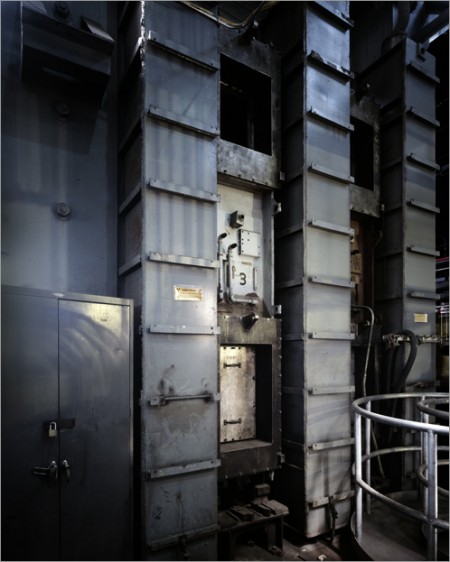
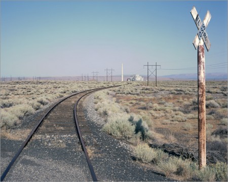
Most have heard of The Manhattan Project — the program lead by J. Robert Oppenheimer to develop the first nuclear weapon — but few have seen what’s left of it. Today I came across Martin Miller’s photo essay — Slouching towards Bethlehem — which gives an inside view of the surprisingly intact facility where the project was based. I was immediately stricken by the aesthetics of this massive nuclear laboratory.
I’ve always wondered how much time and thought is put into the purely aesthetic aspects of military/industrial design. Were the engineers who built this place trying to make it look good? Or am I just appreciating the fruits of design born solely from the pursuit of functionality. At any rate, the photos are excellent and whether intentional or not, the design ethic at work in these facilities is amazing. Link
Mike Cina: Spirit Edit Jazz Mix
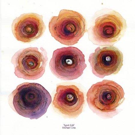
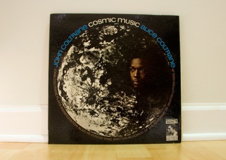
Grain Edit has posted up a very nice Jazz mix by Mike Cina along with a short interview on his thoughts about record collecting and music. It’s always nice to hear what other designers are listening to and being influenced by; it often brings more clarity to my understanding of their work.
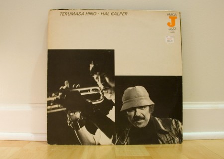
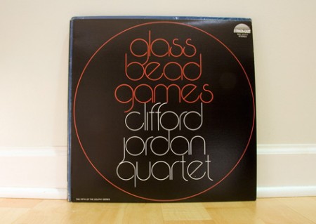
Mike also contributed the custom mix cover you see above and some shots of the album covers for the songs included in the mix (a few are shown below). You can check out the interview and download the mix here.
Studio Update: July 2009
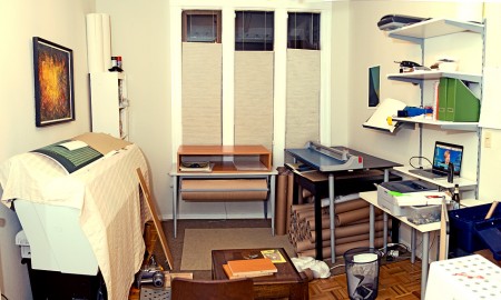
This past month has sort of flown by, I’ve had my head down working on some new posters (one of which you saw a preview of recently) and trying to sort things out around the house. If you’ve been following along you’ll know that I recently got the Epson 9900 large format printer and have since spent a lot of my spare time trying to make a home for it upstairs. I’ve also spent a fair amount of time (as has Alex) bringing together the various supporting elements needed to produce, cut, package, and ship the prints. You’d be surprised how much space all that stuff takes up, the result is that I lost my dining room and now eat at the coffee table in front of the TV. I’ve been kidding myself that I’d eventually move the whole printing operation downstairs into the main studio but today I finally put that delusion to rest and went to Ikea to get some shelves and make it official. Unfortunately I got started a little late so the mess you see above will have to wait until tomorrow. If you look carefully you can catch a couple unreleased prints that will be showing up here very soon.
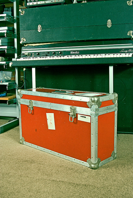
On the music front I’ve been trying to make some headway with the album, which has been slowed a bit by the printer project. As for shows, I’m heading up to Salem later this week for the Emerge-N-See Festival. I’ll be doing a live Tycho set out in the woods (along with Flying Lotus, Daedalus, Plastician and many others: info) where I hope to make good use of this fiberglass ATA flight case (below) I scored at a garage sale this weekend for $30! I was just walking to get coffee and my neighbor had this thing just sitting on the sidewalk; she also threw in a poster case for $10. On the way back I bought a kitchen scale that looks like a prop from a 70’s episode of Price Is Right for $1. The guy I bought it from tried to trade it for the case which he said would “fit his Moog perfect”. Unfortunately for him it will fit mine better.
H34dup: Droit
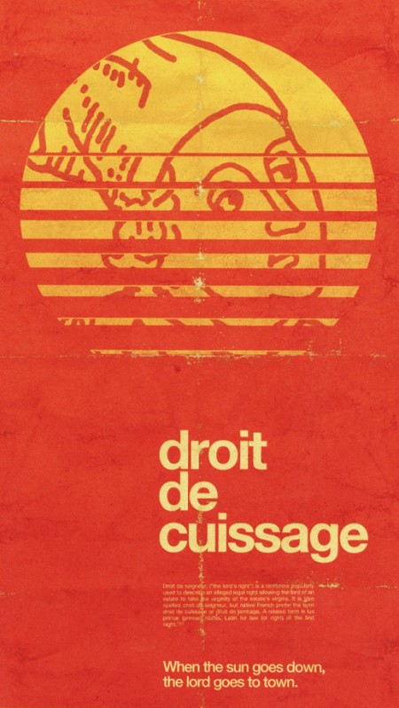
You may recognize Alex Koplin (not to be confused with the Alex who writes for this blog), aka H34dup, as a frequent commenter here. I was checking out his blog today and came across this wonderful image which I just mistook for a vintage piece that Alex had simply blogged about. But after reading on I realized that this was actually created by Alex for Typcut. I see people use textures and aging techniques all the time, but they’re usually pretty transparent and obvious. This, on the other hand, is spot on authentic. Loving the color, type, and composition. This would feel right at home on my kitchen wall or a wine store in the Rhône.
I’ve spent a good portion of my career working on distressing and aging techniques. It’s one of those things that you just shouldn’t even be doing unless you can totally nail it (and that’s not to say I’ve always gotten it right; I cringe at the sight of some of my older stuff). I see people try to use Photoshop brushes to achieve this sort of style but I think if you’re using brushes to distress, you need to turn back because that path leads nowhere. Who knows, maybe it’s possible to get decent results with brushes, I’ve just never never seen it done. That is to say, whenever I see work done with brushes, it always screams “hey, look at these brushes”. Anyways, Alex’s piece is a great example of how to do it right. Now here’s the part where Alex comments and says he did use brushes and I look like an idiot.
Datasette vs. Jason Cawood
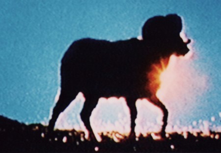
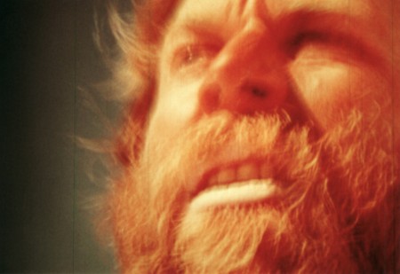
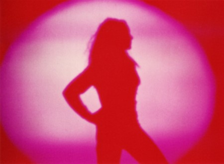
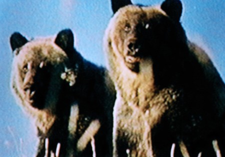

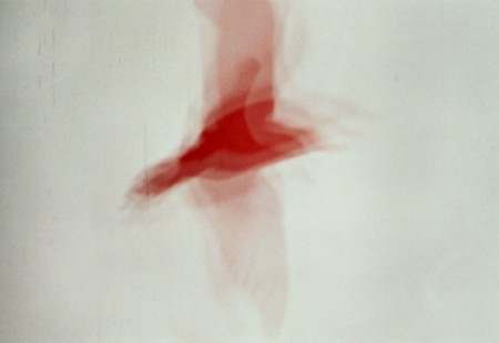
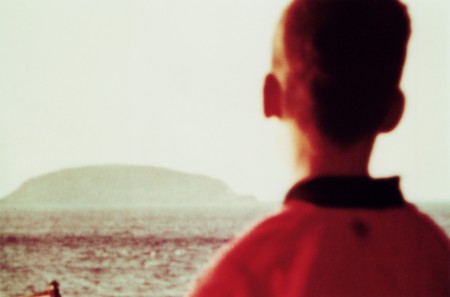
Dusty was over tonight and we were listening to some Datasette. That along with Jakub’s mention of Jason Cawood’s excellent “Salvaged” set on Flickr got me thinking I need to do a post on both. So it is; most of the songs were cut from Datasette mixtapes by Dusty so they don’t really have official names that I know of.
Ghostly International 10 Year Poster
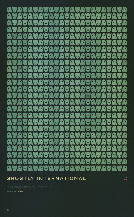
Update: If you’re looking to purchase the print it is now available here: studio.iso50.com
Ghostly International (the label I record for as Tycho) asked me to design a commemorative poster for their 10th anniversary concert series. This is the first print in a series I created for the events. The others will be released over the coming week with the flyer hopefully coming tomorrow. This print will be available soon as a limited edition large-format Giclee; pricing and availability will be announced next week. If you would like to reserve a print please contact studio [at] iso50 [dot] com.
The next poster will be the individual design for the upcoming Chicago 10 Year show where I’ll be playing a Tycho set along with Solvent, Kill Memory Crash, and Dark Party. More information is here.
This first poster lists all the Ghostly 10 year show cities:
San Francisco
Los Angeles
Detroit
Toronto
New York
Barcelona
Moscow
Berlin
Chicago
London
5D Fireworks
Canon 5D MKII capturing the NYC 4th show by Mike Kobal (24-70mm at 2.8 at ISO 2000). Once again, the MKII delivers amazing video quality. Still waiting for Nikon’s answer before I take the plunge though. There are some more 5D MKII video examples over at Kobal’s Blog.
By the way, did anybody else happen to catch the San Francisco fireworks “show”? This puts it to shame and then some. I’ve seen better displays at Dolores Park (before they started parking that mobile command station RV out there and ruining it for everyone).
Paper Embosser
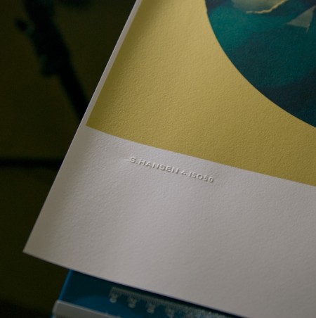
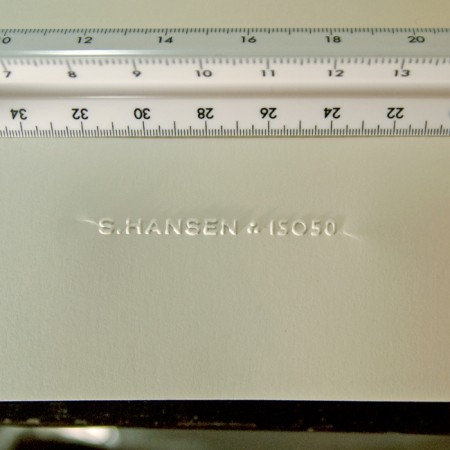
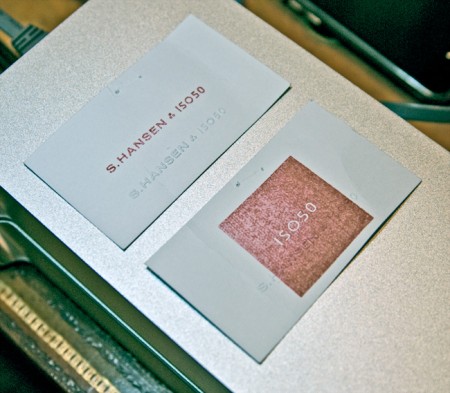
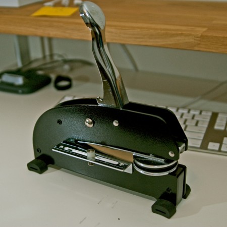
I’ve always loved official stamps and seals; as a kid I used my dad’s Civil Engineer’s certification stamp to make official looking paperwork and IDs for fun. I was looking for a way to add something like that to the upcoming Giclee line I’ve been working on but I rulled out rubber stamps as I wanted something a bit more subtle. So I recently started looking in to getting a paper embosser made with my signature logo. I was pretty surprised by how easy it was and how great the results are. The pictures don’t really do it justice, but you get the idea. The stamp can be embossed or debossed and it really adds a nice crafted touch to a project. It’s so fun I’ve started just embossing everything around the house; just cool to see the thing work.
The main cost is the press which runs about $200 (seems steep for what looks like a glorified stapler). The dies themselves — the circular part that hold the custom design — are included in this initial cost and are interchangeable. The only issue I’ve run into is with creasing at the edges. Depending on how you stamp it there will be moderate (first photo) to severe (second photo) creasing toward the edges. I am working with the vendor to fix this and depending on the technique I am able to minimize the effect. This may just be an artifact of this particular stamp as most are circular seal designs that fill the entire die, but I’m waiting until I can get it to be almost invisible. To be fair though, the flash is really exaggerating the effect in both shots, the creases really aren’t that noticeable in normal light.
Another fun — and far cheaper — alternative is rubber stamps (see third pic). I had a couple made by the same people and it’s been fun blasting those all over everything. But I was thinking the embosser in particular would be a really good buy for design students wanting to add a little extra something to their projects and also to mark their text books. It really has that old school real-world graphic design feel.
The unit pictured above is a heavy duty desk press from Made to Order Stamp and Seal out of New Mexico. We tried some local vendors initially, but the customer service of Made to Order was much better. They really work with you to determine the best option for your needs, and can turn around a custom job within a week. Highly recommended.
