Posts by Scott

1000th Post: Thank You + Giveaway

iso50-10001
Update: Congrats to the big winners: Luci (Lucizzle), Rob (norby), and Bill (serrano). You’ve all been contacted, let me know via the contact page if you don’t get the email.

Last night I hit the publish button on the Buamai post then glanced at the overall post count and noticed it read 999. So that would make this the 1000th post on the ISO50 Blog. Pretty amazing, I never would have guessed the number was that high. I am really good at missing milestones (birthdays, weddings, holidays, anniversaries, etc..) and somehow I missed it when the blog turned 1 year old. So I’m glad I caught this one, seems like a nice round number to celebrate.

I want to sincerely thank everyone who has visited, commented, and supported over the past few years. It’s been an incredible learning experience for me and I’ve really enjoyed hearing all of your thoughts on the various subjects we post on. I originally started the blog simply because I wanted an easier way to update the small news section that was on the old ISO50.com, but since then it’s grown far beyond that initial scope. I can’t say for sure what the next 1,000 will bring, but there are a lot more upgrades and features coming, along with all the usual posts and music, so stick around!

So now on to the festivities: Drop a line in the comments, then sign up for the RSS Feed or the Newsletter and you’ll be entered to win 3 shirts, 3 posters, and a CD of your choice from the ISO50 Shop (be sure to include an email so we can track you down if you win). If you’re already a subscriber, then just add a comment and you’re set. Two runners-up will get 1 shirt, 1 poster, and a CD. The winners will be chosen from the comments at random in a week (May 20th).

So again, thank you all for your support, it’s always appreciated. I also want to thank Jakub, Alex, Beamer, and Sam for all their great posts, you guys are always on point! And as always, I value your opinions so please feel free to take this as an opportunity to make any suggestions or maybe just list your all-time favorite post(s).

Update: Thanks everyone for the kind words! I’ve been on the road so been hard to get the drawing done, thanks for your patience. I will pick a winner today hopefully and get in touch.

Buamai

buamai
Social image bookmarking sites are a dime a dozen these days (think ffffound, Dropular, and their ilk) but Buamai takes the concept to a new level. The brainchild of Michael Paul Young (co-creator of Youworkforthem), Buamai has thus far kept their contributor list closed — something I think is a must if you’re going to keep quality up. It seems that free-for-all sites’ content suffers incrementally as their user count rises. Buamai also has some novel sorting features along with the “Destoy” and “Mutate” options that make for some interesting modes of discovery. Here’s to hoping for an invitation. Buamai

Dan McPharlin

2254545468_7bc6d6e94e_o
2680773423_b4a532640f_o
2471940929_be42e8c524_o
3473955449_f5389e4f58_o
2987819196_55dec0f030_o
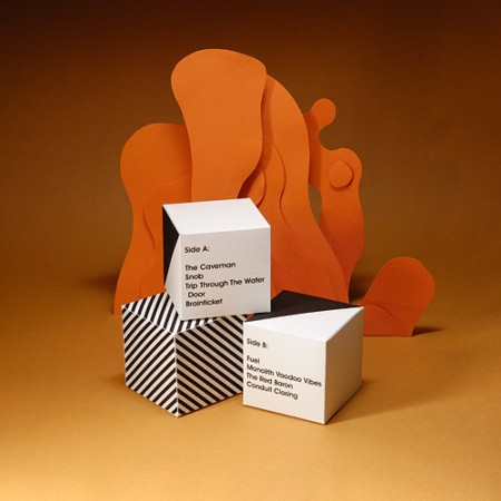
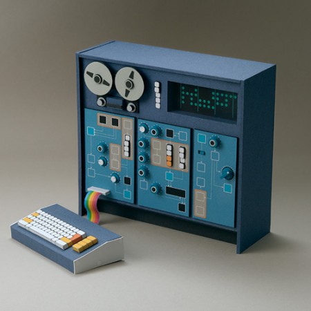
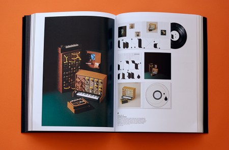
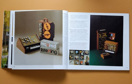
I’ve been following Dan McPharlin’s work for a few years now, ever since his miniature synthesizer models started showing up on Matrixsynth. I fell in love with his perfectly crafted, perfectly photographed (seriously, the photography is almost cooler than the work itself) paper music machines. But after being introduced to his graphic/illustration work he quickly became one of my favorite artists. His illustrations are very reminiscent of another favorite of mine, Roger Dean, and are evocative of that prog-rock driven 70’s sci-fi art scene that, when done right, is just downright incredible.

So it’s been great to see Dan’s work start popping up all over the place, like here, here (Prefuse 73 cover), and here (Jakub, you really should have know better!). Beyond the visual beauty of his work, it’s just great to see someone being creative with such a novel medium. He brings the mind and eye of a designer to a world previously reserved for 60-somethings hiding out in their basements building model railroads. To see him wrap all this up and successfully translate that future-past-that-never-was aesthetic into commercial projects is a good thing indeed.

You can check out more of Dan’s work at his flickr.

On a side note, he’s posted some shots of his home/work-space here. Are you kidding? Amazing. My house looks like it was built of scraps from a 19th-century Troller Boat that ran aground in front of a hippie commune. Seriously, parts of a boat were used in the construction of this house, I am sure of it. Anyways, I am disorganized at best, slovenly at worst and I don’t think I have the skill set to keep such a meticulously minimalist situation like that up for any length of time. If I win the lottery I will get one of those modernist prefabs and put it in front of this house. I’ll then carefully place completely unusable angular furniture and German-designed objects all around it. Finally I will place a single synthesizer with wooden endbells and an analog sequencer on a white table with a molded plywood chair in front of it. When people come over I will tell them that’s where I get all my work done and then I will sit them down at a walnut coffee table with various important looking design books stacked neatly on top of it and expound on typography theory and then chastise them for not understanding the difference between kerning and leading. After they leave I will go back to my real house and eat a sandwich in my basement and watch Adult Swim and then not clean up the plate for a week or so.

ISO50 Newsletter – May 2009

nl05092
The May edition of the ISO50/Tycho newsletter is out! You can view it here. If you’d like to receive them automatically, you can sign up here.

Also a quick correction. If you received the email version of the newsletter, some of the dates for the upcoming Tycho shows were wrong, here are the correct dates:

5/16/09 – Tampa – Back in Black Exhibition
5/23/09 – Detroit – Ghostly 10 Year Show
5/26/09 – Toronto – Ghostly 10 Year Show

Layer Tennis Today: ISO50 vs. BDIF

layertennnnnn
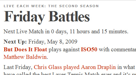
Just a quick heads-up that I’ll be battling it out with Folkert & Atley from But Does It Float today at 12pm PST. I think our styles will make for an interesting match, and looking forward to keeping my undefeated (2-0) Layer Tennis record intact. Don’t miss it!

Layer Tennis

Pin-Up Girls In Stereo

0409-layla
minnie
marth-center
samsung
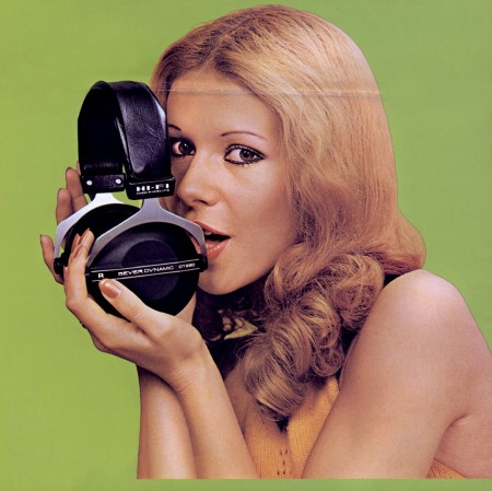
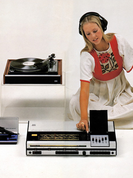
These pin-ups are from the amazing Vintage Knob collection. There’s plenty more of these to see over there along with the more basic fare: close-ups of audio/visual equipment sans hot girls. That Marconi one up there is the best thing I’ve seen in a while; wall size print coming up as soon as they deliver the 9900. Seeing stuff like this always gives me mixed feelings. It just reminds me of the wealth of beautiful images out there that are just lost to time. Can you imagine being able to get the original negatives to these shots and do serious enlargements? It’s nice that sites like The Vintage Knob are making these available in some form, but 72dpi Jpegs just don’t cut it for print output.

The Golden Ratio: Myth or Magic?

3355540655_35c7067bb5_b
If you’re a designer you’re no doubt familiar with the concept of The Golden Ratio. People often invoke the idea to explain why something is inherently well laid out or pleasing to the eye. I have heard people say they see it in some of my work, but I’ve never knowingly tried to pursue it. And that’s apparently the whole point; even if we don’t consciously know it, they say we are constantly seeking it out. When the Golden Ratio presents itself to us we subconsciously recognize it because it supposedly mirrors the proportions of our own human form.

Load of crap? I thought Yoga was a load of crap but now my knee is better. But for the record, I still don’t believe in wizards and/or gemstones, except in medieval times when both apparently worked great. Whatever the case may be, this guy sure seems to think everyone’s favorite ratio isn’t all that golden. Keith Devlin wrote an article for The Mathematical Association of America entitled The Myth That Won’t Go Away and in he he posits that the entire concept of the Golden Ratio as it pertains to aesthetic appeal in humans is a falsehood perpetuated by centuries of myth. He does concede, however, that “the appearance of the golden ratio in nature…is real, substantiated, and of considerable scientific interest”.

I came across the article in @AisleOne’s Twitter who, as it happens, is a proponent of the application of the Golden Ratio in web design and typography. For the record I don’t really have an opinion either way, just haven’t studied it enough. But I thought it was interesting to hear a dissenting viewpoint on the subject given that everyone else I’ve ever talked to about it only sang it’s praises. Makes for an interesting debate I’m sure, anybody have any opinions they’d like to share?

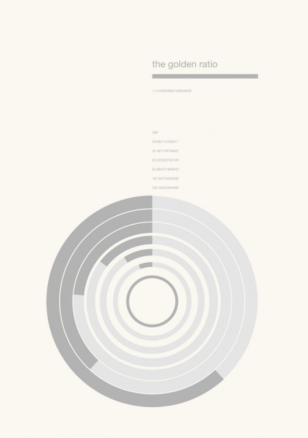
By the way, when I was searching for an image for the article I came across the poster you see above via Myleftisyourright. You can also find some other cool stuff in the same gallery.

Micro Compact Home

2194_1_micro1big
micro-compact-home-by-horden-cherry-lee-architects-and-haack-hopfner-architects
microcompact
ts_2
faq_1
ltd_2
ISO50 is back online after the server apparently took a much needed 24 hour nap, hope you didn’t miss us too much…

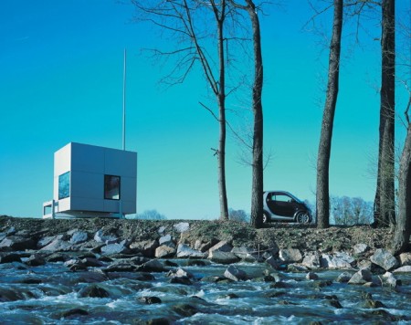
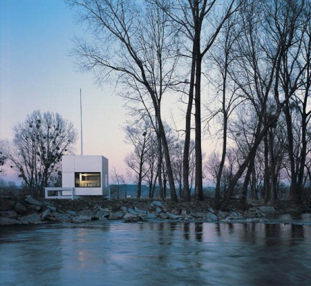
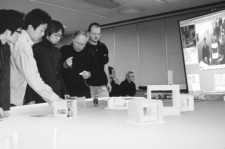
Anyways, before the outage I had planned on posting this amazing prefab home from architects Horden Cherry Lee. The “Micro Compact Home” is a joint Japanese/German project and it shows. You really can’t go wrong with that combination and you also can’t go wrong when your new home is delivered into the mountains by some Swiss helicopter. Awesome. Loving that antenna too, or is it a flag pole? Either way it makes the whole thing about 100 times better.

Vuela Shirt Now Available

iso50-vuela-side
Spring is finally creeping into town (although very slowly here in San Francisco) and I’ve been way into the AA tri-blend tees this year. So I printed up a modified version of the Vuela Print on Heather Grey tees for your sunny weather enjoyment. As always, you can get yours over at the ISO50 Shop. I’m also clearing out a lot of the older designs to get ready for summer so you’ll find lots of shirts marked down 20-30%. All marked down shirts are the final pressing of that particular design/colorway.

On a related note I’ve been spending a lot more time trying to learn the ins and outs of product photography. I’ve been shooting the products for years but I’ve never spent enough time worrying about the color accuracy of the output. After all this time working with cameras you’d think it would come easy, but I was surprised to find how difficult it was to get good shots when the goal is creating a color accurate representation of an inanimate object. With my creative photography I’m always trying my best to make things appear inaccurate and I guess old habits die hard. For the shots above I used a tungsten photo bulb/can light along with a Quad CF lamp from Calumet. I had been using 3 lights but it turned out that hitting the subject from the right side and front with lights and letting some natural light in from the left (there was a window there) made for better dynamics so I’ve been sticking with the 2 light setup.

The last couple product shoots were the first times I’ve used a Gretag card to calibrate the camera color temperature under the lights. That and shooting in NEF RAW really went a long way to getting a solid foundation, but there was still a lot of work done in post. Having the calibrated monitor definitely helped at that point, but the real key I found was changing my own perception of the image and training myself to see it in a different way than I’m used to. I always catch myself slipping and trying to make the shots look interesting or enhanced and then have to step back and realize that this needs to be a literal representation of the real object. At any rate, I’ve got a ways to go (can’t even imagine how they get all those high end fashion shots) but it’s been surprisingly interesting learning the subtitles and nuance of a new kind of photography. It certainly is it’s own art form. I’m sure a lot of you have some product photography chops, feel free to share any of your tricks of the trade in the comments.

Also, I know I’ve been promising it for a long time, and I assure you, a very detailed post about color calibration is on the way. The project has sort of taken on a life of it’s own and I’ve brought Alex on board to help with research and production. We’re going to be shooting an interview with a color expert in the next couple weeks and we should wrap the post soon after that so stay tuned!

Brionvega Doney

brionvega_doney_arancio_sole_aerial_450x401_web
brionvega_algol_bianco_back_450x401_web
brionvega_doney_bianco_profile_450x401_web
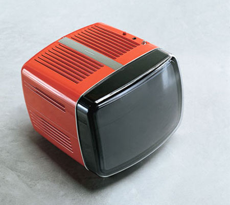
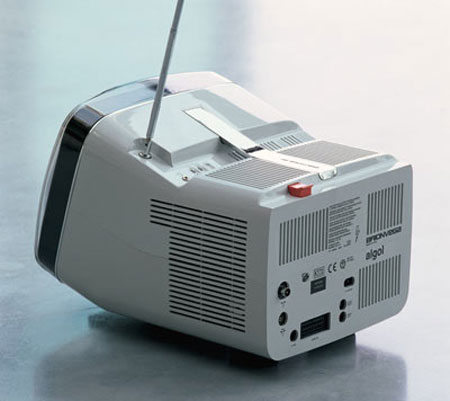
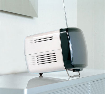
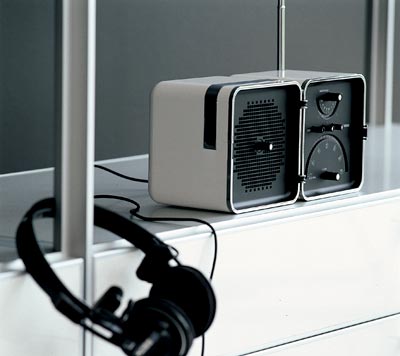
I posted on the Brionvega TS522 portable radio a while back. Now here’s the perfect companion, the Brionvega Doney TV. It is, of course, way expensive (edit: apparently not, around $300 actually, thanks sean) and way hard to get a hold of. And if you’re looking for something even more future-retro, there’s also this concept (if that’s the remote laying there, I’m sold.

Here’s another shot of the TS522 for good measure…So Rams-esque:

00016_8_gallery_big