Posts by Scott

Why Film Can Never Die

2288181293_916c68a058_b1
2288185435_1c03ce41db_b1
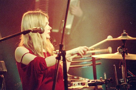
I love digital technology. I love the convenience, the economy, the permanence, and the instantness (yes, that’s actually a word….who knew). So I’m constantly trying to trick myself into believing that I don’t need film photography because digital can replace it. Then I see pictures like the ones above and remember that it’s never going to happen. There’s something going on here that I’ve yet to see captured in a digital image. Sure, I’ve seen incredibly beautiful digital photographs, and they stand on their own. But that’s all they do. They don’t stand over film and they don’t replace it. Film can never die or we will lose our ability to capture the beauty that hides behind the subtlety and nuance that digital seems to miss. There’s a tone, a separation and depth here that I think can only be produced by an analog chemical reaction. The grain is so beautiful it just begs to be blown up to wall-size.

The pictures are of the band Panic Ensemble and were taken with a Canon AE-1 Program by dirkhaim. AE1-P’s can be had for next to nothing (with glass!) on eBay.

ISO50 On Twitter

ISO50 On Twitter
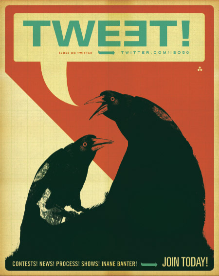
So considering all the infinite hype surrounding it, I’ve finally been experimenting with Twitter over the past couple weeks and I have to say, it’s been surprisingly fun. I hooked the blog up so that all the posts are linked up on my Twitter page (using Twitter Tools) and it’s been an interesting way to communicate via a more direct route than is possible with the blog alone. I’ll be posting up giveaways, extras that didn’t make the blog, process stuff (pictures of the daily work), and random other tidbits here and there. It will also be the front lines so you’ll be the first to hear about anything useful or interesting before it hits the blog.

So there you have it, ISO50 on Twitter, join up! @ISO50

Black Panther Ambulance

bp-ambulance
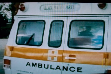
Everyone knows the Black Panthers had awesome graphic design skills but who knew they could also paint emergency vehicles with the best of them? National Geographic aired a documentary about the Panthers tonight and in it they showed this brief shot of the most amazing ambulance ever, part of the original Panther’s “People’s Free Ambulance Service“. In reality, this was probably just a standard issue ambulance from the period, it simply had the Panther’s placard in the window. Still awesome. The cross enclosed in the square is classic and orange/black/white color schemes never go out of style.

Can anyone name the font? I’m guessing something like Akzidenz extended? Sound off in the comments if you’ve got it.

Sony DPS-R7 Reverb DOA

iso50-dspr7
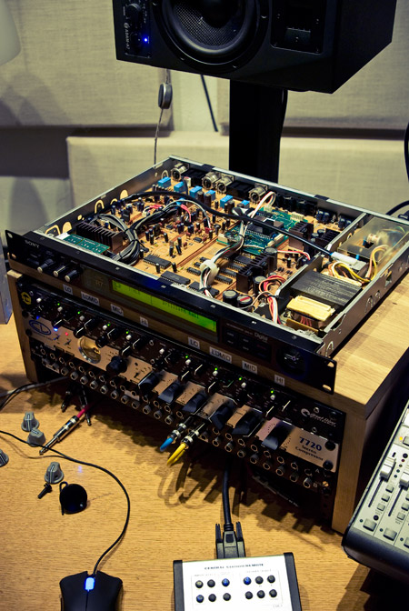
My Sony R7 Reverb from eBay came today, dead. I replaced a dead battery tonight but that didn’t clear anything up, still just passing a dry signal and a dead rotary encoder knob. Not sure what the issue is, if anyone knows a good Sony tech let me know, I have the schematics. Also need a good Lexicon tech too.

Advertising 101 With Tim & Eric

httpv://www.youtube.com/watch?v=5p0QtJMKt1s

Tim Heidecker & Eric Wareheim are comic geniuses and their show on Adult Swim is the best thing on Television or the Innernette. It’s basically a free-form public-access-VHS style collection of sketches with what seems to be a loose focus on late-eighties to mid-nineties culture. Beyond the immediate, viscerally comic aspects of their work there’s a deeper commentary going on and for me, that’s what makes the show so enjoyable time and time again.

Unfortunately, no one I know besides Jakub, Dusty, and Sam agree with me and over the past few years I’ve come to realize that Tim & Eric are rather polarizing figures; you either love them or you hate them. I’ve refrained from posting on them in the past just because it’s a little off topic for this blog and I doubt most of you come here looking for hilarious shows to watch. But today I came across Daniel Murphy’s Esquire article about the series of ads Tim & Eric and Zach Galifianakis created for Absolut Vodka and I thought it was an interesting look at how they approached the project from an advertising perspective. The three spots — which I consider to be some of Tim & Eric’s best work — came out last year as part of the Absolut World campaign. The vodka maker basically gave them an open ended commission; they could make whatever they wanted as long as they mentioned the product. I’ve never worked directly in advertising, but I’d have to imagine this would be a dream gig for anyone in the industry.

“It’s the incense, it’s the ferns.”

A Vodka Movie Pt. 1 – Watch
Esquire Article about Pt. 1 – Read

And the other two parts:
A Vodka Movie Pt. 2 – Watch
A Vodka Movie Pt. 3 – Watch

Classic Sci-Fi Covers

universe-dark
iso50-jwhite1
iso50-sf5
iso50-mind1
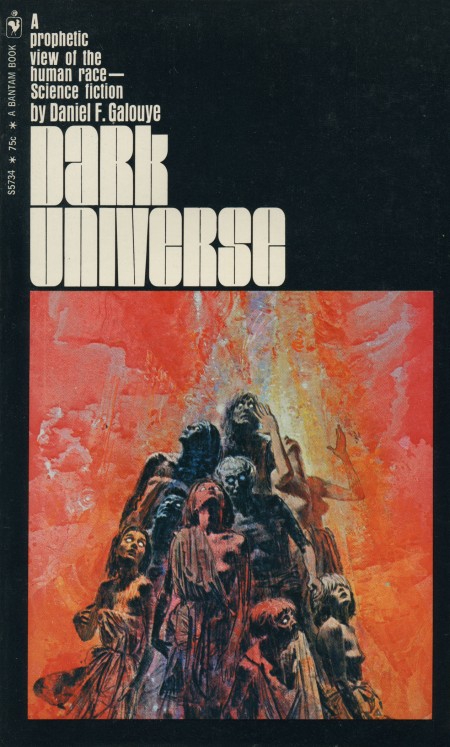
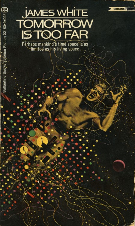
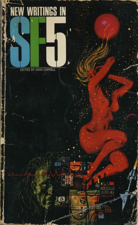
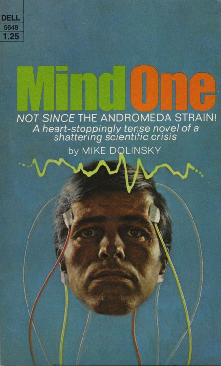
While digging around for Omni covers for last week’s post, I came across blog reader Eric Carl’s Flickr and his downright incredible set of vintage sci-fi / fantasy paperback covers. These really are mind-blowingly good and positively dripping with inspiration. I’ve never seen any of these before but I feel I’ve been somehow influenced by them anyways. They encapsulate everything I love about this period in design; just look at that typography! The “Dark Universe” cover is just off the charts good. Thanks so much for posting these Eric! Quick question if you’re reading this Eric: Do you actually own these? How did you come across find such a nice collection? Link

HUUUUGE bonus: can anyone name the font used in “Dark universe”? Is that even a font or do you think it’s hand drawn? Let us know in the comments.

1976 Tri-Blend Heather Blue

76triblu
tri3

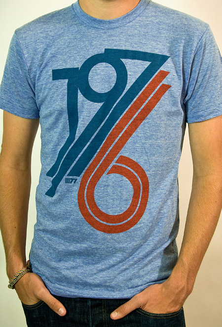
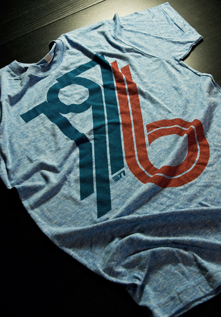
With spring all but here (at least in San Francisco) I thought it would be a good time to whip up some new tees using American Apparel’s summer-friendly Tri-Blend Heather shirts (50% Polyester / 25% Cotton / 25% Rayon). The result is this new 1976 on American Apparel Tri-Blend Heather Blue. When I first designed the original version of the 1976 tee, I had this sort of vintage track tee vibe in mind. At the time, AA didn’t offer a Tri-Blend shirt in blue so I ended up going with the cotton baby blue — which I think has it’s own thing going on — but once I saw the new tri-blend blue I knew it would be perfect for a subtle remix.

Shirts have always been a fun design challenge for me. Unless you’re a pretty big company, you’re pretty limited in your color choices when it comes to blank shirts. Sure, American Apparel (one of the blank shirt manufacturers with the best cuts and colors) has a great selection of colors, but most are pretty straight-forward, bright colors. For most of my designs I envision washed out, faded colors and there really aren’t that many companies offering that kind of blank these days. AA’s tri-blends come very close and the fit and feel are incredible, so I usually end up going with that combo. But it can be a rather daunting task to balance your Pantone ink choices with the dye colors to try and reproduce the style and look you’re going for. You can always mock it up in Photoshop, but you really never know what it’s going to look like until you print one up and see the real thing.

After all that comes the task of trying to get photos of the shirts that accurately reproduce the color and texture, which can be even harder than designing the shirts in the first place. This time around I had a Gretag card and some color-correct CF lights so it went a little more smoothly. I shot in NEF format RAW on the Nikon and got some pretty usable output this time. The process of brining the RAW shots in is always a bit tedious, but it definitely yields more accurate and flexible results. I usually try to get one shot that’s as color accurate as possible (first shot above) for the storefront, and then another, more effected version (second image above) to give another perspective on the shirt. I’m still planning to rent a better lens for a day or so and see if that helps any, although after this most recent session I am feeling a little more confident with my D80. Also, a quick thanks to my little brother Kirk for modeling the shirt! I usually have to hold the remote while taking the shots of myself and it’s a lot harder to frame up shots and get the settings down that way.

At any rate, the ISO50 1976 Tri-Blend Heather Blue is now available for your enjoyment, get them while they last!

Leica R3 MOT

42065151_188110ae27_b
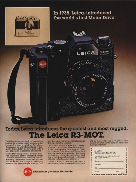
Introduced in 1976, the Leica R3 was a compact SLR based partly on the Minolta XE (the MOT — pictured above — being the motor driven variant). These can be had on the cheap via ebay, would make a great secondary camera for film stuff.

Image via Lauterhaus

Omni Magazine Covers

omnired
omnigreen
omniblue
42105956_7283fd3022_b
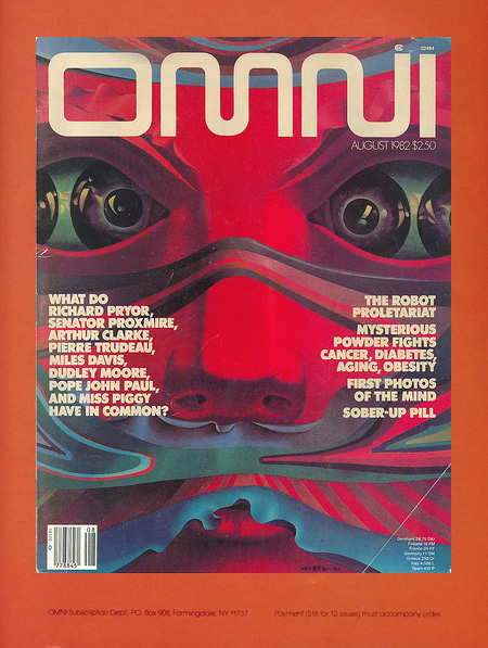
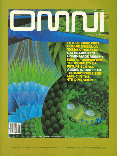
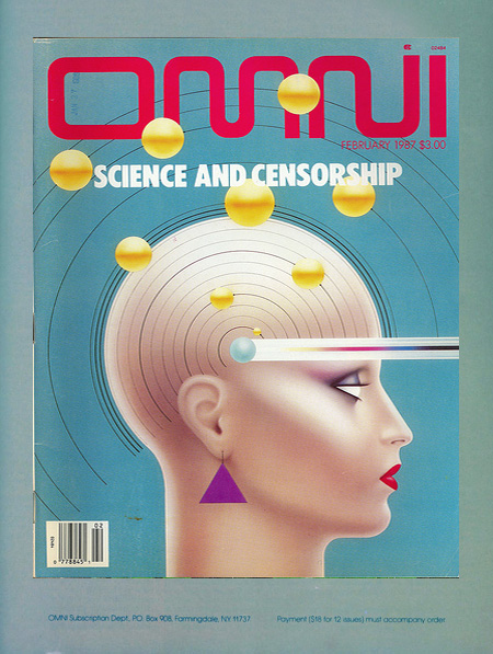
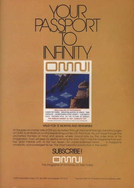
I remember seeing Omni magazine when I was a kid and wanting it. For some reason I was never able to get my hands on an issue, so I still don’t know what it’s about, something to do with sci-fi apparently. Anyways, the covers and style are excellent regardless of the content. You can find an archive of all the issues here, although the images aren’t very large.

F5 Fest New York

f5
I’ll be heading out to New York for the F5 Fest April 16-17th. I’ve known the organizers for a while and worked with them on past in events in Barcelona and New York. They’re a great group and I’d imagine this will be a very inspiring event for everyone. More info can be had at the F5 site, here’s a quick run down of what the event is about:

Two-days of inspiring presentations and discussions that will alter the way you think about work, life and everything in between.

– An international showcase of cutting-edge artwork and design
– A relaxing bar/lounge to recharge your batteries and make new friends
– A reason to visit New York City, one of the great creative centers of the world
– An amazing after-party by Media Temple

There should be a few tickets left, you can purchase them here. See you out there!