Posts by Scott

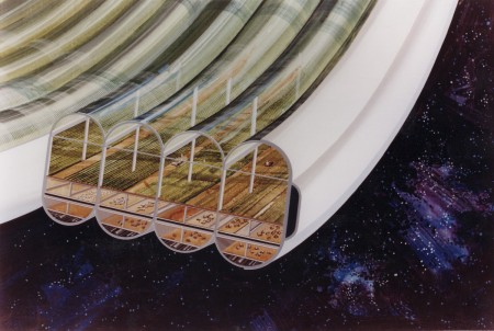
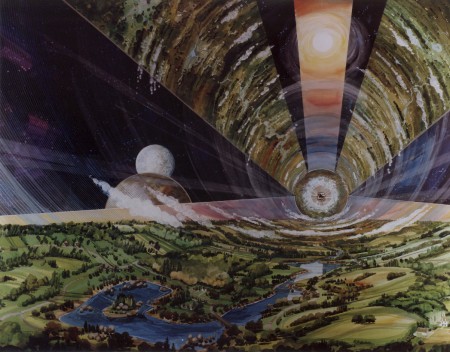
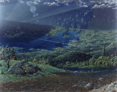
Space Colony 1970

ac75-1086-1f1
ac75-1085
ac78-0330-4f
ac75-1086f
ac75-1883f

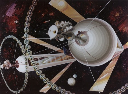
I’ve seen these sort of retro-future space colony illustrations around here and there but never knew the original source until today. NASA has posted a good sized collection of full resolution scans of the original artwork here. Apparently these were part of a series of NASA studies on space colonization:

“A couple of space colony summer studies were conducted at NASA Ames in the 1970s. Colonies housing about 10,000 people were designed. A number of artistic renderings of the concepts were made. These have been converted to jpegs and are available as thumbnails, quarter page, full screen and publication quality images. There are 16 images presented below.”

Link

Mastering Tycho At Monsterlab

mlmain
ml1
mlpano
I made the drive out to Sacramento this morning to have the next Tycho single mastered by Eric Broyhill at Monster Lab Audio. In case this is sounding familiar to you, it’s because this is my second pass at this song. I mixed and mastered it last month but after repeated listens, something just wasn’t quite right so I did another mix over the past week and it’s finally wrapped. It’s been a long road, this particular track is sonically very dense and it’s been a very difficult one to mix. For those of you who aren’t familiar with the idea of mastering, it’s the last stage in the production process in which an engineer puts the finishing touches on your music and gets it into the form it will take for the final release — be it CD, MP3, vinyl, or otherwise. That is, of course, a gross oversimplification of what mastering is, if you’re really interested in the details here’s the Wiki article on the subject. It’s a vital step in the process of moving a recording out of your studio and into the real world where every stereo and every room is different, and you hope that your music sounds good on and in all of them. I think most importantly it puts another set of critical ears on your music. By the end of the production process your own ears can become deaf to the subtleties (or not-so-subtleties) and details of the material so it’s vital to have some fresh ears hear it for the first time and recognize it for what it is, not what it has become for you through infinite listens. Ideally, those ears belong to a capable person who knows waaaay more than you’ll ever know about the science and nuance behind how people perceive sound. Mastering can be heavy-handed or light and transparent, and therein lies the problem. Because the process can have such a profound effect on the final product, you have to trust the person doing it. You must have faith that they get what you’re trying to do with a song. It’s a very difficult thing to hand over the reigns to something you’ve put so much of yourself into, to another person who may or may not understand the essence of what you’re trying to do sonically with a song.

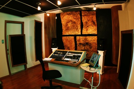
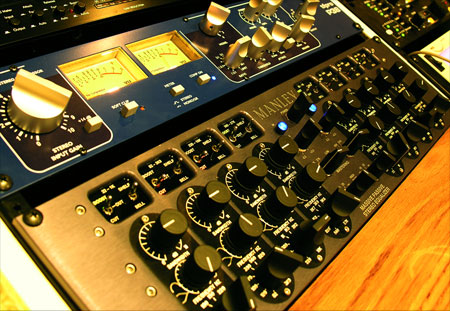
I was fortunate enough to meet Eric Broyhill back when I was finishing up my first album and he’s mastered all of my releases since. He’s great at understanding what I am going for and I am always amazed at the night-and-day results when I compare his versions with the raw material. The shots above are from his space which is located inside Hangar Studios (John Baccigaluppi’s studio and the home of TapeOp magazine) in Sacramento. I took these shots during a session a while back so they aren’t really up to date, I think he’s replaced a few pieces in the rack but the interiors are the same and that’s the really impressive thing about the place (unless you’re like me and you can’t stop staring at the Manley Massive Passive). A mastering environment has to be acoustically treated to ensure accurate monitoring of the material. There are many ways to go about this, most involve fiber sound absorbers and diffusers. I’ve always admired Eric’s solution to these problems from both a technical and aesthetic perspective. He was able to build much of the treatments into the structure so that they’re almost unnoticeable but the most prominent element is definitely meant to be noticed. The primary diffuser on the front wall is a giant face he had built by a local artist out of wood blocks set at varying heights (see picture above). This randomly redirects reflected sound waves to avoid phasing issues that can be caused by parallel surfaces. It looks amazing and sounds even more amazing when paired with the incredible Earthworks Sigma monitors he uses. I honestly don’t think I’ve ever heard a better sounding system than this one.

Now it’s time to finish up the album. I really can’t wait for the day I get to drive back out there, it’s always like a celebration for me at the end of the months spent in the studio slaving away on the music. You get to hand it over and then watch it become complete. If you’re in the market for mastering — which any self-respecting musician should be — definitely check out Eric at Monsterlab, he does incredible work at very reasonable rates. And if you’re not in Northern California I know he can do the work remotely as we did a couple sessions that way. Monsterlab Audio

Linda Aldredge’s Treehouse

6a00e00992ac3d8833010535f96d66970c-800wi
l1023502
6a00e00992ac3d8833010535f973b3970c-800wi
6a00e00992ac3d88330105365a6cb8970c-800wi
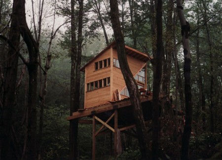
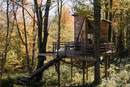
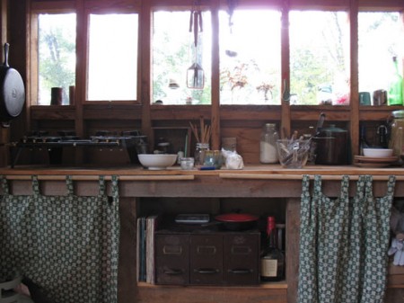
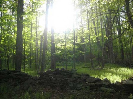
Linda Aldredge is a graphic designer and the creative mind behind LuLu Organics. Also, SHE LIVES IN A FACKING TREE FORT. This is so amazing I can’t even put it into words, the pictures will have to fill in the blanks. Judging by the interior shots I’m pretty sure I would have a hard time coping with the rather spartan accommodations. But, of course, living in a treehouse would probably more than make up for any lack of modern accouterments. The best part is that the whole thing cost like $12,000 or something and runs entirely on solar. I really love the modern design of the exterior; it looks like it belongs right where it is. The house — situated in upstate New York — was designed by Kursten Bracchi and built by her and some friends. The images above are from an InHabitat article about the house which delves a bit deeper into the whys and hows of the whole situation. There’s also an in-depth look at the build process at DominoMag.

Seeing stuff like this makes me realize I’m going to wake up one day when I’m 60 and realize I never really did anything all that adventurous in my life. Maybe on that day I will decide to go into the forest and build a tree house, but I seriously doubt it and I also doubt that solar panels could provide the 200 jigawatts required to power my studio, even in 2037. Of course, all of this is likely moot as by that time we will have been enslaved by some sort of robot overlords and/or the Illuminati or whatever. But not Linda Aldredge, she’ll still be kicking it in the woods all off-the-grid style with her solar panels and iPod like that old couple in Children of Men. What? Anyways, point is, it would be cool to live in a treehouse.

Deleteyourself vs. Canon 5D MKII

picture-82
picture-21
picture-73
picture-61
picture-51
picture-93
picture-10
So I stumbled onto the deleteyourself blog the other day (same guy who runs Photololz) and in turn found his Flickr. There were some nice shots up there but what really struck me in particular was the vivid clarity and tone of the photos. So I took a look at the EXIF data and sure enough, they were all shot with a Canon 5D MKII. As you may well know, I have been trying to decide whether to stick with Nikon for my next camera or make the leap to Canon. I think that decision is becoming much clearer now; after seeing what Tim Navis did with the EOS 30D and now this, Canon is way out in front for me. Of course, he’s also using the $1500 Canon EF 16-35mm, but I suppose a camera like the 5D deserves only the best. At any rate, these shots drive home how good the 5D is at transforming otherwise mundane scenes into exquisitely detailed compositions of incredible depth and tonal range.

On a side note, that second pic looks like it was taken right around the same place I took this one, flying into Phuket Airport. I effected the hell out of mine, so it’s hard to compare the two, but I assure you that even in it’s raw form, mine was never anywhere near this detailed and dynamic. I’m not sure how much post processing he is doing with these, I’d love to know how much Photoshop had to do with the end results. Whatever the case may be, Photoshop can’t just synthesize out of thin air the kind of clarity and depth found in these shots; I would bet there’s just some simple color balancing going on. I’m also really liking the vignetting in a lot of these, can anyone out there with a similar rig testify as to whether that is a natural artifact of that particular lens or something he did in post?

Inspiration Resource: Grain Edit

stamps-2
labels-1
labels-5
labels-3

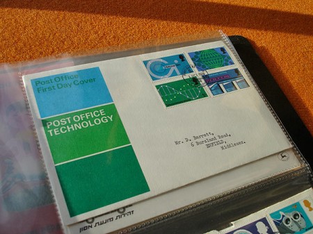
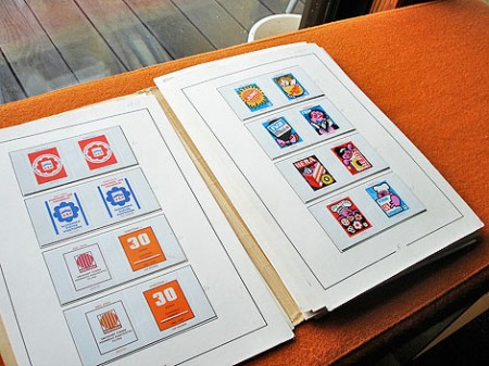
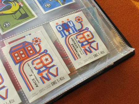
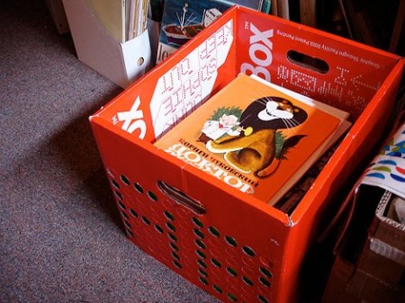
Michelle McCormick recently posted Dave Cuzner’s Grain Edit on her Inspiration Resource blog. If you’ve been to Grain Edit before, you’ll know what a great collection of classic design artifacts Dave has. Above are just a few small glimpses into that collection. Dave is a vintage bookseller out of Oakland, CA who I first met at an ADAC event in Sacramento. He had a booth there and I was pretty blown away by the books he brought out. I later met him again here in San Francisco where he showed me part of an amazing Czech stamp collection which he is working on. All very inspirational stuff indeed! Link

Graphis Flickr Set

3185197486_93c0e4e379_o
3243580494_72eba1ef71_o
graphis-filmtv-2-by-sebhayez
3184367519_48f97475c5_o
graphis-archigraphia-by-sebhayez
3185211714_de634650b8_o

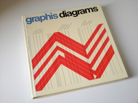
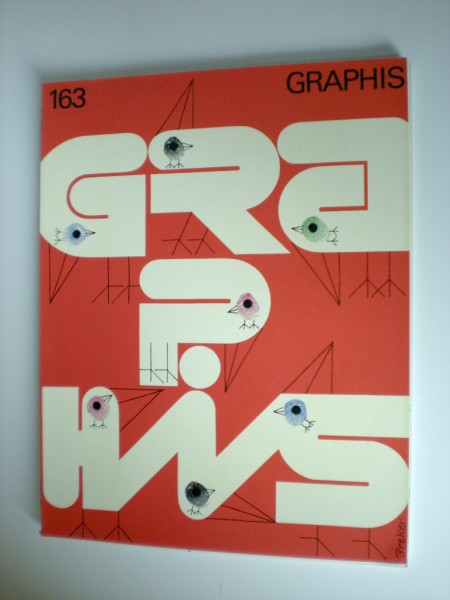
Sébastien Hayez was kind enough to send me this Graphis Flickr set where you’ll find a lot of nice shots of various Graphis books. Link

Where The Wild Things Are Poster

wildthingsposter
Jakub posted some stills from the upcoming Where The Wild Things Are movie a while back and now we have a very nice movie poster to go with them. This thing is looking better and better with each new development.

Neve Sidecar

8014kompimage004
2747400439_9d2e123a99_b

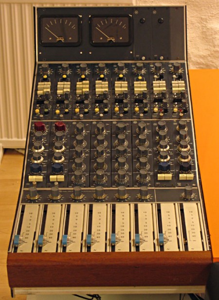
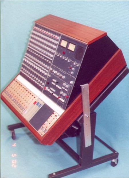
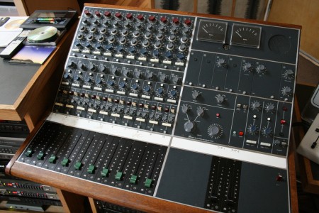
In the world of audio engineering, the name Neve has become almost mythical. Rupert Neve was responsible for a very popular EQ and preamp circuit design that helped produce many a hit record over the years. I personally love the Neve sound and record everything through a set of four Neve clones. While clones are great and can approach the sound of the original, they’re still not truly a Neve. So to see an actual Neve Sidecar show up on Ebay was a surprise. Just seeing pictures of these is pretty intense, I can’t imagine what it would be like to actually use one. To me, the color and design inspire a sort of reverence, kind of like the Futura of the sound engineering world; classic, refined, and functional. At any rate, a $40k mixer is just a dream…but what a nice looking dream.
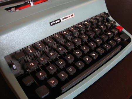
Olivetti Lettera 32

505514446_c77768746f_b
480136252_7e7a676045_b1
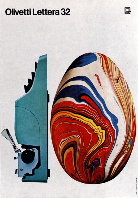
“The Olivetti Lettera 32 is a portable mechanical typewriter designed by Marcello Nizzoli for Olivetti in 1963 as the successor of the popular Olivetti Lettera 22. This typewriter was popular amongst journalists and students.
The typewriter is sized about 34x35x10 cm (with the carriage return lever adding about 1-2 more centimeters in height), making it portable at least for the time’s standards, even though its 5.9 kg weight may limit portability somewhat.”

Wikipedia

Adobe UI Gripes

psdgripe1
psd

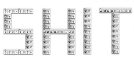
A friend that I used to work at Adobe with sent me this Adobe UI Gripes site yesterday. I really can’t say why I find it so amusing but maybe it’s just nice to see someone going through the same frustration I feel sometimes with Adobe apps. I guess when you’ve essentially monopolized the creative software market like Adobe, you make a pretty easy target for stuff like this. Anyways, it’s a fun read and there are gems like this sprinkled around here and there. I’ve encountered a lot of these before and just asked why, but I’m not sure I ever got as worked up as this. Link

Realistically, I really only have a few problems with CS4. At the top of the list would be Bridge. Somewhere around CS3 Adobe decided to cripple Windows machines and remove the thumbnail icon viewing capability from the OS file explorer thereby forcing you to use Bridge (pretty clever). This wouldn’t be a big deal, I actually like Bridge a lot, only problem is it crashes nearly every time I use it for more than 10 minutes. There’s a fix for 32-bit windows installs but not for 64-bit so we’re left with the generic icon when trying to browse PSD’s in explorer. A couple others would be the permanent hand icon mode (you’ll know it if you’ve encountered it…thankfully there’s any easy fix: reset warning dialogs, but why?) and the delay in dragging content from one tabbed window in Photoshop to another tabbed document, you have to hold that thing up there for waaay too long. How about you, what Adobe bugs do you love to hate?