httpv://www.youtube.com/watch?v=DkqtklABgGQ
This is completely insane and almost creepy the first time you see it. Now I just need to get my printer working to try it.
httpv://www.youtube.com/watch?v=DkqtklABgGQ
This is completely insane and almost creepy the first time you see it. Now I just need to get my printer working to try it.
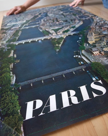
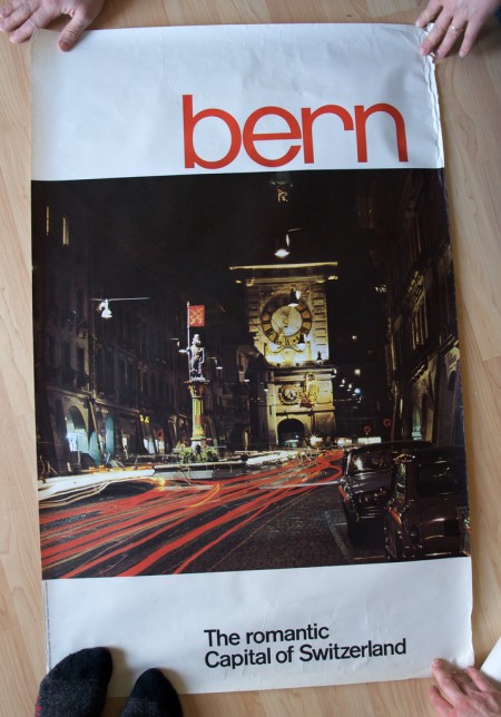
Stephen over at Mid-Century Modernist posted shots of some great European travel posters sent to him by his late father. Apparently the posters had remained in the shipping tube for a few years until discovered during a move. Thanks for sharing Stephen, and thanks to all your friends for holding them down in the shots! (what is that like 3 people holding the Bern print down?) Link
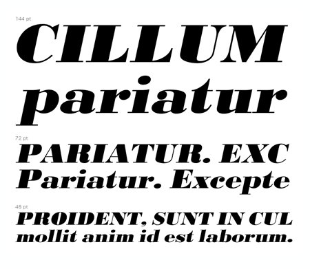
And in case you were wondering, the “Paris” font seems to be URW Bodoni Extra Bold Extra Wide Oblique. There are some slight differences but I am assuming these are artifacts of the digitization perhaps? I hate it when I see a classic font used like this and then find the modern version and it’s just a bit off. “Bern” seems to be PL Brazilia Three.
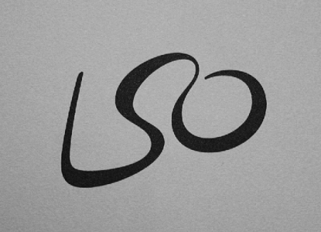
Abuzeedo has posted a collection of “15+ Amazingly Clever Logos” taken from Michael Evamy’s book, “Logo”. Some pretty cool stuff in there but mostly it’s just nice to see them in quality printed form. Many of these — such as the USA network logo — I tend to take for granted. But when I see them printed so nicely in black and white on the page I gain a whole new appreciation for them. Still nowhere near this though.
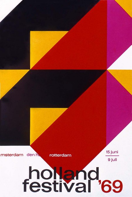
Holland Festival ’69 poster by Dick Elfers
Via Alki1
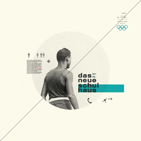
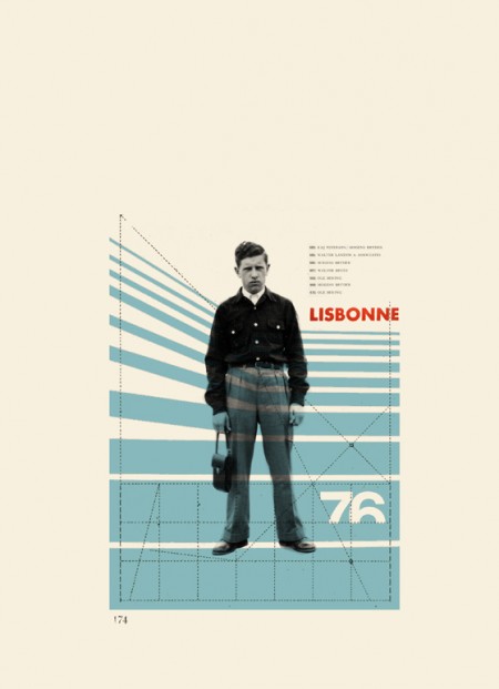
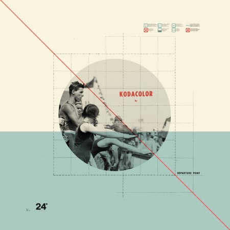
I had seen Cristina Couceiro’s work here and there before but this most recent series really blew me away. What classic style; I really like how she employs found imagery without crossing that fine line into kitsch that so many others seem to stumble over. The typography is spot on as well. You can see more of her design and photography here.
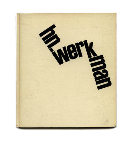
I’ve always been a huge fan of books on modernism, but unless you’re Dave from Grain Edit, it’s pretty hard to get your hands on the good stuff. And so it was with great pleasure that I stumbled onto Modernism 101 booksellers. the site, featuring a vast collection of rare and out of print books on modern design and architecture, serves up cover images and very detailed information on a wide array of classic design texts. Many of the books featured are have sold, but they archive the pages so it’s a great resource for images and information on many books that you’ll probably not find elsewhere. I’ll be running a (hopefully) weekly feature aptly titled “Modernism 101” highlighting the best examples from their collection.
Today’s selection is a collection of Dutch printmaker H.N. Werkman’s work edited by Fridolin Müller. Enjoy!

H. N. WERKMAN
Fridolin Müller
Fridolin Müller (editor), Peter Althaus (introduction): H. N. WERKMAN. NYC: Hastings House, 1967. First edition. Tri-lingual edition in English, German and French. A near-fine hardcover book in decorated glazed paper boards issued without a Dust Jacket: trace of wear overall. Interior textblock in fine condition. Volume Two in a projected four-volume set called Documents in the Visual Arts. A nice copy of a scarce book.
8.5 x 9.75 hardcover book with 104 pages with 79 plates (14 in color) of Werkman’s avant-garde Dutch typography. H. N. WERKMAN presents the most extensive published collection of Werkman’s typography to date. My highest recommendation.
Beautifully designed and printed by Verlag Arthur Niggli in Switzerland with the plate engraving and printing setting a new standard for the reproduction of the presented artwork. Spot colors are used throughout for maximum color fidelity.
Dutch designer and printmaker Hendrik Werkman (1882 1945) is best known for his innovative printing techniques and avant-garde typography. As publisher of De Blauwe Schuitt, a series of underground booklets produced by Jewish dissident poets and writers during the Nazi occupation of Holland, Werkman was imprisoned by German secret police in 1945 and executed without trial just three days before the country¹s liberation.
out of stock
Via Modernism 101
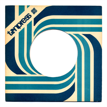
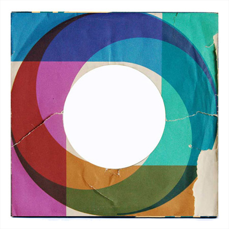
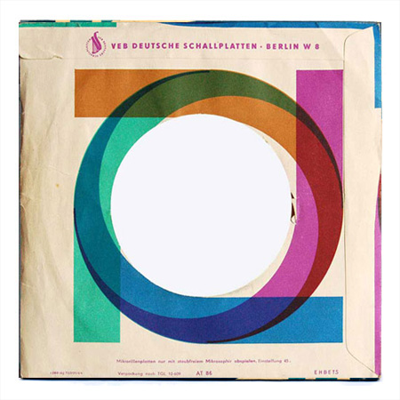
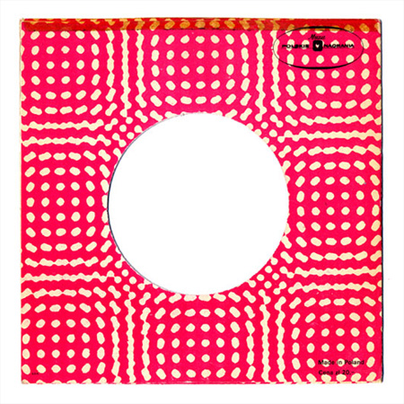
We all know Polish design is amazing, but every now and then you need a good reminder. Karl forwarded me a Wanken post on the Tonpress sleeves you see above. Tonpress was a government-controlled Polish record label in the 80’s and from the looks of it, they had some quality design staff hanging around. If you want to sift through all the links, lots more cover art is here.
Images via Wanken
P.S. Be sure to check out Karl’s blog, it’s got a new skin that’s dripping with minimal goodness.
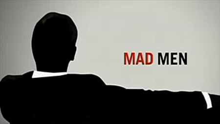
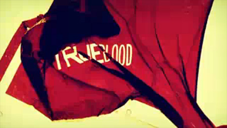
While they’re not quite as good as their big screen counterparts, some TV title sequences are starting to look a lot like what you’d expect from a feature film. Smashing Magazine has an article entitled “20 Brilliant TV Show Titles” featuring some of the better examples out there. My personal favorite has to be TrueBlood; the colors are incredible. Although none of them come close to beating Catch Me If you Can (although Mad Men tries valiantly), there certainly are some nice ones in the list. Link
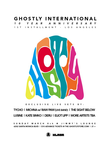
The L.A. installment of the Ghostly 10 Year Anniversary Show is now officially set for Sunday, March 8th, 2009. The lineup is pretty much the same as the S.F. show at Mezzanine on the 6th. Jakub’s flying out for the S.F. show and then we’ll be making the trek down south via I5 on Saturday, wish us luck! Here’s all the details for L.A.:
Ghostly, Xlr8r, Red Stripe and Jimmy’s Lounge Present:
Attn: This is a Daytime show, starts @ 2PM
The Ghostly 10 yr Anniversary – 2nd Installment – Los Angeles
Featuring:
Michna w/ Raw Paw LIVE
Tycho LIVE
The Sight Below LIVE
Lusine LIVE
Kate Simko LIVE
Deru LIVE
Eliot Lipp LIVE
…and more TBA
Sunday March 8th
@ Jimmy’s Lounge
6202 Santa Monica Blvd., LA
21+ 2 pm
Purchase Tickets for L.A. Show
Purchase Tickets for S.F. Show
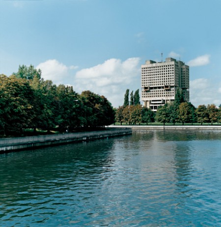
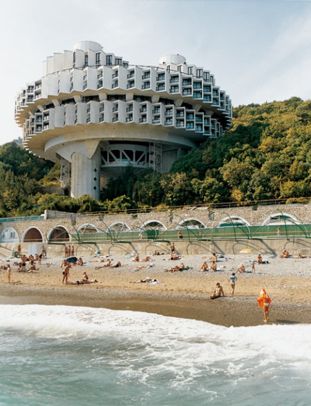
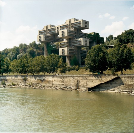
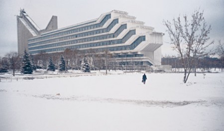
Pop Up Storefront Los Angeles showcased some great photos from Frederic Chaubin, the Cambodian born French-Spanish editor of Citizen K magazine. The show, entitled “CCCP: Cosmic Communist Constructions Photographed”, focused on Chaubin’s fascination with the sort of futurist architecture that came out of Soviet Russia’s Cold-War era. I’ve always been quite impressed by Soviet architecture like this; they somehow built real versions of all those artist’s renderings of future societies that people were cranking out in the 50’s and 60’s. I’ve never seen it represented quite so faithfully; Chaubin’s photos really capture that whole utopian society vibe.