Posts by Scott

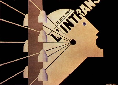
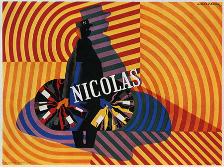
A.M. Cassandre

456678747_b2f6c11fbc_o
454805080_7946678ed3_o
453445580_3c61112e7d_o
250887022_6de2bf6e8c_o
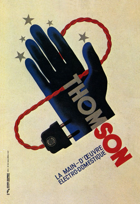
Adolphe Jean Édouard-Marie Mouron is one of my favorite commercial poster artists. Unfortunately, he went from running a successful advertising agency (Alliance Graphique who’s work includes the Yves St. Laurent logo), to losing it all and serving in the French army in World War II, to doing set design to get by, and finally suffering from depression and committing suicide in 1968. It’s very sad to think this was the fate of a man who contributed so much to design. You can find more information on Cassandre here and here.

Perhaps his most recognizable work, the Dubonet Wine poster is all but ubiquitous in vintage poster collections these days. This style of poster art is sort of a bittersweet thing for me. I really do love it, but once you start seeing something sold at Target it’s hard to take it seriously as art. I have a few old advertisement posters from this period around the house (all reproductions), but I really want to start focusing on later modernist stuff.

Images via Alki1

MBW / MLK

mbwmlk
Whatever your politics, we’ve got a big week going on here in the States. Thought I’d post these shots of Mr. Brain Wash’s MLK poster series. Bonus: A couple nice MBW takes on Robert Indiana’s iconic LOVE series stamps.

If you’ve got the day off, enjoy it! If you’re in San Francisco, go outside! It’s way too hot here to be January. Images via Tourist of Life

Manifest Hope Gallery Pics

progress-iso50
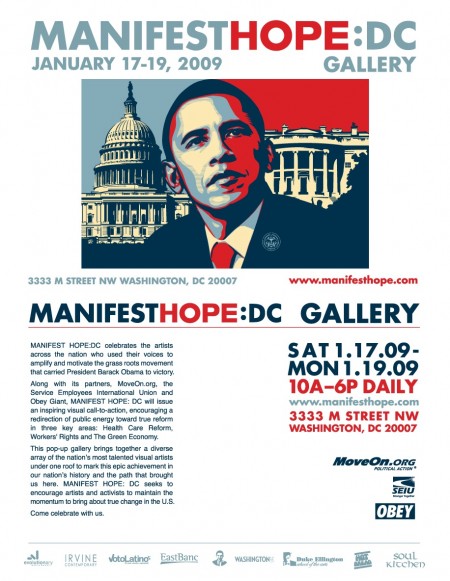
Apparently the Manifest Hope DC show was a big success with a great turnout. Theodor3 posted the pic above on flickr and Piecemaker has some up as well. Unfortunately, I don’t have any personal shots of the print as I didn’t get a chance to grab any before the framed version went out. The print sold so maybe the purchaser or someone else with shots from the show could send a full size head on of it. Notcot also has a lot of great shots from the show here and here. Thanks to everyone who came out and supported, wish I could have been there to see it for myself!

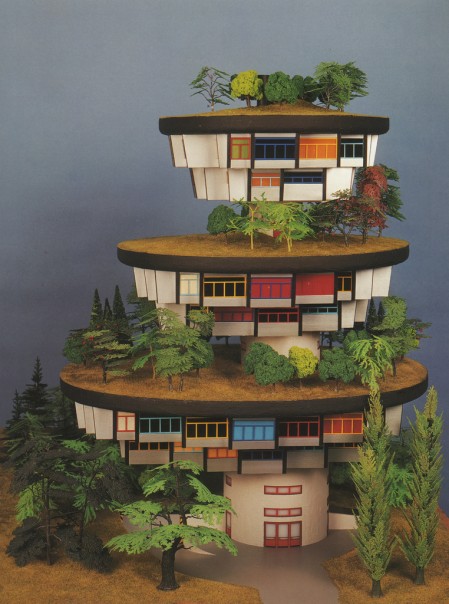
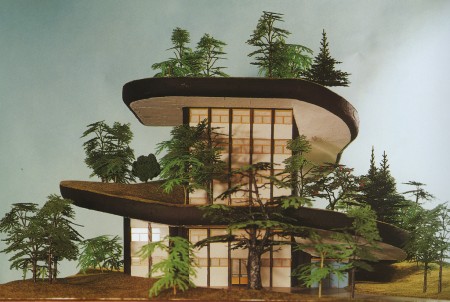
Hundertwasser Architecture Models

1343866594_d4a064ef76_b
1343866586_4268a2f7e9_b
My dad was a civil engineer so he would sometimes bring home project models and I loved to play around with them, but most were your basic hotel mock-ups and the like. It’s probably for the best though, if he had brought home anything like the examples above my head would have exploded. These are simply amazing. I want these under a plexi-glass bubble in the middle of my living room. Apparently they were taken from Taschen’s “Hundertwasser Architecture: For a more human architecture in harmony with nature” book. I found the pics on Doctor Casino’s flickr page where there are more details. Link

Razer Death Adder Mouse

deathadder_lrg2
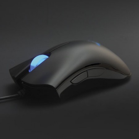
So I was at Best Buy the other day and I happened upon the mouse isle. I wasn’t really searching for a new mouse so much as an alternative input device (more on that later) but I remembered a few of you had recommended the Razer mice in the comments of the design mouse round-up so I thought I’d give them a shot. I played around with both the higher-priced “Lachesis” model and the “Death-Adder” (yes, only “gaming-grade” products are allowed to have names this bad). The Death-Adder felt the best in my hand so I focused in on that one. After playing around with it for a little while I liked it enough to pick one up. I think it was around $60, not cheap, but certainly not as bad as some of the Logitechs which can push the $100 mark.

Once I got it home the first thing I noticed was how light it was compared to my old Logitech which I had weighted with some quarters. I don’t know how I missed that at the shop but I was starting to think it was a deal breaker, I really like heavy mice. But as I used it I started to realize that the extreme precision of the Death-Adder more than compensated for it’s lightness. I think before I needed the weight to make up for how imprecise the Logitechs can be, in this case there was no need. The Adder floats effortlessly across my desk surface and the resolution is incredible. What I really love about this thing is the width, I don’t have to cramp my hand to hold on to it, it fills out the palm nicely.

It’s really a small issue, but this thing looks really cheap. The industrial design department over at Razer Inc. must be comprised solely of 15 year old FPS enthusiasts because this thing is damn ugly (I know it doesn’t look so bad in that pic up top, but you have to see it in person to truly appreciate it’s tackiness). And to top it off, it has a glowing blue thing in the middle of it that looks like some sort of tribal tattoo from 1998. And no jokes, it actually pulsates! WOW….I can just imagine that design meeting… Designer: “Hey, how about we take the ugliest, most tacky part of the design and then draw as much attention to it as possible by mounting a blue light underneath!” Product Manager: “Make the light pulsate and you’ve got yourself a deal.” Overall, the materials look pretty chintzy too but I guess I don’t mind since they seem to have spent the cash they saved on making this thing look good on making it work better.

As for real issues, I definitely miss Logitech’s Micro-Gear wheel and there are only two extra buttons on this thing, back and forward. Other than that, it’s definitely a winner, I certainly prefer it to my Logitechs at this point and I’ve only been using it for a couple days. They have several models to choose from, some with more buttons/features I’m sure but since their site doesn’t have an index it was really hard to see all the mice and compare them at a glance. I would give you a link to the website, but that too seems to have been developed by high school students so I’ll spare you. Seriously Razer, I know your demo is gamer kids, but that doesn’t mean your site has to be completely non-functional.
Manifest Hope Gallery Show

ISO50 - Manifest Hope
My “Progress” print will be featured in the upcoming Manifest Hope:DC Gallery as part of the lead up to the inauguration ceremony on Tuesday. The gallery runs Saturday, Jan. 17 through Monday, Jan. 19 in DC. I had #112 of the original 200 I signed at press framed and shipped it out last week. Unfortunately, I won’t be able to attend, hopefully somebody can check it out and let me know how it went. Here’s the details:

The MANIFESTHOPE: DC Gallery will be open to the public in Washington, DC for the days preceding the Presidential Inauguration, Saturday, January 17th, 2009 through Monday, January 19th, 2009 between the hours of 10:00 AM – 6:00 PM. Art exhibition management will be provided by our Washington, DC gallery partner, Irvine Contemporary.

MANIFESTHOPE: DC
January 17th-19th, 2009
10:00am – 6:00pm
3333 M Street NW, Washington DC 20007
http://www.manifesthope.com

Winter Sale Ends Today

iso50-sale-final
Just a heads up that the ISO50 20% off sale ends today so get on it!

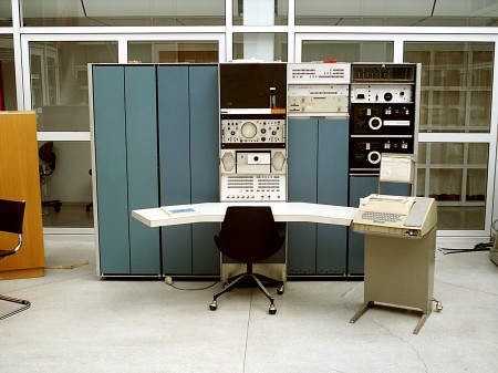
Columbia’s DEC PDP-7

pdp7a
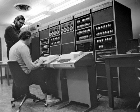
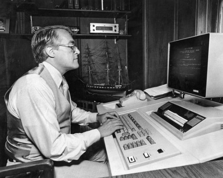
The DEC PDP systems never cease to be a source of inspiration for me and the above example of a PDP-7 system at Columbia’s Electrical Engineering department is no exception. I am not sure who took this photo as there was no credit included (source: Columbia Computing History). It would be tempting to gut the cases and fill them with modern studio equipment if you could find a nice used example. Also, if you have an oscilloscope in your computer you win.

For you Mac heads out there, this is your great-grand daddy. A PDP-7, referred to as the “Unix Genesis Machine”, was used by Ken Thompson and his team in 1969 to develop the Unix OS (a very early precursor to what would become Mac OS X).

leopard-preview-server-1

Old New Tech

439011424390113243901126teaholder
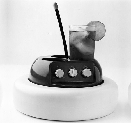
The Chicago Tribune has posted a nice collection of old gadgetry. Yes, we do have all of this stuff now, but none of it looks this cool. My favorite is the inlaid computer keyboard, I’m trying to do something similar with some recording equipment my desk right now but somehow I doubt it will be that clean.

Ted: BumpTop

I remember seeing the BumpTop desktop concept making the rounds a while back but today I came across a bit more interesting version. In it, BumpTop creator Anand Agarawala walks us through the interface and it’s various features during his presentation at the 2007 TED conference. The concept is obviously in it’s early stages and while this demonstration seems to highlight some of the more frivolous features of the interface, I think a lot of the ideas could be very useful in a future OS. My favorite part is when he dares to insult the sacred cow of OS X, pointing out that it’s essentially a more “lick-able” version of the “same old crap we’ve had for years” (i.e. Windows). You gotta love the audience reactions. Video Link

Note: Since this video is now almost 2 years old, a multi-touch interface is notably absent from his presentation. In the time since the original video Agarawala has updated and has a nice multi-touch BumpTop demonstration here.