Posts by Scott

Grid Designer 2

gridd2
gd2
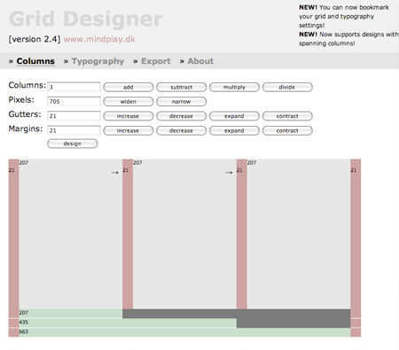
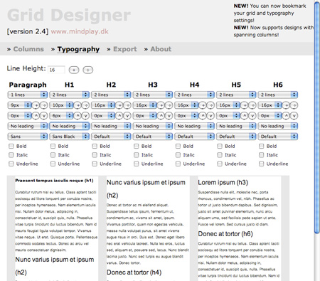
Came across this very cool CSS/HTML grid designer today. Aptly named “Grid Designer 2”, this tool allows you to mock up grid-based page layouts and set typography styles. A very handy page to have in your bookmarks, now they just need to make a widget out of this. Grid Designer 2

Related Reading: Five Simple Steps to Designing Grid Systems, Aisle One

Hatful of Hollow

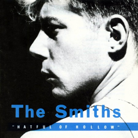
The Smiths - Hatful Of Hollow
I definitely count The Smiths’ 1984 Hatful of Hollow as one of my top 20 all time. This is one of those albums that makes you want to post the whole thing but I thought it would be a good challenge to try to narrow it down to three songs. I posted the re-issue version of the cover—featuring a cropped version of Gilles Decroix’s now iconic image (layout/design by Caryn Gough)—as I prefer its design to the bordered original. I really like the overall visual style of their release art, that sort of duo-tone screen print thing that Belle & Sebastian later used to such great effect. Out of the three standout tracks I ended up choosing, at least one of them—This Night Has Opened My Eyes—would make both my top 50 songs and top 10 basslines list. I love that smooth 70’s DI tone, always amazing how good a lot of the older Peel Session tracks sound considering they weren’t studio recordings in the conventional sense.

This Night Has Opened My Eyes

[audio:smiths-night.mp3]

Please, Please, Please Let Me Get What I want

[audio:please-smiths.mp3]

How Soon Is Now?

[audio:smiths-soon.mp3]

Metal Heart: Tilt-Shift Video

Here’s another nice example of some time-lapse tilt-shift by Keith Loutit. This one is so good it’s hard to believe that it’s real, it just looks like a big stop-action Hot Wheels diorama. The crowd shots are the hilight for me though; I’m loving those seat colors.

Keith also has a couple other good tilt-shift examples up at Vimeo: The North Wind Blew South and Helpless.

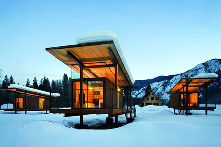
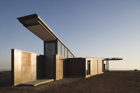
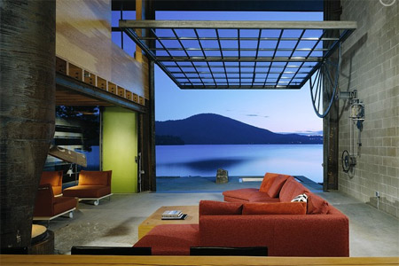
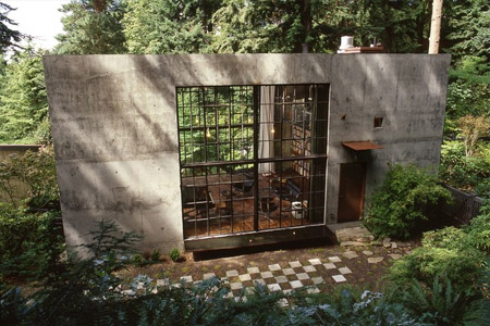
Tom Kundig: The Nature of Design

kundig4
kundig2
kundig3
kundig1
I stumbled across this great article about architect Tom Kundig’s work on WSJ today. That first house is off the charts amazing, I’d move in tomorrow despite the fact that it’s in the middle of nowhere (at least I’d get a lot of work done). Kundig’s goal is to find balance between the structure and the landscape and from the looks of things he’s doing just that. Once again though, after browsing his portfolio I am realizing if I ever want an amazing house like this I’ll probably have to move to a more rural setting (and find a bag full of money on the way out there). It must be so amazing to be in, for example, Mazama, Wash., and come across structures like these in the wilderness.

Vintage Sony Radio

3150961411_c3fcf6691d_b
3150961307_35432149bb_b
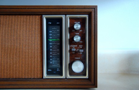
Saw these nice shots over at the Mid-Century Modernist today. In high school I worked at this place called “Good Guys” in Sacramento, it was a consumer electronics place and they had this really nice vintage Sony replica radio. If I’m not mistaken, it was modeled after this one. I remember it being pretty nice, but now looking at these shots, it really didn’t do the original justice.

Images by 33 and a Third via Mid-Century Modernist.

WordPress 2.7 = Success

27
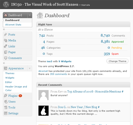
I just successfully upgraded the WordPress install for ISO50 to the new 2.7 version. I must say, this new version is incredible. I was running 2.1 for the longest time as a result of some early edits I made to the core files when I first installed WP (not recommended, but I didn’t really know what I was doing back then). There is a detailed guide on how to upgrade at the WP codex, but I decided to use a plugin that does everything automatically. It literally took 1 minute and I didn’t have to really do anything. The plugin, Instant Upgrade, is available here. If you’re running an older version of WordPress, you really should upgrade simply for security reasons alone, but the new admin interface and features are definitely worth it on their own.

Anyways, let me know if you notice anything weird on the site, I will be trying to flush out the bugs this afternoon.

You probably won’t notice any big differences now, but this is the first step on the path to the new redesign which I posted on a couple days ago. I want to say thanks to everyone who commented, it was a huge help to get such great feedback from all of you. I will be working through all the suggestions and deciding which will benefit the blog the most. As many of you pointed out though, most read the blog via the RSS feed so they rarely even visit the page. With this in mind, I try to make the page sort of the anti-RSS reader version, not stripped down, and not super clean. This isn’t Engaget or something, people come here for more than just the content I think, that is why I’ve never focused too much on things like the inverted contrast, Sifr titles, etc. I still want the blog to maintain a unique visual aesthetic, especially considering 99.9% of all blogs out there essentially look exactly the same. That’s not to say that I won’t be taking steps to make it faster and cleaner in the redesign, I definitely will, I’m just going to try to find a happy medium between form and function. Because those looking for pure function will always opt for an RSS reader.

As for the multiple authors issue a lot of you brought up, this is something I will really focus on clarifying. But to make one initial clarification, a few of you mentioned that you felt I was simply “letting my friends post” on the blog. This really isn’t the case. First of all, Jakub is an A&R, a label owner, and a DJ. I count him as a friend now, but this is from working together (he handles a lot of the day to day stuff for my Tycho music project and ISO50). Besides, he is who I look to when I want to find new music, we have similar tastes, and he is well qualified. This isn’t simply a case of me putting on my childhood friend or something. If I had the time to find new music and put as much effort into it as he does, I would most likely be posting the exact same stuff as him, so I’ve sort handed off a lot of the music posting duties to him and I think he does a superb job (my iPhone is pretty much just a big playlist of everything he has posted on the blog). Beamer is a friend of mine, but he also happens to be the most knowledgeable person I know when it comes to early electronic music and he has a very large collection of rare electronic / ital-disco vinyl. Alex Cornell is a student and my intern here at the studio, his posts are meant to bring a student perspective to the mix. I have been in design for way too long to really see it from that early, super-objective point of view. The point is that I put these guys on the blog because I truly respect and value their opinions and tastes. I am very lucky that they are willing to participate in the blog and I think they are a big part of what makes it what it is. If it was just me posting here you’d all be inundated by a never ending stream of me ranting about what the best version of Windows is for swap disk latencies and MP3s of late nineties IDM. At any rate, I will definitely be making author pages for each of them to make things clearer.

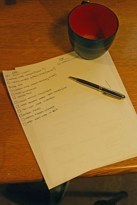
Finally, here’s a tentative list of fixes/upgrades based on your suggestions, there are some other, larger features that will be added but that list is still secret!

coffee-and-lists2

New Year / New Blog

The ISO50 blog is now approaching it’s second birthday and with the new year I thought now would be a good time to rethink the layout and functionality of the interface. The blog runs on the superb WordPress platform (highly recommended) so it’s extremely flexible and I want to take better advantage of that flexibility. When I first designed and built the blog I admittedly had no clue what I was doing. At the time I wasn’t really an avid blog reader so I didn’t really understand the finer points of a well thought out blog design. Thankfully, WordPress supports themes so I snagged the classic Kubrick theme (now K2) and hacked it into the form you see here. I learned a lot during the process and during the following year or so of working with the blog so I feel better equipped now to give it another shot. But as anyone in web design knows, it’s very difficult to be objective about your own interfaces and to understand the difficulties end users may have with your design.

So I wanted to ask you, the readers, what you would do to improve the blog. Is there anything about the interface or the layout that’s confusing, cumbersome, or just plain broken? Are there any features that you feel are missing or would be a good addition? I am in the early stages of the redesign, I have some mock-ups and wireframes going and a development install running here locally, so now would be a great time for suggestions. I look forward to reading any ideas or suggestions you might have in the comments

Update: Based on Michael J.’s comments I have added to this post in the comments.

Casa BF / Humberto Hermeto

370345119_bf-05.jpg  1006863892_bf-04.jpg Saw this incredible house by Brazilian architect Humberto Hermeto posted on Notcot today, amazing! I guess the plan is to first save up and buy a bunch of Herman Miller pieces, then build a house like this around them. Though aesthetically pleasing, I often wonder if would actually be fun to live in a house like this. I have a lot of odds and ends around here, wires hanging out from behind stuff, basically crap everywhere. That probably wouldn’t look very hot next to a stark, modern backdrop like this. But I suppose if you can afford this kind of house you can probably afford some sort of crap organization system, from Design Within Reach. More info and pictures are here

Copyright Free Popeye

Public domain imagery is nothing new (literally), there are entire source art books for sale that are comprised of royalty-free imagery that’s outlived the “life–plus–seventy” rule of EU copyright law. But most of these images are vague and anonymous with no particular brand attached; they came from a time when the idea of branding was still a somewhat nascent concept. So it was interesting to read that the entire £1.5-billion/yr. Popeye brand has become public domain in the EU (still 15 years to go in the US) as it’s copyright expired yesterday:

The copyright expiry means that, from Thursday [Jan.1, 2009], anyone can print and sell Popeye posters, T-shirts and even create new comic strips, without the need for authorisation or to make royalty payments. ” – Adam Sherwin, TimesOnline  

It’s pretty incredible to think that such a visible icon which has fueled so many industries (restaurants, toys, television, film, etc.) will cease to be owned by it’s various copyright holders. It stands to reason that there are myriad complexities and caveats to this situation; I would imagine Popeye’s Chicken and the others will have some legal recourse to maintain their trademark when 2024 rolls around here in the US (do you guys in the EU even have Popeye’s Chicken?). Other brands soon to join Popeye in copyright-free purgatory include Mickey Mouse, Bugs Bunny, and Superman (source). More info here & here

Image via erikland

What I Really Wanted For Christmas

This year I had a very nice christmas, I went back to Sacramento to see my family and came home with some great stuff (5 cutting boards! Also, pants.) But, since I’m not related to or friends with any millionaires and/or billionaires, I didn’t quite get everything I wanted. The following is my dream wish-list which I am publishing here in the hopes that Jimmy Warren Buffett will read it and decide that I need all this crap next Christmas.
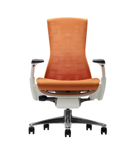

The Herman Miller Embody Chair

I thought I’d start out with something somewhat practical, a humble chair. Although it stops seeming so humble when it looks like a hybrid of 70’s aircraft interior design and an alien throne and costs $1,600. I have never sat in one of these or even seen one in person, but every review I’ve read is glowing and I fondly recall my brief time sitting in a Herman Miller Aeron while I worked at Adobe. As a follow up to his iconic Aeron chair, designer Bill Stumpf created the new Embody just before he passed away in 2006.

Price: $1,600

Chances I’ll ever get one: Actually quite good. I have been sitting in a $150 Office Max monstrosity for years now and considering how much time I spend at my desk, I really owe it to my backside to invest in a good seat.

d700.jpg
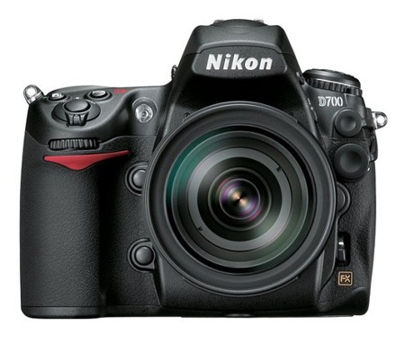
Nikon D700

After a lot of thought, I finally decided my next camera, if bought today, would be a D700. The only problem is my D80 hasn’t been stolen or dropped into a lake yet. I did drop it recently, breaking the flash, but it still works and the repair would be cheap so it’s really hard to justify dropping $2,700 on a new camera. Of course, a new camera this nice would need a very, very nice lens to do it justice. Add at least $1,000.

Price: $2,700 – $3,700

Chances I’ll ever get one: Slim. By the time I upgrade there will probably be something bigger and better in this price class. Although, I will definitely be getting something on this level, one of the gear purchases I regret most was skimping on my current rig (D80 + Tamron Lens).

ssl.jpg
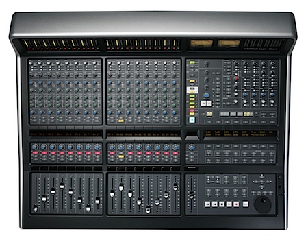
Solid State Logic Matrix Console

I thought I would sneak the big one in the middle. If you aren’t a total audio geek or professional engineer, you probably don’t know or care what this is, but if you’ve ever listened to popular music then you’ve no doubt heard an SSL console at work. SSL makes some of the best sounding recording equipment known to man and their consoles (basically huge mixers) have been used to record countless hit records. I use SSL plugins, which are basically software emulators of their real-world counterparts. The plugins do sound amazing, but there’s nothing like the real thing. 16 channels of SSL EQ, motorized faders, DAW control…The list goes on. Of course it’s not cheap, hint: just the legs for this thing cost $900. While it is a steal compared to it’s full sized brethren, the price puts it’s well into pros-only territory.

Price: $26,000 (yes, three zeroes)

Chances I’ll…. Let’s just stop there, it’s not happening. Ever.

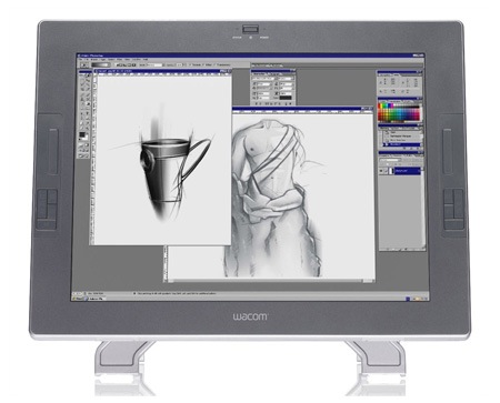
cintiq.jpgWacom Cintiq

Ok, back to something a bit more reasonable. The Cintiq is the top of the line Wacom, it’s essentially one of their tablets grafted to an LCD monitor. I got a chance to try one of these at OFFF in Barcelona and it was pretty incredible, actually being able to interact directly with the screen is a very refreshing way to work. The only problem I have with the Cintiq is that you really can’t color calibrate it properly, the touch sensitive membrane interferes with colorimeters. So essentially you would need this screen and then another for color proofing, causing a problem with desk space.

Price: $2,000

Chances: Pretty slim at the moment. This is the sort of thing I’d love to have, but it would really be hard to justify considering how seldom I would probably use it. If they came out with an LED version and dropped the price to around $1,500 I’d give it some more consideration.

akg.jpgAKG K 702 Headphones

Although not ideal, headphones are sometimes a necessity when working late hours on music projects. I broke the jack on my AKG K 240’s a while back and have sort of been limping along with them (have to jiggle the cord every hour or so to get stereo sound out of them). The K 702’s are the new, top of the line set from AKG and probably blow away those entry-level 240’s I’ve been using all these years. The beauty of buying high-end headphones for music production is that they also sound great for recreational listening.

Price: $450

Chances: Marginal. Headphones aren’t a huge priority for me so I haven’t done much research. When I do replace my set, if I spend anywhere near $450 I will definitely look around for some alternatives to the AKG’s before I take the plunge.

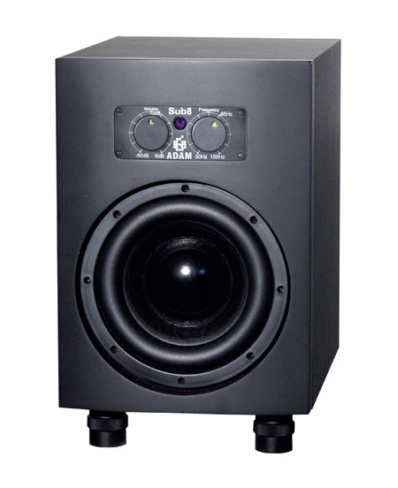
000002233.jpgAdam Sub 8

I thought I’d end it off with something I’ll definitely be getting, though from myself. I ordered the Adam Sub 8 yesterday to complement my recently acquired Adam A7’s (pictured, the speakers closest to the monitor). I have been suffering with M-Audio BX8’s for about 6 years now. I sold my Event 20/20’s, then traded my Event Tria’s to get them for some insane reason I can’t quite recall now. They are really just terrible monitors, completely inaccurate. But I used them for so long that I got used to their inaccuracies and just sort of settled into a rut. After a very long and very frustrating ordeal mixing my latest single I decided enough was enough and got the A7’s. They’re incredibly accurate and very easy to work with, my ear fatigue is almost non-existent now. The only problem is they are small, they’ve only got 6″ drivers, so it’s hard for them to fill my studio and produce the lower ranges. So I decided to go all out and get the Sub 8 to fill in the low end. Let’s just hope it lives up to the sound of the A7’s.

Price: $800

Chances: It’s in the mail.

So that’s it, not so much to ask right? Mr. Buffett, if you’re reading, I will accept a wire transfer, at your age I don’t expect you to shlep this stuff all around town. Anyways, has anyone had any experience with any of this stuff? Any thoughts? I’d love to know about the Embody in particular, that thing is calling me in a big way.