One of the greatest failures of modern computers is the lack of options we have when choosing a way to interact with them. Whether it’s a mouse, keyboard, or pen pad, the medium through which we manipulate our computers is the most important link in our workflow. An 8-core Mac Pro can’t read your mind (yet), so unfortunately we still must rely on rather archaic modes of interaction to get machines to do our bidding. Whether by choice or necessity, most designers use the good old mouse, a device which dates back to 1963 and remains largely unchanged since its inception. Sure, they’ve added lasers, buttons, and scroll wheels, but these aren’t exactly conceptual quantum leaps; the humble mouse still adheres to a fundamentally flawed model for human-machine interaction. I don’t know what’s next, but I can bet it isn’t multi-touch, at least not for us designers.
Pointing devices have always been an important issue for me, when I was in my early 20’s and getting started in design I had to wear a brace for nearly a year and learn to work with my left hand to overcome the repetitive stress syndrome brought on by mousing. This prompted me to get a pen pad, but of course I skimped and got a low end off-brand and really never took to it. I have tried the Wacom tablets, which are admittedly more precise and ergonomic, but after so many years with a mouse it’s hard to make the switch to such a foreign system. That said, I am planning to finally get a good Wacom this week and start the long road to learning it and from what I have heard from other people, I would recommend any young designer not yet set in their ways to strongly consider making the investment and learning Photoshop / Illustrator with a good tablet. Your wrist will thank you and so will your productivity. But the truth remains: most of us still use mice. Go to even the biggest design firms and you’ll see row after row of desks with mice sitting on them. This article is for everyone like me who either doesn’t want to fork out $400 for a decent tablet system or just can’t make the switch from the mouse.
Let me start by saying that I believe Logitech is about the only real player in the mouse game at this point. There are a lot of other competitors, but none offer such a wide variety of options and features in their products. And specs aside, none in my experience come close to the real-world functionality I have found in my Logitech mice. I have looked into many of the specialty companies that offer so-called “ergonomic” mice but have never gone for one since it seems I always have to sacrifice so much in the way of functionality and features to get to the improved ergonomics. I have owned about 10 Logitech mice and all have served me well in different capacities but none have really excelled across the board. I judge my mice on three criteria and in this order: precision (and I don’t mean the quoted DPI of the device, I mean how precise it really handles), ergonomics, features (wheels, buttons etc). What follows is a list of my favorite mice from over the years, why I bought them, and what I liked and didn’t like about them.
Logitech MX518
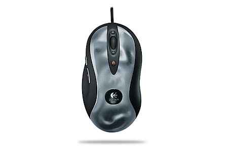 This was the first “gaming grade” mouse I bought. The proliferation of gaming mice has been great for us as designers. Apparently we aren’t a large enough group to warrant many purpose made mice but there are a whole lot of gamers out there and they’re driving the market for high precision pointing devices, forcing the manufacturers into a game of one-upmanship in regards to resolution and features, both of which benefit us as designers. The MX518 also marks the first time I went back to a corded mouse after the thrill of cordless had faded. I have never been a fan of cordless mice, they run out of batteries, lose reception due to interference, and are generally less precise than their corded brethren. But many of the best mice are only available in the cordless variety (more on that below) so at times I’ve had to compromise. But that’s one of the things that keeps me coming back to Logitech, they always have a very good selection of corded mice while most other manufacturers are obsessed with cordless (as if a small cord on your desk is so cumbersome, it reminds me a lot of the glossy screen craze that has killed off the matte screen.) The MX518 is, to this day, my favorite mouse. I still have it around and plug it in for large projects. It’s extremely precise, has a good tactile feel when moving it across surfaces, and has enough extra features to be pretty competitive. It has a rudimentary DPI toggle with 3 level settings which is a big plus when moving back and forth from Mac to PC on a KVM switch as the two OS’s have very different mouse behaviors. It also helps to be able to adjust the sensitivity on the fly as the situation dictates. The MX518 is also one of the last corded optical mice you can buy as most new mice are laser-based. Unfortunately, this mouse does not have the MicroGear wheel which I love (more on that below).
Logitech G5
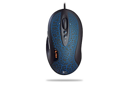 I got this mouse because it boasted higher DPI, a laser, braided cord (less tangling) and a custom weighting system. I love heavy mice, I took my MX518 apart and filled it with quarters to make it more solid and precise so the G5 seemed great because it had a built in weighting system out of the box, no quarters required. The only issue I had with it was the lack of a “forward” thumb button, something which the MX518 had. The image below is off the new (and ugly as sin) version of the G5, the old grey one that I had only had one thumb button. It’s still missing the MicroGear scroll wheel, but with the added thumb button this new version would probably be my favorite if I owned it now. Alas, I left mine on stage at a show (San Diego I think) and it was never seen again. R.I.P.
Logitech G9
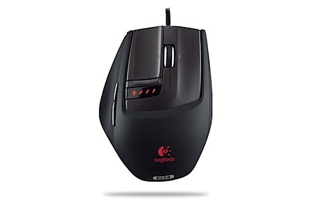 I bought the G9 when I lost my G5 thinking it would be a logical progression in features and ergonomics to its predecessor. It also sports a MicroGear scroll wheel so I thought I couldn’t go wrong. I did. I never liked this mouse, it feels weird in my hand, is too flat, and only has 2 extra buttons. For $100 I want a little more. But this is all beside the point, I left this mouse on stage at a show (detroit?) and never saw it again. Two G-series mice down.
Logitech MX Revolution
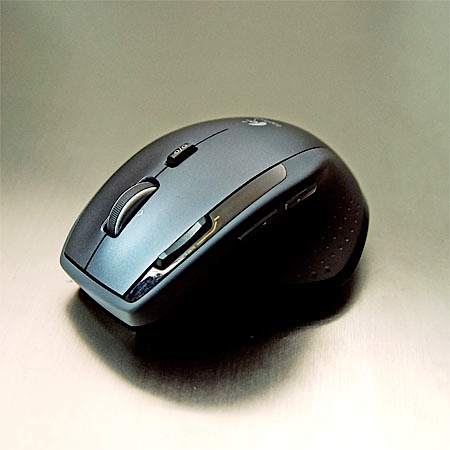
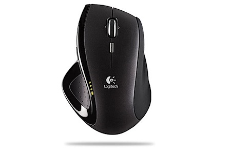 This is without a doubt the most advanced mouse you can get. It has a thumb wheel, MicroGear Scroll wheel, and three extra buttons. The only things lacking are a DPI toggle and a cord. I really wish the revolution came in a corded version, the battery life is pretty bad and the battery itself is prone to failure (a fact well-documented in forums all over the web). Mine is sort of in half-failure mode. Sometimes it charges and sometimes it doesn’t, but it always says the battery is dead which is annoying. It’s also not quite as precise as the corded mice above. Regardless of all that, it now serves as my primary mouse for everyday use. The thumbwheel is amazing for OS X (expose etc.) and if Logitech either worked out the battery issue or offered a corded version, this would be the only mouse I’d ever use.
Logitech MX1100
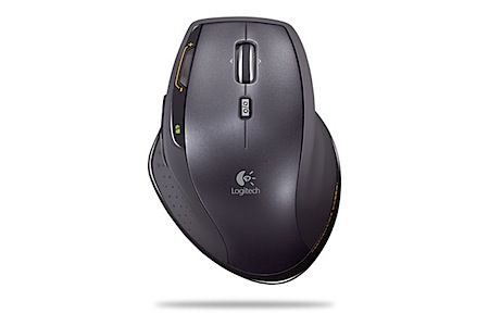 I bought this for two reasons: It seemed to have all of the features of the MX Revolution but with replaceable batteries (thereby fixing my main gripe with the Revolution), and it sported a DPI toggle. I also has a new feature which allows you to lock out the MicroGear scroll wheel which is very nice depending on the situation. It takes AA batteries, has an on/off switch, and boasts an extremely long battery life. I put Eneloop rechargeables in it and it worked out great. I love the ergonomics of this mouse and I love the features, but it’s just not very precise. When I got it I noticed something was off and kept trying to tweak settings to get it right to no avail. I run Steermouse on OS X and the Logitech software on Windows and no matter what I tried I couldn’t get this mouse to act right. All in all this thing was a huge disappointment if only for the fact that I had such high hopes for it. I now use it when I travel since it has the on/off switch and doesn’t require a charging station. It works great in this role but I certainly don’t use it to design at home. For some reason, when trying to make very small circular motions with its resolution breaks up and you end up drawing little squares instead. Not a huge deal for browsing the web, but a deal-killer for graphic design tasks.
So there you have it, my admittedly biased mini-reviews of the Logitech lineup. In the end it’s all about your preference so I encourage you to try out as many as you can to find what suits you best. Hopefully I’ll have a tablet review in a month or so once I get up to speed with the Wacom. If you have any experience with these mice or recommendations of others that I haven’t mentioned here please speak up in the comments.
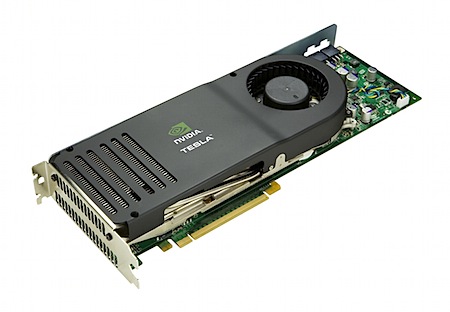



 After all the
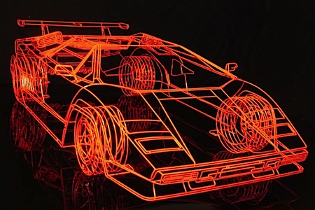

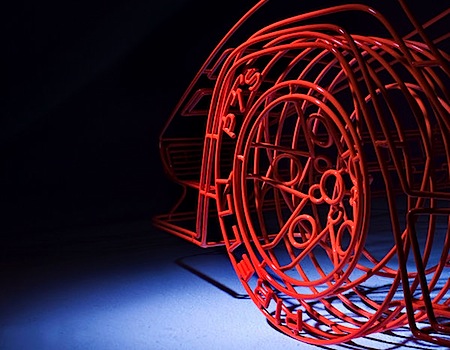
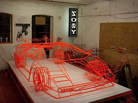
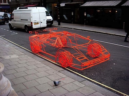 This is for all the 3D artists out there. It’s hard to tell from some of the photos, but what you’re seeing is a real model and not a computer generated wireframe. Benedict Radcliffe crafted this model of Lamborghini’s iconic Countach supercar from steel tubing. It’s incredibly detailed, right down to the Pirelli text on the tires. I can’t imagine the time that went into this, it would probably take me a year just to make this in Maya. There are a bunch more photos over at
 ![products_wacom_tablet_6x8[1].jpeg](https://blog.iso50.com/wp-content/uploads/2008/12/products-wacom-tablet-6x81.jpg) So it’s finally time to go legit and get a Wacom tablet but I’m having trouble deciding which size to get. I’m afraid if I get one to get one too big I’ll have to be making broad strokes just to get the cursor from one side of the screen to the other, and of course too small might be imprecise. Wacom offers the following sizes in it’s “Intuos” line:
So it’s finally time to go legit and get a Wacom tablet but I’m having trouble deciding which size to get. I’m afraid if I get one to get one too big I’ll have to be making broad strokes just to get the cursor from one side of the screen to the other, and of course too small might be imprecise. Wacom offers the following sizes in it’s “Intuos” line: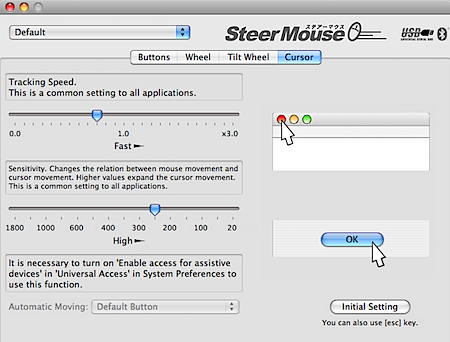 Just a quick follow up to the

 I
I I
I
 I
I


