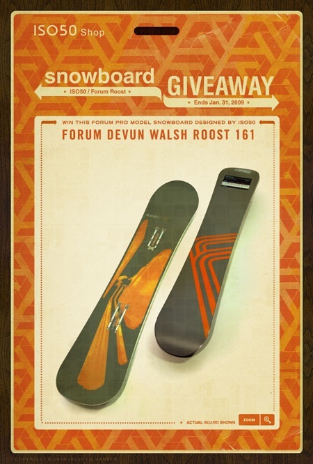
 I designed the ROOST line of snowboards for Forum and will be giving one away this holiday season. Just purchase anything from the ISO50 Shop between now and January 31st and you’ll be entered to win. The board in question is the Forum ROOST Devun Walsh 161 pro model with all the upgrades. If you win and would prefer a women’s size you can trade it out for an ISO50-designed K2 Solace (women’s). You can also choose to have the board signed or unsigned. All the details are over here. Good luck!
Posts by Scott
ISO50 Forum Snowboard Giveaway
Life Magazine Digital Archive
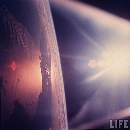
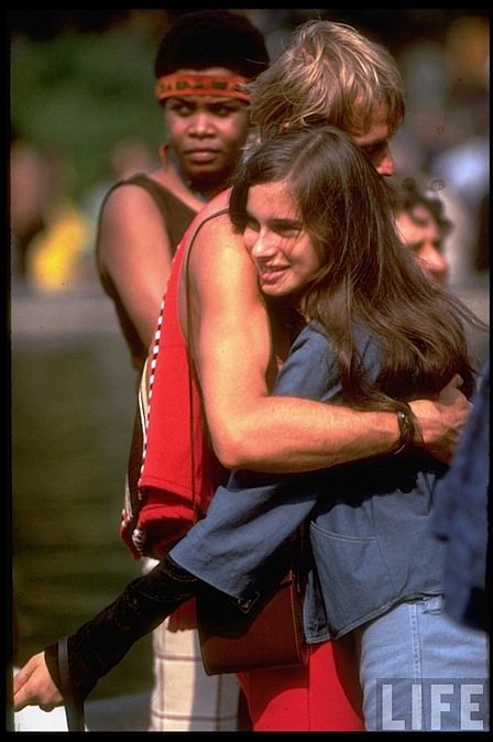
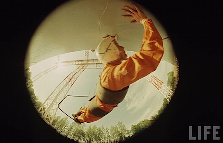
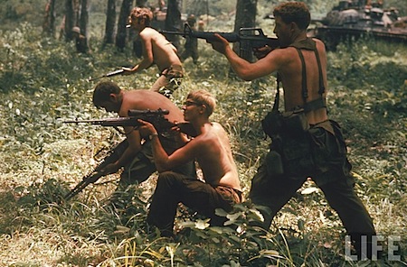 Life Magazine and Google have partnered to make over 10 million photos from the Time/Life archive available online. The images are searchable and all available at pretty good resolutions. (Athough probably not quite big enough for print) You could have some fun lifting textures and elements for web stuff I’d bet, the quality is more than enough for the screen. What’s even crazier than scanning 10 million photos is that apparently 95% of the them have never been seen before. The few I posted above were just from a couple minutes of random searching, I can’t imagine what you could turn up with a little effort. Check it all out over at Google Images’ Life Archive page.
3 New ISO50 Shirts
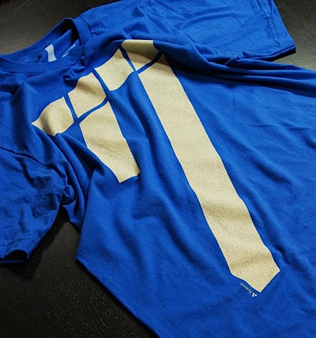
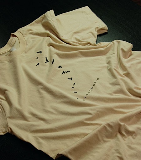
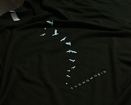 There are 3 new T-Shirt designs now available at the ISO50 shop. “77” Cream / Royal is printed on American Apparel 100% Cotton and comes in all Men’s and Women’s sizes. The two Tycho shirts are new typo / colorways of the original “Tycho Avian” shirts which have been out of print since last year. “Tycho Avian” Cream / Brown is printed on American Apparel 100% Cotton and “Tycho Avian” Black / Aqua-Grey is printed on American Apparel 50/50 Cotton/Poly. Each are available in all sizes, M/W. I’ll bee officially releasing these through the newsletter on Monday but I thought I’d post them up here so the blog readers could get a crack at them first. The product images at the shop page are temporary, I’ll try to get some close-ups and alternate angles posted up tomorrow. Enjoy!
On a side note, I can’t seem to get enough of Trade Gothic Bold Extended lately (the face used on the Tycho shirts above). I’m currently redesigning the interface of the shop and laid most of it out in TG with headers being Extended. For those in San Francisco: There’s an old California Savings (closed) on 16th & Mission (across from BART) with a very cool sign that looks a lot like TG Bold Ext. Has anyone seen that? Is it TG? It’s for sale so they’ll probably redo the exterior, I’ll try to walk over tomorrow and get a couple shots before that happens. Probably not a big rush though, 16th & Mission isn’t exactly hot property.
Swedish Dance Bands of The 70’s
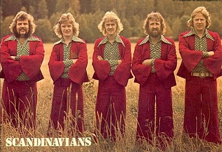
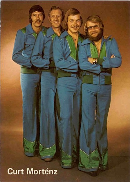
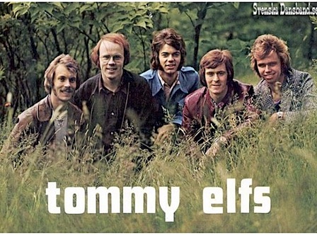
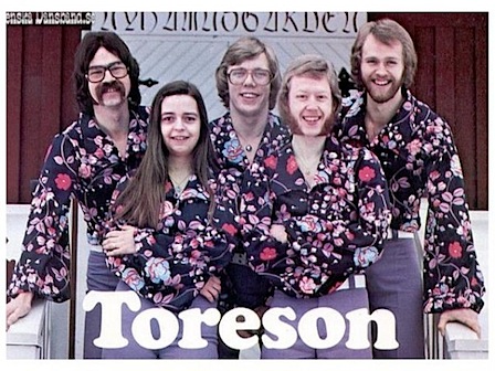
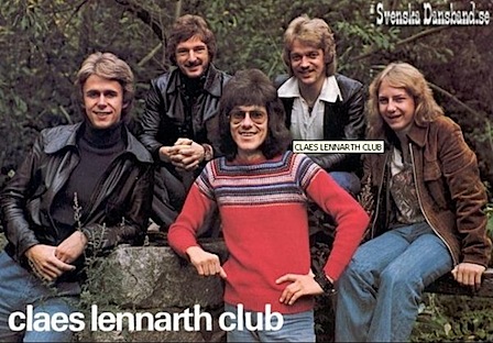
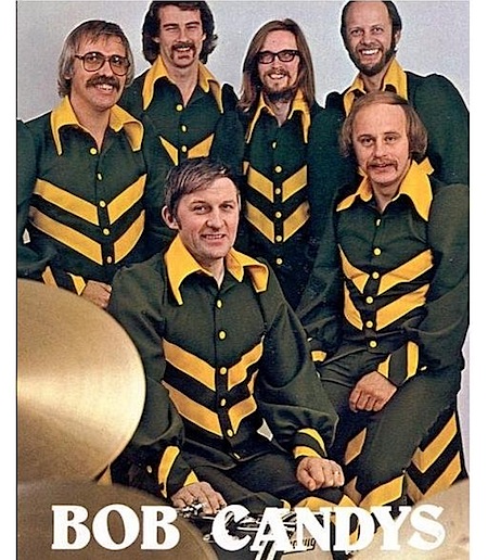 Ok, chalk this one up as random-camp-kitsch, but I just couldn’t resist posting. Pedro Oliveira sent this link in response to my assertion that “everything was cooler in 70’s Sweden” in the Vint post. As the images above make painfully clear, that certainly was not always the case. As infinitely lame as most of the stylistic choices going in in these photos are, some of the typography isn’t half bad. I don’t know what they were eating in Sweden back in those days, but this is one unhealthy looking bunch of people, Toreson look like they hid out in an ice cave for 3 years before taking their big promo shot. Which is probably what really happened, they then emerged from the cave, decided on Cooper Black and the rest is history. There are a lot more over here.
Vintage-ize Your Iphone Photos
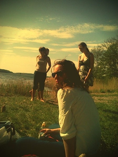
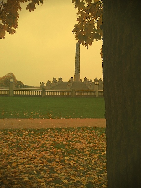 After I posted about the Poladroid app some people were asking about a Lomo version of the concept. My friend Erik Pettersson has released a set of photo processing apps for the iPhone which give your digital shots that vintage warmth. There’s a Vint Red, Green and B&W plugin, each treating the colors a bit differently. My favorite is the Green, it definitely gives you that low ISO Lomo feel complete with vignetting. More examples are available on Erik’s Flickr.You can download the Vint plugins from the iTunes store or on your iPhone, one is free, the other two are $1 each.
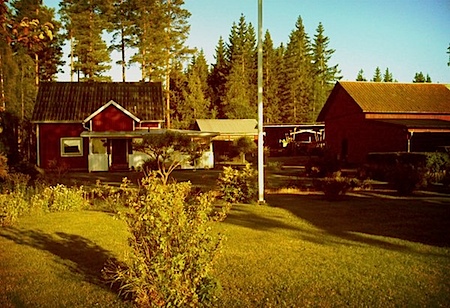
Erik also sent the photo below he says he found at his parent’s house and which was the inspiration for the plugins. Everything looked cooler in the 70’s in Sweden.
New Tycho Single On The Way
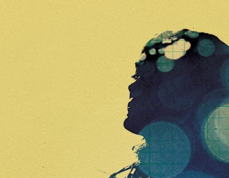 After what was perhaps the most arduous musical experience of my life, I’ve finally wrapped the new Tycho single. It’s a rather dense arrangement so getting everything to work together ended up taking 3 mixing sessions in SF and LA. I definitely learned a lot though, first, SSL is the most useful, greatest sounding EQ and compression I’ve ever used. Second, my monitoring situation at home is garbage. Time for some more Auralex and Adam A7s. Anyways, it’s done, and I’m done…for about a week or so then it’s back to work on the album.
I spent the free time I had between mixing sessions last week creating the cover art for the single, luckily that process ended up being a bit less stressful (you can see a small snippet of the artwork above). All the details will be coming shortly, the estimated release date is looking like late January. As always, you can keep an eye out here or subscribe to be notified when more info is available.
CS4 Tryouts
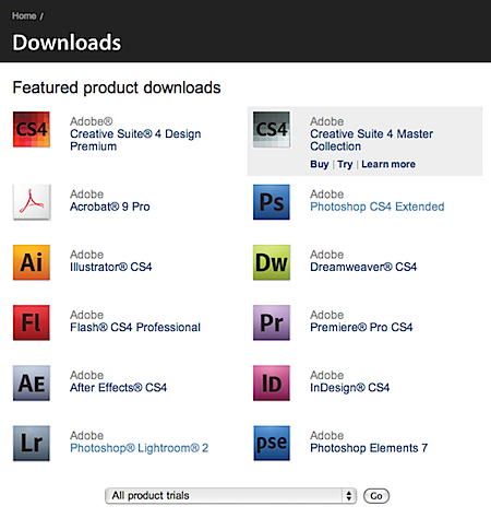 Just a heads up that Adobe finally switched it’s trial downloads section to CS4 over the weekend. All of the CS4 apps are available via a Java downloader, and all are fully functional for 30 days. Link via 9to5 Mac
Poladroid You Pictures
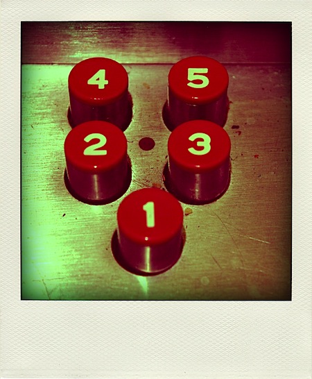
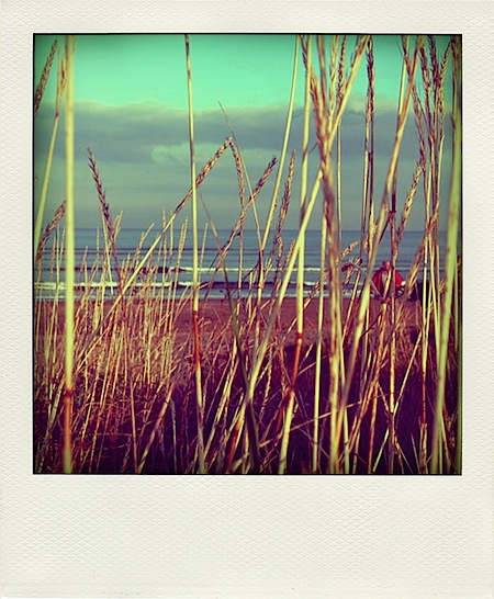
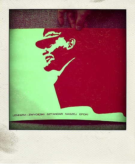
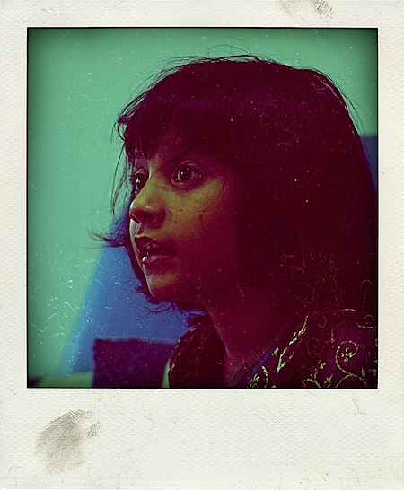 Poladroid is a new app that filters and effects your photos to make them look like, you guessed it, Polaroids. I would normally file something like this under gimmick and move on but I can’t help but appreciate the vignetting and color shift that the app lends to your digital photos, for an automatic filter it’s actually not that bad. Unfortunately it looks like you have to put up with the pretty fake looking border and drop shadow to get at that color shifting goodness, but it’s free so I can’t really complain. Check it out it at Poladroid’s site. All photos from Poladroid Flickr Group.
MLK 64
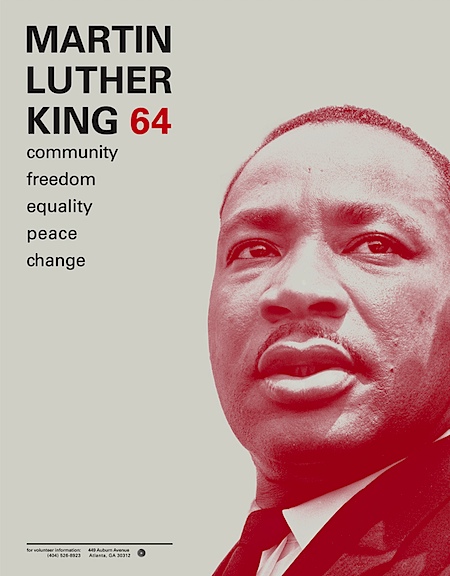
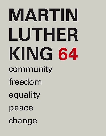
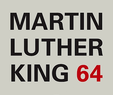 This student project by Ryan Hageman caught my eye today. Very nice color / typo interaction and a clean, direct style. There’s more over at his site notfreelance.com
