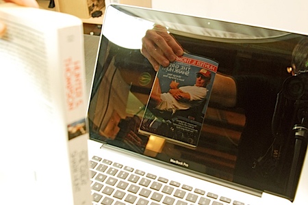

 One testament to the success of Shepard Fairey’s iconic (and nearly ubiquitous) Obama poster is the sheer number of spoofs that have turned up since he created the now famous image. The Village Voice has compiled a rather comprehensive collection of them; some are good natured jabs while others come off a bit more incendiary. Either way, it’s an interesting look at the flip side of the veritable phenomena and centerpiece of a revolution in the visual communication and branding of election campaigns. I particularly like the Mad Magazine take pictured above; as a kid I obsessively collected every issue I could get my hands on and it’s great to see them still at it. Link
Posts by Scott
Spoofing Shepard Fairey
Macbook Pro MKII: Future Artifact
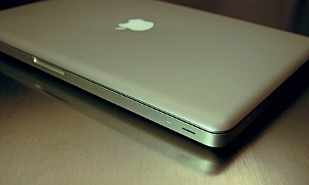
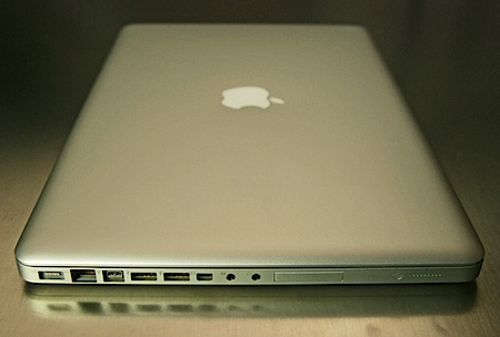
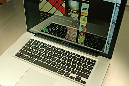 As you may have already guessed, I caved in and got a new Macbook Pro (MKII, Unibody….whatever it’s called) last weekend. Since there’s no sense in beating around the bush with this one, I’ll come right out and say it: This is possibly the most beautiful, functional, and elegant piece of hardware I have ever owned (or been in the same room with for that matter). Obviously it’s a looker, there’s no denying the aesthetic appeal; it feels as if you’re in the presence of some artifact transported back from the future. It’s almost impossibly thin and the weight is perfectly balanced, it feels almost like a solid brick of aluminum. The most incredible part is the power hiding beneath that sleek skin, it’s hard to believe Apple crammed it all into this svelte form factor. I think the real key to the success of this design is the fact that it feels and looks like one solid object. All laptops I have used until this point sort of felt like a loose collection of disparate components shoehorned into a flimsy shell. The new Macbook feels like a single unit; a rugged, seamless, integrated tool. As it should, the body is carved from a single piece of aluminum.
The battery life is also great, I have been squeezing around 4 hours out of a single charge which blows away my previous HP laptops. I Would have to say my favorite part though is the new trackpad. It’s huge, lacking a button (actually, it’s just one big button), and very responsive. The gestures are genius: four finger gestures activate expose functions, three fingers handles navigation (fwd, back, etc..) and the old two finger scrolling is intact. This is the first laptop I’ve used where I wasn’t constantly wishing for a mouse. The keyboard is great too, very nice tactility with a solid feel. A great improvement over previous versions in my opinion. Bottom line: Believe the hype, this thing is a winner.
Ok, so enough gushing, everyone knew the new Macbook Pro was going to be an amazing machine before it even came out. It does have two potentially major weaknesses, and while they pale in comparison to the upshots, I feel compelled to list them here in case any are deal breakers for those of you considering buying one. First up: the infamous glossy screen. A lot of people have lamented the death of the matte screen option which was available on the previous incarnation of the MBP. But to tell you the truth, it really doesn’t bother me like I thought it would (and kind of gives me a nostalgic feeling for my old CRTs). The glossy screen was originally a deal breaker for me, I was planning to wait until they released a matte version (which is supposedly in the works) as my previous HP gloss screens were absolutely terrible. But after comparing the new MBP with an old matte MBP, I definitely prefer the new screen. Given, it is an LED so the brightness and contrast are better than the old LCDs to begin with, so perhaps a matte version of the new LED would win out in the end. But honestly, this has turned out to be a non-issue for me; I have yet to encounter a lighting situation in which I had a big problem with glare. I took a shot of the MBP doing it’s best mirror impression (below). Keep in mind that the screen was turned off for this picture and I was running some very bright photo flood lights, so it really amplifies the effect a bit more than a normal usage scenario. That shiny screen is a fingerprint / scratch magnet though, I can’t imagine it still looking very pretty in a year or so.
Next up is Apple’s new Mini Display Port format. It’s a very, very small port that handles all of the video output duties on the new Macbook. I’m all for innovation and moving forward, but this seems like too much too soon. It also seems like Apple is just trying force it’s customers to adopt it’s own, proprietary format. My issue with the Mini Display Port isn’t that I had to buy $100 in adapters just to make it work with my existing equipment (although that wasn’t exactly a plus), my problem is that, for the time being at least, there is no TV out for the Macbook Pro. The old full-sized DVI ports had four analog pins that allowed for an S-Video or Composite adapter to be used. Even the mini-DVI ports, which would have fit fine in this new form factor, supported analog output. You might say that S-Video and Composite are old formats and worthy of deprecation in this day and age, but a lot of video professionals still rely on these formats for live performance. For most VJs, DVI or VGA just isn’t an option as a lot of venues don’t supply them on stage and most video mixers still run off S-Video/Composite only. I know this isn’t an issue that will effect the masses (clearly who Apple are shooting for), but the word “Pro” does appear at the end of this laptop’s name and I’d expect it to have all the “pro” features included. And even if you aren’t a pro, it’s always nice to be able to hook up to an older (sans-HDMI/DVI) TV in a pinch. I was really caught off guard by this issue since at the time of purchase I was told that TV out was possible and the nice salesman even sold me a TV-out adapter (which of course didn’t work considering It’s only compatible with the old MBP. Something I didn’t learn until I got home). There is hope though, I read somewhere that the new Nvidia chip does support analog out, it’s just a matter of Apple taking advantage of this ability and offering an adapter. But since they don’t currently offer such an option, I’ll have to go plunk down another $100 for a TV scan-converter which will further degrade the already poor S-Video/Composite signal I’m trying to output. (See Peter Kirn’s Create Digital Motion article for more info on alternatives to TV-out on the Macbook.) And if all that’s not enough, those who invested in Apple’s flagship 30″ Cinema display have to purchase yet another $100 adapter just to make Mini Display Port work with their monitor. So to sum up, that’s a potential $300 extra just to get your shiny new Macbook to play nice with all your existing gear/formats. (And that’s not counting a Firewire 400 adapter.)
Obviously, neither of these relatively minor issues were enough to turn me off to this otherwise incredible machine. But I guess when I see something so near perfection and the only things holding it back are such simple fixes, I tend to fixate on those problems. The bottom line is that this is a huge leap forward in mobile computing and would serve any creative well. $2000 gets the base model and $2500 will get you the beefed up version (4GB ram / larger HD / 512MB vram). The student discount will knock off around $200.
So what say you? Anyone else scored one yet? Any thoughts / issues? Sound off in the comments.
Niklaus Troxler

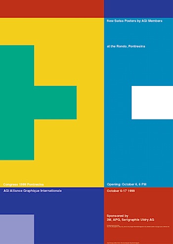
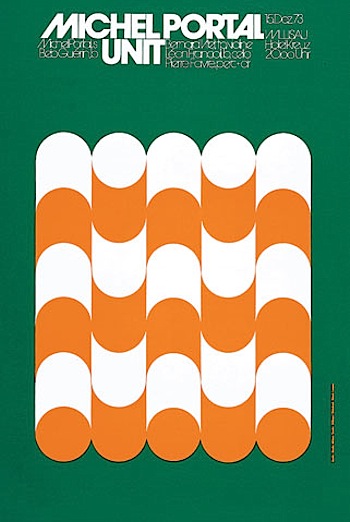


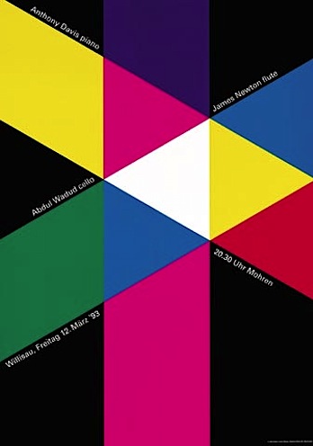
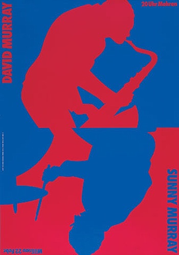
I have been searching for some time now trying to find high res versions of Troxler’s work to post. So far I’ve come up empty handed and consequently I’ve decided to just post the small versions available directly from his site. For the uninitiated, Niklaus Troxler is a Swiss born designer (and also the organizer of the Willisau Jazz Festival) who now teaches at the State Academy of Fine Arts in Stuttgart. Visit his site for more information and images. Very, very inspirational stuff.
Tampa Airport

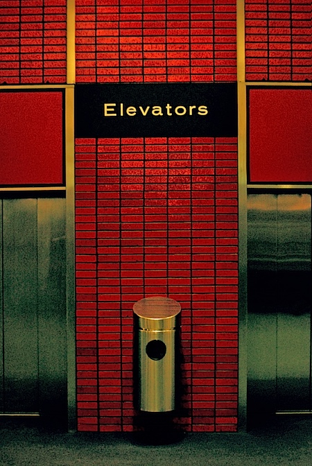
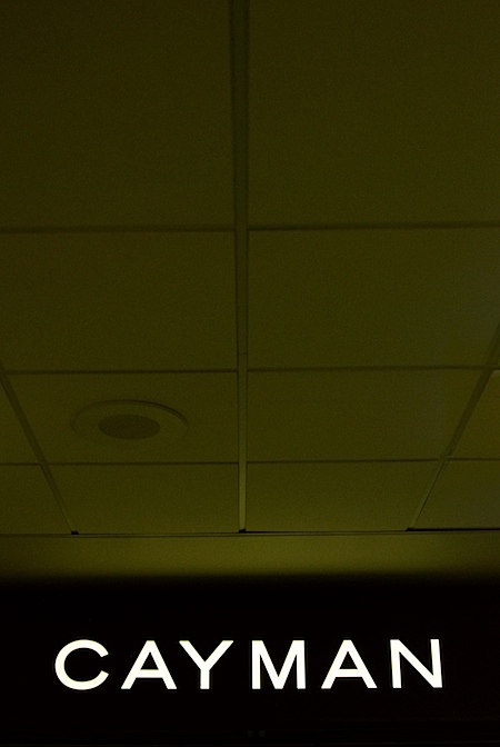 Sorry for the lack of posts this week (thanks Jakub for holding it down), I got back from Florida on monday and have been playing catch-up ever since. I flew Tampa -> Atlanta -> SFO so it was a rather grueling trip as I basically got there, played the show, then turned around and flew home. Thanks to everyone who came out to the show; it was great meeting you all and talking. I also want to apologize for the technical issues. I’m not quite sure what the cause was, but the power on stage was intermittently going out and dropping the sound system, luckily it only went out once during my particular set.
The visual highlight of the trip (aside from the sunset the night of the show which I didn’t have my camera around the catch) was the typography in the Tampa Airport. All of the signage was set in my personal favorite: Trade Gothic LT Std Bold Extended (and look at that logo!). Unfortunately, I dropped my D80 before the trip somewhat crippling it so I wasn’t able to get very good shots. I took a ton and most came out blurry or underexposed. Thankfully, Nikon has a great repair program (which I’ve used many times in the past) which is relatively cheap and quick. So I’ll just have to find a week or so when I can do without my camera and send it in. Or just upgrade…. But given that I just made another major upgrade (more on that tomorrow), I think I need to hold off a while longer on getting a new DLSR.
On a side note: A design student at the show gave me his card (the one with bears on it). I said I’d check the site but when I got home I couldn’t find the card anywhere. If you gave that to me, please drop me the link so I can check it.
Tycho/ISO50 Live Tonight In Clearwater
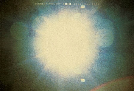 After an unplanned overnight stay in Atlanta, I’ve finally made it to Tampa for the Connext show tonight. Just a reminder, if you’re planning on coming out the show is from 5:00-10:30PM at Coachman Park. I’ll go on around 9PM, all the details are here. See you out there.
Florida
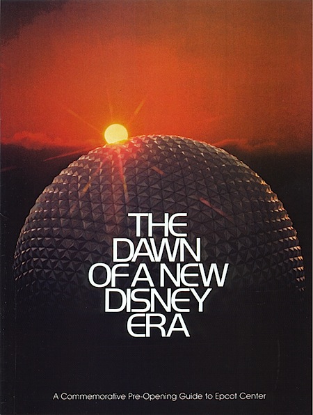
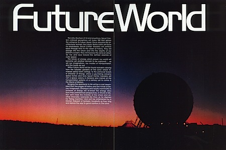
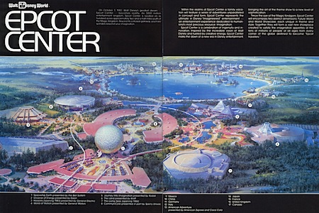
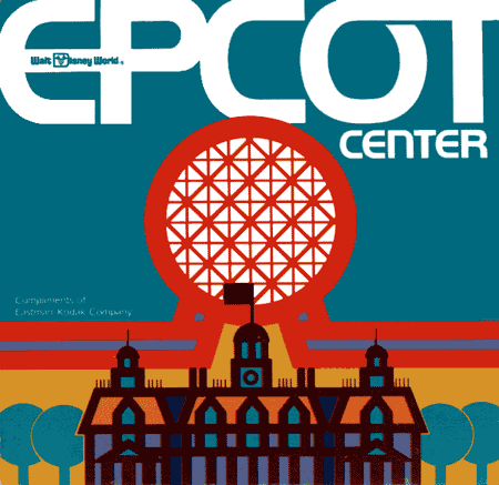
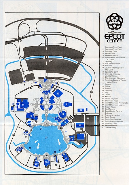 I’m flying out to Florida this afternoon to play the Connext show on Saturday. I’ve never been down there before so I’m pretty excited; unfortunately I’ll only be in town for the weekend. When I think of Florida I think of Crocket, Tubbs, and the Epcot Center. Although I won’t be going to Orlando on this trip, I thought now would be as good a time as any to post some shots from the original Epcot Pre-Opening Guide. I’m loving the logo, and bonus points if you can name the typeface they’re using.
Scans Via Jeff B
Tycho Live This Saturday In Clearwater
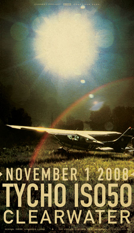
I’ll be playing a live Tycho set and doing ISO50 visuals this Saturday (Nov.1) in Clearwater, FL for The Connext Project show in Coachman Park. There will also be an ISO50 booth with posters, shirts, CDs, etc. The show starts at 5PM and from what I’ve heard I go on around 9PM. Sorry for the late notice on this, but hopefully you can recover from your Halloween hangover and make it out for the show. See you all out there…
Tycho / ISO50 LIVE @ Connext Project 2008
When: Saturday, November 1st, 2008 @ 5PM
Where: Coachman Park – 301 Drew St. Clearwater, FL 33756 Directions
Admission: ALL AGES – $5 – Buy Tickets
This event is rain or shine.
No food or drink except sealed bottles of water.
Children 5 and under are free.
And here’s the TV spot for the show:
Lance Wyman For Obama
 The latest limited edition “Artist’s For Obama” poster is by none other than Lance Wyman. Wyman, as you may recall, is the branding genius behind the 1968 Mexico Olympic logo as well as countless other brilliant marks. It’s really great to see someone still practicing successful design after all these years and obviously having fun doing it. I always wonder if design is one of the few art forms in which one can remain relevant throughout most of their lifetime; it seems that many other artistic pursuits (music, painting, etc.) are typically characterized by brief periods of genius followed by a sharp decline in output whereas the measured application of a practical, systematic approach to design can be extended into the decades. Maybe it’s that we tend to stick to coffee as opposed to heroin.
And please, save the politicking for some other blog’s comments. I am simply pointing out the fact that Lance Wyman has created new work, no one’s trying to start a huge discussion about who’s voting for whom. If, on the other hand, anyone has anything to say about the effectiveness of the design in question, please don’t hesitate to speak up.
Network Osaka

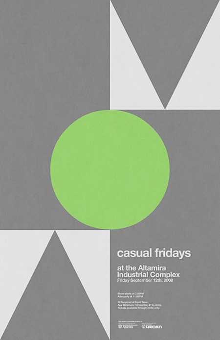
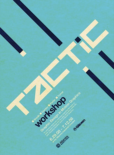

 Tonight I happened upon Network Osaka’s Flickr page via an unrelated search and was pleasantly surprised by a very nice collection of posters. The examples he’s posted range from classic modernism to more contemporary styles; all are well executed. Have a look at Network Osaka’s sites for more:
Your Camera Doesn’t Matter
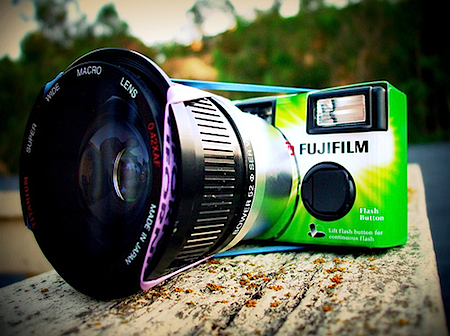 I happened on this article a while back and its message has always stuck with me (although I still obsess over new camera gear). But even a self-confessed gear addict can admit there are some pretty interesting points in there. The article by Ken Rockwell details his theory that you can achieve the results you want with a $150 camera or a $5000 camera, it’s just about understanding and working with the equipment. I don’t agree with everything he has to say, but it’s a good read for anyone lusting after some of the new, and ridiculously expensive, DSLRs popping up. And if you need proof of Rockwell’s claim that “a great photographer can take great pictures with a disposable”, look no further than Flickr where a simple search will yield some really amazing shots, all taken with disposables. A couple of my favorites are here and here. Also worth a read is Rockwell’s “$150 Camera vs. $5000 Camera” article.
I guess at the end of the day you’re really just paying for features when you buy a high end camera body. Easy access to settings, quicker focus, faster shots: it all adds up to an easier to use camera that allows you to get the shots when they present themselves. I remember my old Nikon CP 8800 fondly, it took great photos, but it was a total pain to use and I can’t even count the number of great shots I missed waiting for that thing to focus or write to the memory card (it took forever to do both).
Above image Via lslphoto
