Posts by Scott

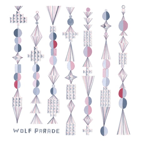
Apologies To The Queen Mary

Sub Pop Poster
I posted on the new Wolf Parade album a while back so after letting that sink in I thought I’d post some tracks from their first album, Apologies To The Queen Mary. I do love the Queen Mary album, although I have to say I am partial to the new one, At Mount Zoomer. I ran into the guys from Better Propaganda last weekend and we got to talking about bands we’re currently listening to. No matter how hard I tried I couldn’t convince them that Mt. Zoomer was a better record than Apologies. They actually seemed indignant at the mere suggestion that this new one could be better. I then ran that same crazy idea by another friend who knows a lot about music and got the same response. So apparently I’m crazy, but I feel like Zoomer has a decidedly darker tone, it sounds like the product of a maturing band finding their way out of the somewhat crowded category that I felt Apologies placed them squarely in. Apologies is a brighter, more energetic album to be certain, but I guess I’m not really looking for bright or energetic from this band.

At any rate, they are both classic albums in my book with a razor thin margin separating the two in regards to their relative quality. The beauty of the set is that they make such good companions to each other; play them back to back and you have a very fulfilling listening session.

Wolf Parade – Grounds For Divorce

[audio:divorce.mp3]

Shine A Light

[audio:light.mp3]

Student Project: Alex Cornell

fig11

Fig 1: Alex’s Class Project

Alex Cornell is a student at the Academy of Art Graduate Design MFA program here in San Francisco and he also helps me out around the studio with various design and music related things (in addition to being a designer he’s also a ridiculously talented guitarist and a knowledgeable sound engineer).

Recently he brought over a project he was working on to get some critique. Since I never went to school for design it was great to get a glimpse inside the classroom through his project and also very interesting to hear what his professor thought of my input. I had a great time working with him trying to refine the project so I thought it would be nice to have him do a process piece for the blog. I think this serves an apt companion to the Making of Obama post; a good counterpoint written from the student perspective. I am sure many of you were/are design students yourselves so you can relate, seems to me like the professor does a pretty good job of impersonating a client. The following article is his account of the process of creating the piece and working with his professor to complete the project.

(more…)

How to Show Numbers On Letterheads

286114878_dc40b78f5c_o286114992_85e3a3e5cc_o 286114710_832b4703ed_o 286114858_9c97ac4b2f_o
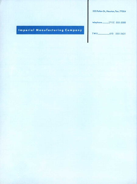
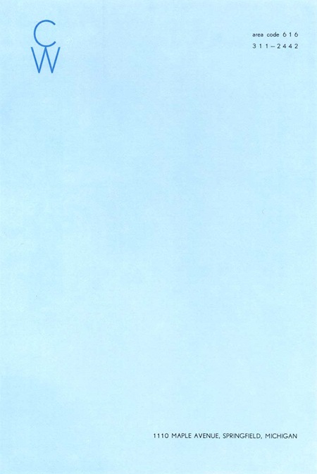
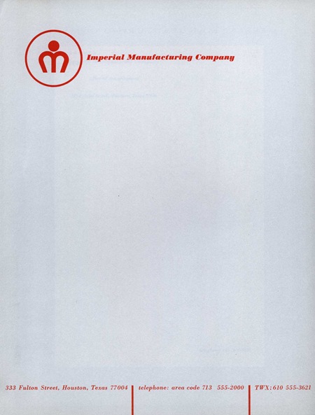
Afiler’s Flickr has some excerpts from a book by Ladislav Sutnar aptly entitled How To Show Telephone Numbers On Letterheads. As you may have guessed, the book features various examples of type placement in letterheads. It’s a very nice set of classic examples of a dying art form and is designed by one of the key architects of information design. I’ve always seen letterheads as a great opportunity to get away with being a minimalist in an otherwise standard design scenario. It’s pretty easy to convince a client that clean, efficient design is the answer in the case of a letterhead as most of the page is required to be blank by default. Of course they will probably still ask you to make the logo bigger. View the entire set on Flickr

Draplin Project

Headphone time: The language in this video is potentially NSFW.

I don’t know where I stumbled on to this video, but It’s amazing, hilarious, and insightful all at the same time. Judging from the title I thought I was about to be subjected to some sort of right-wing rant about morals and values in America, little did I know I was actually in for a very down to earth lesson in design. I really like this guy’s attitude and it’s rare that you hear someone speak so frankly and unpretentiously about design. In my opinion, he hits the nail on the head with this and I couldn’t agree more. Even if you don’t agree with him, you absolutely must agree with the Futura titling.

I don’t have much info on this, but apparently it’s a trailer from an upcoming series called The Draplin Project featuring a guy named Aaron Draplin. Aaron’s site is full of interesting stuff and some very nice examples of industrial modernist design. I’ve posted the poor quality YouTube version above for ease of viewing, but you can also download the hi-res Quicktime version from Jess Gibson’s site.

PDP11 Handbook

11_02[1] 11_03[1]
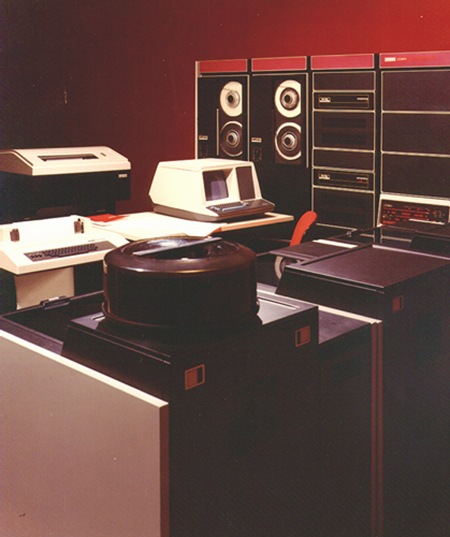
dec-pdp-11.color_pdp11.102630690.lg Up top is the original handbook for the Digital PDP11 Microcomputer (front and back). This was a successor of the PDP8 line I covered earlier. This time around we’ve got a liberal shift into the magenta range for the interface. The lower image depicts the machine in use; funny how they’ve dubbed it a "microcomputer" yet it’s peripherals fill an entire room. Makes me realize that for all the ills of the modern world, we as digital artists certainly live in a fortunate time for our chosen profession. The great irony here (considering the proliferation of computer based desktop publishing) is that these brochures for computers were all set photographically, by hand. I’m not sure what typeface that is, it looks rather custom so perhaps it never made the leap to the digital realm as a font. Let us all know if you have any ideas about it’s identity.

Really liking the cream border on the handbook and it looks to be intentional in this case as opposed to being an effect of aging like we saw in the Blue Note covers. Also, here’s an interesting example of a programming card from the PDP, unfortunately it’s a bit cut off.

Printing Posters + Restocks

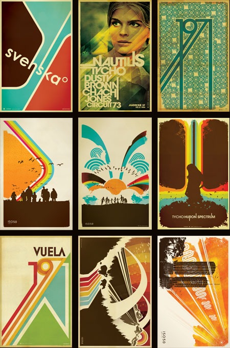
restock0708
The prints you see above have all been reprinted and restocked over at The ISO50 Shop. Many were out for quite some time and they usually move fast once back on the shelves, so if you’ve been holding out for your favorites to be in stock, now’s the time.

I often get asked where I get my prints made so I thought now would be a good time to touch on that subject and go into a little more detail about the process.  I have all of the small format posters done at a print shop in Sacramento, CA called Blue Moon Printing & Graphics. I found the place back when I used to live in Sacramento and even after moving to San Francisco I still use them as my primary printer. They are a relatively small shop so the service and attention to detail is far beyond anything you’ll find at some of the larger printing companies. I’ve found that personal attention to the output is the key element in getting your prints back looking the way you intended. It’s very difficult to make the transition from what you see on your screen to a printed piece of paper and no matter how well calibrated your equipment is you’re always going to experience a shift in color, saturation, contrast etc. The trick is to tweak the original file and the printer itself to try and compensate for these shifts and it’s important to find a print shop that is willing to work with you through this process.

I have the prints made on a digital thermal press which is essentially a toner-based process. I really like the output of this process because in the darker areas the toner builds up a thicker layer, giving an almost screen-printed effect when viewing an area of high contrast (such as a transition from cream to dark brown; the dark brown will appear to be painted on top of the cream background). The other advantage of the digital press (as opposed to offset) is that there are no plates involved so proofing and tweaking is a much quicker (and cheaper) process. You can adjust the file and run off a new proof in about 5 minutes as opposed to etching new plates and resetting the press as you would in an offset scenario. The only real downside of this process is the format limitation, the prints can only be 12"x18" at the largest. You are also limited to the type of paper you use as the toner won’t adhere to coarser papers; although I like to use a natural tone cover stock which is pretty smooth so this is not a big issue for me. The natural tone stock also has a yellow cast to it so that the yellow range in the lighter areas of the image is boosted. It gives the image a sort of aged, authentic feel which I think takes a bit of the edge off the digital output.

Blue Moon does have a traditional offset press but they just recently got it and I’ve yet to test it out. If you’re looking for a good printer I highly recommend them, and since they can do the whole proofing process via mail it doesn’t really matter where you’re located (my friend in New York does all his printing through them). You can find more information at their website: http://blumoonprinting.com.

I’ll be doing a post on monitor calibration soon in which I will go into more detail about preparing work to be printed and working with color profiles and printers…stay tuned.
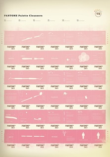
Marketing Clients

I wouldn’t normally post something like this, but it is Friday and this is pretty good. I am having bad flashbacks from my freelance days, sort of in the same vein as this. Enjoy the weekend, but if you have clients like these, I am sure you’ll be stressing all the way through it anyways.

IBM Slides: 1975

ib9[1]ib31.jpgib61.jpgib55.jpgib47.jpgib101.jpgib23[1]ib7[1]
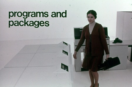
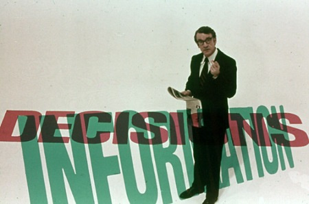
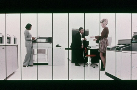
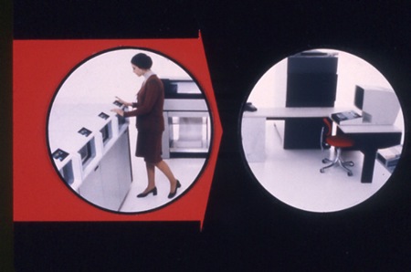
Stuart Dixon sent in these slides from a 1975 IBM presentation. They’re posted in a collection featured at Square America; the only information listed is the tagline at the top:

"It’s 1975 And This Man Is About To Show You The Future (Scenes From An IBM Slide Presentation)"

Have a browse through the rest of the collection, there are some really nice slides in there. I particularly like the information design examples like the last image pictured above. As far as I can tell much of it is set in Helvetica, but there seem to be a couple other faces floating around in there. The segmented slide (4th one down from top) would be great as a massive wall hanging. Someone needs to email Square America and see if we can get hi-res versions of these; many would make great posters.

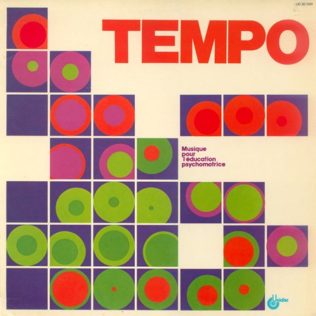
Tempo

_tempo_20070104123034
Bernard Gérard "Tempo: musique pour l’éducation psychomotrice"
Via Sleevery

Current: Ghosts of Techno

While I was in Detroit for DEMF last month I taped a segment for Current TV as part of a feature on Ghostly International (the label which I record for as Tycho). The feature is a good introduction to what Ghostly is about and includes some interviews with a few artists (Osbourne, Kate Simko, and myself).

Yes, it was a bit early and I think I’d had one coffee too many for that interview; no, I don’t know why there are random clips of me taking pictures of dumpsters. A couple of the pictures I was taking in those clips are included in the Detroit DEMF post. There’s also a clip of some of the actual DEMF set towards the end. The whole experience was a bit surreal; I played the opening set at DEMF around 1pm after a long night, was weird to be playing outdoors, in the early afternoon like that. The coolest part was that you could see Canada from the stage (look across the river in the shot from behind).

Original video link