Posts by Scott

N+M II

384128807_9176f16797_o 384128850_d5a578e2f3_o 384128309_3f76d943f2_o 384128669_78b2c97553_o
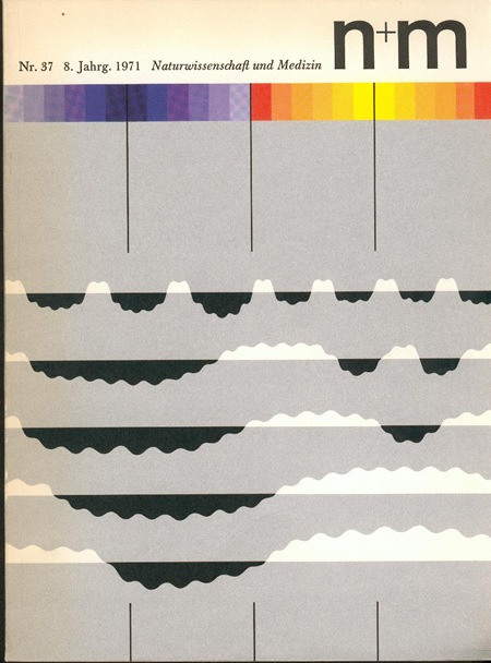
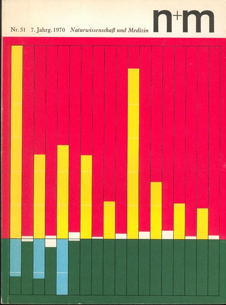
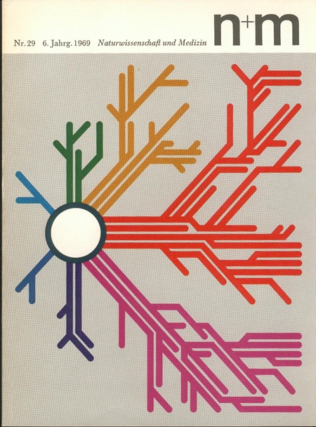
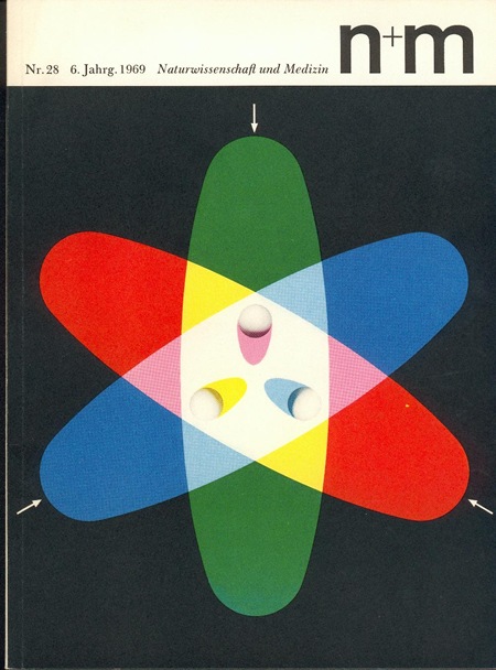
Some more brilliant covers from N+M (Naturwissenschaft und Medizin) Magazine. They were designed by Erwin Poell in the late 60’s. These are such incredible examples, not only are they beautiful, but they are no doubt conveying some extremely complex concepts through information design.  There is apparently a book covering Poell’s work (via Thingstolookat):

Title: Entwürfe für den Alltag. Typografie, Grafik-Design, Art Direction
Author: Erwin Pœll
Year: 1992
Publisher: Birkhäuser Verlag Basel
ISBN: 3-7643-2758-8

Also check out Things To Look At’s article on Poell and the N+M covers.

Fabric 13

fabric13
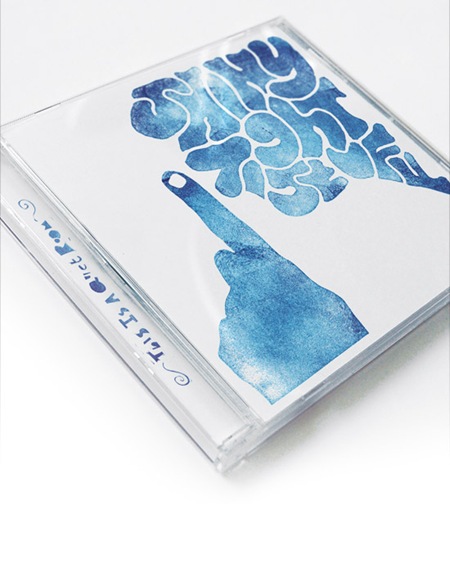
Micro-House, Minimal, whatever you call it, Fabric 13 (named for the London nightclub) was my first proper introduction to a style which I’ve really come to appreciate for it’s stripped down compositions and attention to detail. I’m a self-confessed maximalist when it comes to my own music so I really admire the producers of this genre for building so much energy and emotion into these seemingly simplistic sonic landscapes. Geiger’s wonderful mix of I Think About You isn’t quite as restrained as Villalobos’ offering, but a similar ethic permeates both tracks. My only complaint is that Geiger’s mix gets cut short just as it seems to be hitting it’s stride, but I suppose that was the point, damned minimalists! Another stand-out track from Fabric 13 you may remember is Jackson’s mix of Run Into Flowers which I posted on a while back.

As for the cover, I’m not such a huge fan of the haphazard-collage / inexplicable-gaussian-blurring / drop-shadow look, and it doesn’t really speak to the vibe I’m getting from the music inside, but at least the type is well executed.

Heiko Voss – I Think About You (Geiger Mix)

[audio:geiger.mp3]

Ricardo Villalobos– Easy Lee

[audio:easylee.mp3]
A quick note: I’ve installed the beta version of Martin Laine’s Audio Player WordPress plugin (thanks Karl for the heads up). This new Flash MP3 player replaces the old one and should do away with some of the quirks people were experiencing before. Please let me know if you have any issues with the new player.
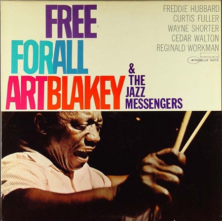
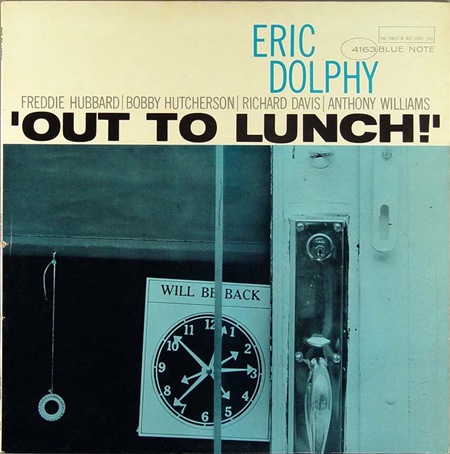
More Color For Blue Note


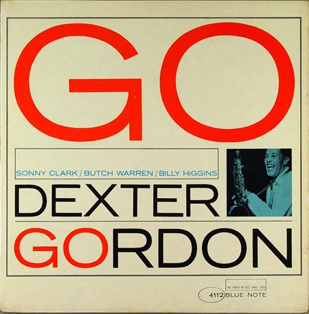
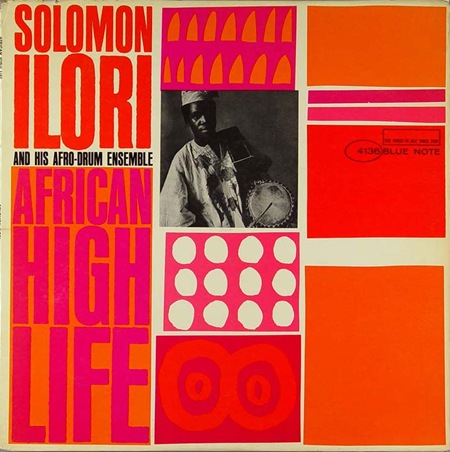
In the last Blue Note post I went with the more duo-tone offerings but with these 4 covers we see a bit more color injected into the compositions. That Dexter Gordon one is choice, this sort of stuff really needs to be offered in poster form. I always wonder who actually owns the rights to these images, I assume EMI does (they now own Blue Note), so that doesn’t bode well for future large format prints.

Massive bonus round: Name all the fonts used on these covers.

By the way, if you missed it last time, there was quite a nice debate running in the comments after the original Blue Note post. Worth a read, some good opinions from people in there. But no matter how good your opinion is, you can’t sway me from my original position: Cream > White!

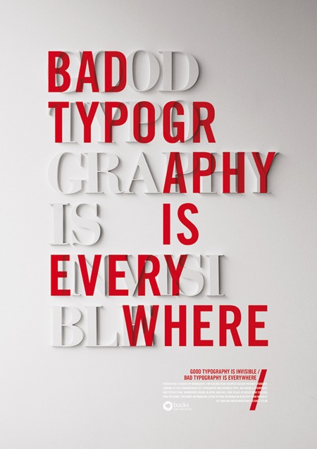
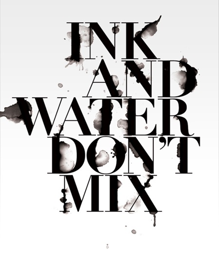
Craig Ward: Typography

533181210951137ink_and_water sts_550x700px tocutashortstory_550x700px
I just stumbled across Craig Ward’s site this evening. Really loving his type-centric design style. Check out the rest of his stuff here

Polish Stamps

all-stamps
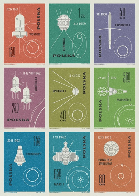
Some very nice 60’s-ers Polish stamps via The Ministry of Type. I have a whole book of Czech stamps in this style, I will get some scans / pics up soon.

Orquesta Sinfónica de Puerto Rico

puerto
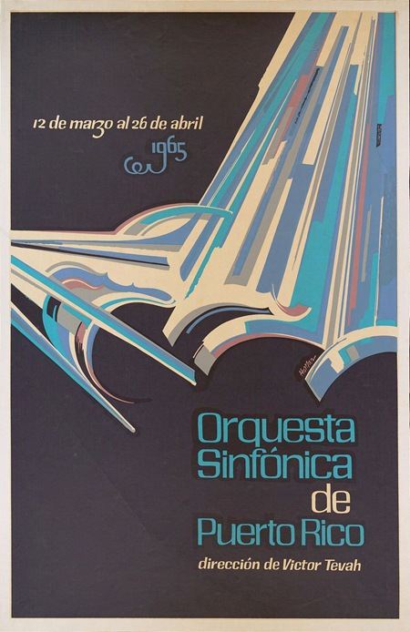
Some awesome typo going on in here, found it over at The Ministry of Type. It’s apparently by Puerto Rican artist Lorenzo Homar, there’s a full bio on him at the bottom of the page. Really very nice hand lettered style, The Ministry briefly discusses the possibilities of creating a digital typeface based on the top font up there, let’s hope that happens at some point. The bottom one, although obviously hand lettered, looks familiar…But I can’t put my finger on it. Any ideas?

Rod Laver

827-117747-1 827-117747-5b 827-117747-3
I don’t pretend to understand sneaker culture, and rarely indulge in buying shoes for any other reason than that they look and fit good. But there are a few designs I hold dear, shoes I used to wear a lot or that just remind me of growing up. One shoe in particular is Adidas’ Rod Laver, I used to wear the white/greens all the time. Sort of burnt out on them (if that’s possible) so I don’t currently own a pair. I came across these new "Laver Classics" on Zappos today, but of course, they are out of stock. Guess I’ll have to actually venture out of the house to find them, perhaps one of the billion boutique shoe stores up on Haight Street will have them. Anyways, these are amazing, can’t wait to score a pair.

Funki Porcini

b0011234_18552294
This classic from Funki Porcini’s album Hed Phone Sex always hits the spot. I’ve been wanting to post it, but not wanting to post it’s poorly designed album cover. So I’ve posted the cover to another Porcini release, Fast Asleep, which is amazing. If you look closely you’ll see that the titling is all done in vintage audio gear, pretty clever.

Funki Porcini – Dubble

[audio:dubble.mp3]

Kick Ass Speed Boats

book_art_4_025 Crouse04 Crouse09photog28 photog25
These are some hi-res shots from a 70’s speedboat cup held by Benihana (Yeah, the Japanese restaurant. Apparently the owner used to be into boats until he almost died when his disintegrated in the San Francisco bay). I’ve had these pics laying around for a while and figured I’d post some of them. I really like the photographic style, very nice colors. And check out the paint jobs on the first two, rad.

Banksy Revealed?

124659356_bbe1e5b661_o
Banksy may be one of the most famous artists in the world but his identity has been a closely guarded secret, perhaps until now. The Mail UK has printed an article that supposedly reveals Banksy’s true identity and has even gone as far as to print a photography (allegedly) of him. I find it funny how the media are always so concerned with the background of people like this. We have no control over where we come from or how we were brought up, we can only control where we go after that. And besides, it’s the message, not the messenger. If accurate, this article will surely put a dent in Banksy’s ability to create in the future. So it begs the question: if you care enough about art to care who Banksy is, why would you destroy what he is trying to do by writing an article like this? Article Link

Photo via nolifebeforecoffee