That last post (particularly the OEPBS Ident) reminded me of this bonus video from the Japanese version of Boards of Canada’s Trans Canada Highway EP.
WARNING: The end is somewhat NSFW.
That last post (particularly the OEPBS Ident) reminded me of this bonus video from the Japanese version of Boards of Canada’s Trans Canada Highway EP.
WARNING: The end is somewhat NSFW.
A small collection of Network Identifications from the 60’s-80’s. I always loved the synthesizer work on these and the mechanical video effects are something you just can’t fake. The second one down is the OEPBS (Oregon PBS) sign off from the 80’s. The beginning is just the standard PBS ident, but watch until 0:35 and you’ll seen their own amazing logo animation complete with warbling analog synth melody.
This has me feeling a bit dated, I remember vividly each of these (with the exception of the Oregon PBS Ident).
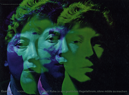
Hoffman-La Roche commissioned this ad featuring photography by René Groebli for the anti-anxiety drug, Esanin. At first glance I really didn’t grasp how amazing this composition is. If you really study it you’ll see some incredible typography and layout. I love the image, the various faces blending to create these almost psychedelic colors is very striking. Those crazy Germans, why do they have to be so good? You’re making us all look bad.
Via Alki1 on Flickr.
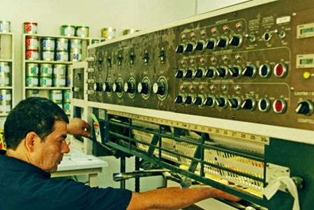
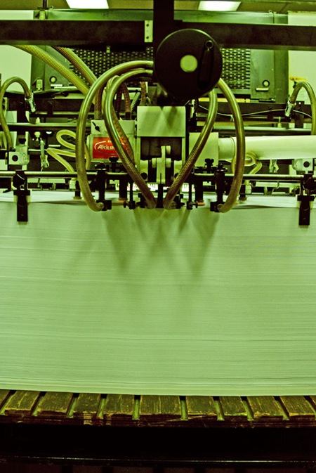
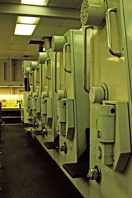
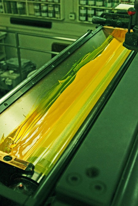
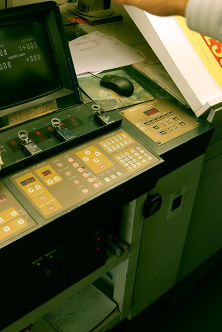
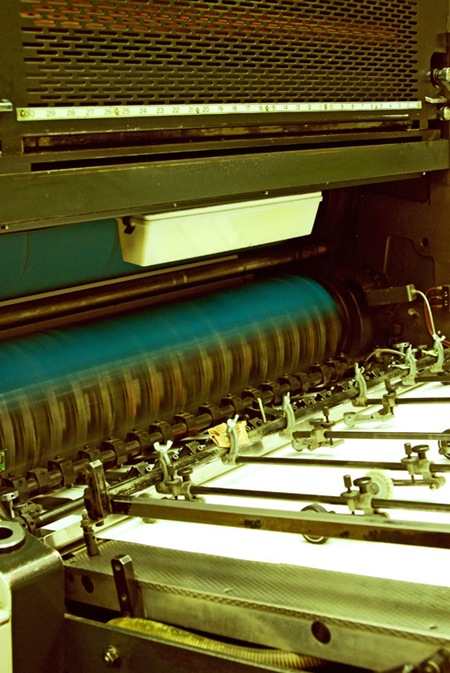
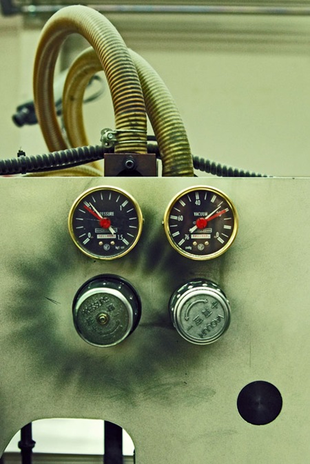
I’m at Continental Colorcraft in LA for the Obama printing. The proofing is complete and the presses are running at full tilt. As the title suggests, they aren’t playing around at this place, the press is the size of a small house. Some really cool 80’s era industrial design going on, great knobs and dials (the first shot looks like a Moog Modular, can’t go wrong with that). Not trying to be a tease (as some of you commented on the last post) but you can catch a couple small glimpses of the print up above.
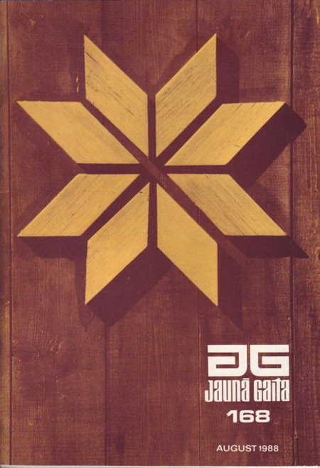
I came across a nice cache of Jauna Gaita cover scans on Mikus Vanags’ Flickr. Some of the scans are better quality than the ones on the official JG site which I posted yesterday.
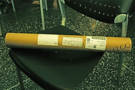
I’m sitting at San Francisco International right now waiting to fly out to Los Angeles to proof the Obama poster. I’ve got the Epson soft proof in hand (pictured above) and it’s looking good color-wise; here’s hoping they can match that with the litho. I’ll be getting a lot of shots of the process while I’m down there and, from what the campaign told me, I’ll be able to start releasing pictures of the poster within a week as long as everything goes well today. I plan on doing an in depth study of the whole process with images from various stages of the production from concept to finished product, I’ll be posting that here once the print is finished and as soon as I get the go-ahead from the campaign.
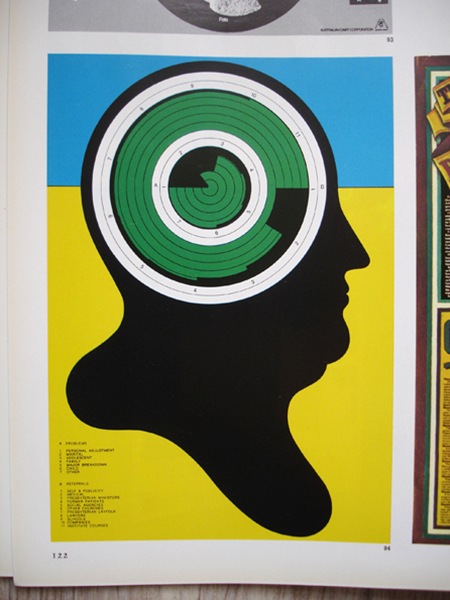
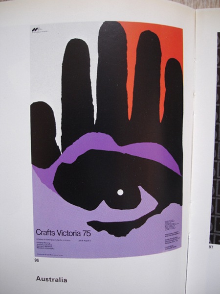
Some more pages from Graphis 190 (1977/78) via insect54
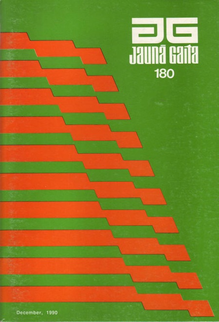
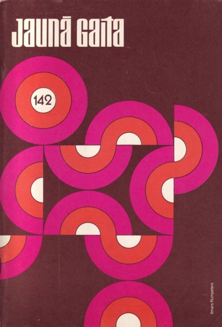
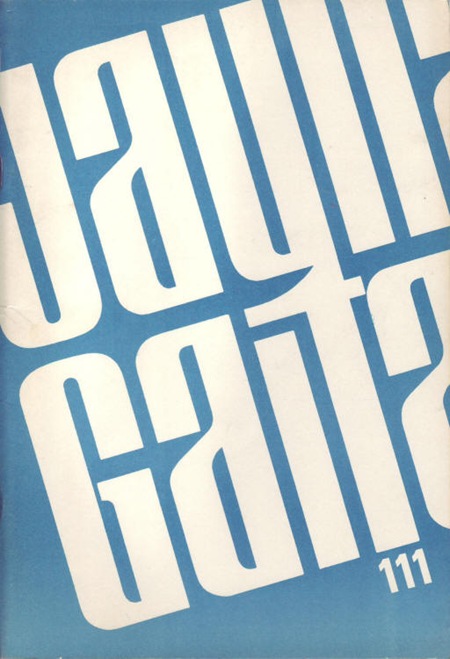
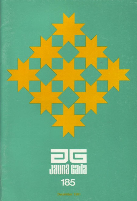
I don’t think I have been this excited about design in a long time; to me this is as close to perfection as is humanly possible. I was checking out Grain Edit before bed last night and came across a post about the Latvian magazine, Jauna Gaita (The New Course). I’ve never seen so much great design collected in one place for one purpose. The magazine is still in print and you can view over 50 years of covers here. Thanks so much to Dave at Grain Edit and his sources for turning me on to this great source of inspiration. This is the sort of stuff I am compelled to re-design in large format just to print up some posters for my house.
Incidentally I am flying home from Lisbon in a couple hours; sort of sad to leave as I didn’t have as much time as I would have liked teo really take in the city. But there’s a lot of work to be done back home so it’s time to go. On Thursday I fly to Los Angeles to proof the Barack Obama poster so I should have some shots from that posted up soon.