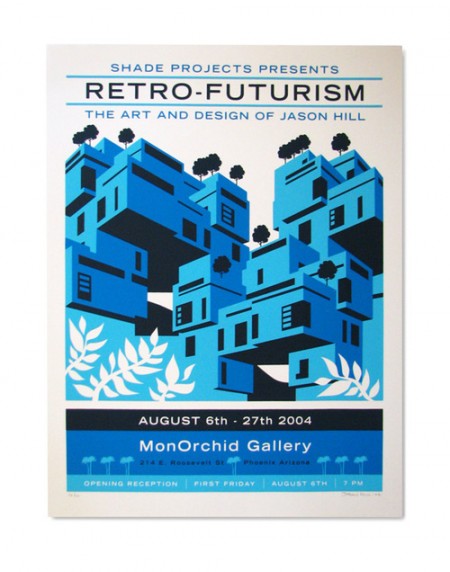
I was really taken by this poster by Jason Hill. All of the elements are appealing to me; the type, the illustration style, and even the words chosen. I would imagine anything held at the “MonOrchid gallery” must be kind of awesome to live up to such a sexy name. I wasn’t familiar with Jason’s work previously, but he has some really interesting pieces in his portfolio. His Dreamscape series is pretty rad.
Posts by Alex
Jason Hill
Dieter Rams in Frankfurt

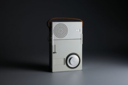
I am very jealous of any of our readers that are able to make it to this event. Starting May 22, the Less is More exhibit will be at the Museum für Angewandte Kunst in Frankfurt, Germany. The exhibit surveys Dieter Rams entire body of work and is also accompanied by a lecture series. I’m hoping this Vitsoe sponsored roving exhibit will eventually make its way to California. Though the last time I wanted to visit a design museum, I had to all the way to Milan.
If you can’t make it to the event, do remember the 800 page catalog I posted on not long ago. This book is terrific. If you haven’t picked up a copy yet, they are available from Vitsoe and Amazon.
Dribbble
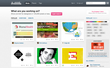
Dribbble is a place to share little snapshots of what you’re working on. It’s kind of like Twitter, except instead of being limited to 140 characters, you’re limited to 120,000 pixels. Better have a good eye for cropping!
Dribbble is show and tell for designers, developers and other creatives. Members share sneak peeks of their work as “shots” — small screenshots of the designs and applications they are working on. It’s also a place to talk design, give and receive feedback and iterate toward better work.
They exited private beta about a month ago and are in invite-only mode right now. I’m very impressed with how solid the site feels overall. Seems like they spent a really long time finessing all of the details. I haven’t had a chance to ‘dribbble’ any of my own projects, but I really like the concept and I think it could be really fun to use. If you want to try it out, you’ll need to be drafted.
Renaud Hallee
Sonar and Gravité by Renaud Hallee. Both are ridiculously awesome. Make sure to watch Sonar until at least 1:17, that’s my favorite part. Mega simple ideas like these are endlessly satisfying to me (especially when executed this well). I want to see more from Renaud! Both of these are almost a year old now, would love to see what he’s been up to recently.
Overnewsed but Uninformed
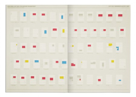
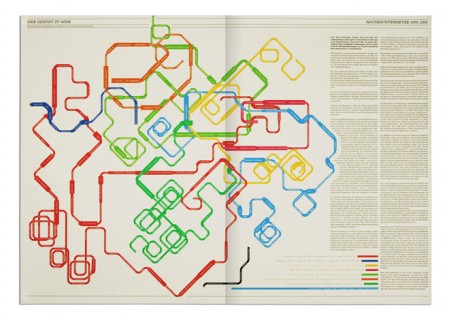
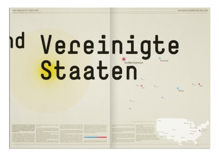
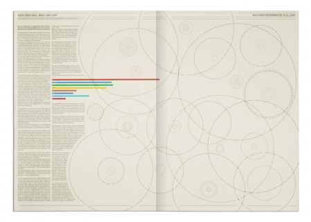
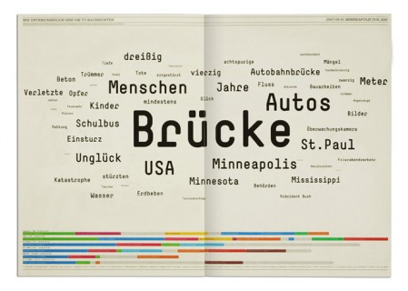
Overnewsed but Uninformed is a collection of infographics and by Stefan Bräutigam. When I first saw the title, I misread it thinking it said Overnewsed and Uniformed, which could also have made sense strangely enough. As it is, Stefan point is something we all can relate to: feeling overwhelmed with incoming “news” while actually learning nothing at all. At least that’s what I can gather, some may be lost in translation. Either way, the design is pretty brilliant.
Volkswagen Folding Bik.e
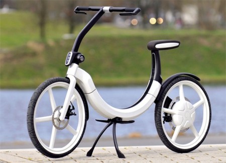
We think far beyond the car as such, with a focus on mobility in general. We do this regularly in concept teams made up of specialists with a mission to look into the future and give up existing conventions. – Dr. Ulrich Hackenberg
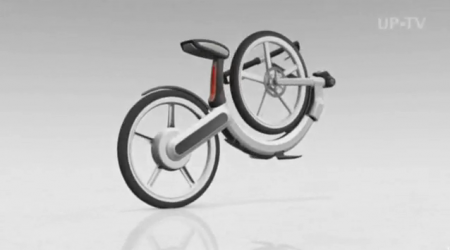
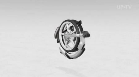
The two wheeler above is Volkswagen’s latest bid in their mission to become the most innovative and environmentally friendly car maker in the world. Of course the VW Bik.e looks just like a bike, though I didn’t notice the lack of pedals at first (indicates how often I ride a bike). This folding contraption is battery powered and has a range of 12.5 miles, with a top speed of 12.5 mph (apparently allows legal helmet-less riding). Given these specs it’s definitely intended as an supplement to your car. In its collapsed state, it easily fits inside the spare tire compartment in your vehicle. Check out the video below for the animation showing it going from bike to tire. Sounds like it might actually be for sale too, eventually.
As an idea I am skeptical. I don’t like the reliance on cars to get you to a place where you can practically bike about. If you don’t live in a dense city or a city center, this solution is always going to be a car + bike situation. While the design is obviously a step in the right overall direction, I prefer urban mobility solutions that remove cars from the equation completely. That said, this is definitely the coolest looking folding bike concept I have seen. (Here is another one if you are interested, this one with pedals.)
Kidnapping Myself on Youtube
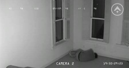
Last year I invented an aeronautical research company called Aeolas International. Their sole purpose was to take my Youtube personality hostage and post videos of their scientific findings. Ideally people would think that this was actually happening and I would eventually become mega famous. This didn’t happen exactly as planned, but the process of diving deep into a self initiated project was terrific and something I would highly recommend. I’m excited now to get a chance to further explain the project; the motivations behind it, the process, and what eventually unfolded.
Background
Some of you may know that I am also a musician. Most of the work I have online is design related, but I also maintain a Youtube page where I mainly post covers of my favorite songs. I’ve been posting over there for about 2 years now and some videos have done quite well (150K + views). Most chill somewhere around 15K. Overall it’s been a great way to get my musical side out there and generate a fan base. An example of a “normal” pre-Aeolas video is below.
At the end of last year I decided it was time to switch it up. I was enjoying my periodic recording sessions, but I wasn’t nearly as into it as I was when I started. The market had become significantly more saturated with cover artists and I felt like I was just one of thousands of people doing exactly the same thing. Initially, I felt like I was distinguishing myself with higher quality recording techniques, but even this became relatively commonplace. After an intense brainstorming session, I decided it would be best to invent an old aeronautical research company called Aeolas International that would take me hostage. I didn’t really have much of a plan beyond that when I started.
Maxim Zhestkov
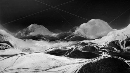
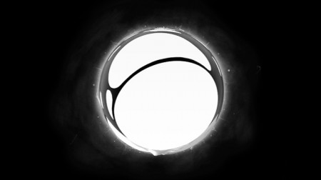

I’m still wrapping my head around how cool those videos were that Jakub posted yesterday. In a similar (but stylistically divergent) vein, these clips by Russian artist Maxim Zhestkov are stunning. He’s got a few videos on his Vimeo page, the rest you have the see on his site. If you click the thumbnails above, they will link to their corrosponding video. They all remind me of the Minus the Bear “Planet of Ice” album cover, if everything went completely crazy.
Phil Ashcroft
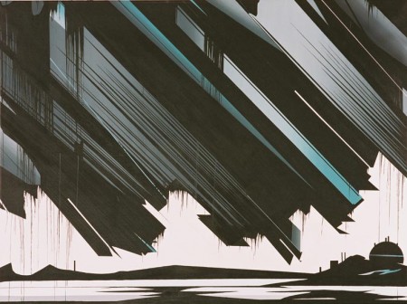
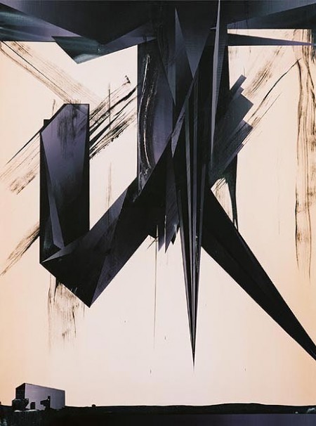
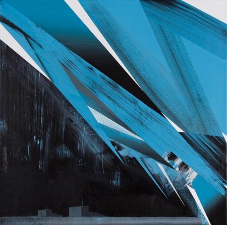
Big fan of these paintings by Phil Ashcroft
The unknown is a space at once fascinating and fearful by mankind’s technological advances and the romantic notion that there still lies undiscovered elements to the world in which we live. A derelict hospital, oil depots, nuclear power stations, the abominable snowman; collectively these semi-surreal settings and cartoon-like motifs appear as mysterious manifestations, phenomena both real and imagined. link
Qubik
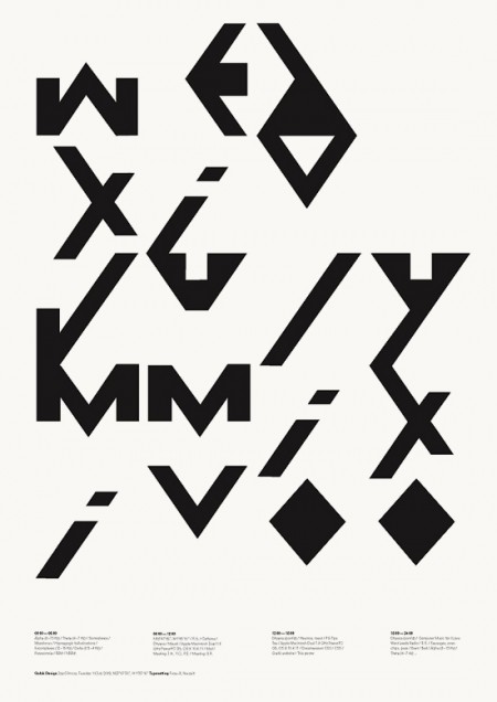
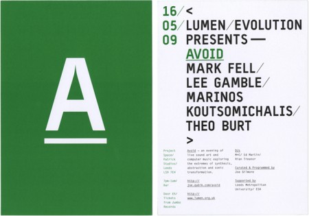
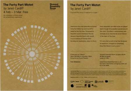
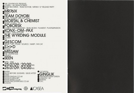
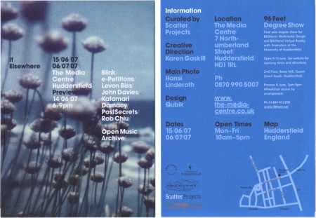
Qubik Design is a graphic studio based in Leeds UK. I like everything about these pieces except the color. The layout and type compositions I find very interesting; personally I just don’t prefer the chosen hues of green, blue or gold. Otherwise I think this work is fantastic. Especially that first one! I also like how clean and organized their site is. I’m starting to appreciate this much more now as a writer; recently I’ve come upon a number of sites that are so poorly laid out I give up researching, even if the work is amazing.