Posts by Alex

Trent Mitchell


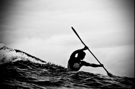
A few photos from Australian photographer Trent Mitchell. That first image is really amazing — looks more like a painting than a photo to me. I am obsessed (and terrified) of the ocean, and I love shots like this that capture the colossal power and beauty of the ocean.

The other day I was convinced I needed to take underwater shots with my new camera. Thinking an underwater housing might cost somewhere around $100, I set out to purchase one and rent a wetsuit. This, I’ve learned, was a naive assumption. An underwater housing for my camera costs approx $3500. The dream died as quickly as it appeared.

The original inspiration for this underwater mission was the work of Asako Narahashi. The idea of floating just off the coast of various beaches, taking the occasional photo, sounded pretty good. Looks like I’ll have to make due with a complicated array of ziplock bags.

Dropular Reboot


After being “almost done” for the last couple weeks (months?), the newly redesigned Dropular has been released into the wild. Dropular, like FFFFOUND and vi.sualize.us, is a social bookmarking site for images. I used it a fair amount when it first came out; I liked how clean and streamlined the design was. It was also very easy to tell how images got to the front and what the “top” image criteria was (unlike FFFFOUND, which is a complete mystery to me). You could organize the content by “most dropped” of all time, the month, etc. You could also roll over images to see quickly how many people had added it to their collection. And if I remember correctly, there was an infinite scroll, which increased the likelihood that you would spend an inordinate amount of time browsing the backlog.

I haven’t really had a chance to play around with the new site too much yet, but it’s here and ready for testing. Everything looks OK to me thus far — it’s definitely still under development, so it’s kind of hard to judge whether or not things have improved. At the moment, most of the features I loved and mentioned above appear to be gone. Hopefully they are still to come (they have stated numerous times that features will continue to be rolled out as the release progresses).

It looks like registration will soon be open for new users, so keep an eye out if you didn’t have a chance to get an account last year.

Image via Olly M (was the first thing I Dropped when I signed up last year. Perhaps an apt motto for the Dropular development team…)

Nike Music Shoe

This is absolutely everywhere on the internet right now because it is absolutely awesome. The Nike Music Shoe video features Tokyo DJ duo Hifana playing different Nike shoes via bends, bounces, and slams. Easily one of the most creative branding videos I’ve seen in a long while. The last time I got this excited over a soft sell video like this was probably Only the Brave. Talk about inspiring too. After watching Music Shoe I want to run, paint, jam, fly and do just about everything creative I can possibly do.

UPDATE: Wow. They actually were playing the shoes

The Unfortunate Omnipresence of Archer


One of the very first articles I ever wrote for this blog lamented the careless proliferation of Archer, the slab serif from H&FJ. At the time, I was specifically reacting to the unfortunate redesign of the San Francisco Chronicle. That was in February of last year. Since then, the typeface has spread itself ever further, and continues to pop up just about everywhere.

Lauren Adams wrote a article about this very topic over on the AIGA blog. She states, “Archer’s instant stardom raises questions about its appropriateness. Can a font with such a defined character properly suit so many purposes?” She goes on to point out numerous recent examples of Archer’s continued domination of the ‘friendly’ typeface sphere. I was excited to see her article, as this issue continues to bug me the more I spot those little ball terminals. (Be sure to check out the blog she mentions, Archer Alert, for recent examples of Archer in the wild.)

At the end of my article back then, I asked if “Archer was the next Papyrus” — a polarizing contention to be sure — but maybe now my question doesn’t seem so far fetched. Before you get all crazy on me, let me say again that I am a *fan* of Archer. It looks good. I have nothing against the way it is drawn and actually think that it is quite amazing (like all of H&FJ’s work). Though as Lauren states, “an elegant typeface doesn’t simply translate to universal functionality.” I would add that such a distinctive typeface shouldn’t translate to ubiquity.

Like Papyrus, Archer shares a unique personality and the aforementioned “defined character”. Just as Papyrus became the go-to font for “exotic” or “earthy”, Archer has become the easy choice for “friendly” and “approachable”, which makes its misuse all the more prevalent. The more Archer is used in scenarios where it’s vaguely appropriate, the less effective it becomes in situations where it actually makes sense. As Christopher Simmons points out in the comments over there, “In unskilled hands even a Stradivarious will only make noise”. With Archer being clumsily wielded as frequently as it is, it’s this “noise” that has rendered unbiased viewings of the typeface impossible.

So I’ll ask again and this time duck for cover, is Archer the next Papyrus? Is it just a matter of time before the next summer blockbuster uses Archer for the movie poster?

ISO50 | Academy of Art Lecture Video


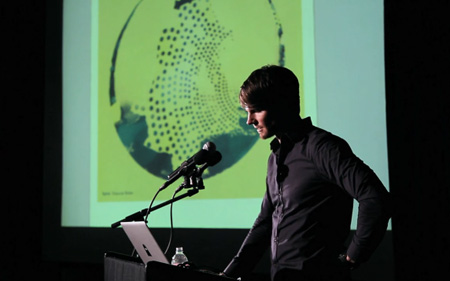
A few weeks ago, Scott gave a lecture to my fellow Academy of Art students. The talk was part of the Designspeak lecture series and was open to students and faculty (and 20 lucky blog readers). The room was jam packed, with a bunch of people even crammed in on the floor. The talk covered a wide range of topics: early influences, current design process, Tycho, the blog, and much more. We even got a glimpse of the first poster Scott ever designed!

The lecture was about 1.5 hours long, with a 30 minute Q&A at the end. In addition to the Academy film crew, I was on hand with my 5DMKII to capture some of the evening. Given the massive file size, and limited continuous shot duration on the 5D, I only recorded sporadically, and wasn’t able to capture everything I would have liked. I shot until my memory card filled up and was able to capture a total of 30 minutes of the talk. I selected the shots you see in the video above from this sample.

As I said in my intro that night, it would be hard for me to convey how much I’ve learned from Scott over these last two years interning at the studio. I consider myself enrolled in two design schools (Scott’s, and the Academy) and it was really exciting for me to see these two worlds combined. I’m very glad that everyone at the Academy was able to get a glimpse into Scott’s world and I’m also really excited now to be able to show you all at least a little bit of the talk. If you haven’t been fortunate enough to see one of the talks in person, I highly suggest you make that happen (I think Toronto is your next opportunity). In the meantime, hopefully this video will tide you over.

Recording the talk was another great test run with the 5D and I learn something new each time I take it out. This time, audio was the main issue as I wasn’t able to find a suitable solution before the talk. What you hear through most of video was from the Academy microphone — at the end is what it sounds like off the internal mic on the 5D. Basically the on camera mic is completely useless. It helps for syncing external audio to the video, but that’s about it. For future excursions I am definitely going to look into some form of either a mounted shotgun mic or wireless LAV.

Video Link

Science and Tech


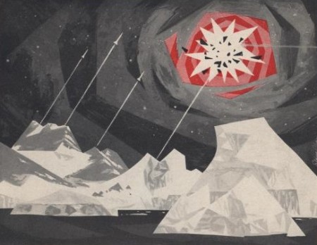
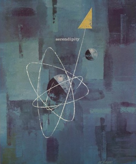
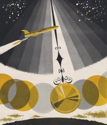
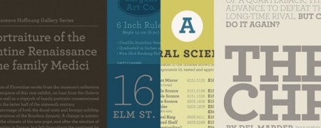
A few selections from the artwork portion of these Science and Technology adverts. I often like the text layouts on these old advertisements, but in these cases it was the artwork that caught my attention. I see a little Matthew Lyons in that first one. Be sure to check out the rest of the set.

via Ministry of Type

Sulki & Min


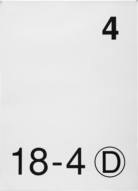
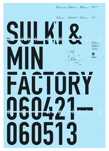
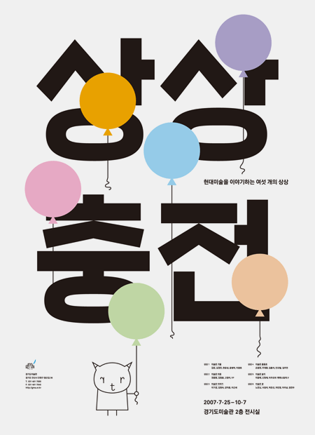
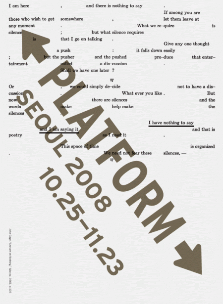
I am very excited about the work of Sulki & Min. I saw these on but does it float this morning and they jump-started my mind. I’ve been in a bit of a creative funk recently and these posters were just what I needed to get excited about design again. I’m not exactly sure what specifically it was, though I suspect the type lockup in the top right quadrant of the 2nd poster down may have had something to do with it.

I also love the subtle details in the first poster — the line weight of the circle around the D, the differences between the two fours — simple yes, but boring no. (I’m sure some may disagree with me on this, but I can’t help but admire the restraint/confidence it takes to call a poster like this finished.)

Sulki and Min are Korean designers who both got their MFA in design from Yale. They have an astonishing body of work and have been exhibited many times. I am also a big fan of a few of their typefaces designs.

via bdif

How to Shoot Stop Motion from Above


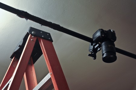
You do not want to know how long I spent trying to rig a vertical stop motion set up this week. Duct tape was flying around everywhere, lights were falling and shattering from above, and I had to take at least one ‘cool down before I break something’ walk. Surprisingly, Google was unhelpful in providing useful solutions — though this may have had something to do with a confusion in terms (is it aerial stop motion? vertical? 90 degrees?) I never quite know what to classify it as.

Anyway, I’ve written this brief process post about how I set up everything. It worked great for me, but I do not intend this to be a “this is HOW you do it” type article. Classify this as a go-to “bootleg” option if you don’t have access to one of those crazy $10,000 rigs that lets you fly above your subject etc. If you are looking for a relatively easy and inexpensive way to complete this type of project, this is one way to do it. I’ll walk through the supplies and exactly what I did that worked best for me. At the end of the day, it’s actually pretty darn easy — but it’s always nice to get a peak at a successful process just in case you’re spinning your wheels. There probably is a better way to do this, but I couldn’t find one. (And do excuse the slightly blurry photograph above…unfortunately the camera that has the external flash capability was the one being photographed…)

And in case you have no idea what I’m talking about, this video is a GREAT example of this type of stop motion done extremely well.

(more…)

I’m Here / Spike Jonze


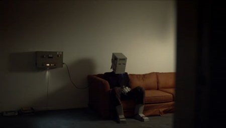
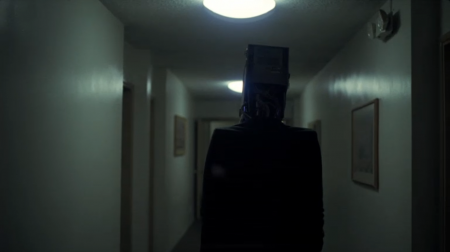
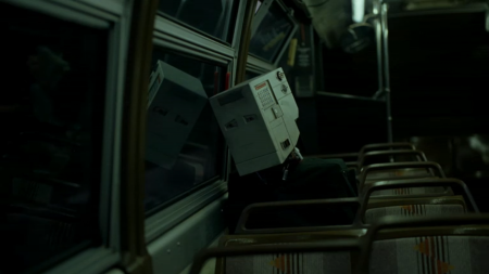
I didn’t realize the other day, when I mentioned Spike Jonze’s “I’m Here”, that the actual film had already been released. The trailer was exciting enough for me I guess. Now you can view the entire 30min film on the website. They limit the amount of viewers per day, so make sure to take a look when you can. I haven’t seen it fill up recently, but you never know. Props for a smooth web interface too — feels like a video game without being frustratingly slow or clumsy like most Flash pages.

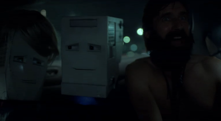
The film itself is great; the opening sequence is especially well done. The music works really well with the visuals throughout, and of course the whole thing stars robots. They are remarkably expressive, what for being robots and all. I really like the combination of animation and lo-fi costumes; it works really well for this, just like WTWTA. The story is a nice one, a little sad/mopey, but I enjoyed it overall. I found myself more attracted to the uniqueness of the whole project rather than any specific aspect of the plot.

My favorite part is when the bearded guy in the car yells “You’re a ROBOT!!” into the main characters head. Awesome. Check it out here.

Julien Vallée


Witness the unchained creativity of Julien Vallée. I suppose this is a little more whimsical than my average post here, but I can’t get over how awesome his work is. The combination of hand-made elements, motion graphics, and unparalleled ingenuity create some stunning work. He also does a great job documenting his process — his behind the scenes videos are just as entertaining as the actual finished product. The last video above is a “Making of” for Danse Dance. You can view the actual interactive video here.

As he says in his Gestalten interview about his work, “I got bored with the computer technique and a pre-formatted way of working”. Good thing he did — it’s refreshing to see work like this that jumps off the page in more ways than one.