Posts by Alex

Prolost


I’ve been delving into the depths of the internet over the past few weeks; reading about everything from ultra high speed video camera comparisons to the best post production workflow for the 5DMKII to FCP. One of the best resources I’ve found is Prolost, the site of filmmaker Stu Maschwitz. The blog is generally about filmmaking, with a heavy lean on post production techniques, typically as it relates to DSLR equipment.

You may have already heard of it, but as was true for The Strobist a year ago, I had not and am very glad to have discovered such an informative resource. I came to Prolost by way of an article on color correction called Memory Colors. It’s not a ‘how to’ by any means, but puts forth some interesting information on the theory behind color correction and manipulation.

With the release of the new (now fixed) firmware for the MKII, it’s been hard to escape the buzz. Finally the MKII can shoot 24p! (In case you don’t see why this is awesome.) Of course now I am lamenting the fact that it can’t do 60fps (all of a sudden I had the urge to get some really smooth slow motion). Maybe next time.

Danny Clinch for Absolut


If you can look past the periodic in-your-face product endorsements (I know you can!), these videos are actually very cool. I am a big fan of Danny Clinch, Wolfmother, Jay Z, (and John Mayer), so what’s not to love here. Makes me want to to quit everything and travel around the world with a band. That or quit everything and start a band and hire a photographer.

The Jay Z collaboration just came out a few days ago, while the Wolfmother one has been out for a while now. With both of these, they are obviously promos for Absolut, but they’re mainly just well-shot rock&roll mini documentaries. The class I’m in now is basically an advertising class and I have really come to appreciate it when a company put something like this together — especially compared to most of the nonsense you see out there. Just about all of the Absolut ads are very well done, most are up here. And if you haven’t seen the Spike Jonz “I’m Here” trailer you must watch it immediately.

Heads of State / Travel Posters


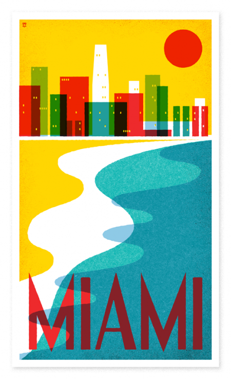
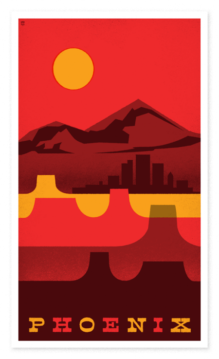
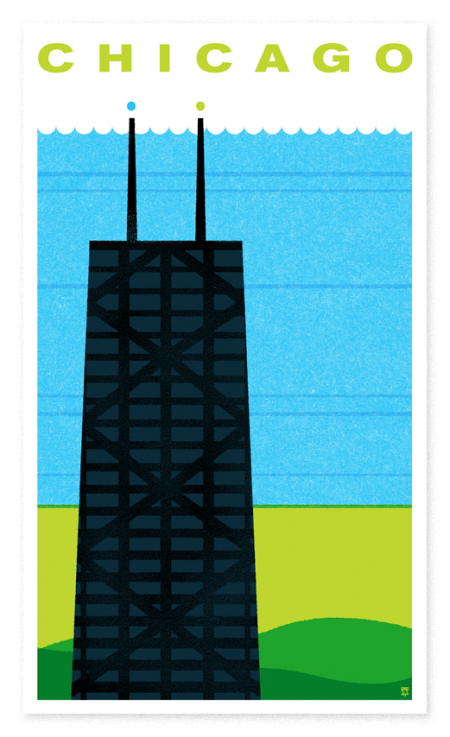
Great new series of posters by the Heads of State. I love the colors! (Vaguely reminiscent of the 826LA Time Travel series, with less type or floating people…) I wish travel agencies packed their walls with anything nearly this cool looking. I might actually decide to go somewhere based on the poster — as opposed to questioning my travel plans as I stare at a 1980’s US Air sponsored photograph of “Miami”.

Don’t forget their Legal Weed packaging too. Hilarious stuff. The Travel series is available for purchase here.

Wolfgang Weingart


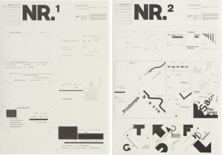
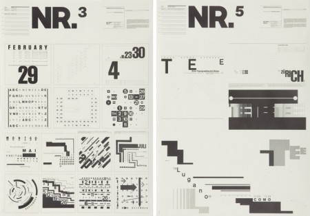
I’ve seen these posters floating around the internet for a while. I searched long and far to try and find anything at all about them, always to no avail. It was tough when all I had was the letters NR and my feeble attempts to describe their excellence to Google. Recently I saw them again on Shelby White’s blog and was very excited to at least have a small lead as to their origin.

Turns out they were designed by Wolfgang Weingart for Kunstgewerbeschule Basle in 1974. These, and a number of other Swiss poster designs, are at The Swiss Poster Collection at Carnegie Melon University. I would love to see one in person; I’m very curious how large they are. I like to imagine them as these massive wall sized super posters, best viewed at a distance. Ready to intimidate any graphic designers that unwittingly wander underneath.

*Favorite is definitely NR1

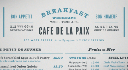
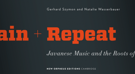
Combining Fonts


H&FJ just put out a really cool article on combining fonts. They break it up into four lessons and provide visual examples and typeface options. All the examples use their fonts, but the lessons carry over to usage with other typefaces easily.

I found the article to be especially inspiring, or at least liberating. I have a weird mental block when it comes to combining typefaces. I’ll often use two different ones, but never three without a huge mental commotion. I don’t know what it is, but I get really stressed out trying to finagle more than two typefaces into a design. Of course it depends what type of design it is. I guess I always felt like there was this mystical over-arching design rule that prevented exciting combinations of type (I know that sounds ridiculous). Anyway, something about their examples opened things up for me. It’s nice to hear it from the high authorities that this sort of thing can be this effective.

I’m also consistently amazed how good they are about talking about type; the adjectives they use are always way out of left field but completely spot on. Calling Gotham Rounded ‘cheeky’, for example, wouldn’t have come to me right away but makes complete sense once I hear it. If you recall their scene in Helvetica where they rattle off some rather satisfying descriptions of type — that was awesome.

Plancast Process Updates


The little penguin made his iPhone debut last week with the release of the Plancast iPhone app. Everyone is at SXSW right now spreading the word and drumming up support. I designed some emergency t-shirts and business cards for the excursion and I’m excited to hear how it all went. Should have some pictures of that material this week — I’ve yet to see them in person due to the time/production constraints. Plancast also had a big article in the New York Times a few days ago which was exciting to see. If you look closely, you can see a wee version of the logo in the screenshot. Too bad the penguin didn’t hit the front page!

When I wrote about this project last week, I forgot to mention how different the post-production time has been compared to my normal project routine. For just about every one of my process posts I’ve written here, the work has always been completed in school for an assignment. Once the project is complete, it’s over as far as just about everyone is concerned. It’s been exciting to see this one continue to evolve in the real world — like winding one of those wind-up toys and setting it on the table.

Plancast Penguin // Development Process


I was hired about three months ago to design a logo and consult on the brand identity for Plancast, a local San Francisco start-up founded by Mark Hendrickson and Jay Marcyes. As you can probably guess from the name, Plancast a way to broadcast your upcoming plans to your friends; or as it’s often described, Foursquare for the future. The site is exceptionally easy and helpful, and I encourage you to check it out.

By the time I joined on Plancast was up and running, but they were without a logo or distinctive visuals. I began work in December and we agreed on the finished logo a few weeks ago. The project was easily the hardest I have ever completed — as well as the most fulfilling. I almost destroyed myself developing this logo and I am really excited to share the process with you here.

(more…)

Canon 5D Mark II / First Impressions


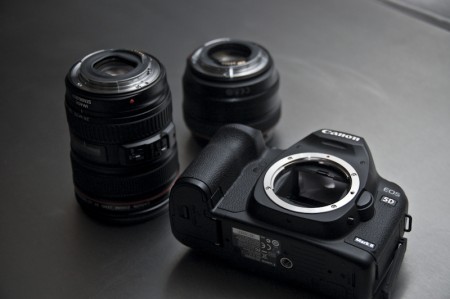
I did it. I am now a very proud owner of the Canon 5DMKII. It took months (years) of deliberation (pretty much since Scott wrote this article) and I finally pulled the trigger. I know the rumors are swirling about Mark IIIs and the etc, but once I heard about the upcoming 24fps firmware update I decided it was time. No more waiting. I’ve been shooting on a Nikon D40 since I started school and it was definitely time for an upgrade. (Though I still love the SB 600 flash — took the photo above)

As soon as I pulled it out of the box I was in awe. People say that Canons feel cheaper due to the construction materials, but I disagree. This thing feels like it could level a small village if thrown at the proper angle. Pair the body with the kit lens (24-105) and you have one serious piece of machinery. I purchased through Adorama because they seemed to have the best package deal. Just about everyone sells the body for $2499 at the moment; Adorama throws in a shoulder bag and a 16GB card. (Update: Or at least they used to…it must have been a temporary special price because now that package is listed higher. Keep an eye out in case it comes around again.)

My shots so far have been decent. Honestly I’ve only had it for a few days and have yet to really take it for a photography spin. I’ve mainly been experimenting with the HD video feature (a large part of why I bought the camera). After numerous videos of my shoes and other random subjects I decided to test it out in a music video scenario. Nothing crazy, just a acoustic performance like I usually do on Youtube (till now I’ve been shooting on an embarrassingly old MiniDV camcorder that is almost twice the size of the Canon). You can view the result here.

An unexpected issue with the completion of that video was the post-production file format mess. Apparently Canon had no interest in making things easy on us (although that looks like it will change this month). I ended up following the steps outlined here on Vincent Laforet’s blog with great success. I imported to the desktop, converted H.264 to Apple Prores (tanked my drive space), imported to Final Cut, sent to Color and back, exported using Quicktime H.64 compression, then uploaded to Youtube. Kind of a long roundabout process, but things went smoothly. As is true for the still shots as well, you immediately notice how much more control you have over the image in editing mode. Edits that used to crunch up image quality or produce unwanted noise no longer do so at all. The picture is so clean that you can tweak away to your heart’s content without ever losing the integrity of the image.

As I said, I’m just getting my feet wet with this thing and I’m sure I’ll have more to say about it once I field test it a lot more. I’ll be going to Japan in May and am looking at that trip as a great opportunity to take thousands and thousands of pictures and crash my hard drive with absurd amounts of footage. As I continue to experiment with this wonderful object I’ll put together a more complete review. In the meantime, for my sake, cross your fingers Canon *doesn’t* come out with any shiny new cameras anytime soon.
Old School BMX


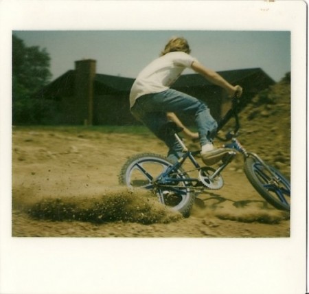
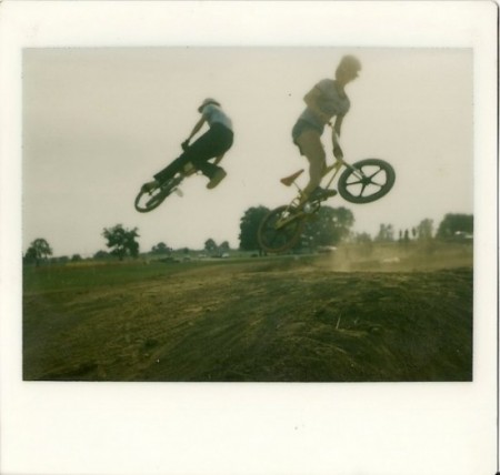
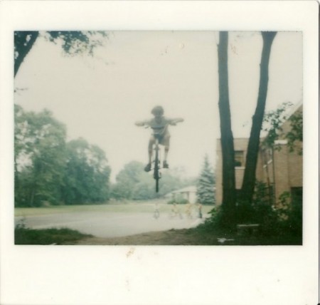
I wish I could say these were from when I was younger, but the closest I ever got to BMX was digging jumps and watching my friends careen off of them (I went off once with a road bike, crashed, and stayed grounded after that).

Anyway the above shots were taken by Cameron Muilenburg from Hidden Clothing. It looks like he and his friends were pretty good — not only at riding but also at capturing the experience with basic equipment (I assume Polaroid). I love the color and composition. The first one feels like a still from a film, paused at just the right moment to capture the most movement.

Sure look like some fearless little kids. Check out the rest of the pics here.

via defgrip

The Dark Lens


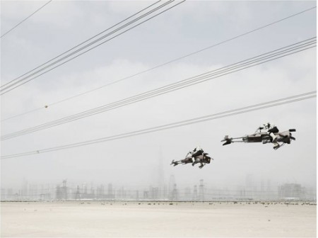
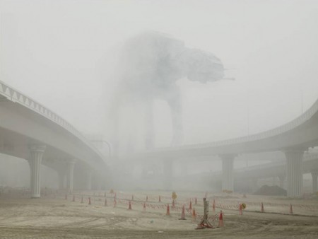
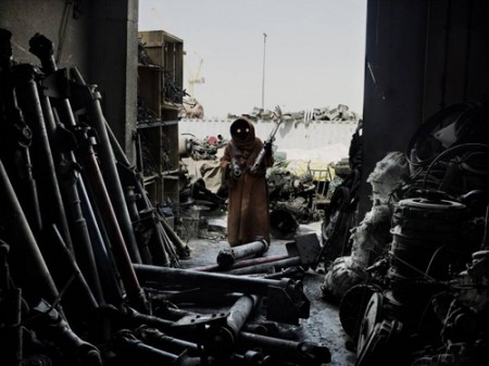
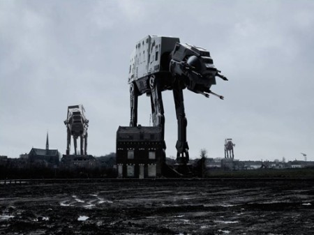
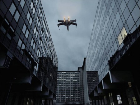
These images are from photographer Cedric Delsaux’s Dark Lens series. The project has been around for a while but a new set of images was just released. World Famous Design Junkies has a great write up of the history of the project. They detail the three waves of content releases and go into a little more detail.