



The Museum of Flight displays an impressive collection of vintage airline logos. As I’ve just spent most of my young life traveling between DC and SF over the holiday, airline logos aren’t exactly what I want to be looking at right now — regardless, some of these are too good for me to mind. Lufthansa is still my absolute favorite (I gravitate towards anything with a stylized bird). The images are relatively high quality and they have a ton more over on their site.
Posts by Alex
Airline Logos
Gestalten TV
The wondrous Gestalten has a terrific selection of videos up on their site Gestalten tv. Anyone familiar with their publications knows that Gestalten is synonymous with extremely high quality production. I wasn’t familiar with many of the subjects listed, but found each one engaging and very well done. The one on Postlerferguson above was especially entertaining. Definitely going to order a paper MP5.
Of course I had to include the recent video on Dieter Rams above. I find interviews with him to be mesmerizing and am nowhere close to tired of seeing new ones pop up (as his exhibition makes waves in London). The book Less and More is available for purchase from Gestalten (in Europe), Vitsoe, and Amazon (though looks like not until January).
Gestalten.tv creates a broad range of documentaries, interviews and features that introduce Gestalten related subjects alongside individuals, projects and companies that are vanguards of visual culture.
Rebranding Playboy: Book Production
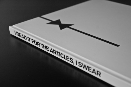
My rebranding Playboy project came to a close last week with the end of our fall semester. If you read the last article, you are familiar with the first part of this project, which was the new logo for Playboy. While it is absolutely the flag bearer of the entire project, the logo development represented a small amount of the work we were required to do for the overall project. The final deliverable for the class was a book in which we the explain history of the brand, walk through our rationale for the new identity, explore the process of the logo development, present brand standards and guidelines, and show example brand implementations and extensions. Other than this required content, there was no specific criteria for the book. Each student also gave a short final presentation explaining their rebranding and the choices they made along the way. Everything was created for the Nature of Identity class at the Academy of Art, as part of the graduate graphic design program.
I really enjoyed the conversation the first post on this project generated. I was excited to see that the new logo was as polarizing as it was — I feel like these types of solutions are the most exciting and rewarding for me. I noticed that many people were up in arms about the idea of Playboy removing nudity and becoming an all article magazine. While I would like to note that the new strategy was purely a conceptual exploration constructed in an educational environment, I actually do think they might be well served to switch things up this drastically. Playboy was once irreverent and boundary shattering. They are no longer. I can think of no better way to recapture this audacious spirit than by doing something this extreme…
Robert Samuel Hanson
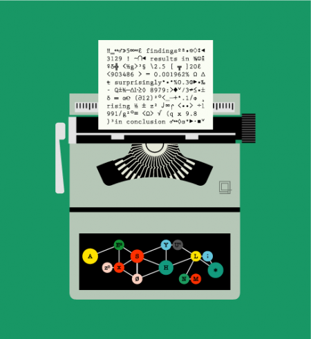
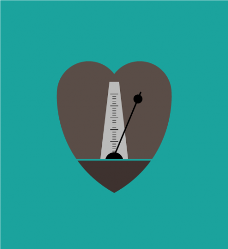
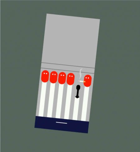
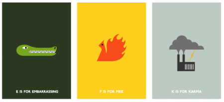
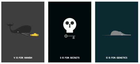
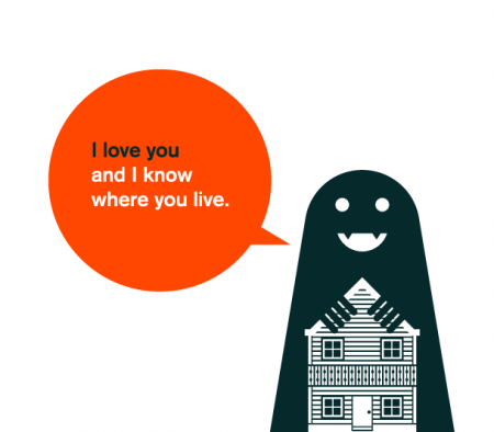
You may have seen the work of Robert Samuel Hanson here and there, Monocle and elsewhere. I’ve seen some of his wonderful illustrations before, but a few of the works above are still getting a good laugh out of me. The “I love you and I know where you live” piece especially cracks me up. I would totally send that around as a Valentines Day card if I thought the recipients had enough of a sense of humor to not get me arrested.
Not only is Robert’s work beautifully rendered and realized, but it’s just the right amount of clever without being too cute. Aren’t we lucky he works for so many terrific publications! It’s always a nice surprise to stumble on one of his delightful illustrations. His logo is amazing too, check it out on his front page.
Pan Am’s “Helvetica Dream”
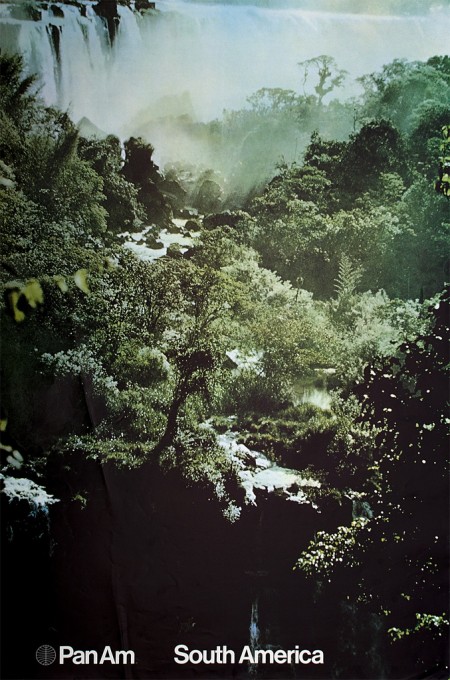
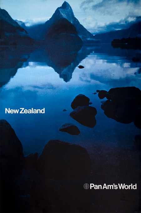
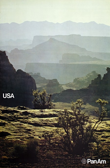
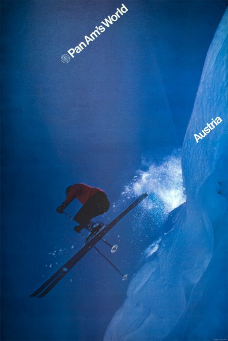
Determined to find out the history behind these beautiful posters, Frederico Duarte did some extensive research and learned how “Pan Am’s short-lived Helvetica dream” came to be. He chronicles this process over on the Eye Blog and in an article for Eye Magazine. These posters are incredible and their story is well worth the endless emails and phone calls he had to make to determine their origin.
Pan Am is no longer. But the story of its redesign, as told by the people behind it, proves personal connections, proximity and chance are all makers of (design) history. How many other great design stories are left untold?
Fredrico’s post reads like a design mystery and I lamented how little of this research I do, or even curiosity I possess when I come across work that interests me. For example: I wake up, see something amazing on FFFFOUND, then I bookmark it. End of story. If it’s especially awesome maybe I blog about it, but I rarely dive deep into whatever visual universe I’ve uncovered. I usually just absorb it quickly, then move on with a slightly augmented sense of visual understanding. This is why I both love and hate sites like Dropular or FFFFOUND. While they allow me to quickly consume lots of high quality design, they remove context and discourage the exploration that would otherwise go along with finding out about a new artist. (Of course there are many benefits to sites like these, but the removal of the ‘story’ that goes along with the work is one of the primary downsides.)
As Fredrico mentions in his article, the research was done for an SVA class where the rule is “No Google”. I thought this was interesting because I tend to use Google and “research” interchangeably, especially when thinking about design. To be stripped of my only research tool! Of course this makes sense these days, as most of us young designers primarily exist on the web anyway (which is a scary thought if you think about it…if the hardrives go, so do I). What the story hammered home for me was the importance and overwhelming benefits of a design education. What allowed Fredrico to take this much time plunging into the depths of design history (and what allowed me to spend so much time with Playboy) was the freedom and time provided by the design education environment. While you could always try and inspire yourself to do this on your own, it’s hard to beat limitless boundaries coupled with external motivation.
Le Grand Content
This is an old video but it’s amazing and I had to post it. I was blasting around the web looking at various inforgraphics and I came upon the fantastic indexed again. The video above, Le Grand Content, was inspired by the site, and is a similarly excellent collection of random and insightful anecdotes (this time in motion) about nothing in particular. Any time you have a graph with time on one axis and “the adventures you’ve taken” on the other, I am going to be intrigued. The voice over by Andre Tschinder is my favorite part — the delivery is oddly perfect (…”but speaking of forever, it’s obvious that this takes some time”.)
Le Grand Content examines the omnipresent Powerpoint-culture in search for its philosophical potential. Intersections and diagrams are assembled to form a grand ‘association-chain-massacre’. which challenges itself to answer all questions of the universe and some more. Of course, it totally fails this assignment, but in its failure it still manages to produce some magical nuance and shades between the great topics death, cable tv, emotions and hamsters. by Clemens Kogler
Color of the Year

Pantone has just announced that PANTONE® 15-5519 Turquoise is the Color of the Year for 2010. I gather that they are predicting its heavy saturation throughout the fashion and interior design worlds, but I’m not entirely sure what “color of the year” is supposed mean. Besides gut feelings and casual observations, I’m not sure how on earth a color of the year would be chosen. Perhaps there is some magical color metric that I am not aware of. Personally I think the color of the year is grey but that might be a little too depressing for Pantone. Last year was yellow after all…
An interesting aspect of this story that I’ve been struggling with is which version of PANTONE® 15-5519 to trust when you come across it reblogged on the web. I’ve seen some pretty divergent interpretations of the color that are clearly the result of some wacky color profile. Even the one I’ve saved above looks a little darker than Pantone’s website to me. Anyway, you get the point, turquoise is the color of the year. Now paint your walls and buy a new shirt.
Combining the serene qualities of blue and the invigorating aspects of green, Turquoise evokes thoughts of soothing, tropical waters and a languorous, effective escape from the everyday troubles of the world, while at the same time restoring our sense of wellbeing.
Building a Home Studio Pt.1: Paint
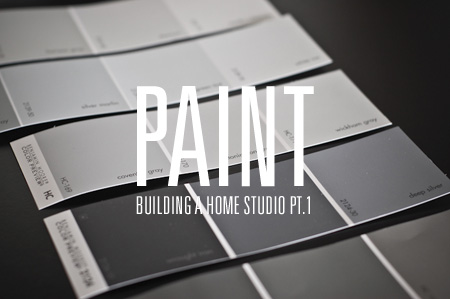
I am in the process of moving into a new apartment in San Francisco. Amidst the endless furniture shopping, cleaning, painting, and waiting during absurdly long delivery-time windows, I have been planning the construction of the ultimate apartment-based graphic design studio. As I’ve always set up shop in a room with another purpose (currently my studio also serves as my bedroom and recording area), the prospect of having a dedicated design room is very exciting. I figure this move will be a good opportunity to really take my time and build the perfect work room — from the paint on the walls, to the the table tops and filing cabinets — every detail will be meticulously considered.
The room itself is 11.5′ x 9′, plus a generous closet. The purpose of the room will be a place where I can work, file, cut, store, display, print and create. Basically a little graphic design super room. Unfortunately there will not be space for my music set up, so my guitars are going to have to bunk with me in the bedroom. You’ll notice there is also a small window. Ideally, for consistency reasons, I would prefer to have no window — but I’ve come around on the issue in hopes of the keeping studio morale high…
Debbie Millman / Design Matters

Design Matters, the long running design radio show by Debbie Millman, is making the jump to the small screen. SVA is producing a TV version of the show and will be taping the pilot episode this Friday. The first two guests are Milton Glaser and Stefan Sagmeister. To top it all off, the show will be directed by the wonderful Hillman Curtis. I’m not sure where the end result will be available, but I’m sure those details will be revealed in the coming days. I’m hoping for the Thursday 8pm slot on NBC.
If you’re in New York, the taping is open to the public — more information can be found on the Facebook event site. Why don’t I live in New York. Sometimes I want to defollow all of the New York designers on Twitter because all these cool events make me jealous.
I recently met Debbie Millman when she was in town to give a talk at school. Her talk was terrific and I’ll try to do a short write up later this week after I go over my notes. I also participated in her workshop about visual storytelling, which she led having just released her new book. She had each of us write a short story, which she reviewed and then set us on our mission of illustrating the story using all sorts of fun tools. It was fun to write fiction — I’ve become rather used to this “blog style” of writing that I forgot there was a whole other way to go about things. (My story is here if you’re feeling adventurous.) The workshop was great — I love periodically going back to the drawing board, literally, and breaking out the pencils pens and crayons. It was also great to just let loose creatively with no rules, objectives, or criteria. Something I certainly don’t do enough.
Hey Studio
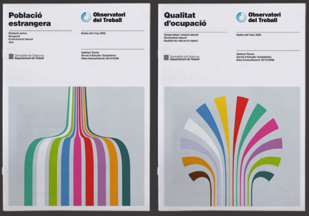
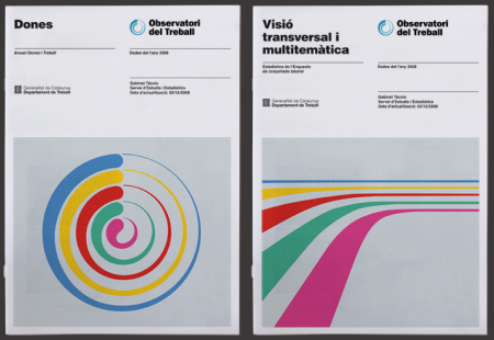
I hope everyone had a great Thanksgiving holiday last week (or weekend if you’re abroad)! I just got back from DC tonight after a nice long break and was greeted by this excellent work by Hey Studio. Their entire portfolio is filled with incredible work, but I was especially attracted to this piece for the Observatori del Treball. I love information graphics more than most things in the world and these illustrative forms reminded me of some really beautiful graphs I’ve seen in the past. Of course they aren’t providing any “info” here, but they look so good I don’t mind at all.
Check out the rest of their portfolio here. (The Playboy poster, third one down, made me smile…). Via Changethethought.