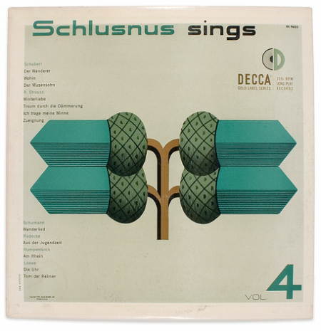
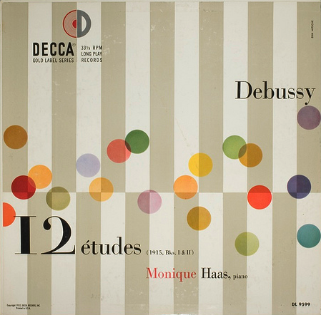
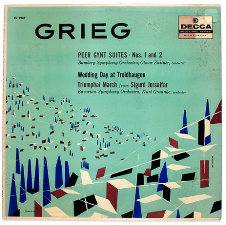
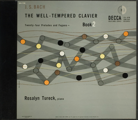
A few Decca record covers done by ISO50 favorite, Erik Nitsche. I was browsing Flickr for some or Nitsche’s work and I came across the massive assortment of images here, compiled by BustBright. I am in love with the type on these, especially the “Schlusnus sings” typeface. I’m not sure what it is but it amazing. And I always love Didot — if you browse the rest of the archive, you’ll see a lot of that.
Posts by Alex
Decca Records
Sketching and Design
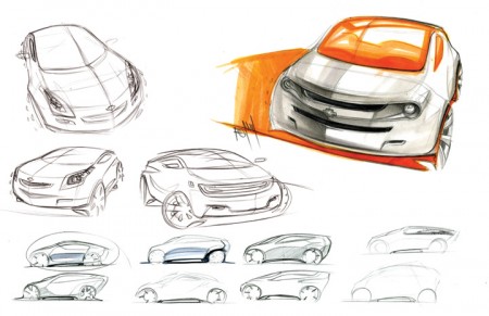
Spencer Nugent posted an interesting article on the Levels of Sketching over on IDSketching (that’s his image above). I don’t know a lot about industrial design, or the complex role sketching appears to have in the field, but I was really interested to read a little more about it. What came to mind immediately was the sketching process we are constantly encouraged to go through at graphic design school. I am always terrified of this part and try my best to avoid it (which is impossible). Of course, though the role of the sketch is different in this case — as it serves as a rough internal mock up rather than a deliverable for a client — it’s importance remains of a high level (for a number of reasons, many of which Milton Glaser explains in this video that’s been floating around the last couple weeks).
The sketching process for the project I mentioned a while back has been pretty intense. Recently I’ve been working through countless concepts and designs, sketching my hands off. I was lucky to figure out my direction/concept early on, but it’s taken me forever to figure out the right way to render it. This has meant ENDLESS amounts of sketches and crappy little mock ups. I guess I lack the patience to sketch well, and my process book looks like I was drawing blindfolded, drunk, and with my off hand.
Seeing the way industrial designers sketch, I am truly envious. To be able to render something that detailed and precise, without a computer sometimes, I can’t imagine. Of course, I am reacting this way because I grew up designing with the computer. “Process” to me has always meant keyboard and mouse, not pencil and paper. I recognize this as a potential weakness in my workflow, and have been trying really hard to incorporate sketching into this project. Results have been here and there so far, and I wonder if I will ever be able to develop my sketching ability to where it’s consistently worthwhile.
I know David Airey for one is a big proponent of sketching, and has written many interesting articles on the subject. How do the rest of you feel about sketching when it comes to the graphic design process? When starting a project (especially a logo design for example), do you start with pencil or mouse (or the hybrid, Wacom Tablet)?
Mrs. Eaves Long Lost Husband
Mrs. Eaves is one of my favorite typefaces. Especially when it comes to serifs — which admittedly, I use infrequently — Mrs. Eaves has long been a go-to. I agree with designer Zuzana Licko’s description that “Mrs Eaves was a mix of just enough tradition with an updated twist. It’s familiar enough to be friendly, yet different enough to be interesting.”
After much anticipation, the sans-serif companion Mr. Eaves is complete. It comes in two varieties; Mr. Eaves Modern and Mr. Eaves Sans (character map pictured above). Like Mrs. Eaves, both variations were designed by Zuzana Licko for Emigre. I’m excited to use this — especially the lowercase ‘a’ variant pictured at the bottom.
Mr Eaves was based on the proportions of Mrs Eaves, but Licko took some liberty with its design. One of the main concerns was to avoid creating a typeface that looked like it simply had its serifs cut off. And while it matches Mrs Eaves in weight, color, and armature, Mr Eaves stands as its own typeface with many unique characteristics. [ Purchase ]
Hans Gremmen
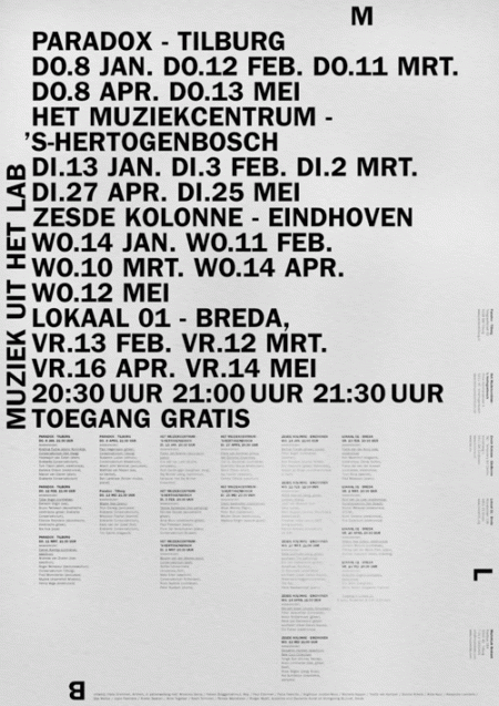
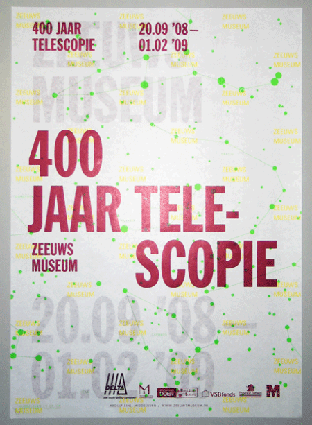
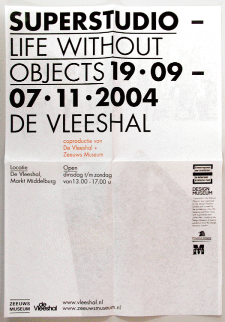
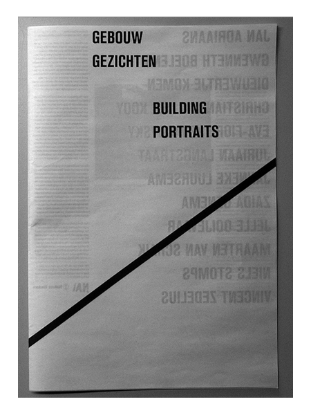
Assorted posters by Dutch designer Hans Gremmen. I love posters — like the first one — that are just PACKED with all sorts of information and data. Really gives the designer a chance to show off their typographic skills and hierarchic sensibilities. I especially enjoy the tendency for the asymmetrically balanced composition; really makes for that much more of an interesting poster.
Also worth noting is Gremmen’s portfolio site which randomly generates a selection of eight of his works. An interesting approach to be sure; I like the concept of an ever-changing front page, though it was a little tough to find the specific work I was looking for.
Graphic Designer Vs. Client
WARNING: While hilarious, the language used in the above videos is NSFW.
“I have made a mock up myself to help you in Microsoft Word. Just one other thing — seeing as I’m only going to use one of the ten designs you are going to do for me, I would like to pay 1/10th of the £3.50”
I was rolling on the ground watching this. I laugh at these videos in that “oh yeah, SO true” sort of way, but am not really comparing it to any of my past jobs. It’s almost as if this sort of client relationship is understood on some sort of primal level for designers. You hear enough stories and it may as well have happened to you. Anyway, this is hilarious; the automated-voice delivery is perfectly weird. The way they say “Microsoft Word” is fantastic.
Louis Reith
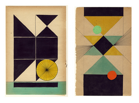
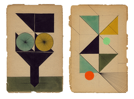
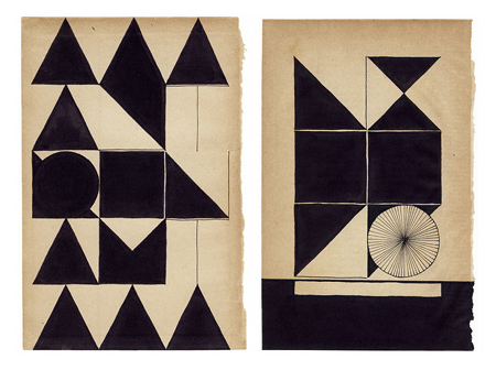
Assorted works by Dutch graphic designer Louis Reith. I really love the texture and the color of the paper he’s working on. I’ve spent hours in Photoshop trying to replicate that same off-white mix; can’t beat the real thing. Even more exciting is the color at work in the shapes — each hue is dialed in exactly where it should be. Some of the forms in the bottom image remind of the typographic stylings of Non-Format.
More info about Louis, including upcoming gallery showings, can be found on his Myspace.
Asako Narahashi
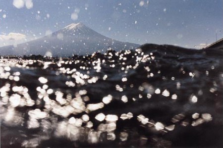
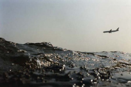
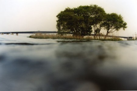
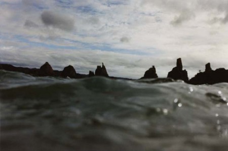
Jakub’s recent post about his mystery images inspired me to do a little sleuthing of my own. I’ve had the top image on my desktop for a long while now labeled “awesome_findit” and never had any idea where it came from. Turns out it was part of a (now a few years old) series of photographs by Asako Narahashi.
I’m a big fan of the whole half awake and half asleep in the water series — concept and execution. I have always been fascinated by the ocean, and bobbing about idly in the waves is one of my favorite things to do. Her photos simultaneously capture the tranquility of this wonderfully lazy activity, while still maintaining the dynamism of an ocean swell. I also really enjoy how heavy the water looks — reminds me of that Keane album title Under the Iron Sea.
Japanese Municipal Flags


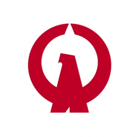



The above are some examples of the flags of the various cities, towns and villages of Japan. After looking at these, the “logo” for my town is very depressing. If I had one of these instead, flying over the place I lived, I would feel infinitely cooler and forever at ease. I am amazed at 1) how many different logos there are and 2) how many of them are absolutely incredible.
The original post on Pink Tentacle has many more on display. You can also see the full (and massive) list on Wikipedia.
Non-Format Interview
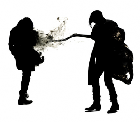
Non-Format is one of the most exciting studios working today. Comprised of Kjell Ekhorn (Norwegian) and Jon Forss (British), Non-Format is known for an exceptionally innovative approach to typography and a fresh, boundary-smashing graphic style. Clients such as Nike, Coca Cola and The New York Times have all tapped the studio’s award winning and internationally acclaimed design talent. Operating on two continents, Non-Format is based in Oslo, Norway and Minneapolis, USA.
One of my first assignments at design school was to bring in some books that I found inspiring. As I had just started the program, I didn’t really have much to show for myself, and I distinctly remember arriving that day to see that around 3/4 of the class had all brought the same book: Non-Format’s Love Song. The extent of their influence on the field of design became immediately clear to me. Since then I’ve kept a close watch on the studio and am always excited to see what they’ve been working on. Recently I had the privilege of interviewing Jon and Kjell and our exchange is after the jump.
Art & Copy / Recent Design Related Films
Art & Copy is a film about advertising currently making its way around the country. The film is an in-depth look at some of the best and most creative minds in the business. As director Doug Pray states, “I felt it could be a more powerful statement to focus the film only on those rare few who actually moved and inspired our culture with their work. And that higher standard made me want to make a film that reflected the same kind of disciplined artistic approach that my subjects used.” It looks really interesting and I’m really excited to see it.
The frightening and most difficult thing about being what somebody calls a creative person is that you have absolutely no idea where any of your thoughts come from really — and especially you don’t have any idea where they are going to come from tomorrow. — Art & Copy
We’ve been watching The Persuaders in class over the last few weeks and, while it’s not specifically about graphic design per se, it’s easy to draw useful parallels between the two disciplines of advertising and design (as they are often one and the same anyway, whether you like it or not). If you are interested, you can watch all of The Persuaders on the website.
This winter is shaping up to be a pretty excellent time for designers as far as film is concerned. Art & Copy will be in San Francisco in early November, Objectified comes out on DVD on October 13th (so sad they had to push it two weeks due to a “manufacturing snafu”…how ironic), and Visual Acoustics will be here November 6th.
I think I am most excited for Visual Acoustics — I remember writing about it a while ago and have been surviving off of Shulman’s wonderful photography in the meantime. Also worth mentioning is The September Issue, the film chronicling the development and process behind the largest issue of Vogue Magazine. I saw this one recently and would recommend it, but it wasn’t quite as good as I was hoping. It’s exciting to see design related films making their way into the (almost) mainstream!
Side note: Art & Copy employs a beautiful ampersand in the logo for the film. Not sure what it is, but it’s very excellent looking.