Posts by Alex

Spacetime | Kitsune Noir x Poketo

poketo-spacetime-cody-hudson-wall
poketo-spacetime-damien-correll-wall
poketo
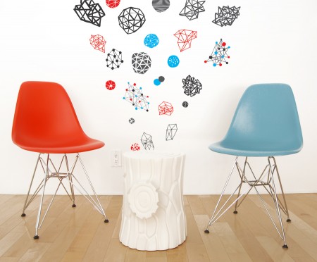
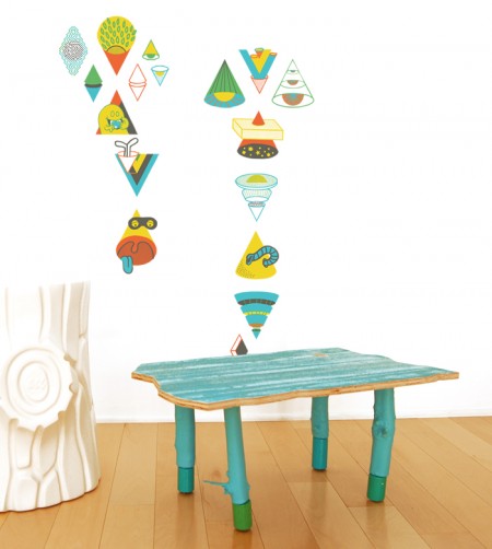
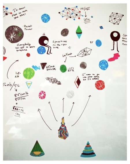
The Spacetime Collection is a set of whimsy outer outer space-themed wall decals co-curated by Kitsune Noir and Poketo. They enlisted a talented group of artists to design the collection; Mike Perry, Cody Hudson, Damien Correll, and Andy Miller. Each set is different, but the idea is to combine them to make any kind of wall galaxy that you want.

I spent my morning pasting up the decals and my galaxy is displayed above. This was extremely fun; just pasting things every which way and creating something wacky on the spot. Compared to my normal, highly regimented routine on the computer, this was a refreshing change of pace. I find that I do less and less work “offline” so to speak, and it’s great to spend some time creating without a mouse and keyboard (or design brief and deadline for that matter). My roommates were surprised to find our whiteboard transformed into a very unusual (and exciting) combination of space diagrams and whimisical illustrations. ‘Wonderfully weird’ we determined.

Information regarding the project can be found over at Kitsune Noir or the Poketo website.
In Praise of a Typeface: United

united
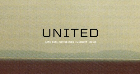
United by House Industries has been my go-to typeface over the last few semesters. It is a massive family — 105 total fonts (three styles, seven weights and five widths). This variety makes it an incredibly versatile collection. I really hate it when I find a typeface that I love, but find it missing a crucial weight or style. (DIN for example — would love to be able to wield more styles). United does not have this problem. I’ve used it on many projects (a few you know; ISO50 EP, Mega Cities book) and in each case the variety allowed it to be implemented in a unique and effective way.

I discovered it a long time ago while searching for the typeface used in a Nike ad (can’t recall which one, but it was amazing). I don’t actually remember if United was employed in the advert, but if you spend any amount of time searching around the typography of the sports world, you are bound to come across United at some point (Fox, I’m pretty sure, uses it for in game football graphics). There is an obvious resemblance of a few of the weights to a very collegiate look, which might be a turn off for some people, but the rest of the styles make up for this ten fold.

The most exciting part for me has always been the fact that each style has five different widths. I love condensed or extended widths and it’s nice to find a worthy competitor to the standards (Univers, Trade Gothic etc). When you need an extra touch of personality, especially if the project skews toward the technical or urban, United does the job nicely.

I don’t know many other designers (at least at school) that use it regularly and I thought I’d spread the word a little. Finding a new typeface is always pretty exciting, so hopefully if you haven’t tried United before, you can give it a shot and experience the sweetness. Anyone else have any hidden gems? I haven’t come across a new super typeface in a while — would love to hear about what people are unexpectedly enjoying these days.

Book Worship

advanced-engineering-mathematics
ping_pong
imgp17041
facts-and-figures
plasma-physics
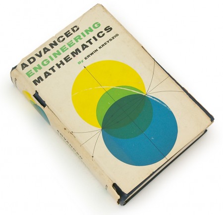
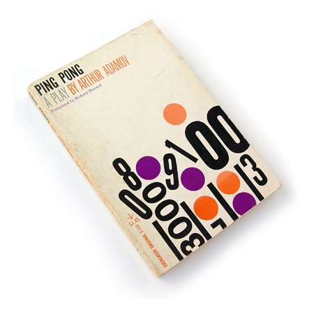
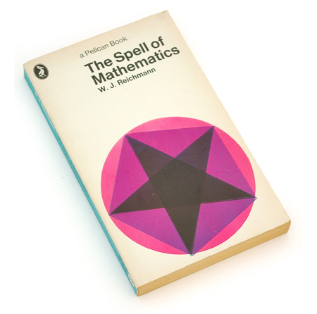
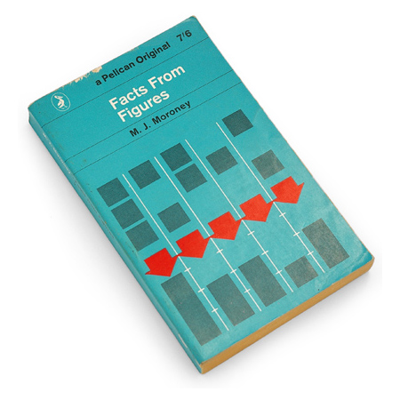
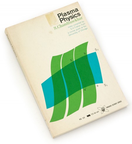
I’ve been enjoying the terrific blog Book Worship recently. The images above are some of the many beautiful books that Shawn Hazen has collected. As I’ve mentioned before, I have never had very good luck combing used bookstores in San Francisco — most of the cool stuff seems particularly adept at hiding from me (that or it’s long gone from the troves of other SF designers looking for the same things). Shawn, as you see, is much better at this than I. Definitely going to keep checking back often for more posts about these books he describes as “…graphically interesting, but otherwise uncollectible, books that entered and exited bookstores quietly in the 50s, 60s, and 70s.”

via Colourlovers

Man Must Explore / Tom and Tim Muller

2009_diesel6
2009_diesel5
2009_dieselwall4
2009_diesel8
Easily the coolest advertisement for a fragrance I have ever seen. Tom and Tim Muller put this together as part of the campaign for Diesel’s new fragrance Only the Brave. There are many other videos up on the site — nothing comes close to this. (Though Si Scott’s could be cool in a few weeks.) This video, in addition to being flat out gorgeous, really captures the essence of the phrase only the brave. The Apollo 15 Mission connection is a perfect match:

As I stand out here in the wonders of the unknown at Hadley, I sort of realize there is a fundamental truth to our nature. Man must explore.

UPDATE: Tom Muller has written a post detailing this project on his blog. Great to hear a bit more about this fascinating project.

via Kitsune Noir

Ira Glass on the Creative Process

Ira Glass describes the importance of producing a lot of work to endeavor through the frustrating early stages of a creative career. The first two minutes of this video should be required viewing for anyone and everyone getting into a creative field. In his case, he’s talking about video production, but his points are easily applied to any other realm. Definitely one of the most inspiring (or illuminating) pieces of advice I’ve come across.

The first couple years that you’re making stuff, what you’re making isn’t so good — it’s not that great. It’s trying to be good, it has ambition to be good, but it’s not quite that good. But your taste, the thing that got you into the game, your taste is still killer and your taste is good enough that you can tell that what you’re making is kind of a disappointment to you. A lot of people never get past that phase and a lot of people at that point quit.

And the thing I would just like say to you with all my heart is that most everybody I know who does interesting creative work, they went through a phase of years where they had really good taste and they could tell what they were making wasn’t as good as they wanted it to be. We knew that it didn’t have the special thing that we wanted it to have and the thing to do is — everybody goes through that. And for you to go through it, if you’re going through it right now, if you’re just getting out of that phase or if you’re just starting off and you’re entering into that phase, you’ve got to know it’s totally normal and the most important possible thing you can do is do a lot of work. Do a huge volume of work.

Typography of the Fashion World

The Fashion Center
In honor of the currently unfolding (ha) Fashion Week in NYC, I thought I’d post on some of the terrific typography at work in the fashion world. When I first got into design, I used to think the typeface for the Louis Vuitton logo was the epitome of graphic design. I remember writing everything in Futura Medium for a good month (even research papers, nothing was spared). These days, I still to pick up the occasional GQ or etc just for the ads — usually can pick up a few interesting things. There are always a number of logos that catch my eye, continue reading to see some of the marks that resonate most.

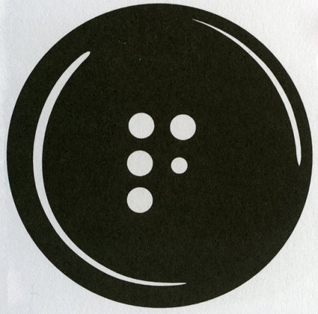
The mark for The Fashion Center (above) is perfectly simple. How brilliant to utilize the button holes to form the F! This is probably one of my favorite logos of all time. What it comes down to for me is that the 5th button hole is slightly smaller than the rest — this subtle scale shift makes the whole thing. Developed at Pentagram.

(more…)

Klas Ernflo and My Favorite Letters

goya
cano
davinci
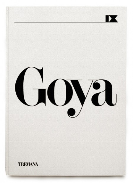
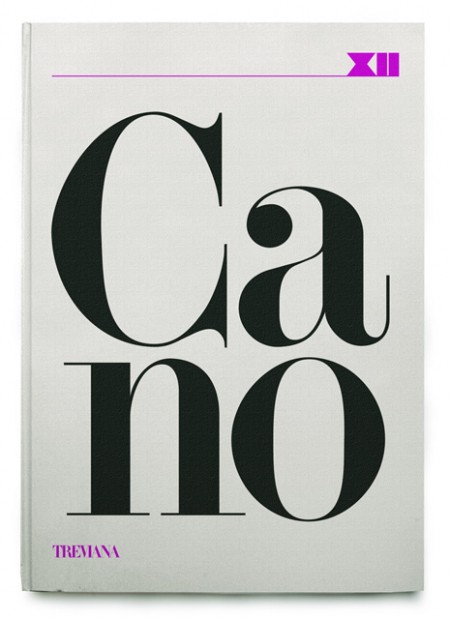
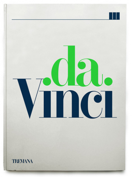
A few rejected book covers by Klas Ernflo. Beautiful typography at work here — I especially can’t get over how amazing the uppercase G is in the top image (looks like Didot, but I’m not positive). Surprising (and not at the same time) that these were rejected by the publisher. I would have bought them on the spot, regardless of their contents!

Recently I’ve been trying to determine my favorite occurrence of each letter of the alphabet. I’ve picked a few, like the “G” seen above, but most letters remain up in the air. The eventual goal will be to have a list of 52 shapes; representing my absolute favorite renderings of each letterform, upper and lowercase. After that I guess I’ll move onto symbols and numbers (I already know my favorite “7” — Clarendon). A few other examples might be the “W” from the Westinghouse logo, the lowercase Avant Garde “a”, and maybe the “H” from Scott’s recent post.

Would love to hear everyone else’s favorites! It’s hard I know, to narrow it down outside of the context of application, but I’m sure there are some standout letters for each of you. Let us know!

Brands: Dead, Dying or Defunct

panam
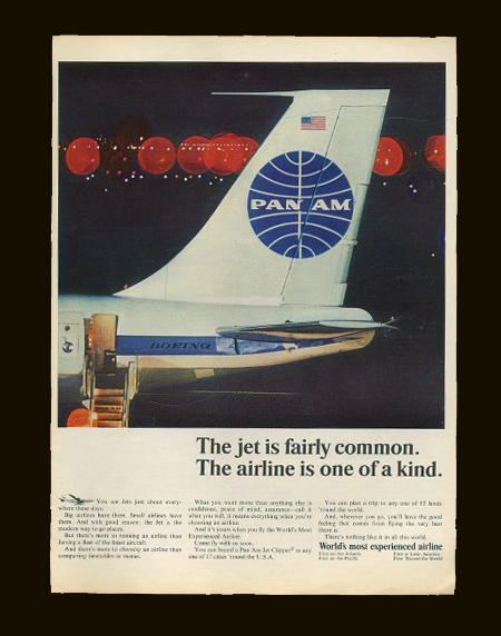
My most recent assignment for my MFA program is a pretty exciting one. Our task this semester is to pick a dead, dying or defunct brand and revitalize it. We are free to choose pretty much whatever we want so long as we can make a case for its need of a makeover and/or repositioning. The goal is not only to develop a new identity system for the brand, but also to extend its focus into untapped commercial avenues. For this part especially, we are encouraged to let our imaginations go wild. At the end of the project we will have an overhauled identity system, new product extensions, and an imagined history starting from wherever we picked up — the only thing that must be carried over is the original name.

Pan Am, a most beloved brand, would be a great example of something that would work really well for this project. Picking something that is familiar to people and in the public consciousness is always a good strategic choice. Although, you do run the risk of competing with a powerful history and a previously very effective identity. Another good example that Scott and I discussed was General Dynamics.

Today in class we went over everyone’s choices and there were some pretty cool ones; some very random, and most with lots of potential for sure. I am still on the fence with my choices, but I think I’ll come round this weekend when I have more time to think of potential futures. Right now, I’m thinking it might be fun to try and make No Fear cool again. They obviously aren’t an extinct brand, but if you visit the website you’ll see there is room for some…improvement.

Anyone think of other brands that are in desperate need of a renovation or rebirth? We found this list, but most I had not heard of. I’m sure there must be some others out there just screaming for an overhaul. Sound off in the comments.

UPDATE: The brand I ended up choosing was Playboy. Read about it here.

Alexandra Valenti

73500022
lake
10
L1023522
L1010822
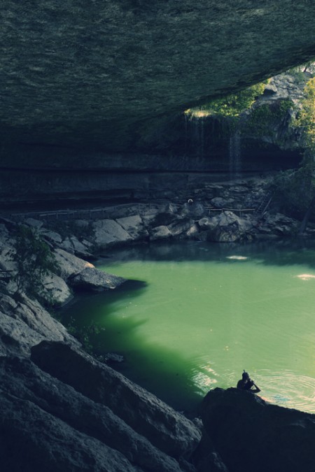
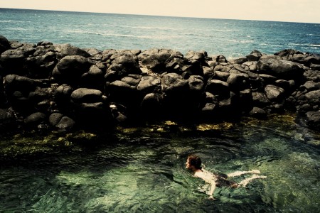
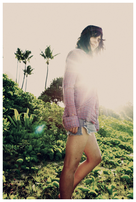
Alexandra Valenti has a very diverse portfolio of photography. Two of my favorite things — Hawaii and recording studios — are frequently portrayed. Her work reminds me of what I imagine to be the perfect day; adventuring around some abandoned island all afternoon, then coming inside and recording deep into the night. What a combination.

The chosen subjects and processing style remind me a bit of some of Neil Krug’s work.

via do it for the fame

826LA Time Travel Posters v.2

nationalparks
firegood
changes

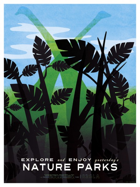
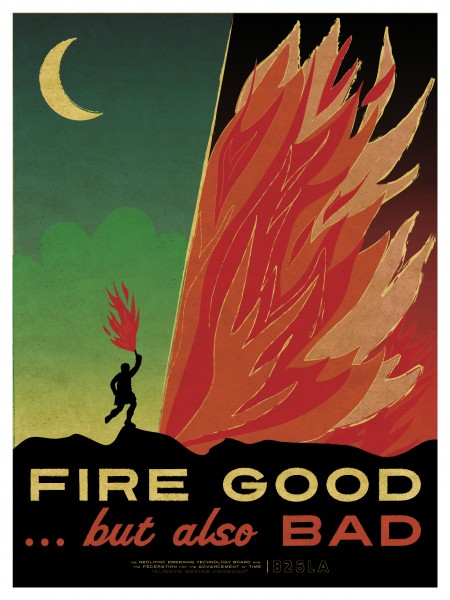
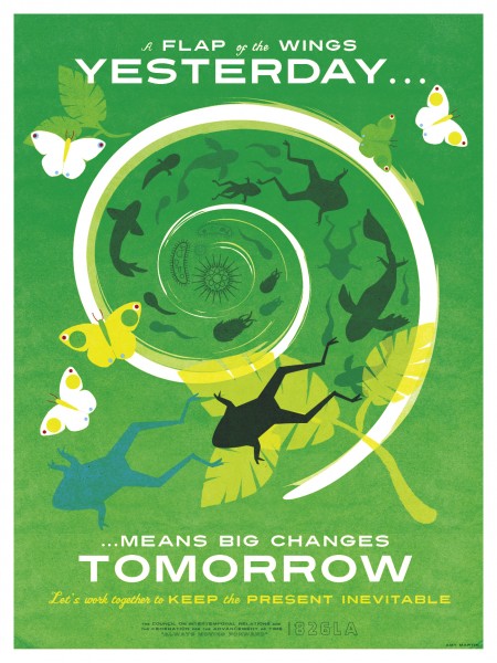
826LA has released a second round of Time Travel posters, on sale at their Echo Park Time Travel Mart. You can view the first series on this page as well, just scroll down a touch. Both were created by Los Angelas based illustrator/designer Amy Martin. As Amy notes on her blog, the sans-serifs at work are Turnpike and Featured Item. The script face is Vitrina.

I love both editions — can’t really decide which set I like better. I think they each have their strong points; for me, the illustrations of the first series and the typography of the second are the standout features. If there were some way to make a super amazing hybrid of the two I’d be all for it. At the end of the day, they are both great — terrific concept and strong execution.