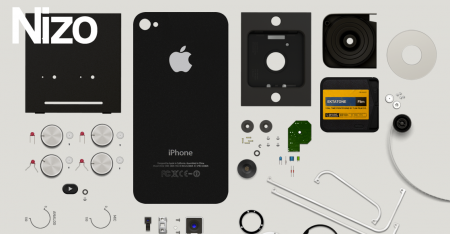
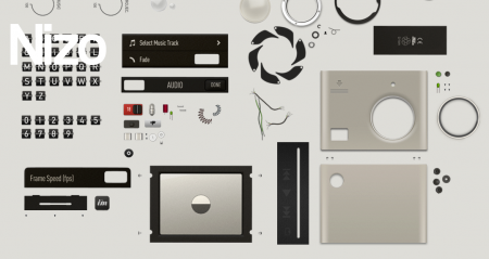
From what I can gather, Nizo is an app that brings the lovely Super 8 stylings to the iPhone. The app isn’t out yet, but right now I’m just mesmerized by the promo page. Its elegant implementation really stopped me in my tracks this morning. The app is put out by Image Mechanics, who have a pretty darn sexy site themselves.
Posts by Alex
Nizo
Jamie Beck: Cinemagraphs
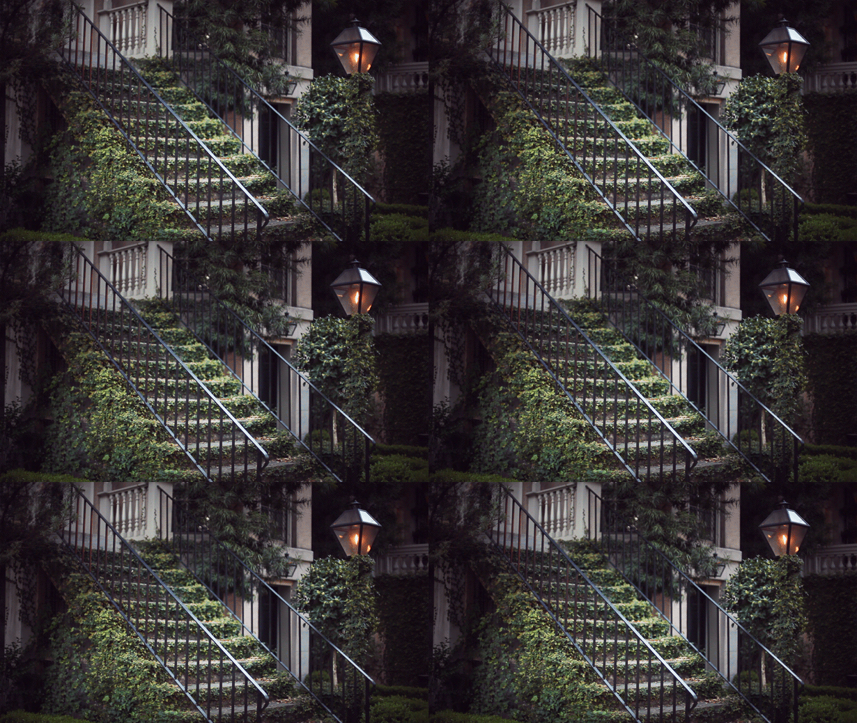
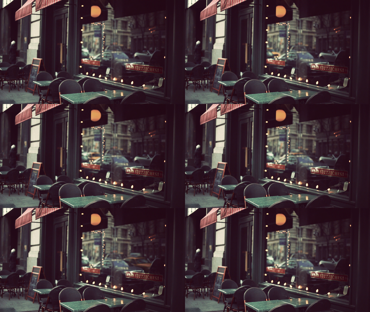


This is my favorite thing on the internet right now. These terrific animated GIFs were created by Jamie Beck, a NYC based photographer. The allure is simple: rather than overtly drawing your attention to obvious movement, these animations are very subtle and controlled.
*Tasteful* I think is right word to describe them. It’s what sets them apart from all the other nonsense GIF animations. The subtlety creates a kind of serenity almost — sort of a halfway point between film and real life. Definitely makes you do a double take the first time you see it.
Prediction: I know animated GIFs are as old as time, but I think soon this subtle spin on the technique will be absolutely everywhere. Enjoy it now.
Anatomy of a Computer Virus
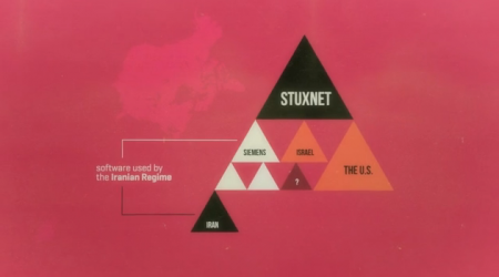
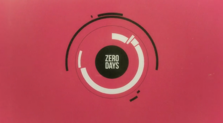
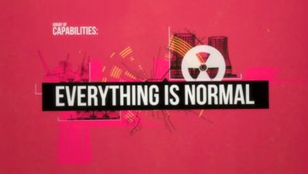

This is an awesome video infographic about the computer virus Stuxnet. It was created by Patrick Clair, a motion designer from Australia. I’m not sure which was more captivating for me, the visuals or the information. From a design perspective, this is gorgeous, but it’s also a fascinating description of Stuxnet, the first “open source weapon.”
WMC Festival

I’m giving a talk this Saturday at the WMC Fest in Cleveland, Ohio. The Weapons of Mass Creation Festival is a 2 day event packed with design talks, concerts and all sorts of other creativity-related goodness. It’s now in its 2nd year and is put on by local agency Go Media. A whole host of exciting people are speaking, check the lineup here.
My talk is Saturday evening at 5:30PM EST. I’ll be talking about all sorts of things — mainly some strange and wonderful lessons I’ve learned along the way from trying to become a famous musican to eventually dropping out of graduate school to terrify my parents and live a life of crime. Or something like that. Anyway if Cleveland is nearby for you I hope to see you there! Definitely find me and say hello. Maybe we can even talk about design (or anything else random of our choosing at that moment).
You can buy tickets here and watch live.
Apolis Global Citizen


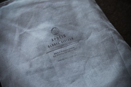
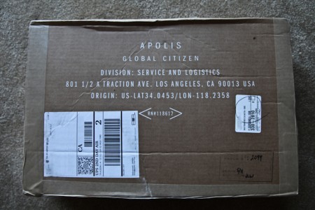
It’s hard to pin down what Apolis Global actually is. One part clothing shop, one part advocacy group, they guys at Apolis are certainly a versatile bunch. I’m writing about them mainly because of how impressed I was with their overall branding. They’ve got their visual message down. I placed an order through their shop and received the awesome artifacts above. It took me a moment to open the box because I didn’t want to destroy it.
I actually found Apolis by way of their logo, which I absolutely love. You can find out a little more about it here.
Firespotter Logo Design Process
While it’s fresh I thought I’d write up the process behind the Firespotter Labs logo I designed. This was an incredibly fun logo to design and probably one of the quickest, at least when contrast to some of the luxurious multiple month (!) design explorations I’ve done in the past for school or other companies. That said, it was exceptionally challenging; it’s hard to take a step back and think objectively about the company you’re a part of.
Before this, I had already designed a couple logos for some of the products we’re working on now. I had to break out of the “consumer application” design mindset I had been entrenched in for a few months. For the mothership, we needed something that conveyed that we were a lab full of crazy people brewing up cool things, while simultaneously appearing to be trustworthy gentlefolk worthy of venture support.
Left School, Joined a Startup

You may have noticed I’ve been a little less prolific around here lately; finally I can tell you why. I’m very excited to say that as of last November, I dropped out of my MFA program and am a cofounder of Firespotter Labs, a startup funded by Google Ventures. As cool as the concept of “stealth mode” sounds to me, I am decidedly *not* used to *not* writing about what I’m doing. Finally my sneakiness is over! In this post I want to talk a little bit about what it’s been like working full time at a startup, as well what went into the decision to drop out of my design program five months away from graduation. I really couldn’t be happier.
Of course all this would be more interesting if you knew exactly what we were doing. I wrote our About Us the other day and it’s spectacularly vague, so if you want to find out a little more, there were nice articles in The New York Times and Techcrunch last week.
(more…)
Skydiving with a GoPro
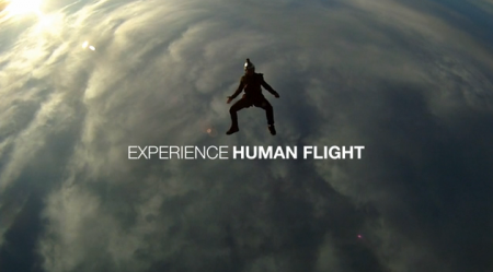
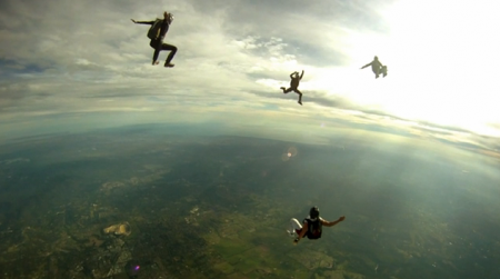
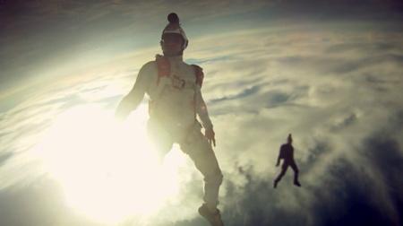
Betty Wants In crafted this very unique skydiving video using a GoPro. It’s exceptionally peaceful; it makes skydivers look more like they’re floating gracefully underwater as opposed to plummeting through the windy stratosphere on their way toward terminal-velocity.
I’ve never used a GoPro, or gone skydiving for that matter, and now I really want to experience both. Mission accomplished Melbourne Skydive Centre.
Alex Stoddard

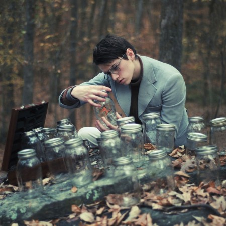


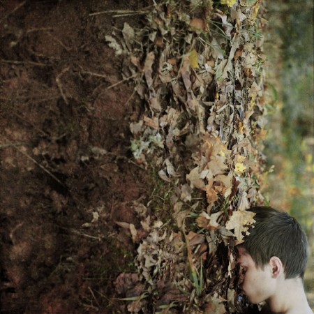
I’m blown away by these self-portraits of Alex Stoddard. According to Alex, he is “seventeen years old, and spends far too much time running barefoot in the forest.” Love it. He also seems to spend a fair amount of time naked or dillydallying around open flames. Can’t help but feel I misspent my late teenage years…
Thomas Doyle


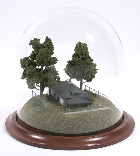
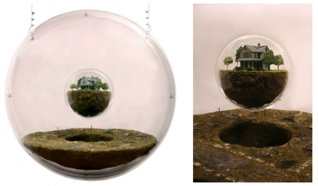

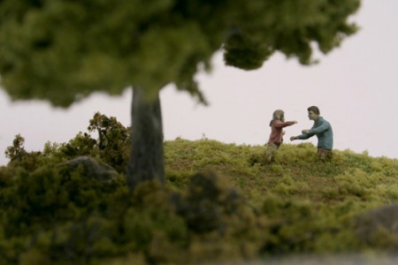
This is the work of Thomas Doyle. Truly unique and unusual in the most wonderful way! I recognized the style from a NYT Magazine cover a few years back that I always kept around just because I loved the image. Definitely a little weird, but definitely a lot awesome.
On a side note, I love cityscapes or scenes contained in glass — I think a sentiment carried over from my days spent playing SimCity 2000 where the glass-enclosed Archipelago was the ultimate goal. Despite the obvious spatial downsides of being confined to a limited space, I’ve always wanted to reside in such a dwelling.
