Posts by Alex

Chad Hagen

knob-dial
Basic RGB
complicated_graph_5.1
complicated_graph_1
cube
Basic RGB

I found a number of cool sites as I explored the Cargo network this last weekend. One such site was the portfolio of Chad Hagen. I love how each of his projects unfolds as a series; within every section there are a number of interesting images tied together by similar visual stylings. I enjoyed clicking through the slideshows and determining my favorites of each, some of which are above.

His beautifully designed illustrations look like they could be out of an instruction manual for some amazing (albeit nonexistent) product or device. As his title “Nonsense Infographics” indicates, there is actually no “information” being conveyed per se — but when the graphics look this good, I don’t really care.

A Weekend with Cargo Collective

cargo
Cargo is a terrific web publishing platform built with creatives in mind. Like many content management systems (Squarespace, Indexhibit, Joomla etc), Cargo provides a backend that allows you to quickly publish and maintain a website without ever opening Dreamweaver. What distinguishes Cargo is a focus on simple and effective design. Consistent in all Cargo templates is a layout that is clear and simple; allowing the work to speak for itself without a complicated interface getting in the way.

Cargo evolved out of the system that runs the SpaceCollective community. We found it remarkably successful and efficient in creating visual content on the web, placing a strong emphasis on design, layout, image quality and typography. Our goal is to dramatically increase the accessibility and exposure of creative individuals on the Internet, while aspiring to build a networked context that will contribute to the culture as a whole.Cargo Collective.

Noteworthy Features
– Free hosting with the ability to set up a custom URL. This is awesome. I have also played around with Squarespace, but their hosting costs are a little frightening — especially if you are also paying URL registration on top of that.

– Multiple template designs to build off. Each one starts with a great layout and it’s really easy to apply your own brand. Simple manipulations of color, font, and header images etc quickly distinguish your site from the skeleton template.

– Follow feature, similar to Tumblr or Twitter — allows you to keep tabs on your favorite Cargo pages.

– Developer forum. I had a small issue which I posted to the forum — received a response within 3 hours. Not bad!

– Slideshow and Fullscreen features for viewing images. This is exceptionally easy to incorporate (just a matter of clicking the buttons) and is a really great feature. Works flawlessly and adds an extra touch of unique functionality.

My Experience

I spent the last few days migrating my portfolio to the Cargo system. I had done a lot of the preparation work a while ago, when I put a portfolio up on Behance, so I didn’t have to spend too long sourcing my images and writing description paragraphs. I was thrilled to be moving to a more personalized portfolio space — as much as I love Behance, sometimes it can feel a little too much like a design Myspace.

The set up process was quick, easy, and remarkably enjoyable. All in all I would say it took about 6-8 hours from start to finish. Most of this time was spent designing the look and feel after the content was uploaded. Once I got familiar with the CSS at work, it was just a matter of figuring out exactly how I wanted to look — altering fonts sizes, small layout tweaks, and making sure everything worked properly. I only hit one or two speed bumps, all easily solved by a quick Google search.

I think it’s important to note that I am not a “web guy” by any stretch of the imagination — if I can handle it, this is a good sign for anyone intimidated by the words “CSS” or “target blank”. Having a basic understanding of CSS/HTML helps, especially if you are planning on tweaking the template significantly, but it is not completely necessary. Even with my limited knowledge, I was able to make the adjustments necessary to create a site I am happy with. As mentioned, the important part of a site like this is the work, and I didn’t really feel like I needed to brand the site too extensively.

As of now, Cargo is in the pre-release stage. I am really excited to see how this system evolves as more and more people get involved. I would highly recommend it to anyone debating which CMS to choose. If you would like to apply for an account, use the contact address on the website.

Favorite Cargo Sites
but does it float
superfamous studios (aka Folkert Gorter)
The Office of Feltron
Avant
Jory Dayne

Vintage Book Covers

IMG_0256
IMG_0251
IMG_0283
IMG_0260
IMG_0249
IMG_0281
IMG_0278
I was exploring the depths of my basement the other day and came across these books. My favorite is the first one, but I think they all have something interesting going on. (I remember the Animal Farm cover from Scott’s post a while back.) The typography of each cover is worth noting — especially the beautiful implementation of the lowercase Carousel on the “Secrets of Health…” cover! The ampersand in particular is pretty amazing. As much as I love Bodoni and Didot, Carousel has a few extra twists that make it more exciting to me.

Sometimes I wish I didn’t live in a design centric city; all the used bookstores were plundered long ago of anything with cool design at work. It is a rare occurrence that I find something worth buying at even the most remote vintage bookshop. Got out here too late!

Apologies for the iPhone photos — it was all I had at the time and I couldn’t pass up the chance to snap some shots. Also worth noting is the price of some of these…when was the last time you paid 25c for a book?

Said the Computer to the Specialist

rowe
rowe2
rowe3
rowe4
Said the Computer to the Specialist is a new book by Tom Rowe. It’s a collection of illustrations of analog recording equipment and long extinct super computers. Very stylish if you ask me. I would love to see some typography going on though — could really make some of these pieces. Nothing crazy, just some interesting titling to introduce some variety and that extra level of visual interest. Either way, some terrific illustrations.

Production is limited to 50 signed/numbered copies, so better act fast if you’re interested. Availible for purchase through Nobrow press.

via The Silver Lining

Siggi Odds

siggi0
siggi
siggi3
siggi4
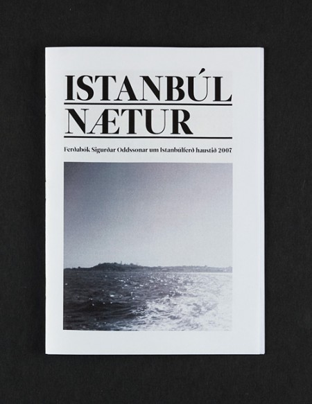
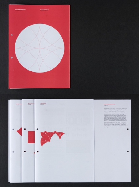
Icelandic artist Siggi Odds is amazing. I think it’s great that he takes time to describe a little background for his projects — each description is perfectly concise and provides just enough context for a better understanding of his artistic choices. Not to mention the work is terrific. I would love to see what he’s been working on recently — if his older work is any indication, he is probably doing some pretty incredible design. Keep an eye out for updates on his site. Hopefully see something new soon!

via The Strange Attractor

Color Management: A Field Guide

Color Management: A Field Guide
Whether you are designing for print or for the web, making the leap from what you see on your computer screen to the outside world can be a tricky process, fraught with unpredictable changes and unexpected results. The web is full of information regarding color management and sifting through it can be very overwhelming. Contradictory opinions abound and it can be difficult to find reliable sources of information.

Over the last few months, Scott and I have been researching this topic extensively. With the addition of the new Epson 9900 to the studio, we wanted to be sure that our printer workflow was optimized and producing a consistent output. With the help of Kirk Economos of Meridian Cyber Solutions, we have implemented a color management system that works for us. Below we have tried to aggregate this knowledge into a simple and useful guide, designed to help you ensure your studio is set up correctly. It is not intended to be the end-all article on color management by any means — but it’s a good place to start if color management isn’t something you have previously implemented or considered.

(more…)

Design Magazine Overview

magazine spines
As much as I love my Google Reader, I still prefer to get my design fix in printed form. In addition to providing the necessary dose of inspiration, magazines usually include insightful commentary and design criticism. I love this sort of writing on design and it seems like the best place to find it is still in the “unplugged” land of printed media. Additionally, with each one you get an actual piece of design to hold in your hand. It’s easy to forget how cool this is if you’re used to bouncing from blog to blog. After the jump, I’ve put together an overview of a the major players in the design magazine realm. Check out the list!

(more…)

Branding Strategy: Names

names
If you’re like me, you have piles and piles of notebooks filled with half-baked name ideas for firms, bands, and the like. When I was in college, I think I went through about 30 pages of (truly) terrible names before settling on something for my former band*. Basically I’ve never really perfected this technique. Whether it’s for a new band, new client, or my own (eventual) design studio, it is always a long and arduous process to think of the perfect name. (Herein lies the problem — looking for the “perfect” name is often the creativity killer for me.)

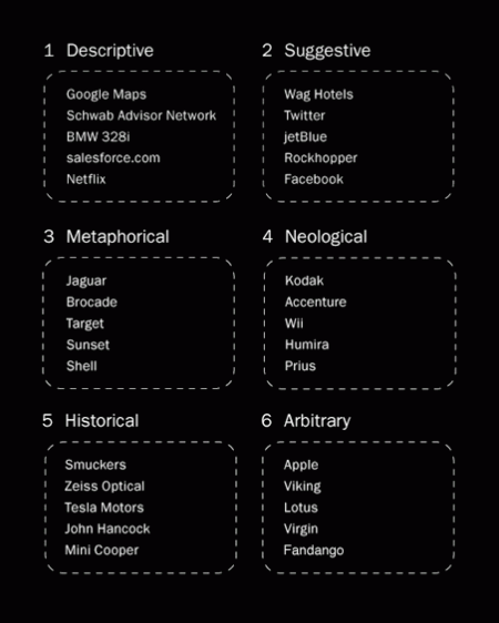
My process generally starts with a pencil, thesaurus, dictionary, and my iTunes playlist (pieces of song titles have served me well). It’s worked in the past, but for a recent project, I decided to try something new. I based my exploration off of Josh Levine’s useful chart that divides naming styles into six categories. You can see the chart above for examples and read the full descriptions here. I tried to go through the list three times, thinking of a potential name for each category on every rotation. What ended up happening was I thought of about 30 names in the metaphorical category, avoided the descriptive, and thought of one or two for each of the others. After about two hours I had my name, at the bottom of my metaphorical category list.

Of course, my normal process is not unlike this most recent one — but the added structure and formulaic approach really seemed to help me in this case. I just hope to be able to replicate it in the future. I would recommend giving this chart a try if you are looking for new brainstorming techniques. Just switching things up is really all you need to spark something cool. I’m sure everyone has their own strategies and I’d love to hear some if you’ve got them!

*Crazy story actually — the name I eventually decided on (Running Lights) was the same name my Mom had sent me in response to my plea for suggestions. We had thought of the exact same name, on the same day, without any direction or communication. I told this story to my band mates and that was that — how could we go with anything else!

ISO50 x Epson 9900

As Scott mentioned, the ISO50 studio recently added the hulking Epson 9900 to its arsenal. We purchased the printer through Kirk Economos of Meridian Cyber Solutions, and he was on hand to help us set things up and make sure everything was working properly. I filmed the set up procedure and a trimmed down version is displayed above. Many thanks to Kirk for helping out! If you are in the market for a large format machine or other print supplies, we would highly recommend the guys over at Meridian.

In case it doesn’t come across on screen, this is one serious machine. I’m used to working with the much smaller R2400 and there is really no comparison. It’s been pretty exciting to have the ability to output such massive prints with the 9900. We had a few color profile and paper issues initially, but everything is working smoothly now. Look for a detailed post about color management and calibration next week.

Hatch Interview Part II

hatch
Dave (of the fantastic Grain Edit) spoke to Katie and Joel for Part II of our Hatch interview series. They talk in detail about the JAQK design process and look at a lot of early visual directions for the brand. Further proof of the innovative work the crew over at Hatch is doing. Check out Parts I and II of the interview.