Posts by Alex

Sebastian Gram / Hello Monday

Picture 2
Picture 3
Picture 1
892641233871995
892641233932952
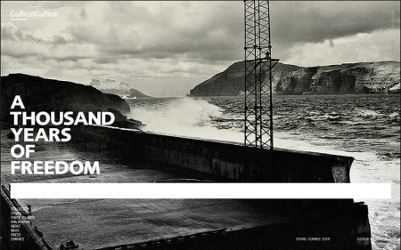
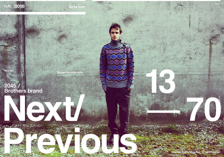
Seriously impressed by the diverse portfolio of Danish designer Sebastian Gram (currently art director of Hello Monday). The first image (interactive design for fashion brand Revolution) made the FFFFound rounds a while back, but it wasn’t until recently that I explored his portfolio further and found the rest of his exceptional work. Each project, whether it’s a logo or full blown identity system, is considered down to the smallest detail. It’s also cool to see process shots along side the finished product; gives you a sense how much time and refinement went into it.

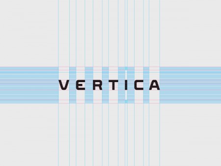
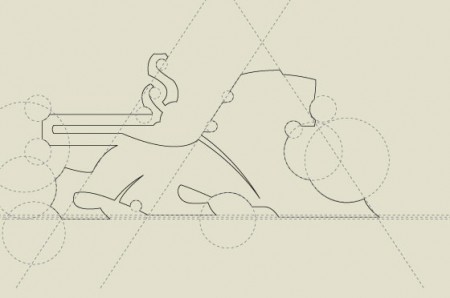
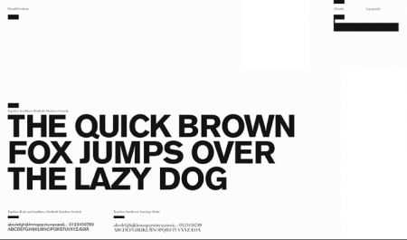
I was especially intrigued by the typeface for Vertica, developed by Gram and Creative United. My guess, based on progress images like the one above, is that it was designed as a custom face for Vertica and is not commercially available. Too bad, those are some sexy letterforms. Like much of Gram’s work, it manages to rock out with a rigid, corporate aesthetic, without being boring or common. I would love to see my name written in that font.

The Graphic Design Thesis

plan
As of this summer I am officially halfway through my graduate design program at the Academy of Art. Unlike a BFA degree, the MFA requires the completion of a thesis, and the second half of the graduate program is dedicated to the development of this. The most recent checkpoint I had to clear was Midpoint; basically a review of your work and skills to date, as well as a clearing ground for your upcoming project. It’s a pretty exciting meeting actually; you place all your work on the table, in front of a faculty committee, and they determine whether you are fit to continue. The main focus of the meeting is your thesis proposition. Before they allow you to embark on a 1-2 year thesis project, they want to make sure your idea is viable and worth pursuing.

I am past the Midpoint stage now and am in a class called Thesis Development this summer. It is a very different class than those that I’ve written about previously. Rather than creating a series of graphic design based projects, we are spending all of our time researching and strategizing how we are going to go about the next few years. I always picture that scene in Apollo 13 when they are trying to get back to Earth and only have one chance to fire their rocket boosters to enter the atmosphere at the correct angle. It is extremely important that they get their aim correct, else they bounce off the atmosphere and careen into space and die. I think of this class as that moment in the space flight; we are aiming where we want to go before firing our boosters over the next year and trying and pull off a successful project.

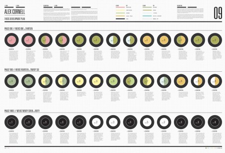
Above you see a piece created for the class. It is a piece of design, as everything we bring to school must be, but the main purpose of the document is to chart my progress over the next year. It divides the weeks up into sections and outlines what I should be doing when. I expect it to change many times over the course of the coming months (it’s already way off base), but it really helps having a checklist like this to keep tabs on my progress. I have never pursued a project of this magnitude before and the planning involved is unlike any design challenge I have been faced with previously. Most of the time I just open Illustrator and start drawing lines and scribbles until things look cool.

A graphic design thesis is a very interesting concept. The biggest thing I struggled with, as I decided on a topic, was whether my thesis would implement graphic design, and pursue an issue outside the field, or whether it would be about Graphic Design itself, and aim to make waves within the design community. Most projects do the former. We are lucky in this way — because design really can be used to solve just about any problem — but there is the concern that this strategy will be of no relevance to the actual field of study. I still don’t know quite what to make of this dilemma. I have tried to meld the two directions with my project (I’ll discuss details in later process posts), but I am unsure whether it will end up being that much more effective because of this, or if it will fail because I never decided which path to pursue. I guess it’s still too early in the process to know.
Max Huber Round Two: Idea Magazine

idea1
idea2
idea3
idea4
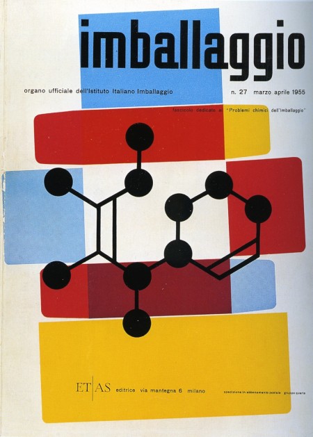
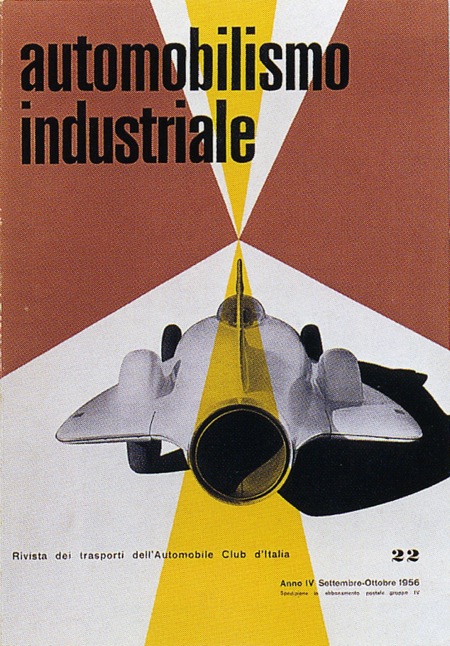
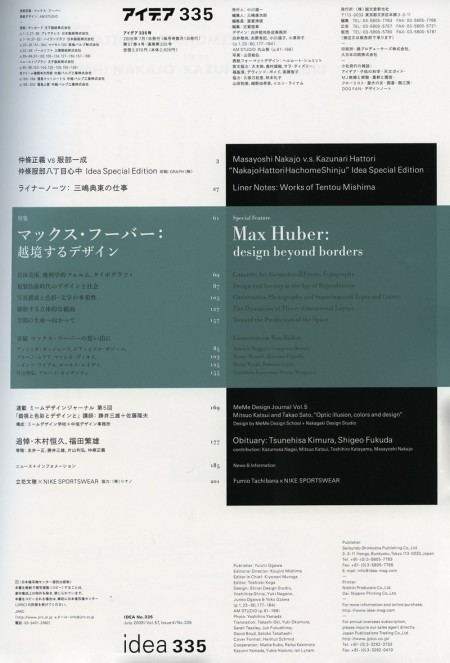
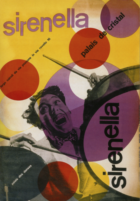
Immediately after I posted a few Max Huber posters earlier this week, I walked into Kinokuniya and saw that the latest issue of Idea was devoted to the man himself. A fantastic coincidence and even more fuel for my Max Huber inspired creative fire. The issue is huge (about 200 pages) and is filled with some pretty incredible stuff. A lot of work I had never seen before; I put a few of my favorites above (the Table of Contents as well). The issue costs quite a bit for a magazine ($50 eek!) but Idea is certainly of much greater quality than most magazines. Well worth a perusal if you find yourself in a Japanese bookstore any time soon.

Max Huber

Picture 3
Picture 4
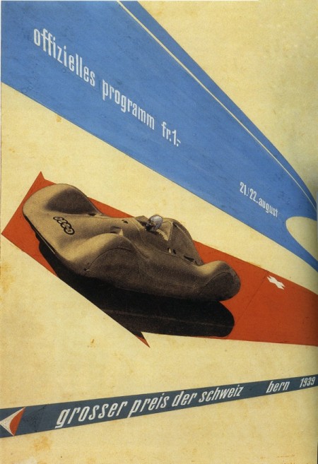
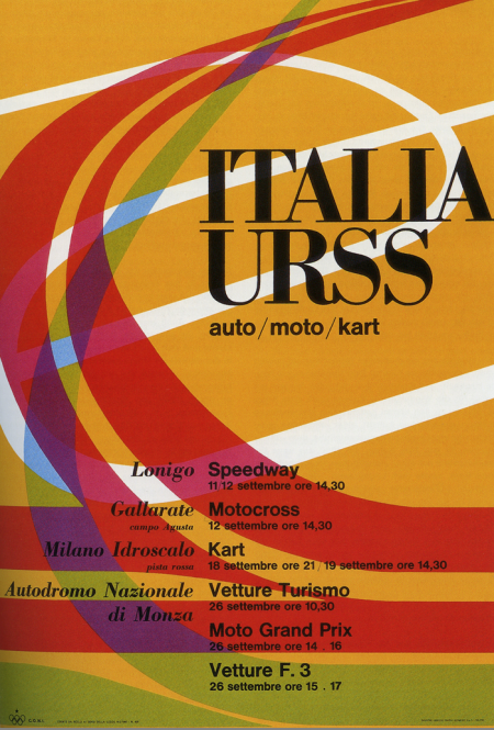
I’ve got a few projects coming up so I’ve been browsing through some of my old design books for inspiration. These two posters by Max Huber kick-started my mind into creative gear. I really like the color palette at work in both; really unusual and effective. The second one is all about the type for me. Didot Bold in all caps always does a good job. I was recently in Switzerland and am really bummed I missed out on the Max Huber Museum. Next time I guess.

Leandro Castelao

tom_dixon
birds
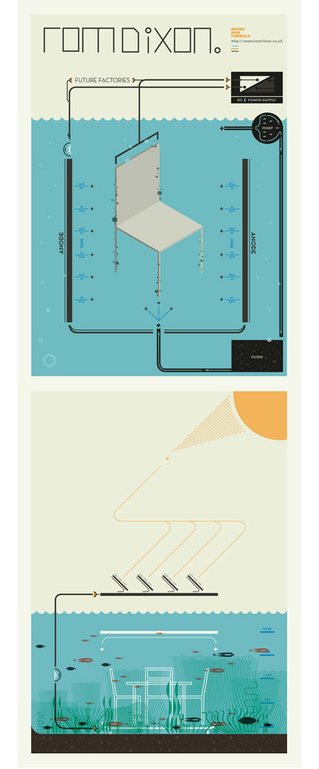
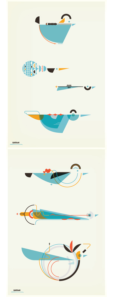
A few pieces by Argentinean illustrator Leandro Castelao. Terrific attention to detail and great color at work here. I feel like I’m looking at a retro instruction manual for some super bad ass birdhouse. Illustrations like this remind me of the work of Feric. Castelao’s are a little less intricate, but the playful/scientific aesthetic is reminiscent of some of the Fevolution renderings. Some impressive work from both artists.

Milton Glaser Contest Winners

miltonposter-sig-450x538
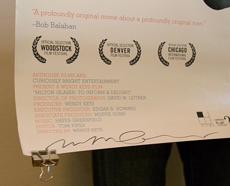
The Milton Glaser giveaway has come to a close! Here are the winners:

Grand Prize: David Bilodeau
Runner Up: Christian W

Congratulations guys! Your prizes are in the mail and should arrive within the next few days. As for everyone else, thanks for entering, it was great to see so many people excited about Glaser and the new film. We’ll be holding more contests and giveaways in the future, so if you didn’t win this time, keep an eye on the blog for more to come.

Film the Blanks

Picture 3
Picture 4
Picture 7
Picture 6
Picture 2
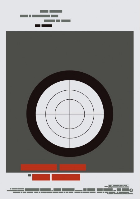
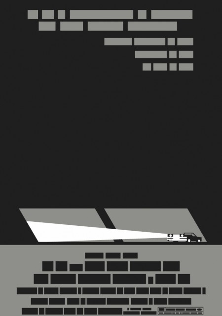
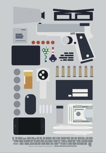
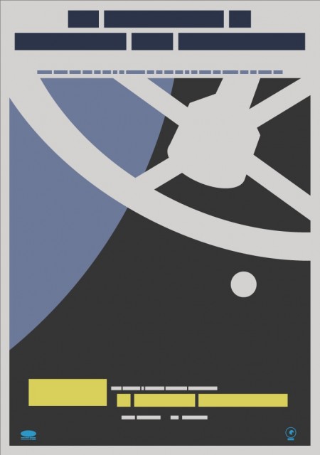
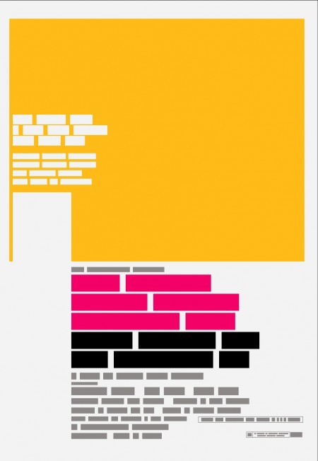
Film the Blanks is an ongoing design experiment that takes existing film posters and abstracts them down to their core elements. The project has garnered much press over the last few months, and I figured I’d post up some of my favorite pieces. I like the work because of the visuals, but there is also a strong participatory component that sets it apart. Each time a “blank” is uploaded to the site, users are invited to guess which film the abstraction represents. In some cases the solution is obvious, but it’s often remarkably difficult to discern which poster is hiding behind the blocks. Eventually clues are released and points are awarded to the successful guessers. It’s an exciting format for a design project; one that takes a strong concept, built around a fairly standard medium (poster), and twists it into something unique and engaging.

You can find all the posters in the Flickr set. You can also buy a few over at the Buy the Blanks store.

Ring Geigy for Service

img093
img096
img094
img095
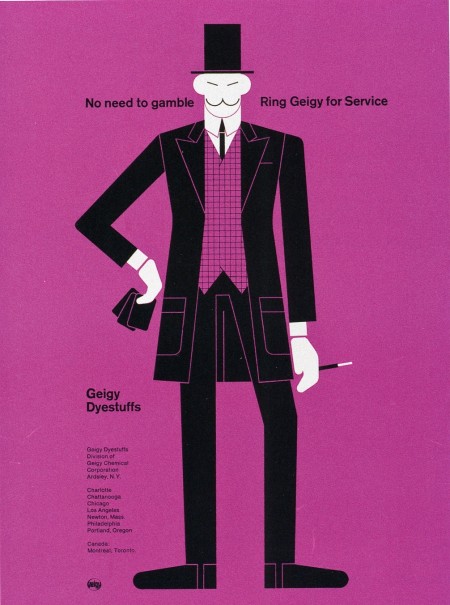
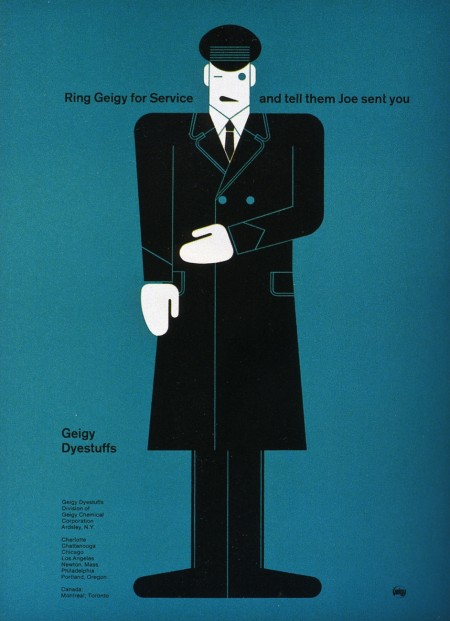
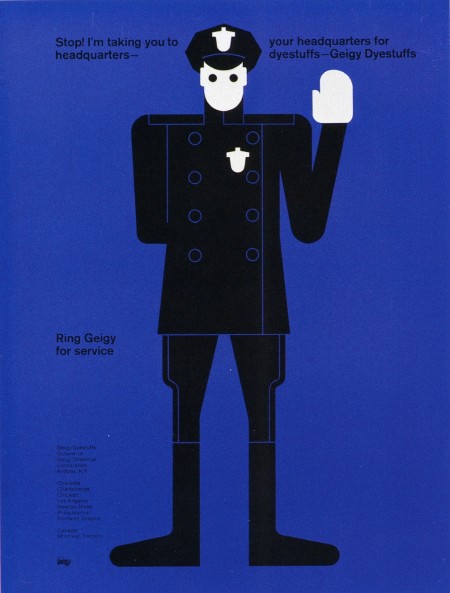
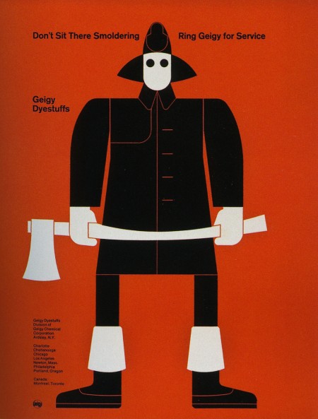
These advertisements are part of a Geigy campaign from 1965. They are all letterpress illustrations by Fred Troller. Each version pairs a striking figure with a related slogan and encourages you to “Ring Geigy for service.” I probably would have called these guys up even if I had no idea what “service” they could provide.

I like Winkreative’s identity for Porter Airlines for similar reasons. I wouldn’t stack one against the other by any means, but the use flat colors, stark figures, and limited perspective at least puts them in the same inspiration folder for me. (And the panda is awesome)

Quick Review: To Inform and Delight

miltonposter-sig
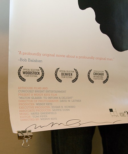
Don’t forget to enter the Milton Glaser giveaway! We will be choosing two winners on Monday, so you’ve still got a couple days to get your comment in and have a chance at winning the signed poster and/or a copy of Glaser’s new book. Winners will be drawn at random and notified via email. Leave a comment on the original post to enter.

I got a chance to see To Inform and Delight on Thursday and I really enjoyed it. It’s not a big production by any means; just a simple portrait of one of the world’s greatest designers. The film does a great job overviewing Glaser’s career and you really get a sense of the magnitude of his impact on the field. Glaser is strikingly articulate and a pleasure to listen to as he describes his career, work, and perspectives on design and art. It’s still playing at the Roxie in San Francisco until July 2nd.

note: For you Bay Area folk, Objectified is making another San Francisco run this weekend. If you missed the premier a few months ago, try and get over to the Yerba Buena Center for the Arts before the end of the weekend.

Robert Longo

Picture 3
Picture 4
Picture 2
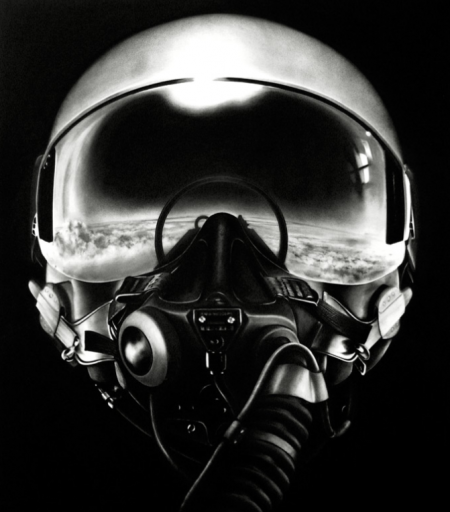
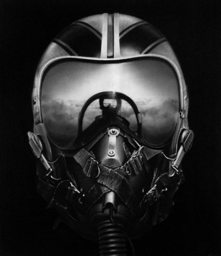
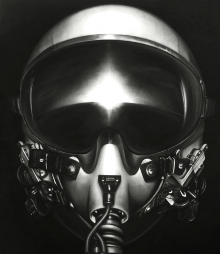
These images are by New York City based artist Robert Longo. Props to but does it float for spotting these, truly a great find. I have always been fascinated with anything and everything to do with aviation, so these are of obvious appeal. The coolest thing is the process behind them; though they look like photographs at first, they are actually graphite and charcoal drawings, based off projected photographs. The background disappears and all that is left is the strikingly detailed subject. These pilot renderings are my favorite, but much of his other work is up on his site for your enjoyment.

via bdif