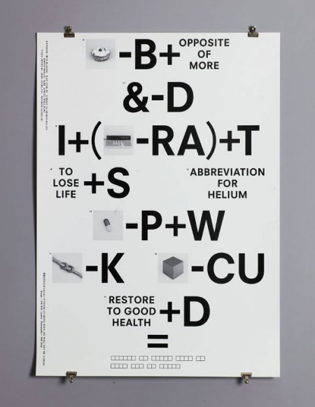
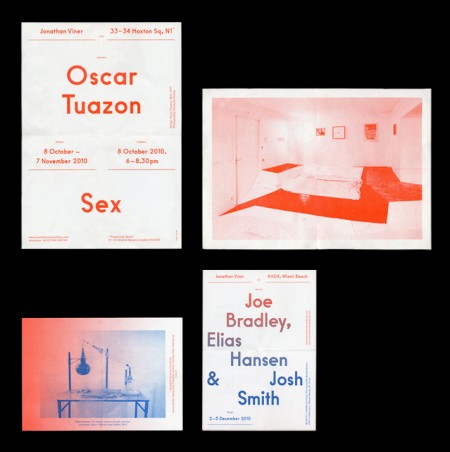
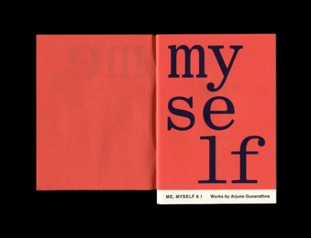
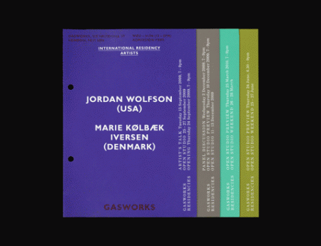
This is the work of OK-RM, a London based design studio. The style reminds me a lot of Sulki and Min and maybe a little bit of Qubik. I enjoy this style; where type is placed all over the page, in a seemingly gridless manner, while still maintaining a sense of balance and proper hierarchy. To me it shows a kind of fearlessness, and a clear love of letterform.
Posts by Alex
OK-RM
Hugh Ferriss
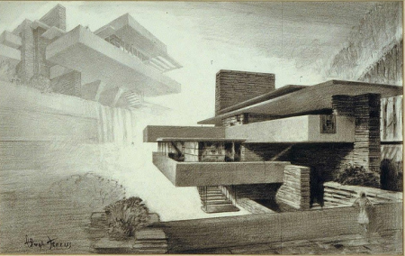
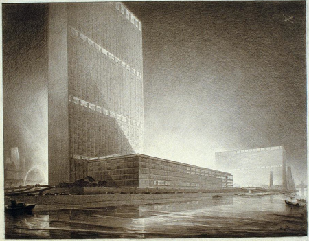
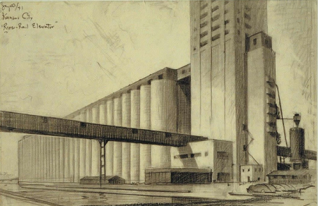
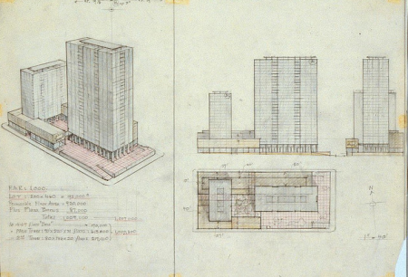
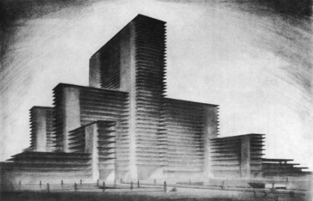
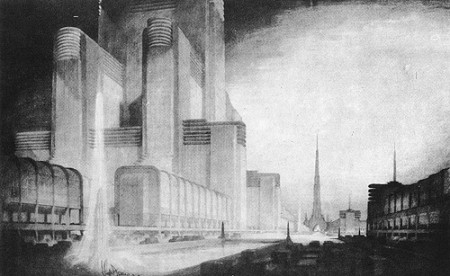
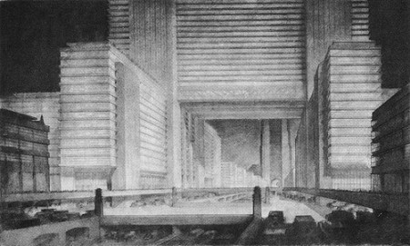 These drawings are by architectural draftsman Hugh Ferriss . His work is really incredible and demonstrates a fantastic imagination (not to mention patience). I prefer the style of the lighter, more detailed images, but I enjoyed the story behind the last few charcoal renderings. They are from The Metropolis of Tomorrow, where Ferriss imagined what a future megacity might look like. Delineator of Gotham indeed.
I recommend looking through this epic Flickr set to see more of his work.
Release the Freq
This is the video for Matta’s “Release the Freq“. The incredible cinematography and design is by Kim Holm. I really like how the visual complexity builds subtly over the course of the video. And of course it maps to the music nicely, though I’m not really a huge fan of the song. The color grading on this is terrific — I’m tempted to go off into the woods searching for domesticated deers to photograph.
Aaron Feaver


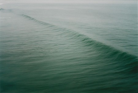
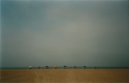
Aaron Feaver is an absolutely terrific photographer based in Los Angeles. His work is very moody and drenched in melancholy. It seems everywhere he goes it’s foggy and there are countless beautiful women moping around. Sounds like San Francisco…er…well, at least the bit about the fog.
Check out the rest of his portfolio here (depending how old school your job is, some of his shots may be nsfw).
Jennifer Sterling
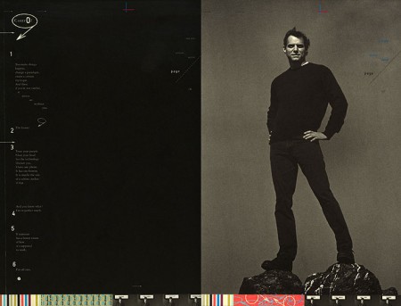
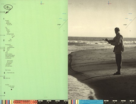
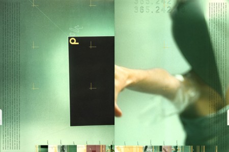
I had the great fortune to study under Jennifer Sterling at the Academy of Art, a couple of years ago now. She taught two of my typography classes (one of which I completed the Pantone Poster for). I’ve always been a big fan of her work, and as Fabien points out, her long disconnected site, has recently popped back up. No new work that I can see, but it was exciting to see the archive back online.
Jennifer was definitely one of my favorite instructors at school. She was intensely critical, which I loved, and I feel like her exacting evaluations drove me to do some of my best work at the time. I can’t stand it when people hold back during critiques or are luke-warm on giving feedback. If something I’ve done is bad I want to know. Maybe I’ll disagree and we can argue about it, but it is in no way helpful for students/teachers to hedge around giving honest feedback. I always appreciated Jennifer’s classes for her honest and precise critique.
Irina Werning
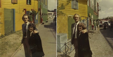
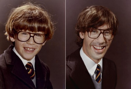
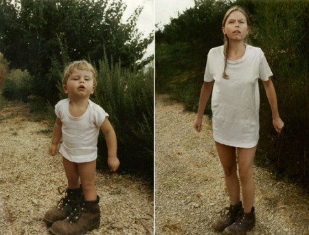
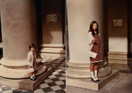
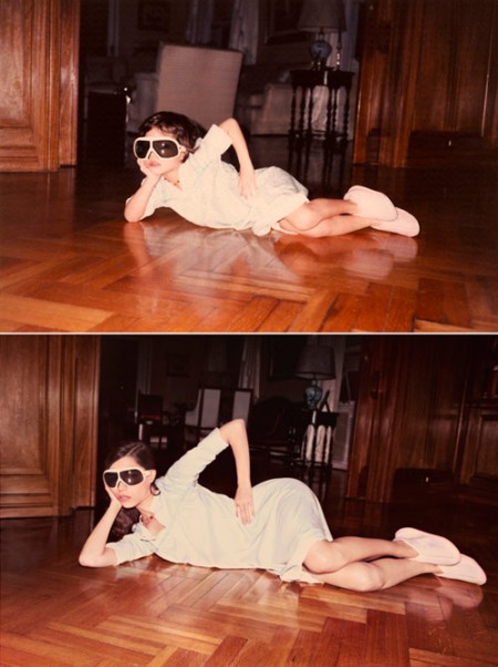
Back to the Future is a fascinating project by Irina Werning. She has convinced friends and family to recreate their old photos — in some cases, the resemblance is absolutely uncanny. Of course the location, person, clothes etc are all the exact same, but she’s also done a wonderful job of matching the look and feel of the original photograph. That is way harder than it looks. Matching the lighting must have taken forever!
I want to do this. Off to find some old photos of myself…
TED Behind the Scenes
I am headed to the TED conference this year and am unbelievably excited. I’ve been addicted to the talks for the better part of the last three years. My absolute favorite has always been Sir Ken Robinson’s discussion on creativity in education. I was excited to find the two videos above, the first of which shows a behind the scenes of Sir Ken’s talk, as well as the conference in general. A pretty cool peak into the workings of this amazing event.
Steven Hill / Film Screens
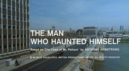
I love film titles, I think most designers do. If you’re looking for a comprehensive collection, Steven Hill’s Movie Title Screens Page is a good place to start. While there is video, there are thousands and thousands of screencaps. Only one shot from each (and you’ll have to look past the old school web design), but it’s a good place to jump off from if you’re looking for some kind of inspiration.
And of course it’s always worth mentioning the amazing Art of the Title Sequence again.
Kyle Tezak
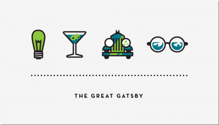
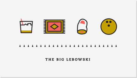
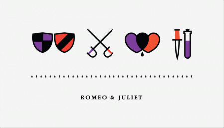
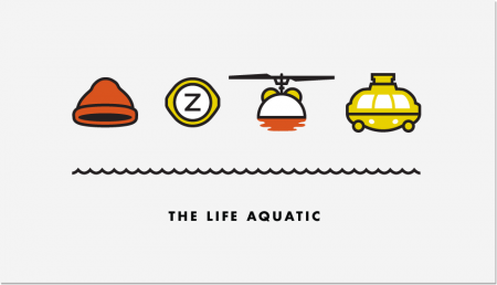
Kyle Tezak designed these icon collections to represent select films. Each film appears to get four icons, two colors, and a unique type treatment. You can see some of his work in-progress for this project on his Dribbble page.
I’m aware there are countless other projects that reduce films down to a few graphic elements. I particularly enjoyed this one because the elements are icons, not just squares and circles (albeit cleverly chosen ones). I find icon design trickier than poster design, and I am impressed with Kyle’s clear adeptness at the former.
Matthew Lyons / Push it Backwards
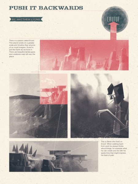
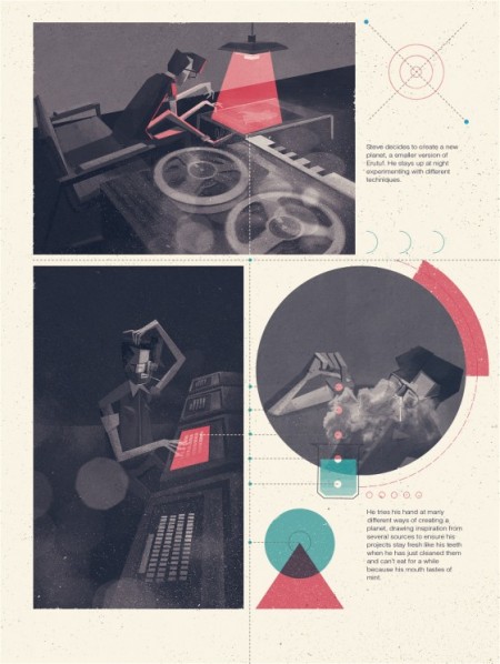
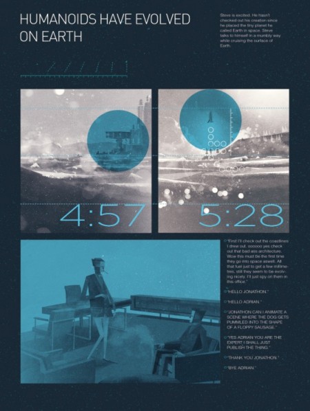
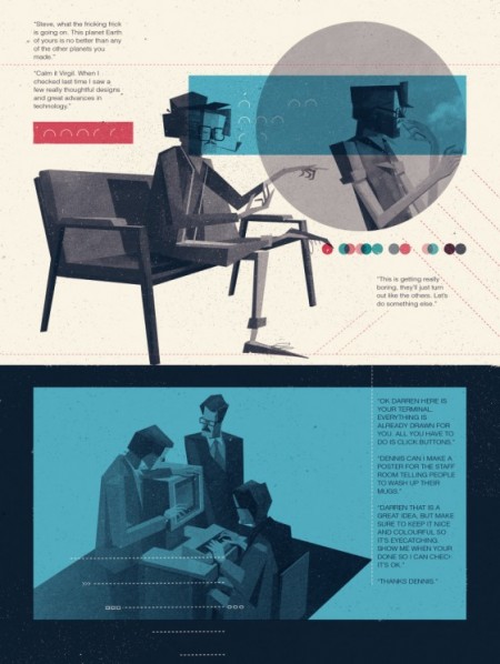
Matthew Lyons just posted a new comic called Push It Backwards. Consistent with everything he does, this looks absolutely amazing. I continue to be blown away by his talent, but more impressive to me is his imagination. The story he tells here (the pages you can read) is peculiar and wonderful. It’s really only a matter of time before we see his work absolutely everywhere (Pixar if you don’t hire him I will). A rare talent this one. Be sure to check out the process piece he did for us last year.

