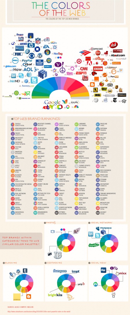
While the initial reasoning for the colors chosen may be trivial, the impact that these dominant players now have in the web world will surely influence the smaller startups that want to share in the positive color associations created by their bigger siblings
The fantastic Colourlovers put together this chart diagraming The Colors of the Top 100 Web Brands. A fascinating chart — the results of which you could probably guess — but it’s cool to see them all laid out and analyzed. Click here for the full size image.
Posts by Alex
Colors of the Top 100 Web Brands
Gap Contest Winners

First Place: Roger Schami
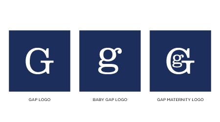
Second Place: Steve Juliano

Third Place: Benoit Henken
The votes are in and we have our top three Gap Logo redesigns. A varied bunch to be sure. Congratulations to our winners Roger Schami, Steve Juliano, and Benoit Henken! You will be notified by email with information regarding how to collect your prizes.
Honorable mentions to both Jason Caldeira and Chris Reynolds, who scored fourth and fifth place respectively.
Gap Redesign / Follow Up and Voting

Well it looks as though Gapgate is over as quickly as it appeared. After all the speculation, they did indeed pull a Tropicana. And what started out as a fun little experiment for us, quickly swelled far beyond our expectations. We received hundreds of submissions, so many that we had trouble keeping up. So now it’s time to sort through all of them and choose the winners. But before we do, I wanted talk a little about the contest in general and what we’ve learned during the past week.
As we mentioned in the previous post, the contest is not affiliated with Gap in any way. We are not crowd sourcing a new logo for Gap. To think that we are is to misunderstand the concept of crowd sourcing as well as our intentions. This contest was designed to give people an opportunity to put themselves in the shoes of Laird + Partners; to see what they would do if tasked with the (apparently) impossible mission of rebranding Gap. These mega-rebrands are always hit with a wave of inevitable criticism, but rarely do you see designers offering viable alternatives in addition to their critiques. It’s harder than it looks. I wanted to challenge our readers to not just criticize the new logo, but provide an alternative solution. The contest was an exercise — like a school project — and had nothing to do with Gap’s ludicrous (thankfully temporary) decision to engage in crowd sourcing.
The entries were interesting to say the least. Submissions ran the gamut from tongue-in-cheek innuendo to well executed contenders to the original logo. What filled the space between was a raft of subtle variations and incremental evolutions that all seemed to rely heavily on the original brand. But I suppose that’s what’s at the core of this whole argument: people apparently love the blue square.
So now we leave it up to you again. Please refer to the submissions on the original post, noting the number of the submission (directly below the image on the left) and place your vote here. Voting will be open until 11:59 PM Wednesday October 13th. (Update: Voting is now closed, winners posted soon)
Thanks to everyone who submitted a logo, good luck!
Gap Redesign Contest

Editor’s note – In answer to some of the questions in the comments: This contest is not for Gap. We are not affiliated with Gap. Gap has nothing to do with this contest. This is for fun, not Gap. Gap will not be using any of these logos. Gap will not be forcibly entering your home and removing belongings. This is not a secret conspiracy by Gap and the Freemasons to get you to design free logos. This is not crowd surfing. I bought some socks there one time like five years ago. Also, Gap has apparently been using the new Helvetica logo for nearly a year now, everyone just decided to notice and get super pissed off when they added a gradient square this week. If you submit a logo to this contest, you retain the rights to that logo.
By now you have seen the new Gap logo. By now you have sent a “this is terrible” rant to all your designer friends. By now Gap is probably about to pull a Tropicana. (Update, they did).
OK so I get it, you don’t like the new logo. I don’t either. I want the little gradient square to fall into the gap and never come back. But I couldn’t help but think: what would I have done if Gap had come knocking and asked me for a new logo? How do you rebrand a company as ubiquitous as The Gap?
So rather than rant and rave, let’s fix this. We are a community of designers and I’m sure someone here can come up with something better. So here’s the contest:
Your Job: Design a new logo for the Gap. Assume a fairly open brief and think about where their brand is and where it’s going.
Timeframe: 1 week. Contest ends on Wednesday October 13th. Short yes, but this isn’t school, let’s work quick.
First Place: Your choice of giclee print from the ISO50 shop (size 24 x 36), a shirt of your choice (also from the shop), and a process feature article here on ISO50 (If you choose to, you can write a process piece on how you developed the winning design, which we’ll post here on the blog).
Two Runners Up: Two shirts of choice from the ISO50 shop.
Instructions: Email alex [@ symbol] iso50.com with the subject line “New Gap Logo” and attach your redesigned Gap logo. Please make sure your file is in JPEG or PNG format and clearly displays your logo. Size 450w x 250h pixels please. Center the logo, make it look nice. Limit two entries per person.
Due to the extremely high volume of submissions, entries may not be posted right away, but we’ll do our best to get them all up before the 12th!
Voting: Winners will be determined by a popular vote after the last submission date on a separate post.
Legal: All entries remain the sole property of the designer who created/submitted them.
All entries will be posted here after the jump
(more…)
The Dark Side of the Lens
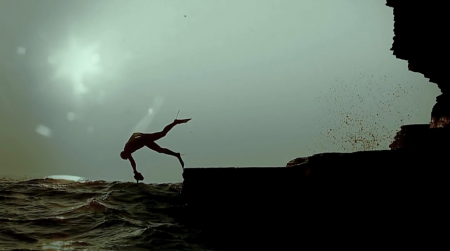
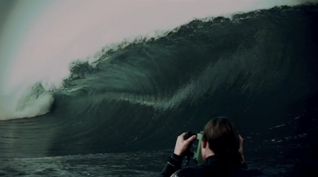
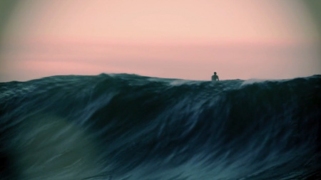
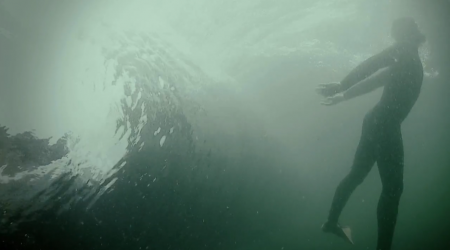

Do yourself a favor and watch this video right now. It’s filled to the brim with absolutely breathtaking shots — so many that I can’t believe they were taken all by the same team. The Planet Earth folks need to hire this guy RIGHT away. Honestly I’m speechless. This is an amazing piece of film. An amazing piece of art. Congratulations to Mickey Smith and Allan Wilson for making such a brilliant piece. And all for Relentless Energy — who knew.
“Still look forward to gettin amongst it” – The Dark Side of the Lens.
I should also mention that I love this video because I LOVE the ocean. I am terrified by the sea, but I love it. Of course I like the way it looks, but I also am constantly taken by its incomprehensible size and power. I am not a surfer (you should have seen me try in New Zealand), but I have always felt the same connection to the sea that I often hear the surfer describe. I like to sit in it, lay there, do nothing. My favorite thing in the world is getting tossed, turned and pummeled by waves — salt water filling my head every which way — then rolling up on shore and lying in the sun where the sea meets the sand.
Display
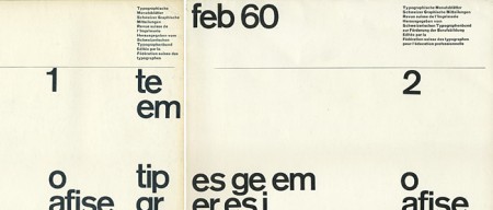
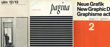
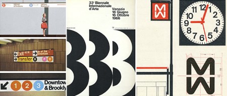
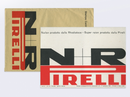
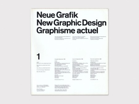
Display is a curated collection of important modern, mid 20th century graphic design books, periodicals, advertisements and ephemera. Documenting, preserving and providing public access to these original materials will raise the profile of Graphic Design as a source of educational, historical and scholarly analysis for teachers, students, designers and independent researchers. [link]
This is one of those sites I’m hesitant to blog about because I’m afraid you all will go there and buy all the books before I can. Of course Display is more than just a store: their collection is a terrific source of inspiration and history. I’m really impressed with how thoughtfully put together the whole site is; extremely well curated. Seriously you must visit this site — I am having a terrible time picking images for this post because they are all amazing.
Makeshift
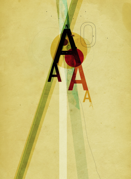
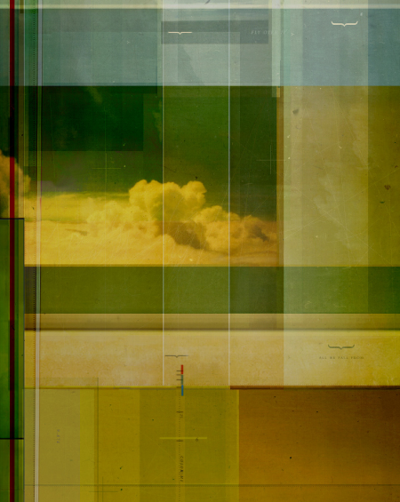
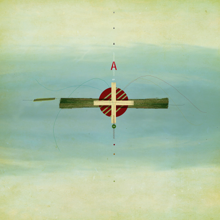
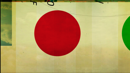
Pascal Tremblay aka Makeshift is a graphic designer based in Montreal. I am usually not a fan of anything resembling postmodernism, but Pascal’s eye for color and composition make him an excpetion for me. I am not sure how Pascal renders his images, but they sure look hand done, at least for some of the watercolor-like textures.
I also noticed you can most of his work here, sometimes at really massive sizes (yet still affordable).
BMW 3 Series TV Spot
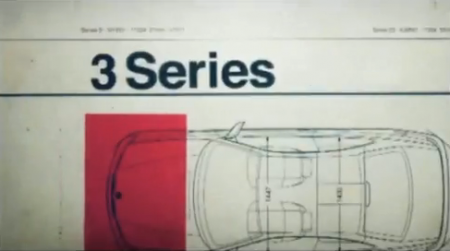
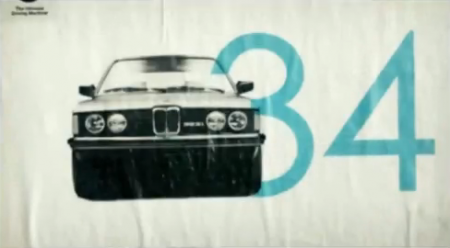
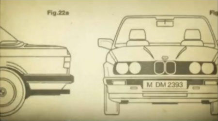
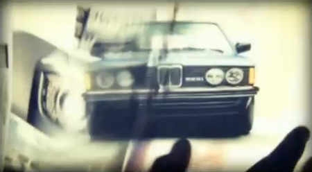
There I was, minding my own business watching Sunday morning football, when these sexy pieces of design snuck up on me. Typically my brain turns off at the first sight of a car commercial, but this 2010 spot for the BMW 3 Series is a breath of fresh air. It’s great to see a company going back to their roots. Interspersed with the requisite this-is-a-car-commercial-and-we-are-driving-on-a-closed-road-that-doesn’t-exist type shots, there is some really terrific graphic design. Watch it on the BMW homepage for the highest quality version I could find (header image 2 of 5).
It’s not the first time BMW has impressed us with their design sensitivity, check out these vintage ads as well.
Josef Schulz
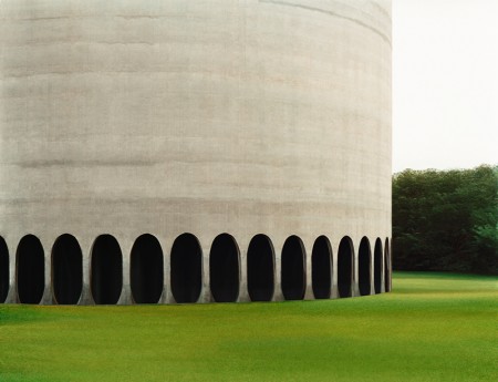
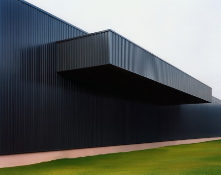
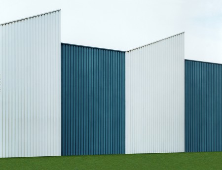
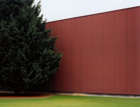
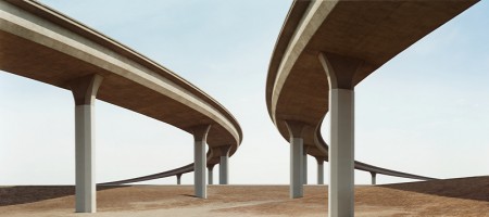

You may remember Josef Schulz’s series Sign Out from a while back. I was a big fan of that series, but these photographs, that focus on the subtle details of architecture, are much more intriguing to me. It’s all about the lines and the color. I am reminded of the work of Philipp Schaerer — that or video game architecture, where environmental details are obscured just enough to allow you to focus on the bad guys (or reduce processor load).
Using digital image processing, the analogue picture produced is then “cleansed” of the few remaining hints pointing to age, location or environment of the buildings. All details that might possibly allow conclusions concerning the actual size, users, time or place of the buildings are completely removed. The physical reality of the buildings is changed in such a way that they seem to become virtual blueprints designed to perfection.
— Excerpt from an essay by Thomas Ruff.
Vessel

httpvh://www.youtube.com/watch?v=Ho2m2th66GE
This is the incredible video for Four Tet’s remix of Vessel by Jon Hopkins. Not only is it mega weird in the most perfect way, but it really suits the song perfectly. Hypnotic to say the least. I love it when the dancers are on a really short repeat loop: the shots between 00:16-00:45 and the very last are my favorite.
It’s been a while since I’ve seen a video synced with music in such an interesting way. This was probably the last time.