Posts by Alex

Princeton 1966


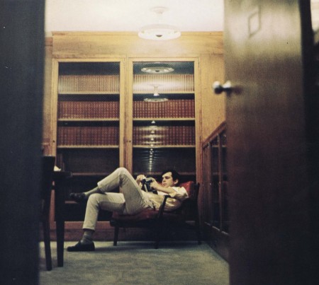
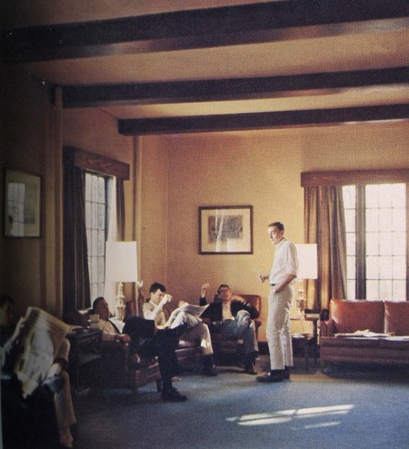
I came upon these pictures from the Princeton 1966 yearbook while tracking down a copy of Take Ivy. These shots are reminiscent of those in Hayashida’s book, but they are actually from a year later and were just published in the school yearbook. I went to prep school and I did not look this cool.

What I love about these shots is the feeling of potential that is conveyed. I feel like important things are being discussed; movers and shakers are in the making. It appears impossible to not achieve ultimate focus in this academic environment.

via The Trad

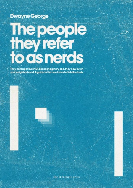
The Infamous Press


These book covers are part of the Infamous Press book cover concept collection. Designed by Morton Iveland.

via Minimalissimo.

(more…)

Kim Holtermand / Tuve


Kim Høltermand emailed to let us know about his incredible new series Tuve. I would love to find this place and see if it’s as eerie in real life as it is depicted here. Out of context some of the rocks look like abstract 3D renderings floating in space. It’s hard to imagine water that still. Breathtaking and haunting as usual from Mr.Høltermand.

Boolean Taxidermy


Zeitguised posted some new work on thier blog called Boolean Taxidermy. I want to eat it. That or float around and go to sleep in it. Anyway I think these stills are pretty remarkable. Check out the rest of their work to catch some of it in motion.

via bdif

Boolean logic is a complete system for logical operations, used in many systems. It was named after George Boole, who first defined an algebraic system of logic in the mid 19th century. Boolean logic has many applications in electronics, computer hardware and software, and is the basis of all modern digital electronics. [link]

Chrome Experiments

Swirling Tentacles by Steven Wittens


No doubt by now you have seen the Arcade Fire + Google Chrome super experiment posted today. This was awesome. Mind still blown. The site where the work was posted is Chrome Experiments and there is a ton of cool stuff there to keep you occupied for hours. (It’s my last day at IDEO this summer and I am having a hard time not playing with this every 5 minutes).

Even cooler, some of the experiments have ‘making of’ links and you can read a little more about their construction. (Warning: only interesting if you know what something like this means: for i in xrange(0, w.getnframes()):. )

According to CE:

We think JavaScript is awesome. We also think browsers are awesome. Indeed, when we talk about them, we say they are the cat’s meow – which is an American expression meaning AWESOME.

In light of these deeply held beliefs, we created this site to showcase cool experiments for both JavaScript and web browsers.

Hurts to try and conceive of all the possibilities with this type of technology. Can’t wait to see what they come up with next.

side note: I still maintain that some of the most interesting websites (in terms of rich/deep content) are those that haven’t even heard of CSS yet. I’m talking about websites that exist solely for the sake of information they host. Screw look and feel, their information needed to reach people. Something like this.

via the entire Internet

Chillout Sessions


Both of these little worlds are part of the artwork created for the most recent Chillout Sessions: a compilation disc series put together by the Ministry of Sound Australia. The diorama-like concept was developed by Collider (design by Andrew van der Westhuyzen and cinematography by Brycen Horne). They decided to switch up the packaging after the first 10 discs:

The new Sessions concept involves miniature ‘worlds’ literally creating a package holiday that has both escapism and a sense of humour. [link]

I want to shrink down to size and move into one of these miniature worlds. As a concept I LOVE this. It was executed exceptionally well; from the world construction to the photography, this is a concept pulled off in every sense. Be sure to check out the video version of each: XII XI

Virb


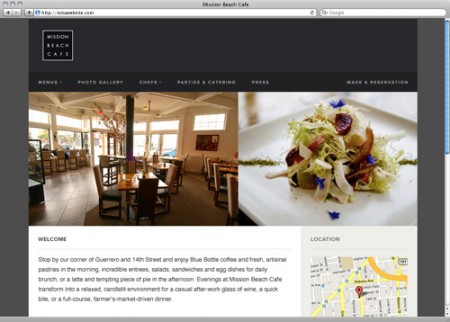
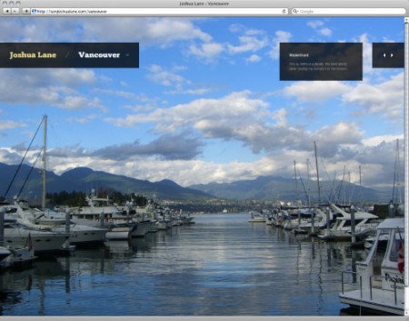
As a non-coder, and someone actually rather terrified of the “code” view in Dreamweaver, I feel it’s my duty to present notable website development platforms as they crop up. Sites like this really are a blessing for those of us that spend more time in Illustrator than Coda (give me your lunch money nerds). Virb is the newest kid on the block in this regard.

You may have heard of Virb before; their history is pretty interesting actually. What started as a social networking platform (apparently they used to be stacked up against Facebook and Myspace) has now morphed into something completely different. Strategically that was probably a good move. Now their mission is to provide the tools to build an “elegantly simple” website easily. As their CEO Brad Smith told Business Insider:

What Tumblr has done for the simplicity of setting up a blog, we want to do for the simplicity of creating a website. Sure, some people use Tumblr as their website, but at end of day its a blogging platform. We’re taking it a step further to where the entire idea is based around what we’ve always known a website to be — one location for all your content. [link]

Virb 2.0 (3.0?) feels like a mix between Squarespace and Cargo Collective, with maybe a dash of Tumblr thrown in. Overall I would say everything feels slightly simpler (perhaps to a fault) than the competition. I should mention that I am a user of Squarespace, Cargo, and Tumblr, so the Virb platform was immediately familiar to me. I haven’t really put it through the paces yet, but next time I need to create a website simply and quickly, I would consider Virb for sure.

You can rock a 7 day free trial now, but will have to pay $10 a month after that to keep things running.
583 Calculators


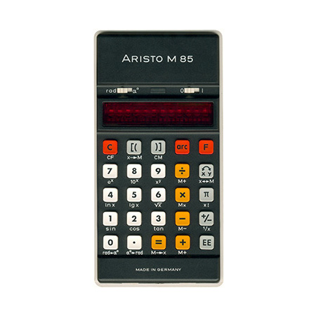
Vintage Technology has an enormous array of 1970’s era calculators on display. I’m into it because I love numbers, but if you want to know how many diodes and capacitors there were in a Caltronic 812, you are in luck. Each comes with a photo and an extraordinarily detailed reference page. There are 128 identified brands, and 583 calculators in total!
As an aside, I used to love calculators with an on/off button. I hated the kind that would turn off in a minute or two when unused. I mean I get it, but I like the power of having an on/off.

You may recognize the Omron from an earlier post. I’m sad Braun wasn’t represented on this page too…

via Core77

North America Wildlife


Mark Weaver has got to be one of the most consistently stellar (not to mention prolific) designers I know. I saw his “How To Destroy Angels” cover printed tinty tiny next to a review in Rolling Stone and knew immediately, Mark Weaver! The prints above are from his North American Wildlife limited edition series. They are for sale on his shop as of this week.

Be sure to also check out Mark’s answer to how he overcomes creative block: …”To achieve full creative potential I must sit in the woods, watch Mad Men, and listen to Boards of Canada simultaneously.” One of my favorite answers.

Toko


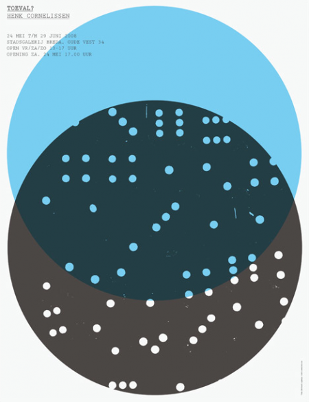
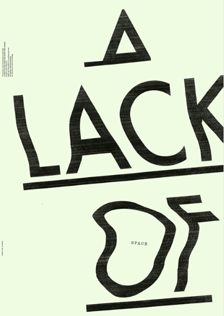
Toko is a multidisciplinary design studio based out of Sydney (formerly Rotterdam). Their work is difficult to pin down as they exhibit design prowess in many styles and mediums. In the works above you may notice a consistent ‘distress’ to each poster — whether it be a simple fade or a TV-like distortion. Almost looks as if the posters were laid out and then tampered with by some visually gifted distress-gremlin later on. I especially love the “A Lack of Space” piece.

Also notice they are sporting one of those ever so shiny .nu domain names.