Posts by Alex

No Fear of Missing Out // Process Post


Before jumping into this process post I want to define my terms: This project revolves around the concept of ‘FOMO’, which if you haven’t come across, stands for “Fear of Missing Out”. Fomo is a very real and worrysome condition that can affect anyone at anytime. It describes that feeling of jealousy and helplessness when you miss out on something great. Typically the condition becomes more prevalent during the weekends, summer, and nighttime. For example, “When I was looking at John’s pictures from the submarine party last night, I had a really bad case of fomo.” If you are stuck at work right now and your friends just went skydiving, you have fomo.

Nofomo by contrast refers to the state of being in which you have cured your fomo. You do not have a fear of missing out because you are always the one doing something awesome. You actually cause fomo, rather than experience it yourself. If you are living your life to the fullest and saying yes to everything, you have probably achieved such a state.

This is a project about NOFOMO. (And while it may not seem like it, yes this was for school.)

(more…)

OpenIDEO

OpenIDEO is a web platform for facilitating social innovation. It launched this past Monday and was developed by IDEO. It is designed as a collaborative creative space where everyone (designer or not) can come together and participate in the design process, through inspiration, concepting and evaluation. It is based around design challenges which start out as simple questions but tackle significant global challenges. Watch the video above to learn more. To really get a sense for the site, sign up on OpenIDEO and start adding inspirations!

The first challenge is for Jaime Oliver, the winner of this year’s TED prize and flag bearer of the Food Revolution in America. The goal is to find ways to raise awareness about the benefits of healthy and fresh food, especially for children. You can watch Jaime introduce the challenge in the video above.


I’ve been working as an intern at IDEO for the past 2 months and was able to participate in the first OpenIDEO internal challenge: to design the logo for the site. It was a really exciting process and I cannot wait to see these other challenges get put through the same paces. By breaking up the design process into these three easy phases, it ensures that important milestones are accomplished. I found the inspiration phase especially helpful, even for projects unrelated to the logo development.

I’ll be at IDEO through mid-September, when my master’s program begins again.

10,000 Year Time Machine

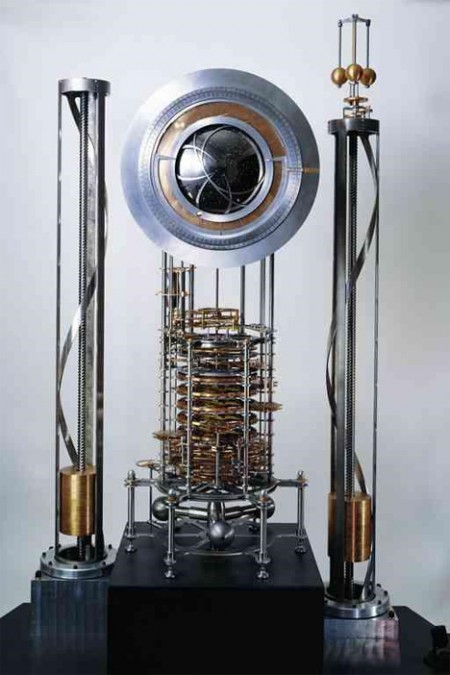
10,000 Year Clock Prototype


Did you know that The Long Now Foundation is building a 10,000 year clock?

The idea behind the Clock is to be an inspiration for long-term thinking, to help make thinking long term automatic and common, instead of difficult and rare. It is hoped to be an artifact to connect its visitors to the future in the same way relics from ancient civilizations connect us to the past. Such a clock, if sufficiently impressive and well-engineered, would embody deep time for people. It should be charismatic to visit, interesting to think about, and famous enough to become iconic in the public discourse. Ideally, it would do for thinking about time what the photographs of Earth from space have done for thinking about the environment. Such icons reframe the way people think. [link]

The clock may reside mostly underground, near Van Horn, Texas, and will tick once a year. There is a fascinating set of principles guiding the construction of the clock. I enjoyed the various options for timing the clock: piezoelectric oscillator, pendulum, orbital dynamics and etc. “Sounds made up” as my roommate is fond of saying. Currently there is a prototype design at the Science Museum of London.

By the way I titled this post “10,000 Year Time Machine” because any clock that will work for this period of time is much more than a clock, it is a giant MACHINE. Apologies if you were expecting a post on an actual time machine like a Delorean.

TeuxDeux

I don’t know how I haven’t posted on this sooner. It is basically the best internet tool that has ever occurred in the universe. TeuxDeux is a mega-simple web based to-do application. I’ve been using it since it came out and it is now a permanent part of my workflow; not just for business, but also for laundry concerns, In-N-Out runs, and whatever else I have to DO. And it’s free. Boom goes the dynamite as they say.

You can watch the video above for a quick description, but just about anyone could figure this out within seconds. Basically you write in what you have to-do under the day you have to do it. Cross it off when it’s done. View is seven days wide but can be scrolled through if you are the kind of person to plan ahead (do they exist?). There is also a Someday area for things to-do in the undetermined future.

The iPhone app version has been in development for what’s seemed like ages. But! I just read this morning that they’ve submitted it to the iTunes store, so keep an eye out for it on their site.

On a side-note, I love and hate the “Someday” bucket provided at the bottom of the list. It’s great because there is a ton of stuff that I don’t have time to do during a given week that I plop down there. The reason I don’t like it is because I am constantly reminded how many things I would like to do “Someday”. This can be discouraging if they stay down there too long. Conversely, crossing something off of the ‘Someday” list is very cathartic and replaces any discouragement you might have felt with a sense of accomplishment.

TeuxDeux is a result of the collaboration between swissmiss and Fictive Kin.

The Visual Mixtape


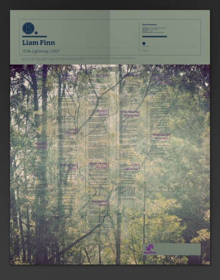
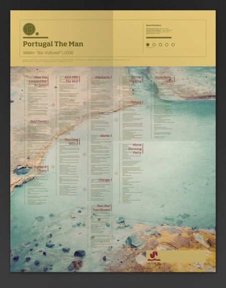
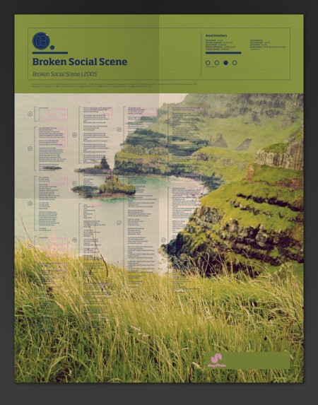
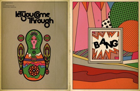
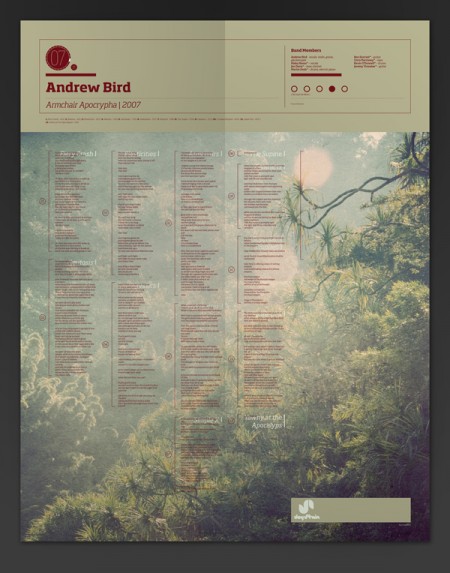
The Visual Mixtape is a series of self-initiated posters by Noa Emberson. The series contains a staggering 25 variations, all with very intriguing color palettes and images. The lockup stays largely the same, but the artist and song list changes with each poster.
See more of my favorites after the jump.

(more…)

Qus Qus


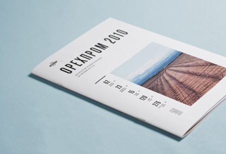
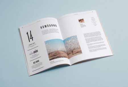
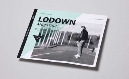
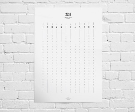
Qus Qus is the design studio of Dima Kuzmichev. This work is super clean — I feel like if I ran a corporation of any kind, I would have Dima do my annual report. Especially if we were based in Iceland and wanted to make our wind power turbines seem sexy. There is a cold perfectionism at work here. Great grid work, some beautiful type, pretty much everything you need. I was also really impressed with the logowork. The one for Artisanale was my favorite (and the name sounds awesome to boot).

via TSA

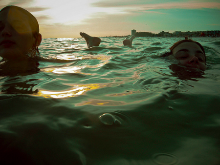
People Floating in the Water

via CeeMarie


via Domino Island


via Domino Island


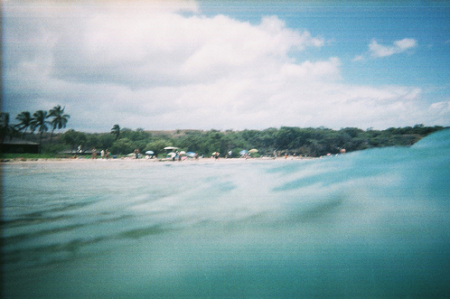
One of my favorite posts I’ve written here on ISO50 was on Asako Narahashi. I recently bought the book, which I would highly recommend if you enjoyed her photos. Like all photo books I buy, it’s hard to resist the urge to cut out and frame all the pages, as opposed to letting them all live together in their intended format. A friend of mine has his Richard Misrach On The Beach book adorning his walls and it looks great.

Anyway, the point is that Narahashi’s photos were one of my favorite things I’ve found scouring the internet for the blog. The photos above remind me of her series half awake and half asleep in the water, with the obvious addition of human beings. I prefer her photos (the absence of humanity gives them their distinctive mood), but these are still captivating in their own right.

In order the photos come to us from CeeMarie, and two from Domino Island.

If underwater housings for the 5DMKII weren’t SO EXPENSIVE I would be out in the bay right now shooting my own version.

POGO / SOKO


If you’re in need of some editorial or layout design inspiration, head over to the Behance site for POGO. I’ve just been cruising the archives of all issues of the online magazine SOKO. There is a ton of great typography and photography throughout each issue and I’m sure you’ll find something you like. Content-wise, it’s mostly fashion we’re talking, but it’s really just a playground for POGO to go crazy and design what they like. I also included their video Voyeur, because the color and post-processing is so good it made me forget I have to go to work tomorrow.

Culture Fasting


If I neglect my Google Reader for just one day, the contents build up so much that perusing them becomes more tedious than anything else. I blast through them, glancing often at only the tops of images, feeling the need to empty my “New Items” as soon as possible. I suppose I feel required to stay on top of “new things” and “new” designs — lest I become instantly irrelevant for missing a passing trend. Who knows the reason why but I surely never miss a day; my Google Reader stays empty.

Recently I read an article by one of my favorite authors, Alain De Botton. The article was called On Distraction and I found this passage of particular interest:

We are continuously challenged to discover new works of culture—and, in the process, we don’t allow any one of them to assume a weight in our minds.

I coudn’t agree more with this statement. Just think of sites like FFFFOUND, with its endless parade of sourceless and context-void images. How long do you contemplate each? Then again think of sites like this! I am as much a culprit of perpetuating this rapid culture consumption as any other blogger. I write 2-5 times per week about cool work I find, but how long do you (or I) actually spend looking at it? We glance at it, maybe visit the website, but in all likelihood it is in and out of your consciousness in less time than it took me to write the post. I’ll sometimes almost write a post on the same person twice without realizing it (this has only a few times, but is rather indicative of the problem Botton describes).

Botton’s solution to this problem is a period of culture fasting:

The need to diet, which we know so well in relation to food, and which runs so contrary to our natural impulses, should be brought to bear on what we now have to relearn in relation to knowledge, people, and ideas. Our minds, no less than our bodies, require periods of fasting.

Taking his suggestion sounds terrifying at first. It is not something I have ever been able to do by choice — usually its a vacation that puts my Reader so far over the edge that even I can’t J/K shortcut my way out — I have only hit the dreaded “Mark all as read” button a few times. It is something I would like to explore more. I remember when I grew up I was usually only aware of a few artists/musicians at one time, but I dove deep into their catalogs. My understanding of their work was broad and I can still cite examples of how whatever it was continues to influence me.

I don’t know. The article hit home for me and I am curious what you think about it all. As a blogger, I am inclined to defend my profession of endlessly posting work for the world to consume rapidly, but Botton makes a great point that seems to indicate otherwise.
Matt Moore / Crystals and Lasers


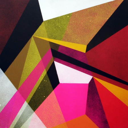
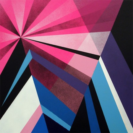
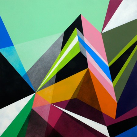
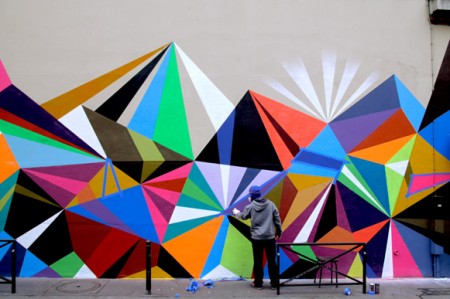
The ideas for the artworks have actualized while processing time spent absorbing French Culture, exploring the City Of Lights, the vibrant colors, the exaggerated geometry, and the diverse architecture and fashion of Paris. These paintings were created entirely with spray paint, one of Matt’s favorite mediums. But the designs are very clean, and appear almost digital in their precise details and craft. An honest, analog attempt to achieve the same depth and abstract geometry of his digital “Vectorfunk” style. [Link]

Color! What more do you want? These paintings are by Matt Moore and are called Crystals and Lasers. At the bottom of that page he also has a cool collection of iPhone photos that he took of inspirational items while in Paris creating the series.