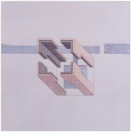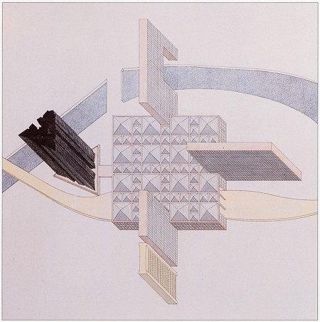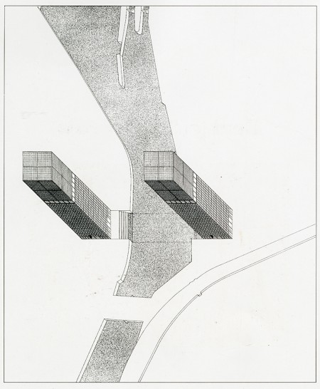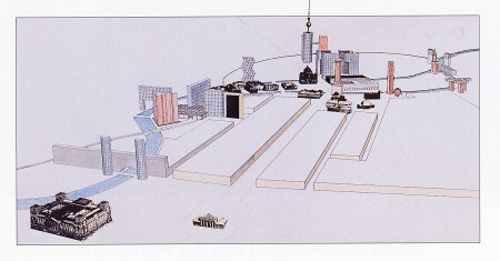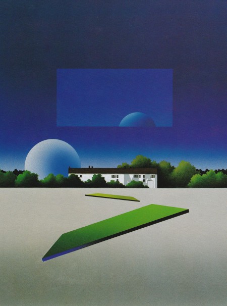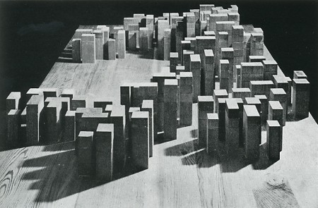
Oswald Mathias Ungers was known for his architecture all around Germany, what I found even more interesting were these drawings and studies he did, some became a reality and some have just only lived on paper.
Posts by Jakub
Oswald Mathias Ungers
Torn Hawk Essentials
Murky exploration that rolls through soundscapes of your lost Uncle’s VHS collection of softcore porn and B grade action films. Its like rolling credits of those films that you never want to end, Luke Wyatt holds that key that is the nostalgia of your best friends older brothers sweet room from 1988 that you weren’t allowed to go into. Enjoy the weekend.
Soichi Terada Low Tension Edits
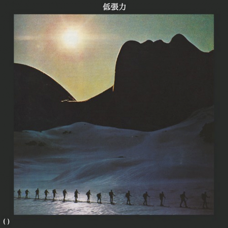
I know …I know I just posted but look at that cover, I had to share plus here’s a link to the reissue that isn’t $200+. Buy here
Soichi Terada – Love Tension
Just saw this song drop today on Rush Hour, looked it up and it seems like this is the original release in 1991. If you want a copy from back then be ready to shell out over $200.00 on discogs.
STREAM: New Fort Romeau Album
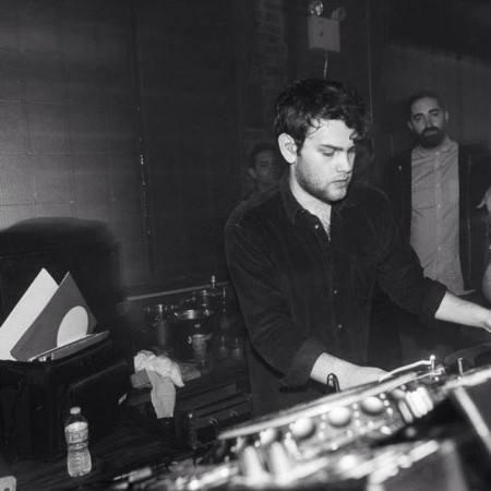
Smooth with the delivery is all I can say across the board for Fort Romeau, whether its DJing or this album making every moody addition count. Give this album a spin, you won’t regret any moment.
Like many others, Ghostly became enamored with Fort Romeau’s idea of “slow listening,” the concept of enriching relationships with music through careful attention and focus. His understated take on deep, groove-friendly house started pushing this practice three years ago, when the producer’s debut LP, Kingdoms, appeared via 100% Silk. The native Londoner, born Mike Greene, has evolved considerably since then, finessing his sound over the course of three breezy 12″s, one EP, and lengthy DJ sets at some of the best clubs in Europe—not the least of which were Berlin’s famed Panorama Bar, London hotspot Plastic People, and Robert Johnson in Frankfurt. Those years Greene spent immersed in his craft and new inspirations have generously informed the eight stunning productions which comprise Insides, Fort Romeau’s long-awaited sophomore album.
“Playing in those clubs definitely had an affect on how I approach composition and pacing,” Greene shares. “I want to allow things to breathe and develop gradually over longer track lengths, rather than cram everything into four or five minutes.” His patient methods are a central component to the billowy house music on Insides, though this isn’t an indulgent album of gratuitous buildups and tiresome breakdowns. Each production is pointed and purposeful, as the artist crafts every second of analog electronics with rich detail, nuance, and refinement.
Throughout Insides, Fort Romeau guides us down misty corridors lined with supple synth pads, quietly thumping kicks, and elastic low-end sequences reinforced by an emotive confidence. Thick dancefloor cuts like “All I Want” and “Folle” are built on such satisfying elements—sounds so full-bodied, you’d swear they’re knocking against your bones. This, too, is by design. “I wanted to make sure all the songs have a tangible quality,” says Greene of his LP’s physicality, “to make texture and grain become as important a part of the vocabulary as timbre and pitch.” This was accomplished with an arsenal of machines, including his Moog Voyager, Yamaha DX7, Roland Juno-6, and Korg 770, a vintage synth he describes as having “so much presence and vitality, it almost feels like it’s alive.” Equally important to the weighty presence of his music is meticulous post-production. “The record was mixed on an analog desk and mastered to tape,” Fort Romeau elaborates. “These processes are as much a part of the sound as
the synths and sample sources themselves.”There is also a deep stylistic eclecticism to Insides, and coming from Greene, this was galvanized by deep cuts he discovered while digging to find music for his extensive DJ sets. Old kosmiche, disco, and early electronic records are among the strongest influencers, and Fort Romeau used them as an impetus for creation. “It’s those strange and wonderful tracks that you find on the b-side of an old record that sparked my desire to make something new,” he shares, “but it’s very important for me never to feel like I’m making a pastiche.” Indeed, the sleek expanse of “Lately” and the title track’s jacking grooves take cues from buoyantly cosmic dance music. And yet it’s the personality of a young artist coming into his own that makes Insides such a graceful collection of house music, one that only further enriches the soul over time.
Support here: Vinyl
Tycho Tour Update
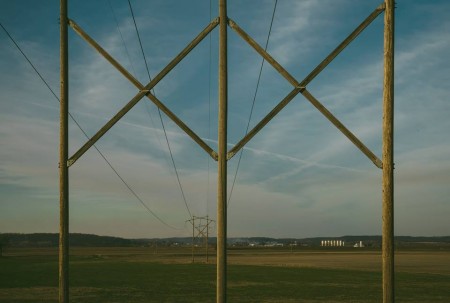
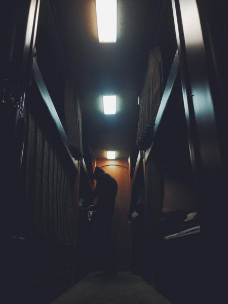
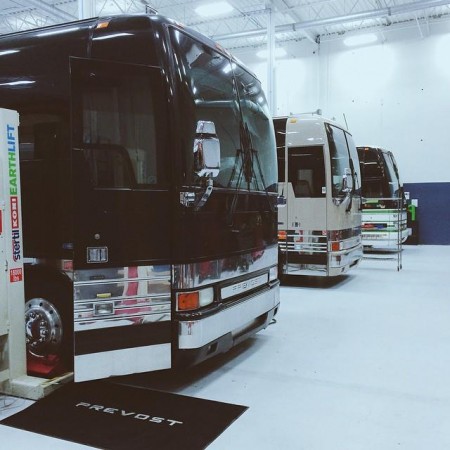
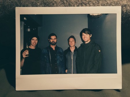
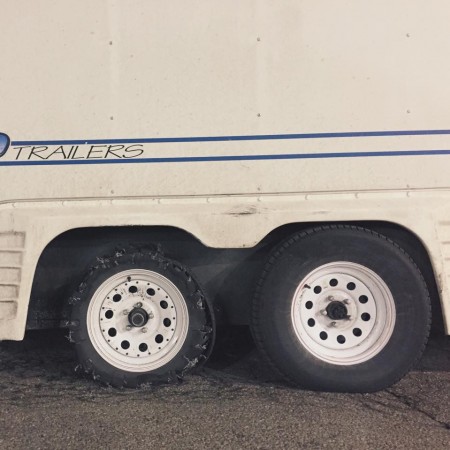
Tycho just finished some dates with Shigeto and now have Beacon as support, dates below of the upcoming Alt-J run. The photos above give you a little catch up on whats been happening, the tire blow out from this morning was a bit of a bummer but the guys pulled through. Keep up with the photos on the Tycho facebook.
Tour Dates
MAR 27 | Royal Oak, MI | Royal Oak Music Theatre
MAR 28 | Toronto, ON | The Danforth Music Hall
MAR 29 | Indianapolis, IN | The Vogue Theatre
MAR 31 | Columbus, OH | Newport Music Hall
APR 01 | Cleveland, OH | State Theatre at PlayhouseSquare #
APR 02 | Pittsburgh, PA | Benedum Center #
APR 03 | Raleigh, NC | Red Hat Amphitheater #
APR 04 | Atlanta, GA | Chastain Park Amphitheatre #
APR 05 | Birmingham, AL | WorkPlay
APR 06 | Nashville, TN | Grand Ole Opry #
APR 08 | Oklahoma City, OK | Chevy Bricktown Events Center #
APR 11 | Indio, CA | Coachella
APR 17 | Berkeley, CA | Greek Theatre #
APR 18 | Indio, CA | Coachella
MAY 21-24 | Bradley, CA | Lightning in a Bottle
JUN 11-14 | Manchester, TN | Bonnaroo Music and Arts Festival
JUN 18-21 | Dover, DE | Firefly Music Festival
# – w/ Alt-J
Pale Blue a.k.a Mike Simonetti
Hype Machine x ISO50 SxSW Party
Top 5 Best NHL Logos
Now onto the brighter side of the NHL logos and branding. The worst logos list was easy compared to the best. I fit in a few into the top just based on necessity ala a well crafted unique font and a aesthetics that the general public would lean towards.
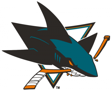
#5 San Jose Sharks
Starting off with the Sharks logo, it has appeal right away to a younger crowd, its fitting for the area the team lives in and it has a modern take which i’m not against. The reason I put it in the top 5 was because it might have that modern speedy look that I might complain about BUT there is reason here, its a shark breaking through a hockey stick, its a fast creature unlike lets say the Blue Jackets logo there was no reason. Also, it looks like someone took the time with the details and pulled it back a bit to find balance and I can appreciate that.
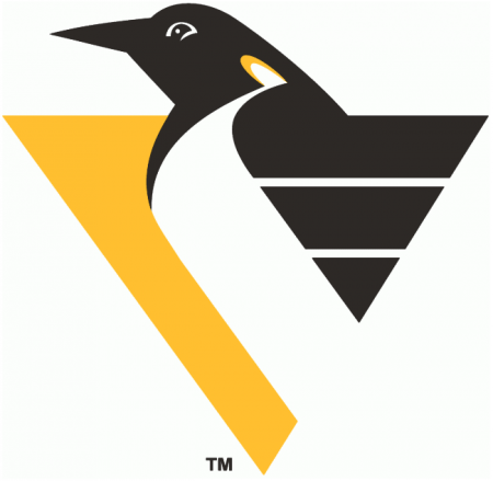
#4 Pittsburgh Penguins
This one might be a hard one to have people agree with me on. I personally thought it was iconic and it simplified the penguins image for the better. The problem I have with the current Pittsburgh Penguins logo are the old school equipment he’s wearing, if it was more timeless i’d probably like it more. I love the wings here and the bit of yellow on the neck, it shows off that detail is doable in a simple logo.

#3 Hartford Whalers
Classic. Hands down maybe the best executed sports logo for a designer that has to work under the these circumstances: a whale mascot and a team called the Whalers. Do you see the H for Hartford? And we thought the FedEx arrow was special. What a fluid effort, too bad they are now the Carolina Hurricanes, who have a horrid brand.

#2 Edmonton Oilers
So you’re getting paid to do a logo for a sports team, probably a dream job for many designers. You’ll probably want to make it your own and be remembered for your best effort, right? so probably on the top of your list would be a custom font and this designer knocked it out of the park.

#1 Colorado Rockies
When you can take the States flag and transplant it into a team logo and hand in something literal but also create something that can look great on any piece of merch then i’m all in. The designer that created the MLB Colorado Rockies probably will always feel 2nd best. This is bold, grabs your eyes, its for all ages, a city can be proud of it, the uniforms looked out there but one of a kind.
Top 5 Worst NHL Logos
This is a pretty passionate subject for me, probably one that I could argue over for the rest of my life so I decided to finally make a series of posts. Lets start with the NHL aka the National Hockey League. Who has the best and worst logo and why is the question, if you want to join the argument, here is a list of logos.
I will be doing the best NHL logos in a different post and we will go through a few other sports as well.
TOP 5 WORST NHL LOGOS
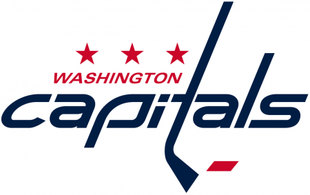
#5 Washington Capitals
Let me point out a few things before I start explaining the problems I have with it. First off, not a boring font, not a great font but hey i’m actually alright with the ITA situation with the stick and connections its making. Now step away from it and stare, what is it? I want to sell merchandise for my hockey team and make something special for the city that will support it. What is this though? a love for a font and i’m adding a hockey stick because hey its hockey?? It honestly looks like a rushed college graphic designers homework assignment that was turned in without a passion or connection with the sport. An agency maybe doesn’t even care for the sport? could that be what happened here? I’m not going to question the 3 stars or the color scheme but seriously if I was from DC i’d just sort of feel bummed out by this.

#4 Winnipeg Jets
I’ll start off with 2 nice things to say, first off nice work on fitting in the Canadian maple leaf and second i’m happier with this than their old logo which isn’t saying something that nice.
Okay now, i’m into an icon that represents an organization but that has to be a pretty low effort in the jet icon world. Also, why so literal with the leaf and the jet? I also have a problem with its something hard to get excited over, as a fan i’m already excited about the team why not add some cherries on the top for the people of Winnipeg? its like a vague statement without any effort for surprise. I mean this city JUST got their hockey team back and they revealed that…the city was in tears announcing they got their team back and a designer turned in a C- / D+ effort, you give a graduate design class this project and 2 to 3 students in each school across the continent would turn in hands down better executions for a team in 2015 that has the word jet in its name.
Ooooooooooh boy, now we get into the portion of the list where the pros column gets a little thin. We have a star with a flag whizzing across the front like a Miss America ID ribbon strap. You want generic? here is something pretty generic. You already made the average sports fan happy by using colors that most people would wear and I guess the patriotic angle works BUT who made this rule on why things need to look 3D and more importantly angled and tilted?? I completely understand its better than their old logo which is a ribbon cutting disaster but if you’re building a city from scratch to fall in love with hockey then this 2nd step forward on the logo front is full of hesitation and conservative ideas, someone with an imagination needs to step in and start working with them, they aren’t a lost cause.
My beloved Canucks, my first sports team that I completely adored. I never was a fan when this logo came around in the past and in the present because I was pretty much a fan only in the 90s during the Pavel Bure era. Some people might argue with me that I just like a simple logo, this…I don’t know… who let this out in the public? I’m sure more than one person is in the decision making of a logo out in public, I don’t think there was much thinking going on. Again with the fascination with the hockey stick, we understand one is used to play them sport but putting over a hockey rink and saying thats your cities logo…no, no you can’t turn that in. Its almost frightening that adults were in charge and approved this.
Well well well, look how far you’ve read into this rant, i’m surprised you stuck around.
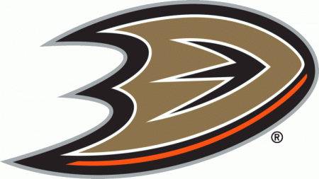
Look at this logo… maybe blow it up full screen i’ll wait… and gaze at the glory of it and imagine the confused faces across the country when they saw this the first time.
Its a D for Duck THAT. IS. MAYBE? A BACKWARDS DUCK FOOT?? or a chubby boomerang that would never work because of the surface area and die-cuts. Maybe a shield!?..no, no its not, its just a copper D that was abused in illustrator by a Mountain Dew loving bro. I can’t wrap my head around it and I don’t expect anyone else too either especially anyone in California that showed up to the unveiling of this logo. You go from team colors of teal and purple with a duck mask into this batman weapon made of Taco Bell ingredients.
