Posts by Jon

Explorers of Tomorrow / Process Post


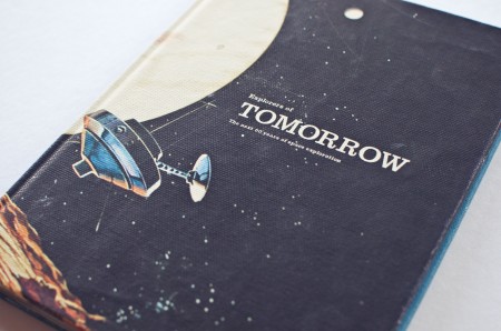
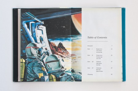
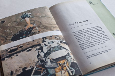
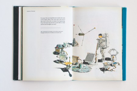
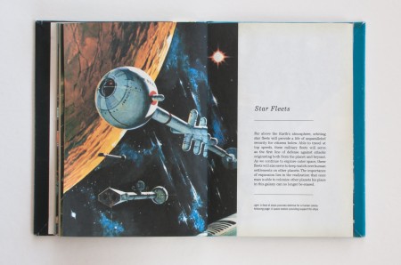
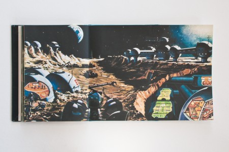
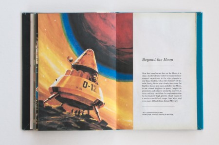
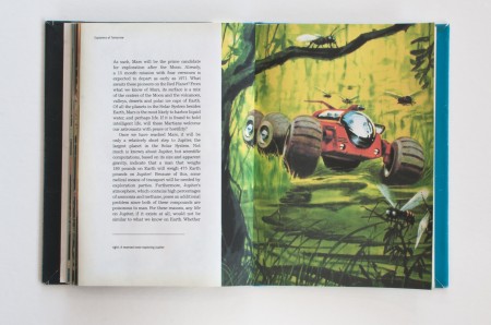
Explorers of Tomorrow is the title of the first book project I completed at the Academy of Art University in Spring 2009. Up to this point our projects consisted of posters and small printed materials, so this was the first time we were pushed to develop a consistent visual language and extend it across multiple pages. The assignment was to take a subject of interest, research its future 10 years from the present, and display our findings in a book.

Growing up, one of my favorite books was Automobiles of the Future by Irwin Stambler. Written in the 60s, it imagined the automobile in the 80s, 90s, and even the new millenium. The book was a window to a strange parallel dimension, where everything inside was a streamlined, pastel version of reality. Its pages held promise, for the future of automobiles was about more than spark plugs and oil filters, it was the story of man’s struggle to better himself. At the same time, it was very naive and simplified the world of tomorrow to a utopia that answered all of the problems facing their society. It never considered the possibility that the future would have its own set of obstacles to overcome. But that was its biggest appeal to me, to see the ways our society had advanced so far from their wildest dreams, yet fallen short on its fundamental ideals.

Space exploration has always been a fascination of mine. With that in mind I began to think about our future. 2019 will mark the 50th anniversary of the Apollo 11 flight, and I thought it would be interesting to look at the future of space exploration 10 years from the present, but from the perspective of writers in the past. Specifically, I wanted to look at how a society that had just landed on the moon would view space travel in the future: how would our idea of 2019 compare to a society’s that looked to the stars for answers?

(more…)

Hoyle Rebranding / Process Post


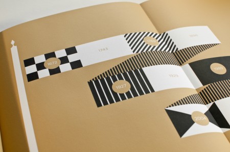
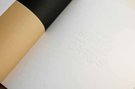
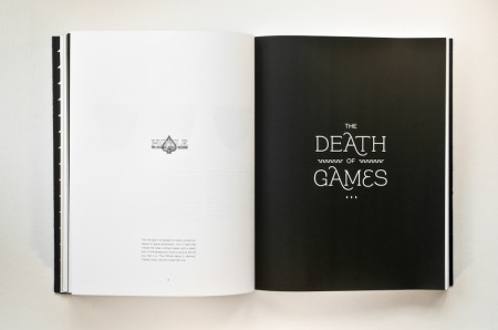
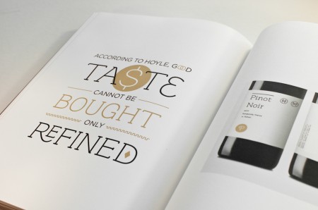
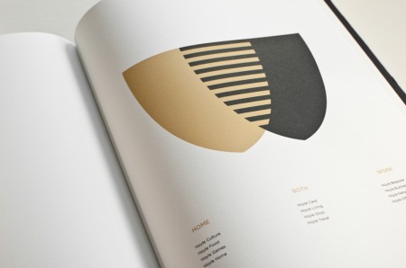
Continuing my new year’s resolution, I wanted to share my experience working on a rebranding project for school. This project was completed over the course of Spring 2011, and the assignment was to choose a dying or defunct brand and breathe new life into it. Throughout the semester we developed a logo, letterhead, visual identity, and brand extensions for the revamped company, and the final deliverable was a brand guidelines book. Alex described his process working with Playboy, and I highly recommend you check them out if you haven’t yet.

I had a lot of fun designing the deck of playing cards for Beast in a Neon Cage, so I thought it would be interesting to work with a playing card company. Once I chose my industry, I looked at brands like Kem and Copag and ended up choosing Hoyle. Hoyle is part of the United States Playing Card Company, which also owns the Bicycle and Bee playing card lines.

(more…)

Space Dog Books Interview


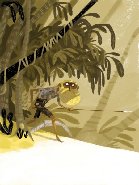
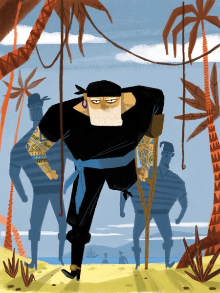
Space Dog Books is an interactive book publishing company that aims to introduce readers to new worlds through the use of touch-sensitive devices. Last month they released their first book app, Treasure Island – A Space Dog Book, and I was blown away by the experience.

I had the opportunity to speak with Tymn Armstrong, Art Director at Space Dog Books, and he was kind enough to share his thoughts on the project and give a behind the scenes look at the process of “creating universes in a digital world.”


Jon: Thanks for sharing with us. Congratulations on the launch of Treasure Island. When you set out to create content for these devices what led you to children’s books?
Tymn: First off, thanks! It was a lot of work. Over a year of production went into making it and it feels so great to see it completed.

I think we’re starting with children’s books because they present more challenges than adult books. There is this misconception that children’s publishing is easy because it’s for kids but it’s actually quite the opposite. It’s an extremely competitive industry with some of the most talented people in the world of books. That said, we do have plans for books that are not necessarily children’s books. We don’t ever want to limit ourselves.

(more…)

Beast in a Neon Cage / Process Post


I’ve been meaning to write up process posts for some of the work I’ve created while studying at the Academy of Art University, and now that it’s a new year I figured it would be a good time to get started.

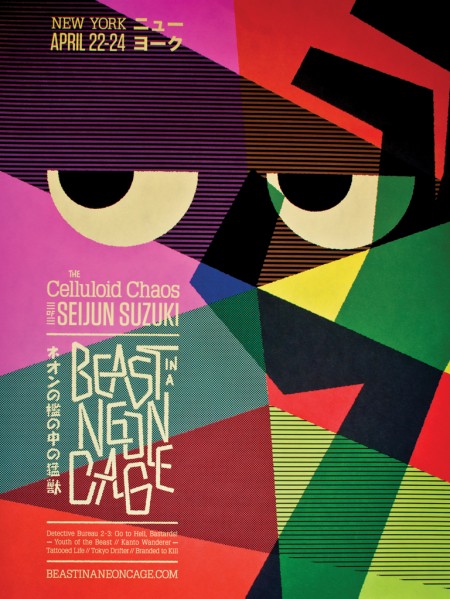
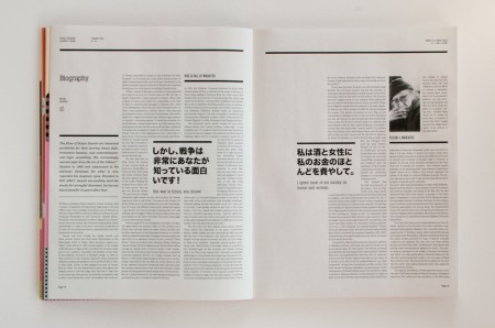
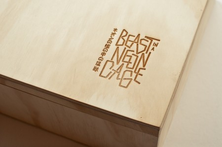
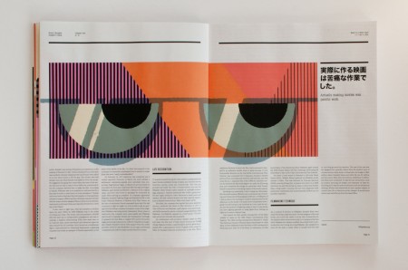
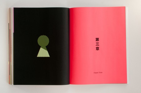
Beast in a Neon Cage is the name of a hypothetical film festival I created during the Fall 2010 semester. The assignment was to create a festival for a director of our choice and develop a brand and visual identity to extend across multiple pieces including: a poster, catalog book, DVD set, soundtrack, letterhead, schedule, tickets, signage, website and numerous products. Previously, Alex wrote about the process of designing his festival for Wes Anderson here, here and here. Instructors at AAU continue to use his festival as a benchmark for a successful project.

(more…)

Why “It” Matters


Room557 is the recently launched blog of Academy of Art University instructors Hunter Wimmer and Anitra Nottingham. I’ve had the good luck of studying under Hunter numerous times at the Academy. His advisement has been instrumental in pushing me to improve my work at every step, and I wanted to share one of his teachings that has had an important impact on my design education.

Hunter was responsible for giving me my first (but sadly not my last) failing grade, and although it was hard to stomach at the time, it was a much needed wake up call. Up to that point my barometer for successful design was how “cool” something looked. I didn’t understand the importance of having a strong concept, choosing appropriate typefaces, or using relevant materials. I saw little value in learning how to comp, bind, or print on anything other than my Epson. I didn’t understand the importance of these things because I wanted to be a designer, not a salesman, typographer, printer, or bookbinder. Thankfully Hunter was there to explain Why “It” Matters:

Would you trust a civil engineer — who’s responsible for the stability of bridges and the like — if there was a math error on their cost-estimate? Would you trust a mechanic who drives a broken-down hatchback? Would you trust a personal trainer with love handles? Now, I don’t care if my engineer has love handles or if my personal trainer drives a smoking Hyundai, but there are minimum expectations in each profession. In order for a personal trainer to convey a sense of health and well-being (and that they’ve mastered it enough to pass it on to me), they should also be fit, right?
Where does that leave the graphic designer?

When you fail you can take it one of two ways: as a rejection of yourself, who you are and your talent as a designer, or as practice, an experiment that isn’t successful… yet. Once I was able see the latter I could ask myself what was expected of my work and where it was falling short. As designers we are called to be communicators, aesthetes, conceptual-thinkers, and craftsmen. Now that the dust has settled from another semester it’s nice to go back and be reminded of what we’re called to do, why it can be frustrating, but ultimately what makes it so fulfilling when countless hours of practice result in that brief moment of success, before we go back and repeat the whole process all over again. If you are a designer or have any interest in the profession, Hunter’s informative post is well worth the read.

via Room557

Jimmy Turrell New Work


Jimmy Turrell launched his new website recently and I spent the evening pouring through his work. Really great stuff, my favorite is this set of designs for Yellowire. Check out the rest of his work here.

Model Soldiers


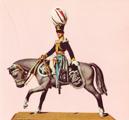
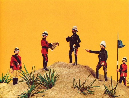
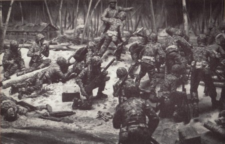
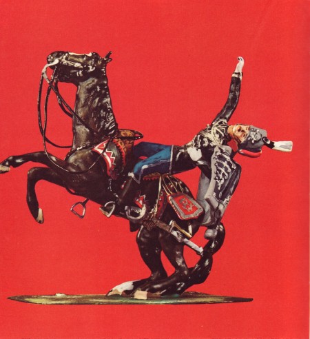
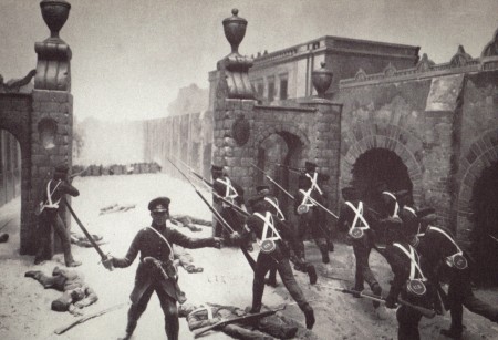
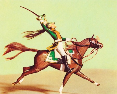
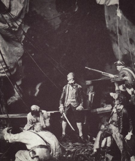
I picked up a few used books from the second-hand store last week and finally had some time to scan them in. These images are from Model Soldiers by Henry Harris. Growing up, one of my favorite books was The Indian in the Cupboard, and this led to a fascination with the Warhammer 40K figures at the local comic book store. This book doesn’t contain any space marines, but its meticulously modeled miniatures remind me of the tiny battlefields I was drawn to back then. The detail they manage to include at this scale is amazing.

Ikko Narahara


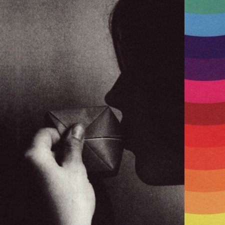
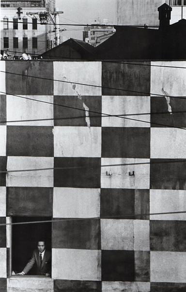
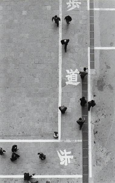
Ikko Narahara is a self-taught photographer and co-founder of VIVO, a Japanese photography cooperative he formed with five of his peers. Narahara’s work often depicts subjects in isolation from the outside world, and I love how he is able to abstract scenes of everyday life into graphic compositions, making the viewer feel an otherworldly detachment from familiar sights.

Galerie Priska Pasquer via Japan-Photo.info

Lytro Light Field Camera


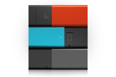
Lytro released its revolutionary Light Field Camera last week. Apart from its unique design, the camera uses a different type of sensor to capture light fields, allowing photographers to focus images after shooting them. It also allows users to capture three-dimensional shots with a single lens. Check out their picture gallery for a chance to see light fields in action.

I can see this technology being particularly useful in point-and-shoots and Blade Runner-esque “enhance” sequences, but I’m really interested in its creative applications. On one hand it takes away from the artistic choices available to photographers, but on the other hand it opens up a whole new set of possibilities. Either way it will be interesting to see what people come up with.

Lytro via All Things D

Daily Book Graphics


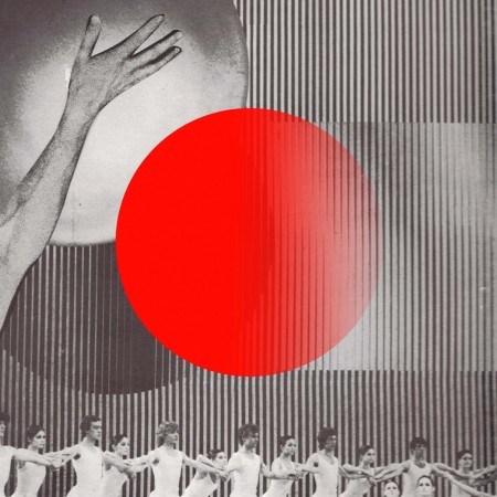
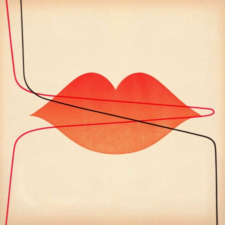
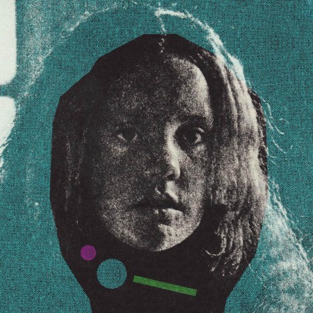
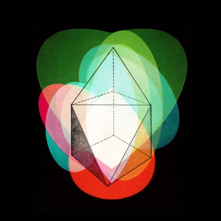
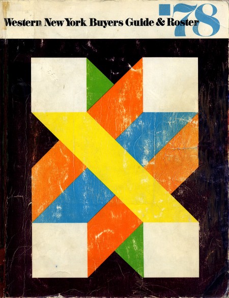
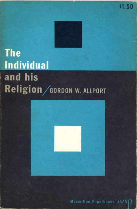
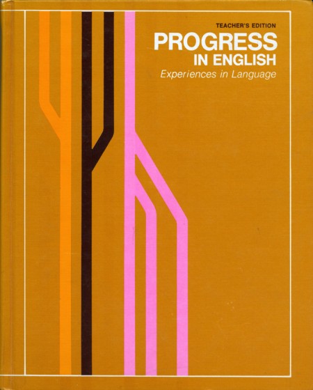
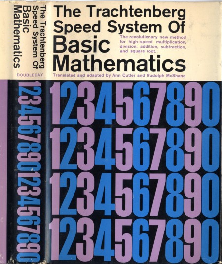
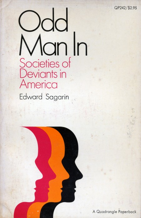
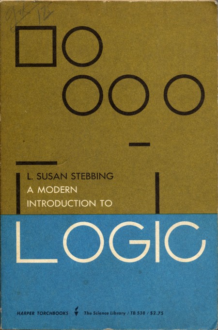
Julian Montague has collected a wealth of inspirational book covers from the 1950s-80s. These are just a few of the great designs I came across while browsing through his Daily Book Graphics project. You can see the rest of the set on his Flickr, or check out previous posts for more vintage book covers.

via Montague Projects