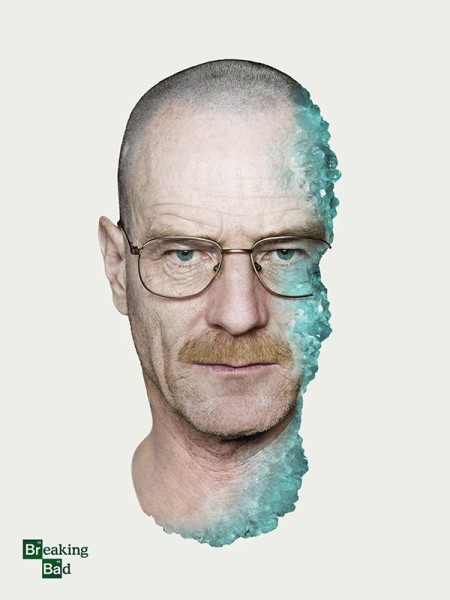
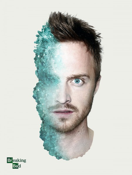
For the final episode of AMC’s Breaking Bad show, I (Shelby) created these two posters of Walter White (Bryan Cranston) and Jesse Pinkman (Aaron Paul). If you’ve seen the show you’d immediately recognize the blue as a representation of Walter’s high-purity methamphetamine. Without spoiling the show, you’ll notice there is more blue crystal on Pinkman’s face than there is on Walt’s. In that lies the concept of these posters. The posters were created for fun using only a few images.
Posts by Shelby White
Breaking Bad Poster Series
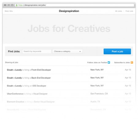
Designspiration Job Board
Over the last few months I (Shelby) have been working on a number of large updates to Designspiration. The first of these updates is the job board. The goal of the job board is to help creatives find career opportunities at great companies.
There were a number of challenging aspects of building this site addition, but the main one was how to handle mobile. It’s not something I’ve done a whole lot of and just to complicate things, a new grid needed to be developed for the updates to follow. The restructuring of the grid took just about as much time to figure out as it did to build the job board itself. I’ll follow up this post after the next updates to talk more about making Designspiration fast on mobile (hint, hint).
If you know an agency or company looking to hire, post a job or let them know about the job board. Also, follow the Designspiration jobs twitter @Dspnjobs for job updates.
Check it out: http://ds.pn/jobs
80s VHS Tribute Posters
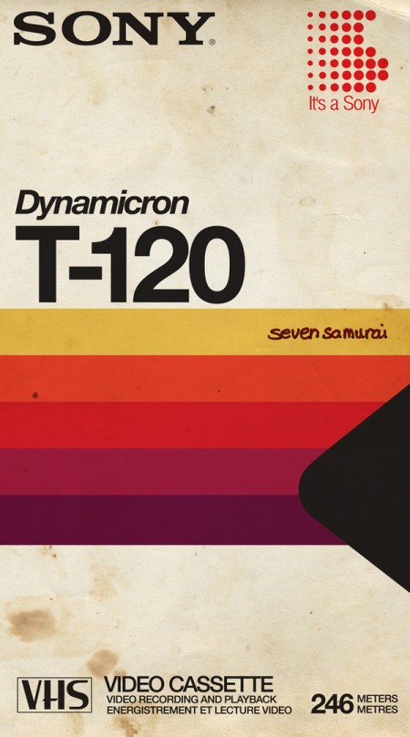
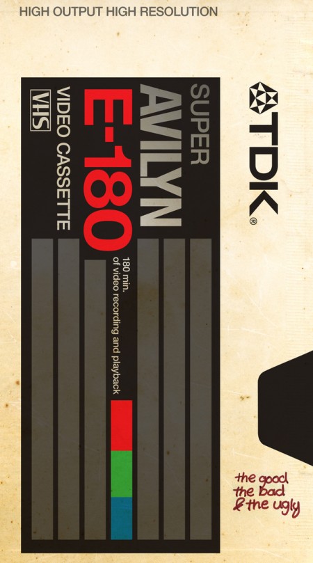
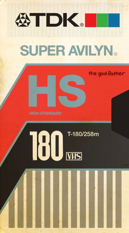
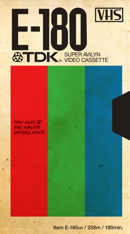
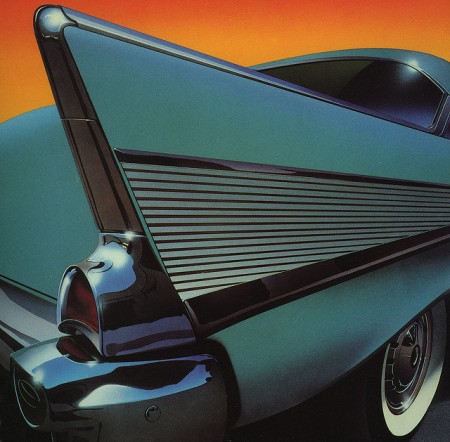
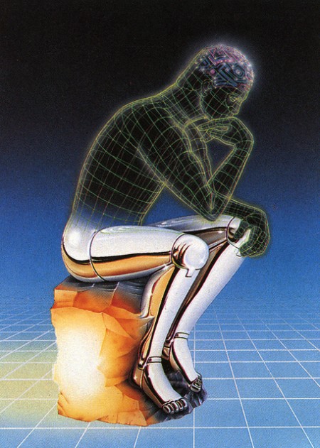
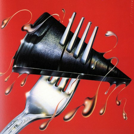
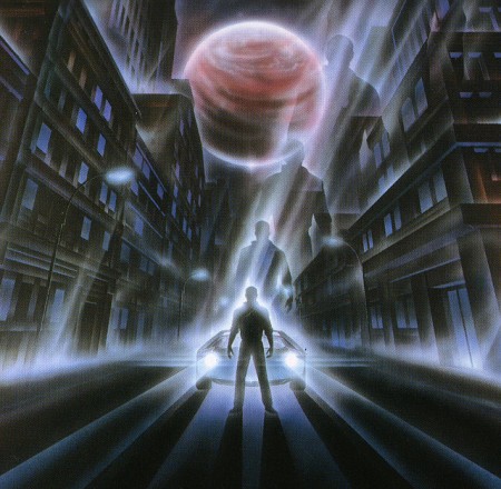
Stumbled upon these cool posters by Ahmed Youness. They aren’t actually 80’s vintage but they do look the part.
Via Designspiration
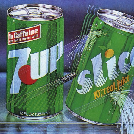
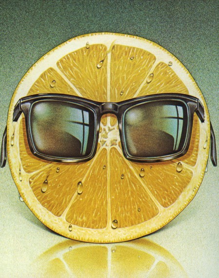
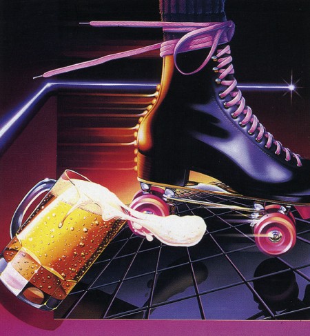
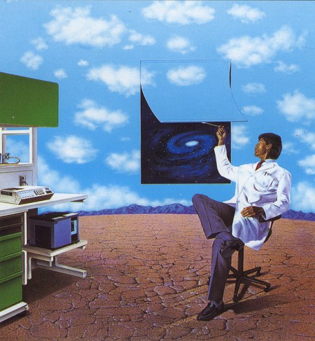
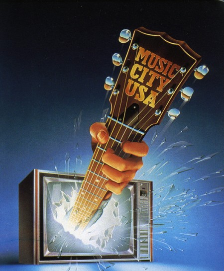
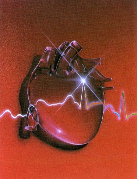
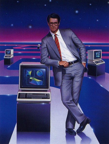
1980s Vintage Graphics
Instagram Shapes Series
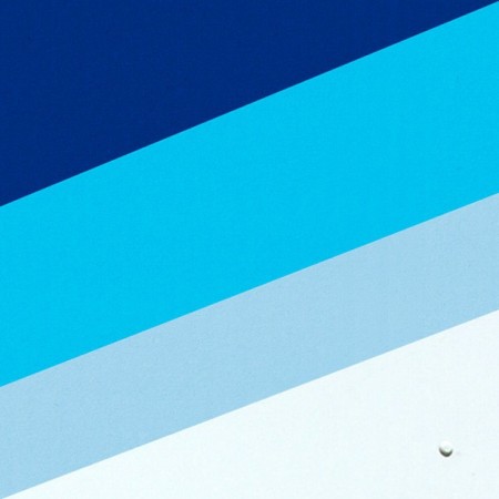
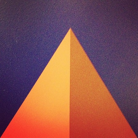
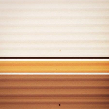
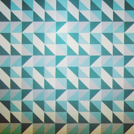
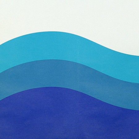
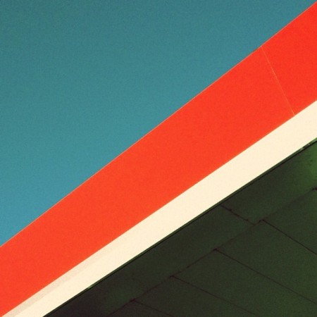
For the last month and a half I’ve been posting a series of found “shapes” on Instagram. The objects in the images are various places, signs, or vintage objects. Each image expresses my affection for simple, clean and effective design. It’s also about connecting with those lines; It’s about the feeling you get when viewing it.
It’s a challenge finding new compositions that really give off that spark, but it’s also fun. It’s also really interesting to see how others react to certain shapes and colors. Hope you enjoy!
View more from the series.
Vintage Apple II Ads
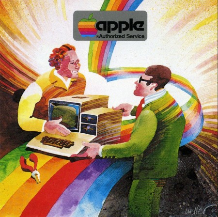
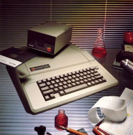
Apple’s vintage print material during the late 70s to the 80s was sexy, and I do mean sexy. The first image here is a print ad for the Apple II. It’s really such a beautiful illustration; if only it could be brought back to life to be used again somehow. The second image is also an ad for the Apple II, this time using photography.
Via Mac Spoilers
Barcelona Apple Store Architecture
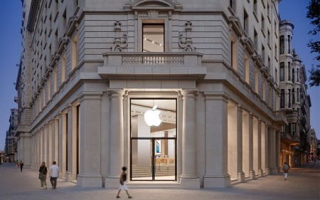
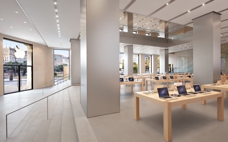
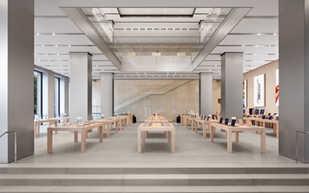
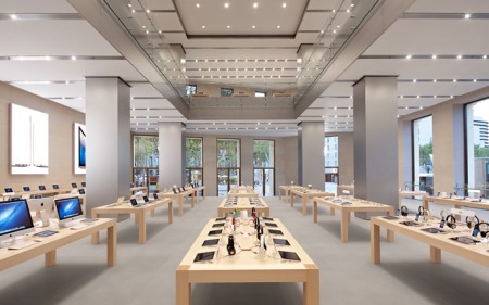
The design of Apple Stores around the world don’t get enough attention for their design. We’ve all been in an Apple Store before and seen just how simple and effective the interior is. Even though sometimes it gets crowded, the interior design is impeccable. Here are images to prove it.
View more on Mac Spoilers
Vintage Apple Catalog from 1983
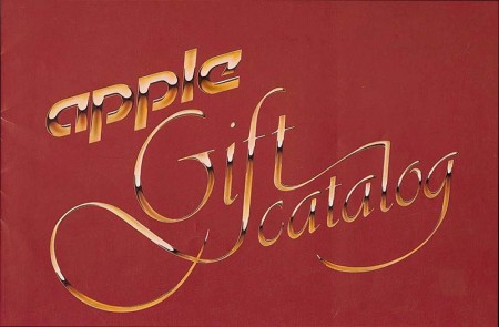
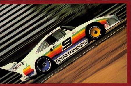
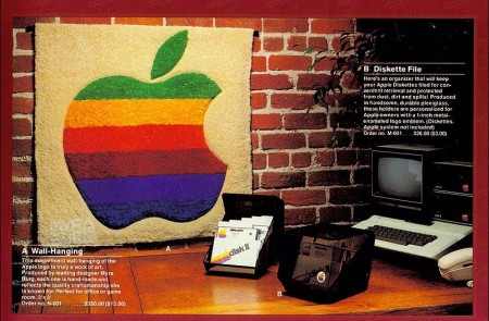
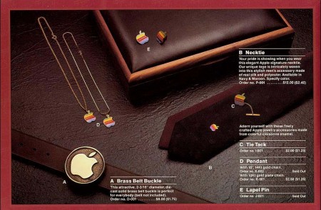
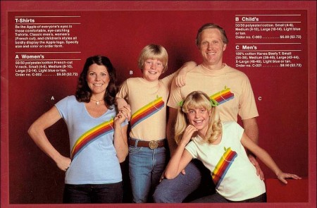
Apple was up to some cool stuff in the 80s. We’ve seen evidence of it before with Apple’s 1986 clothing line and with this Apple gift catalog from 1983. The logo made it on a range of products including race cars, kites and carpets.
More images from the catalog on Mac Spoilers.
Twitter GUI Photoshop PSD Template

Twitter just rolled out a new profile design that allows you to add your own header banner. Pretty cool, but it’s hard to tell what looks best without fidgeting with it, then waiting. To make it easier on you, I’ve updated my Twitter PSD Photoshop template to the new design.
The profile images in the template utilize smart objects to make it easier to update all of the images in the template at once. The name/username’s in the tweets also utilize smart objects. Double-click to edit, then edit the contents and it will update all of the smart objects synced with it.
This template was built closely to Twitter’s current layout as of September 20th, 2012. Download the template below. Please share the PSD if you find it useful. If you have any questions or suggestions leave a comment.
Enjoy!
For updates to the PSD you should follow @ShelbyWhite.
Steve Jobs 1984 Photos by Norman Seeff
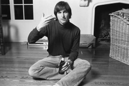
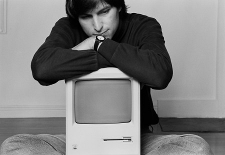
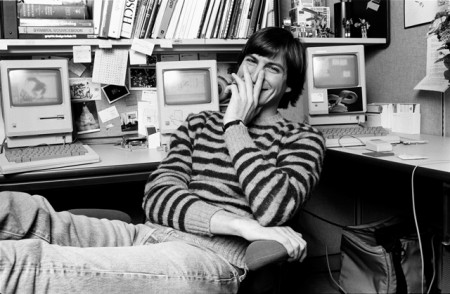
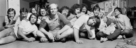
Norman Seeff has photographed some of the greatest legends of our time. One of my favorites was Steve Jobs. Seeff was able to photograph Steve both in the work environment with the Apple team, but also in Steve’s home.
In captions that support these images, which can be read on his website, Seeff recalls how Steve surveyed his work before he was comfortable enough to allow him to come to his home. This photoshoot would in turn produce one of the most iconic portaits of Steve Jobs of all time.
Shared from Mac Spoilers
