Posts by Shelby White

5D Mark II ruined by laser

Until now I had no idea that a laser could cause damage to a DSLR, but apparently it’s possible. In the video you can see the laser beam across the sensor of a Canon EOS 5D Mark II leaving a burn. It would be a big shame for it to happen to any of you so I just wanted to make you aware if you weren’t already.

Here is an excerpt from the International Laser Display Association:

“Lasers emit concentrated beams of light, which can heat up sensitive surfaces (like the eye’s retina) and cause damage. Camera sensors are susceptible to damage, similar to the human eye.
For large scale shows, such as on a televised concert, laser show producers work with clients to avoid TV camera locations and video projectors (ILDA Members, see this page for details). However, it is not possible for laser show producers to be responsible for all cameras and camcorders which might be at a show.
Therefore, if you attend a show as an audience member, you should take reasonable precautions not to let a laser beam directly enter your camera lens.”

If this isn’t convincing enough, here is another video.

Sourced via Planet 5D
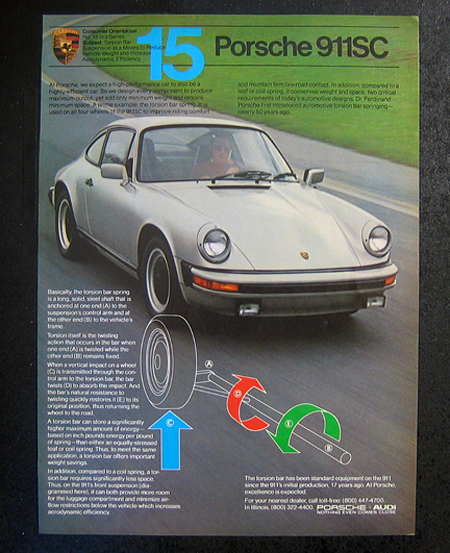
1980s Vintage Porsche Ads


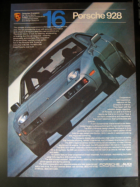
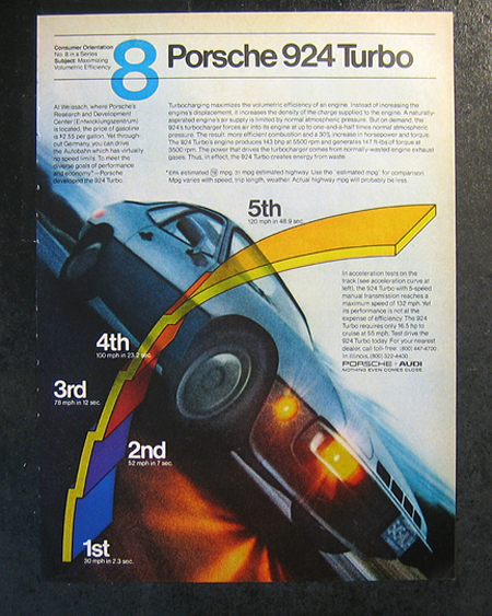
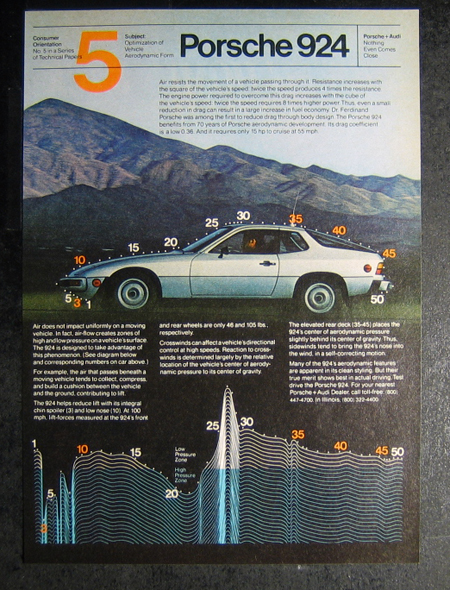
It’s funny how a lot of those things that you thought were boring when growing up, are now actually really fun things to do. I never would have thought I’d spend a sunny Seattle Saturday sifting through tubs and tubs of posters and ads. But its a damn good thing I did because I found these vintage Porsche ads. I was tempted to purchase all of them but instead I wrote down some info and looked them up online. All of these ads I found on eBay and were from the 1980’s. A few of them might be late 70’s, but it’s tough to tell.

The thing I really like about these ads is that they feel authentic. That’s not to say that ads nowadays aren’t authentic but there is certainly more than enough CGI being done to them. It also seems like it’s rare to see such nice large type of this treatment in ads anymore.

Sander from the comments informed us that Helmet Krone was the designer behind these ads—more info here.

(more…)

Swiss Holiday House


Houses like this one outside of Rigi-Scheidegg, Switzerland just make my jaw drop. The view is simply stunning. There is nothing like being able to look out above your neighbors’ houses, through a 5-meter long window or in the lawn chairs on the deck and still see a mountain range with snowcapped peaks every morning. You just couldn’t ask for a more beautiful view.

Parts of the house utilize a lower ceiling to help give it that mountain hut vibe. It’s also helped by the cement and wood combination, giving a super raw feel. It’s almost too raw which doesn’t make the house feel all that comforting. A little interior flare would warm it up and make it more welcoming. Perhaps some deer head mounts on the wall or large floor rugs would do the trick.

Found in the archives of Arch daily.

(more…)

Brockmann in Motion

My love for Swiss design just grew substantially. Up until now I hadn’t seen any swiss or international style design pieces translated into motion. But now Vít Zemčík has done it and he has done it well.

This was an educational project made during the International Typography Workshop in Czieszyn. The task was to translate a known print design piece into motion. If you’re not familiar with the poster Vít has used, it is by Josef Müller-Brockmann, one of the greatest Swiss designers.

Davone Ray Speakers


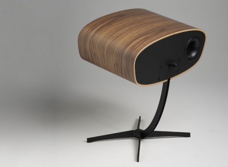
A Danish company called Davone has released their second model of Ray speakers. They have a nice shape wrapped in walnut veneer that gives them a home alongside the Eames lounge chair. I’m all caught up in the beauty of these speakers but could only justify saving for these if the sound was exceptional. If you’ve had the pleasure of listening to audio from these speakers, please let us know in the comments.

The speakers use an 8″ woofer and a 1″ tweeter with a rated frequency response of 38Hz – 20kHz. The impedance is 8 Ohms, with 89dB/W/m sensitivity and a hefty price of $6,000—yeah, that’s $6,000 a pair. Extremely pricey isn’t it? Maybe some of you audio-savy folks can make sense of the specs to help justify the price tag.

Found via Grain Edit.

The New Mid-Century Modernist


The Mid-Century Modernist has remodeled their website with a new and refreshed look. A few new features were added, one of which is gallery displaying a nice grid of vintage designer furniture that can be purchased from eBay. I find this feature particularly cool even though the price tags are pretty hefty for most of the items.

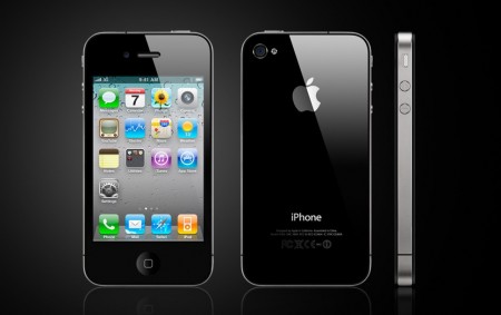
iPhone 4: Form before Function?

It’s certainly safe to say that a large number of people (myself included) have been plagued with an acute case of the “wants” when it comes to iPhone 4. Some of the new features are just downright awesome—Facetime, multitasking, HD video, 5 megapixel camera and the list goes on. We’re seeing all these cool new features, but at what cost do they get included?

During Apple’s keynote, some of the new technology was explained, one of which was the new antenna. The new iPhone chassis was designed not only to provide a more rigid body for the thin, refined design, but also to function as the antenna. As Steve Jobs mentioned during the keynote, the antenna is a metal band wrapping the phone and is comprised of two parts. One part for Bluetooth, Wi-Fi, and GPS; the other for UMTS and GSM.

After reading this article, I began to question whether or not this new antenna was really executed that well. A prime example is shown in these videos: iPhone 4 losing reception when placing your hand over the antenna band. Have I seen this happen in person with iPhone 4? The answer is yes. It’s like magic; something that only Harry Potter should be able to do.

Just to clarify I’m not talking smack against Apple here, I’m just questioning how such a huge oversight like this could occur here. Some folks are suggesting that the phones tested were using the suggested* rubber case (which solves the problem), but I can’t seem to grasp the idea that, in all the testing that was done, no one seemed to notice this reception issue? Perhaps it was noted, but at that point did the rubber case become the solution to the problem? With past iPhones I’ve experienced drop calls which also makes me wonder if this whole time its been the actual design of the iPhone that has inhibited the reception and not AT&T (hard to believe).

On that note while I have your attention, I thought I’d ask for your thoughts.

Would you still buy iPhone 4 even though they are experiencing this issue?

Do you think Apple knew about the reception issue of iPhone 4?

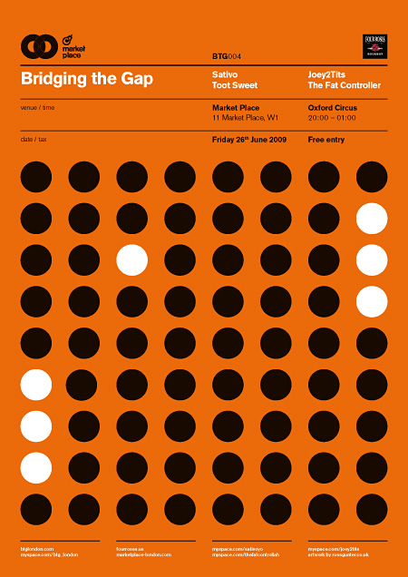
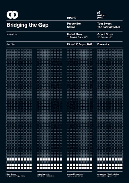
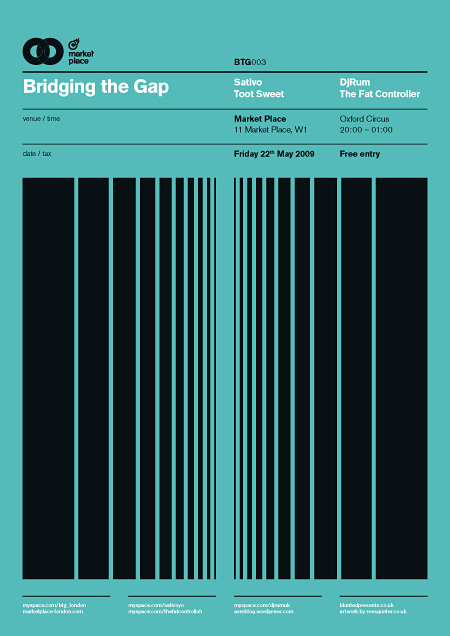
BTG Posters


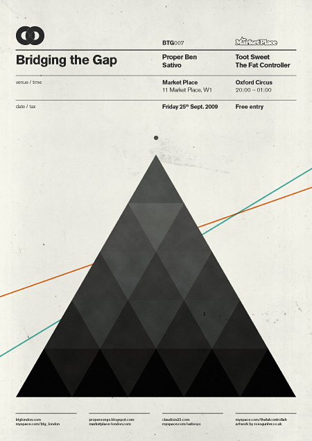
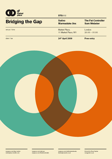
Stumbled upon a handful of really great posters by Ross Gunter, a London based designer. The posters were designed for Bridging the Gap, a club night and blog in London. My favorites of this set were the 1st and 3rd because of the clear showcase of grid as well as the sheer visual stimulation in each.

Images via Behance.

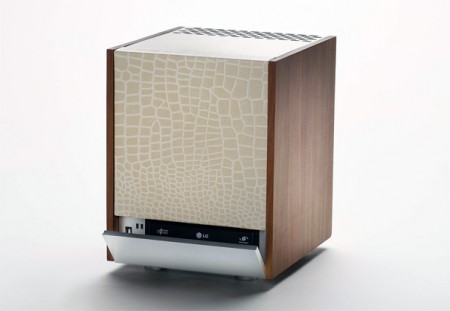
Wooden PC by Design Hara


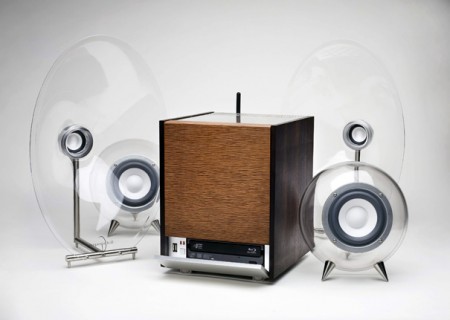
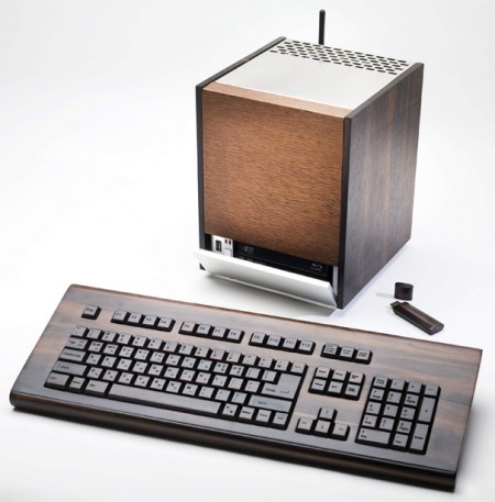
One of the things that turns me away from products is when they are slapped with something saying it’s “environmentally friendly” or “green” when its not. If cutting down trees and mining the soils for ore is environmentally friendly then this PC by Design Hara, is exactly that. I get that you could recycle this but do people really buy products (namely electronics) just because they can be recycled?

My initial thought about this PC was of course the design. It fits into the mid-century category by the materials choice. The option of Italian Cypress wood, Canadian Rose wood or even sheep leather really give this the computer it’s substance. The keyboard and even USB drive also really add to it. Maybe next we’ll see a wood-framed monitor. But as cool as this is and as much as I love the mid-century design aesthetic, I would probably only use this as a decoration (enter Mac vs PC debate).

Images via Yanko

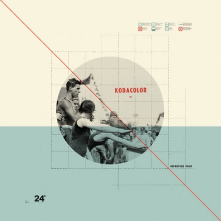
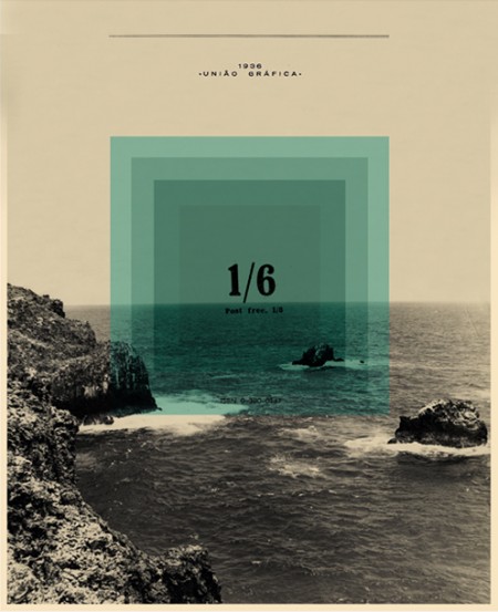
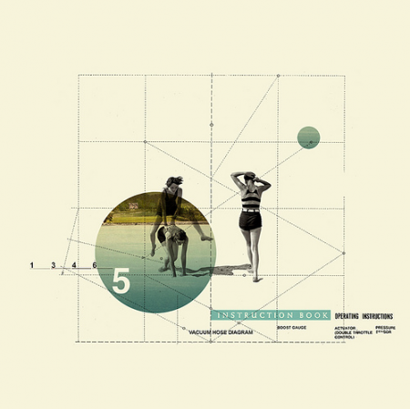
Cristiana Couceiro


A couple of weeks ago I stumbled across these beautiful pieces by Cristiana Couceiro. I was immediately engaged by the simple, collage-like style and muted mid-century colors. There is also something about the use of monochrome mountain imagery and type that really catches my eye.

See more of Cristiana’s work on flickr.