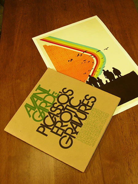
Avant Garde Magazine #8 next to the Command Print. Thought they made a nice pair. Avant Garde was a short lived art/culture magazine in the late 60’s-early 70’s. The magazine itself always had great art direction and layout, but it’s main contribution was, of course, Herb Lubalin’s logo which was the basis for the ITC Avant Garde typeface. This has always been a very controversial font in the design world, many claim it is overused and abused. Lubalin himself thought the face was misunderstood and overused, rendering it something of a 70’s cliché. Whatever the case may be, I have found it to be a striking and versatile font in my own work. The Madrone print is a good example of how I like to use Avant Garde, it’s strict forms and tight angles make perfect building blocks for large scale use.
Avant Garde + ISO50
09.24.2007


I’ve gotta say, I too love Avant Garde, and it’s very right in Madrone 🙂
I gotta say that I always despite that font. I thought that it was very common and ugly. But with time, of course, things might change. I actually found it very attractive, with some modifications on it. That font in your works looks really great. So, long live to avantgarde and Helvetica 🙂
cheers
Who is the girl in the Madrone print anyways? Sweet poster
Brent-
Thanks, this is her.
Thanks Scott. I have that Madrone print on my wall. Always wondered who the actress was, couldn’t quite place her. Candice Bergen. That’s a real surprise.
Pierce-
Yeah, when I first found that picture I couldn’t believe that it was her. Thought it would be perfect to use since most people these days only see her in the context of the Murphy Brown T.V. show from the ’90s. I can’t remember anyone who knew it was her the first time they saw it. That particular picture was from a 60’s issue of Newsweek I had, they were highlighting her as an “up and coming” actress. I think she’s 16 in that photo.
It might be the colours/tones you’ve applied to the image, but I often think it’s the most 60’s looking face I’ve ever seen. I’ll enjoy challenging people to identify her whenever they comment on it.
that IS suprising! i could’ve sworn it was katherine ross – http://imdb.com/gallery/mptv/1369/Mptv/1369/2892_0008.jpg?path=pgallery&path_key=Ross,%20Katharine%20(I)
Hi!ajpz! http://swfndydj.com nbhwr mxixe
Hi! http://ywdnltkv.com jacht rlkfb