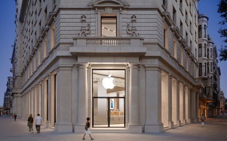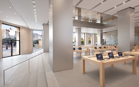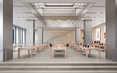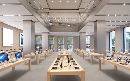


The design of Apple Stores around the world don’t get enough attention for their design. We’ve all been in an Apple Store before and seen just how simple and effective the interior is. Even though sometimes it gets crowded, the interior design is impeccable. Here are images to prove it.
View more on Mac Spoilers


The most revolutionary use of IKEA tables seen yet. Thumbs up guys.
@Chris I sincerely doubt Apple would ever invest in IKEA tables. Sources say that these tables are created by Fetzer Inc (woodwork group out of Utah) and cost anywhere from $2,000-6,000.
A bunch of wooden tables, all ina row, with a bunch of overpriced productes on them.
how is this revolutionary?
My God…Apple can do absolutely nothing and the art and design world would weep about their genius!
I remember when artsist help their finger up against the mega machine of capitalism. Now we worship it.
/justsayin’
Gattica?
These look like renderings to me. What do you guys think? The perspective is almost too perfect when you take a look at the leg of the table in the second image. The shadows under the tables are also a little artificial.
Not taking anything away from the design choices, it’s just interesting to think these may not be photos. There’s an interesting book on Apple architecture from Clog:
http://www.clog-online.com/issues/clog-apple/
@Brian You could be right, though according to Apple these are “photos”. Might have to dig deeper to get confirmation…
@Nick, Do nothing? Haven’t we learned the amount of work that is required for beautiful, minimalistic design. This is true for any sort of design, including graphic. Are you to say Vignelli “did nothing”?
The impressive aspects of apple’s architecture is how clearly it speaks to the branding of apple. Apple has been linking all forms of design (Architecture and Interior, Graphic, Product, Web and Interface) to create one cohesive whole available to the general public. This is revolutionary.
@Sean Curran
You gotta be kidding me right? You are so clueless it makes my blood boil.
lol people are really fucking dumb.
@Lyndsey, how so? I wouldn’t mind a valid argument, rather than a straight up insult…
Props to Eight Inc., design consultancy in San Francisco for a lot of this work.
http://eightinc.com/?pageid=329
fight! fight! fight! fight!
Haha, I’ve got a front-row seat to the winiest, nerdiest fight of the century! One the right, we have the apple fanboys, enamored by the high quality hardware and minimalist philosophy of apple. On the left, we have the former apple fanboys, bored as hell with ios and looking for any excuse to badmouth the girl that broke their heart. ding ding ding, let the fight begin!