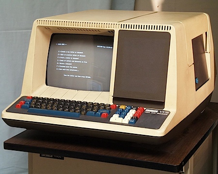
 You know you’d buy one if it ran OS X. The real thing is still a looker though.
All aesthetic concerns aside, the news that the new Macbooks will sport dual GPUs, taking advantage of Snow Leopard’s new-found process offloading abilities, is more than welcome. This is the first time that I’ve seen the whole “GPU as processor” revolution that’s been gaining steam lately actually start to become a reality. It’s no surprise that Apple brought it to the table first. As John Gruber put it: “What we’re seeing may be the beginning of the end of CPU hertz as the rule-of-thumb metric for system performance.” As you may know, Photoshop CS4 already leverages the power of the GPU and it’s great to see that other apps, and even the OS itself will be following in it’s footsteps.


hah, that made me laugh 🙂
You actually think they look good? Aren’t you against the “not real colours!”-glossy screen?
(And then there’s the horrible ratio of the radius of the rounded corner of the edge to the rounded corner of the screen bezel. Ah!)
matthew-
you’re right, I hate the glossy screen, but we all saw that one coming (although it is pretty surprising they aren’t offering any matte option, sort of leaving us color conscious types behind). Overall though, it is a nice looking piece of hardware and I’d imagine that actually holding one would only add to the experience.
I’m not sure if the whole offloading processes to the GPU is too much of a good thing. Adds a whole lot of variability to game development. Lines get blurred, weird stuff happens. Could prevent things from being simple and robust. Cause you know hardware developers and software developers will abuse that and just get sloppy.
😀 So you have sense of humor
I certainly hope the glossy screen stays as an option and does not become mandatory on their Pro line of products. As it stands, I use a matte MacBook Pro privately and a glossy iMac at work, and I absolutely hate the glossy screen on the iMac. Especially on sunny days, I have a hard time seeing what I am working on (I see myself more!). That’s just unacceptable. The design of this whole black-frame-with-glossy-screen line is very beautiful, yes, I love it, but also very useless, unfortunately. That’s where is stops being good design and starts being eye candy, in my opinion. What are your thoughts on this, Scott?
I find it interesting that Apple chooses to model its Macs after its portable gadget line. With the iMac G5/white Intel, it was a copy of the iPod aesthetic. Now, with the new iMacs and now portables, they’re using the iPhone design scheme on their computers. The unification is nice, but in the case of the glossy screen, imitation isn’t always flattery.
I’m pretty surprised myself that both MacBooks have now the same appearance. They always carefully held the consumer and pro hardware distinct from each other, until now. I wouldn’t say they modeled the new aluminium iMac after the iPhone, but I think it was indeed the iPhone that blurred the boundaries, being used by all.
Personally I’m not impressed by the aesthetics of the newcomers. The iMac looked allright, but both the MacBook and the MacBook Pro were stunners, and this new look just hasn’t enough identity for me. It really does start looking more like a PC notebook. Much better done, but not a whole different league like the old ones were.
But, at the end these probably are better machines, and I imagine they will be fantastic to work with once you have them on your lap. I really would fancy a glass trackpad, proper graphics and backlit keys.
jerry-
yeah, the glossy situation is sad. I hate glossy screens. I recently read and article about why everyone is moving to glossy and howyou wont be able to get matte screens on laptops anymore. there are anti-glare film products though that go on the screen and minimize the reflections. but it;s pretty sad that you’d have to put a big sticker on your laptop just to make it functional.
So will you be buying a MBP, Scott?
yeah, that’s the plan as of now. still not sure whether I’ll jump on it tomorrow or wait out the first revision as apple has a tendency to release things a bit before they’re really ready. Of course, I still need to go get my hands on one and actually try it out before I decide.
The glossy screen is still really a huge letdown, but not a deal breaker considering that most of the places I use my laptop are dark (or I have it pugged into my cinema lcd anyways).
The real kicker that convinced me to get it is the Nvidia graphics. VDMX (the live video software I use) relies heavily on the GPU so this new mbp will definitely allow me a lot more creative freedom with the live visuals.
But it’s glass right? Not that cheap overly glossy plastic coating that pc laptops have. It may actually look kind of nice.
It always looks nice, it’s just a damn mirror 😛
They clearly just went for aesthetics instead of practicality, every user I know hates reflections, it’s a classic problem. Seems foolish that they decided with the glass. It’s like they didn’t even think through the basics.