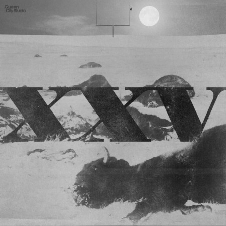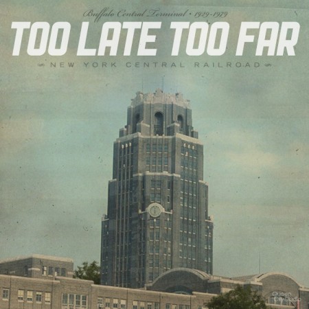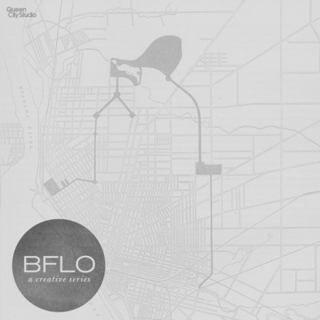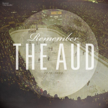


I found this series by Rob from The Queen City Studio pretty impressive, its an ode to his hometown of Buffalo, NY, I think a project like this is perfect for a graphic designer that needs a subject to show off his ideas and skills.
The Queen City Studio: BFLO
12.01.2010

You’re right, it is a good idea for a self initiated project. These ones have a really strong vintage feeling, which I really like – especially the two last ones. The soft, almost faded colors and the typography come together nicely.
Yeah whoa these are greaaaaat
I live in Buffalo, never heard of these til now, but I dig them…great stuff!
quality stuff.
Wow, what a way to start my birthday! Thanks for all the positive feedback, it’s truly an honor to be featured on the ISO50 site. Working on the series has been a great experience, it’s one of those projects I wish I had more time to contribute to. But, when a new idea comes to me it doesn’t take long for me to find the time to bring it to life.
Thanks again!
Yes. Beautiful.
That last one looks like something right out of Mark Weaver’s playbook…
Hmm, that really is quite the brilliant idea. I also need to beef up my portfolio with some new work, finding inspiration in where we came from is a good project to work on.
the dead buffalo on the football field piece is particularly inspiring. well done!
As a Buffalo ex-pat with good friends who stayed and are doing good things for the city, I gotta say the rust belt cynicism wore itself threadbare far too long ago.
Daryle, just curious – is your response a positive or a negative one? Either is welcome I just can’t quite tell! I really like hearing opinions of Buffalonians (past and present).
Rob,
I just randomly found you on this blog! If you don’t remember me by name, I graduated with you in BFA at Fredonia!
Glad I stumbled upon your stuff. Great work. Made my day!