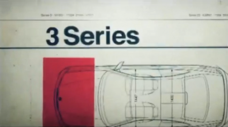
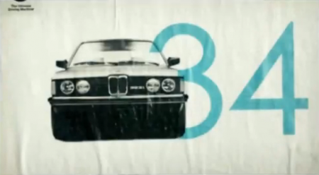
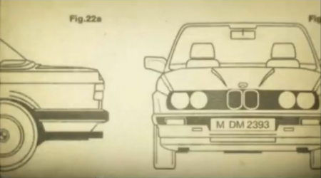
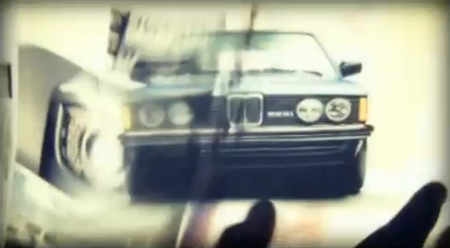
There I was, minding my own business watching Sunday morning football, when these sexy pieces of design snuck up on me. Typically my brain turns off at the first sight of a car commercial, but this 2010 spot for the BMW 3 Series is a breath of fresh air. It’s great to see a company going back to their roots. Interspersed with the requisite this-is-a-car-commercial-and-we-are-driving-on-a-closed-road-that-doesn’t-exist type shots, there is some really terrific graphic design. Watch it on the BMW homepage for the highest quality version I could find (header image 2 of 5).
It’s not the first time BMW has impressed us with their design sensitivity, check out these vintage ads as well.


Watching the 49ers lose? Me too 🙁
I remember this commercial, it was quite nice.
They run these regularly during Mad Men. In fact, I think they had an extended version when BMW was the limited commercial interruption sponsor for the first episode.
I was wondering if this commercial would show up here. I saw it too and was wondering who did it and if they frequent this site for inspiration.
My colleague Colin worked on these during his time at Digital Kitchen. Check out some of his work here:
http://thecolin.com/
Love this spot… They’ve used some of these ‘culture’ of small BMW segments in previous ads, too… Love the swanky type and overall feel of this one. Good energy going here. (makes me even more happy to be a 3er owner!)
This one caught my eye as well. Something about classic racing inspiration that is just so good.
Josh Hurtado
Royall Advertising Agency
Saw this during Mad Men as well and was instantly pleased…It even makes me feel better about owning one.
That commercial just makes me want to troll the classifieds for an old E30, rather than hit up a dealer for a new 3…
BMW teamed with Vice Magazine in the past and made a Glow in the dark cover: http://www.foliomag.com/2008/magazine-runs-embedded-glow-dark-ad-cover
I really like their ideas.
I really like the style and graphics used here, it invokes a lot more than simply a car.
I like it.:)))
Ever-so-subtle use of the Jobsism “Magical” there…!
*ditto*
If only more car commercials looked this good.