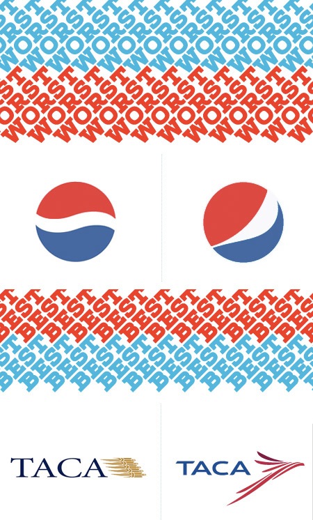
 With all this talk of branding lately it was interesting to see Under Consideration’s Brand New blog’s picks for Best & Worst Brands for 2008. The ever-controversial Pepsi re-brand predictably made the worst list while 826 Valencia and Taca headed up the Best-of column. There were some surprising omissions as well as a few controversial picks–as the 126 comments and counting thread will attest to. Check out both full lists here.
Brand New Best & Worst of 2008
12.29.2008


Wauw that TED talk by Dave Eggers is really interesting, and WAUW to those 826 Valencia products. That “Eau De Mer” is brilliant. Sand in the bottom of the bottle, haha!
Yeah Im with you, every time I see that new p.o.s. Pepsi logo I literally cringe! It is just kind of awkward, and un natural.
How ever the new payless shoes logo is horrible as well!!!!!!
I recently had a discussion with someone about the new Pepsi branding and was told that the price tag for the new logo was $1 mil. I’m sure that included test marketing, but…
If anyone, like myself is in disbelief of this re-branding nightmare, feel free to contact the firm that came up with it @ contact@arnell.com. I have 🙂
I agree with the Pepsi re-design being one of the WORST of 08.
I would also like to mention, one of my favorite re-designs, is the new Walmart logo.
The new walmart logo has grown on me. But it still feels too generic and still resembles an anus.
Pepsi might have been better off by posting a logo challenge at 99designs(dot)com 🙂 I’m sure that would have resulted in a LOT of great suggestions… and a lot cheaper too.
i really like the new design. it gives the circle more dimension. the old logo reminds me of a ying-yang. i find the new one much more modern. i vote its an improvement.
The selling of the new logo is pretty hilarious. Check this out http://bunnitude.com/misc/files/pepsi_gravitational_field.pdf
Its the best pseudo science I’ve ever seen.