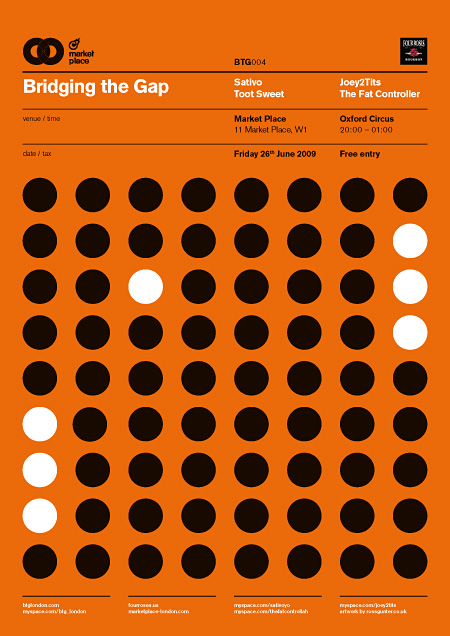
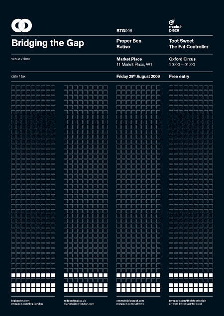
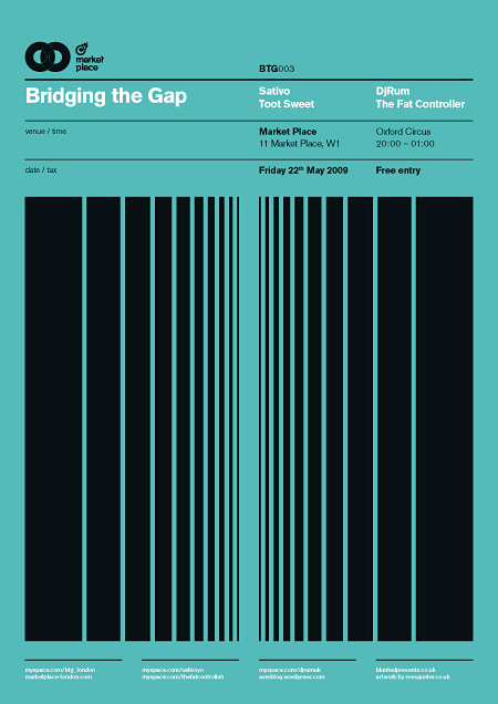
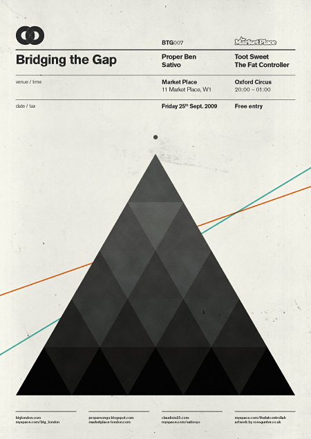
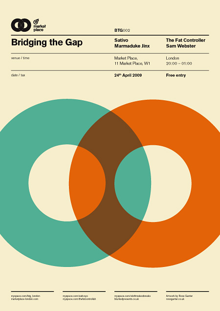
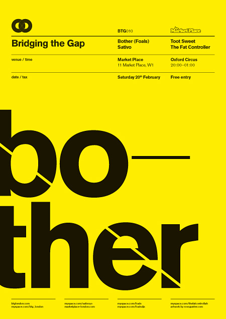
Stumbled upon a handful of really great posters by Ross Gunter, a London based designer. The posters were designed for Bridging the Gap, a club night and blog in London. My favorites of this set were the 1st and 3rd because of the clear showcase of grid as well as the sheer visual stimulation in each.
Images via Behance.
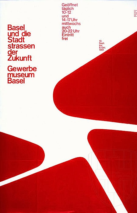
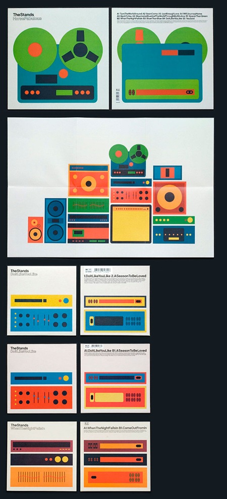

The 3rd poster down is like an improvement on the first Trans Am self-titled album cover.
Digging the second from last. Nice collection.
A huge honour to be featured on this blog. We are massive fans, Scott!
PS, Bridging The Gap is a clubnight & blog, not night club. 🙂
@cdillo
Updated the post! That’s awesome you guys are fans.
Thanks for tuning in!
Thanks for the feature Shelby. I’ve been following the blog for years, massively inspiring. As cdillo says, a huge honour.
Great… i love this “swiss” style
These are really fantastic Ross!
Wow! love the style!
I really like them all. Particularly 1, 3 and 5. Great work!
Great collection of posters. I may have to check this out next time its on in London.
Hey Tom, the next one is July 3rd at The Alibi in Dalston.
Link here: http://www.facebook.com/event.php?eid=133588559985334&ref=ts
Would be great if you could make it!