I am in the process of moving into a new apartment in San Francisco. Amidst the endless furniture shopping, cleaning, painting, and waiting during absurdly long delivery-time windows, I have been planning the construction of the ultimate apartment-based graphic design studio. As I’ve always set up shop in a room with another purpose (currently my studio also serves as my bedroom and recording area), the prospect of having a dedicated design room is very exciting. I figure this move will be a good opportunity to really take my time and build the perfect work room — from the paint on the walls, to the the table tops and filing cabinets — every detail will be meticulously considered.
The room itself is 11.5′ x 9′, plus a generous closet. The purpose of the room will be a place where I can work, file, cut, store, display, print and create. Basically a little graphic design super room. Unfortunately there will not be space for my music set up, so my guitars are going to have to bunk with me in the bedroom. You’ll notice there is also a small window. Ideally, for consistency reasons, I would prefer to have no window — but I’ve come around on the issue in hopes of the keeping studio morale high…
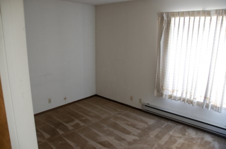
The empty room, ready to be revamped
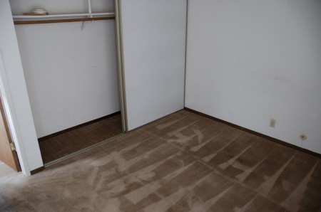
Another 'before' shot. Depressing I know.
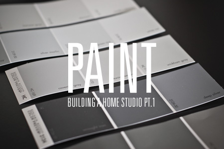
The first order of business is the wall color and I have been staring at infinite variations of color grey for the last very long while. I am trying my best to approximate Munsell N8, the wall color I mentioned in the Color Management Field Guide. Of course, the easiest way to do this would be to buy the actual Munsell paint, but I am unusually freaked out about chemicals and odor, and I tried to find an appropriate substitute with zero VOC’s etc. I spent a long time printing out high quality reproductions of the color I thought I wanted, and I took these to the local Benjamin Moore to see if they could whip up a mix. (And when I say local, I mean next door — so that’s another reason for going with BM. I change my mind frequently and I wanted to have the option of switching colors at a moments notice.)

The color I went with (up to this point) is Grey Horse 2140-50. It looked perfect on paper, in the can, and at first when it was on the walls. Unfortunately, now that it has dried, it reads as a very light blue color (makes the room look like I’m expecting a baby boy). So basically I’ve decided to diverge a bit from the “Munsell or bust” plan I set out with. I could have expereimented with few other approximations, but when it comes down to it, I prefer a much darker grey anyway. I am willing to give up some “spectral bias” if it means the room looks cooler and makes me happier. (I think I prefer something closer to the N3 or N2 end of the Munsell system.) Of course, this means I have to paint the room again, but I’ve become a rather expert painter over the course of my decorating (indecision, and frequent repaints, will do that to you).
A thorough discussion of the color grey and the quest for the ultimate neutral grey can be found here. The article is about home theater solutions, but the information can be carried over. From my searchings on the web, the issues and thoughts surrounding the color grey and its benefits and specifications is very scattered. Like color management, theories abound and there doesn’t seem to be very much consensus. The balance is between overall aesthetics of the room, and how the color of the walls will affect your perception of the work inside it. For me, I’ve decided to error on the side of aesthetics at the moment. I am still going to try and choose as neutral a grey as possible, but I don’t think it will be worth it to sink too deeply into the research for the perfect grey.
(Note: I chose to spell the color in question as ‘grey’ as opposed to ‘gray’. Usually I alternate just for the fun of it, but for the purposes of this article I decided to look into the ambiguous spelling issue a little further. From what I can gather, they are both correct, each is just more prevalent in various countries. My favorite description of the situation was here, and states, “Gray is a color. Grey is a colour” — alluding to the international adoption of grey. Personally I prefer grey, and will continue to proliferate this spelling until all hope is lost for gray.)
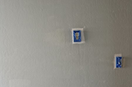
After first coat, before blue transformation

Benjamin Moore Grey
The next step will be the surfaces and I’ve measured the room countless times in anticipation of my eventual run to buy the supplies. Rather than purchase pre-made desks I am going to build my system from scratch, so it will be custom fitted to the room and my specification (not to mention, a whole lot cheaper). The table tops and surface sitation will be the focus of the next article in this series. Feel free to weigh in on your own custom studio/office solutions via the comments.
On a related note, there is a great discussion on Scott’s recent workspace post about the aesthetics of your workspace.


Glad to hear your spelling Grey the proper way 😉 (in Engish not American)…now we just need to work on getting the u into your coloUr 😛
Good luck with the custom fit out, look forward to seeing it grow/build!
I haven’t even read this post yet because I’m too caught up in that stellar graphic.
Nice one Alex, exciting times. I can’t wait until my plan lifts off the ground and can craft my own studio workspace. Grey is definitely a great choice of colour for that space. There’s a great dark-ish shade of grey my brother uses a lot for interiors, Sombrero I think it’s called. Can’t seem to find it online. Searching online seems to just come up with just beachy tones.
Oh and finally, an American correctly spelling grey correctly 😉 In South Africa, we use “grey”. Which really is just better. No bias or anything.
not that it helps, but in germany its “grau”:) i’ve decided to go with a simple white in my “work”-room, with a charcoal/almost black colour behind the desk. works great when trying to concentrate on whats happening on the screen.
alex can’t wait to see the finished space. I totally understand what your going through. I am still working on my space. I’ve moved around my room so many times and painted and bought some pieces of furniture and I still am not done. Your room is going to be great. I would maybe consider new curtains:) Good luck.
that is some sexy carpet. dont. change. a thing.
Ohhh yes, the carpet and those curtains are sexy indeed. Maybe I won’t even put a desk in and just bask in the wonderfulness of the carpet…
i prefer grey as well, but firefox says i’m wrong.
good to see a proper workspace in the works. planning on doing the same soon. but i hope you tried more than just one coat of the grey on the walls. spent quite a few summers working in commercial painting, and the general rule of thumb is; try your best to get away with one coat. but chances are it’ll look horrible compared to two or even three coats. the color darkens and the transparency of the background color get diluted with each application.
Maybe your internal white balance needs adjusting, it looks pretty grey to me.
The perfect workspace is so difficult to find. Can you ever be truly happy with the final result? In that respect its like all things.
Perfect grey, is it even possible to achieve? The ever changing color of sunlight will throw off the pure grey anyway. Either way, it’s going to be closer than say hot pink. Ha!
@ David — Haha, it looked grey to me too…after about 1-2 hours, as it dried, it became more and more blue (2 coats). Of course, we are talking about a SUBTLE blue tint to the grey, but it was very noticeable to me. I’ll get back in there and take a shot of the blueness before I repaint.
Glad people enjoyed the spelling of grey. For some reason, writing it gray doesn’t even vaguely connote the color to me. I picture someone’s last name when it’s spelled that way.
Hey Alex, you could give the idea paint a try… It is a bit costly for a full room’s painting, but maybe this could improve the design process.
Can’t wait to see the finished room.
I’m hoping to move from my beach paradise apartment in the next year to a house. That way, I can have a garage and start setting up a proper studio in there. I like your idea about custom furniture. Plus it won’t be Ikea. I’m guilty as charged for shopping there. Won’t make that mistake again. Although they have nice cheap lighting. Shit just falls apart after awhile.
Looks like a great project to take on there. I eagerly await the day i get to customize my own work space…until then, i can only envy yours. i look forward to seeing how your self built desks and furniture turn out, ive thought about building my own large cutting table myself. might have a go at it now.
best of luck to you!
@ Navis — Oh man, I was flirting with the idea of IKEA for some things…is it really a no go? I know a lot of their stuff is low quality (esp over time), but I thought I might be safe with basic tabletops and/or metal legs etc. The really basic stuff.
Having a dedicated room for design or music or both is awesome. I just got mine last year and its so much nicer and more professional feeling. It can be awkward telling a client they can sit on your bed.
Anyways, for my work space i went with a coffee them color. Three walls are latte brown with the window wall froth cream. Minus my keyboard rack and second desk (that may dad built in wood shop in the 70’s) I built everything from scratch. I recommend this to anyone not afraid of power tools. You get exactly what you need and nothing else. I even ripped out and rebuilt the closet.
color: go to a photo-supply shop. get an 18% (neutral) gray card. take it to home depot. get them to match it in a flat latex paint (not “flat enamel” as it has a bit of gloss)… paint the ceiling the whitest (flat) paint you can find. likely latex kilz will need to serve as an undercoat there. paint the ceiling first. do not paint it gray — you’ll feel trapped in a cube.
carpet: i’d say rip it out, but i’m a bad renter…
ikea: 85% of everything at IKEA is crap. 15% is genuinely awesome and — of that — only half will stand the test of time of both design and build-quality… but considering the mass of SKUs, there’s still something to pick out. however, 96.5% of the customers can’t tell the difference or don’t care. the URBAN chair (a jasper morrison knock off for $40) is a current fave in orange. the KULLA and SAMTID lamps are worth picking up… as are the MELLTORP and NORRSTEN tables. even the LACK bookshelf in white is not a bad choice, but if you expect a BILLY bookcase to last a few moves, you’re kidding yourself. ikea is also a good source for parts… the NUMERAR counters could work as a good surface on some custom built-ins.
hlw said it best. Crap there just falls apart or if you’re like me and have anger management problems and occasionally pound your fist into your desk out of frustration – it WILL fall apart. Avoid ANYTHING like the Billy bookcase. Or anything that has that flimsy particle board stuff for a backing. Not only is it impossible to assemble, it’ll probably break coming out of the box.
I kinda dig the Poang chair though. It’s comfy. But the question is… for how long… if it feels cheap at Ikea, it is cheap. Just really look at the construction/material quality of things.
But if I were you, since you seem to have uncanny amount of patience, I would just scope out deals at small time furniture stores and see what kinda recession deals you can dig up. For a few bucks more, you’ll probably find something you love that will last 128944x longer than anything at Ikea and won’t look like every other hipster’s apartment in LA.
Great choice in grey Alex. I went with a shade of grey in my studio as well with one wall a bright orange because, well, I like orange. Looks like you are working with a smaller space as I am.
i dont know, i think you should make that into a “hot chicks room”…
I’m American, and I always spell it “grey”.
I dont see the real problem with Ikea. At least desk-wise. You can buy the tops of the desks- they are like $30. Buy two, and then buy some metal legs or file cabinets to prop the desk tops up. (Dont buy a prefab desk from Ikea). If they somehow break, it’s not like you spent a lot of money in the first place.
Also, Ikea has some cool lighting stuff.
I’d say definitely go with a custom built desk at least. It will allow you get get as much space out of the room as possible and give plenty of options for stains/finish etc. Just built a corner desk for my office and it looks really sharp, and fits perfectly
As far as Ikea goes, they hey have some great sawhorse type things that work great as desk legs. They are height adjustable. I am tall and I have mine all the way up. I bought a door at home depot for 30 dollars and put it on top of the sawhorses, now i have an 80 in wide desk that I can stand at and trim. I hate bending over to trim paper.
Alex,
Don’t take this the wrong way – but I just got to the bottom of your article and realised I’d spent 5 minutes reading about the shade of grey on your studio walls. And that depressed me somehow. 😛
Also, gray is pretty gay… Grey all the way!
What’s the hex value for that grey?
For aesthetic purposes you definitely need a filing cabinet or two to really get that feel for the studio. Just my opinion though.
Grey
http://www.grey-activity.blogspot.com
good luck with the room, must be refreshing to be in another workspace.
Grey… yep.
Alex, my wonderful girlfriend Adrienne picked out my setup for me and I love it. She is an Interior Designer/Architect, so she is really knowledgeable about this stuff. What I have is two 6′ x 36″ door panels from a contractor hardware store ( no holes cut in it) on top of 4 horses. We got ones with shelving so I can store books/materials. The setup takes up one wall length and is more than plenty of room for digital and manual work. Let me know if you want to see it!-David
@David
Could you post photos! I too am thinking about something like that. I would like to make a desk as big and as cheaply as possible… but still look stellar.
Doors make awesome desks! When I had the space for a studio in my home I used a beautiful 50 year old light reddish fir door we had leftover from some renovation. (We removed a few interior walls to create a more open design to the house). It was awesome – even with the hole from the former door handle, which became the computer cable conduit. Rolling cabinets fit underneath for drawer space. Even better, when the kids scratched up the surface after a few years …. I flipped it over and had a new pristine surface.
Always meant to replace my home-made construction grade spruce sawhorses holding it up with something a bit more visually pleasing to designer sensibilities … just never seemed to get around to it. (My recommendation is get the legs right the first time while you have the momentum – had always intended to get really good cabinets of the right size to replace the sawhorses and rolling cabinets.)
PS, as most interior doors are quite hollow, they make excellent percussive instruments if you are a finger tapper when listening to music in your studio.