"Busag Clichés" [1973]
By: Diggelmann & Mennel Werbeagentur (Zürich)
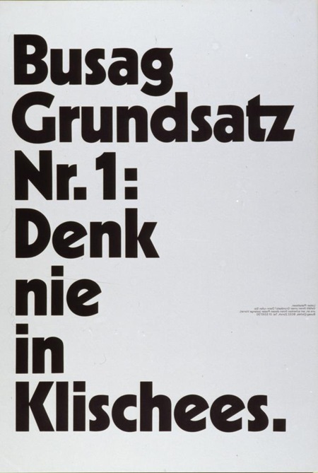
Black and white at their finest from The Poster Library via Joyrex. I really like how this piece emphasizes extremes; dark / light, massive headline / miniscule copy. As a poster designer you dream of being able to keep the detail copy this small. Unfortunately, clients don’t always appreciate the finer points of minimalism.
Name that typeface in the Comments >
Update: Title translation via Jessie Rumble: "Never think in Clichés"


For information, it means “Don’t think in clichés” in German 🙂
To be even more precise, it means “Never think in clichés” 😉
love the typeface.
Anyone know what it is?
It’s gotta be an original cut or a tweaked version of “Kabel Black”. Always loved this typeface, but i’ve never really seen anybody outside of Lubalin really use it nicely until now.
Great Piece!
Hey, Allan! You almost got! It’s not Kabel. It’s Cable, with ‘C’ or, nowadays called Geometric 231 Heavy. The design is a variation from Kabel, both designed by German typographer Rudolf Koch.
Ops… By the way… This font can be found at My Fonts:
http://www.myfonts.com/fonts/bitstream/geometric-231/
🙂 Cheers!
bb
kabel black that is. billy got it right.
wtf, is this billy bacon from brazil??? i noticed the name. where are u man?
Those PESKY clients….it’s a shame how the lack of intelligence on the part of average joe means we as designers need to simplify and dumb down everything, even if it’s minimalist (note simple and minimal are not the same in this regard).
Because something is austere and sparse doesn’t mean it has anything to do with “minimalism”.
I’m enjoying your blog & work very much, thanks.
Bill
Thanks, glad you’re enjoying the blog.
I didn’t go to school for design and I’m not sure what definition of minimalism you are going by… but I am pretty sure this piece is a good example of a minimalist approach to design. I agree with you that something is austere or sparse isn’t necessarily minimalist by definition, but even wikipedia says “The term “minimalist” is often applied colloquially to designate anything which is spare or stripped to its essentials”. I’d say this particular weblog is about as colloquial as it gets right? At any rate, at this point I think it’s meaning is a bit broader than the narrow definition academia would probably limit it to and this piece in particular, goes a long way towards fulfilling all the definitive characteristics of minimalism.
Fair enough, probably just a pet peeve of mine because I like Minimalism so much. 🙂
Minimalism also has a lot to do with material selection. If you look at say Carl Andre’s work (which you’ll probably like) he tries his best to go outside of “traditional materials” and choose things that are already in a particular form, like cinderblocks or railroad ties. There is a kind of raw blunt attitude implied in the work that is very strong, masculine and egotistical. Same goes for some of the others who were floating around in that time period.
It’s one of the reasons that technically you can say there aren’t any Minimalist paintings. Paint being a material that you have to massage and finesse greatly to get into form. The closest would be Frank Stella’s early work.
Looking at the example poster, maybe there is some of that attitude of put it down and do the least with it and appreciate the letterform and the material for what it is. But a true minimalist would probably just look at the paper.
Not that I don’t think it isn’t awesome. 🙂
Also … paint has a history in the world of art that the Minimalists were trying to cut ties with, or at least step outside of and comment on.
Similar to some posters Yellow1 created for Den Danske Filmskole in 2005. Wonder if they saw this.
http://www.yellow1.dk/film/posters/artwork/dendanskefilmskole/01.php
Minimalism makes me happy! This poster is awesome.
sure that’s me, rafael! 🙂
i’m living in shanghai, teaching typography to chinese design students! 🙂
love that poster but one thing is bothering me: the poster is actually reflected horizontally. if you look closely on your version, the small copy text is reflected. in the original, the copy is readable and the large headline text is a mirror image of itself (and then ‘never think in clichees’ starts to make sense).
thanks for posting!