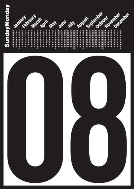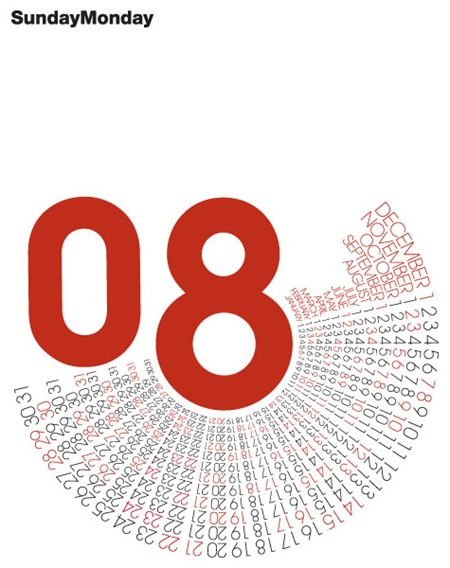

A couple interesting alternative takes on the calendar with some great typography. I am not sure who made these, I remember that I saw them on ffffound but as usual, the source info left much to be desired. Please fill in the blanks if you know more.
Alt Calendars
04.16.2008


Hi Scott! I think I’ve found some information about those spectacular calendars made by SampsonMay Design.
They are A1 2008 limited calendars, and you can find more information here
http://www.sampsonmay.com/blog/?p=34.
Greetings from Spain!
Yeah they are limited screen prints – which is nice! 🙂 I have attempted to emulate the design principles only because I wanted to understand and learn how and what are the typography constraints of an A1 size format and also how the type was constructed for the circle composition…I have successfully achieved this all in Indesign 🙂 and will maybe screen print some alternatives.
I recently came across a very interesting calendar made by a student at MICA named Luke Williams. Its a cube and each side has 2 months printed on it. Check it out at his site; http://www.lukelukeluke.com/ (its the first project under “designer”)
I love the second. Completely useless as a calendar but a wonderful use of type as a visual whole.
Eric – Great link.
Hi Scott! I think I’ve found some information about those spectacular calendars made by SampsonMay Design.
You can find the calendars at:
http://www.sampsonmay.com/pages/shop/posters_range.php
Cheers!
Hi Scott. Nice calendars made by SampsonMay Design, me like this.