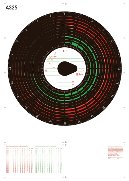
catalogtree is a multidisciplinary design studio based in Amsterdam. Their work is instantly recognizable for its complexity and exceptional clarity; a combination not easily achieved. Their ability to compress large amounts of data into these gorgeous infographics is unparalleled. Joris Maltha and Daniel Gross are the designers behind catalogtree and I had the pleasure to ask them a few questions before I left for Tokyo. Their answers and some example work after the jump.
What were your goals when you initially set up shop?
We never really set up shop and in a way this is our goal. To not have a shop and be amateurs at what we do. Right now we’re working on a 232 meter long radio antenna and are building a crystal radio to receive a local pirate station. We have never done this before and have no idea if this project will succeed.
Can you describe a typical day at catalogtree?
For the past year we’ve been working in separate locations. Daniel worked in an office building in Rotterdam (great view), and I was working from a studio in my backyard (whistling birds). We designed by talking on the phone. Though it was not ideal at all, it wasn’t completely unnatural to us either. We have our own vocabulary when we discuss projects and sketch by describing designs to each other.
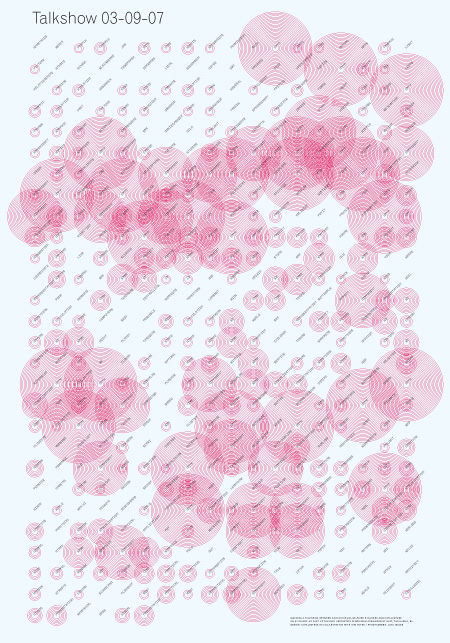
Self-organisation of content is an important tool to us and key to this process. Instead of telling each word or data point where to go and what to look like exactly, we devise a set of rules by which content should behave. Form = Behaviour. We believe this way, a design can be more than the sum of its parts.
It also means that most of our designs are language-based and finished before becoming visual. Over the phone, it is of no use to describe every single page of a book, every margin, every adjustment to the kerning of a headline. But to describe a system that generates from the smallest units of the content a possible flock of birds, can take five seconds.
Today we worked together in my backyard (Sunny day, the birds building nests. Still a bit cold for the time of year. Thought about chopping wood to light up the stove but didn’t). We worked on a symbol-set for a French newspaper and on a book on media-consuption by young people, age 24 to 35. We also did some research on the radio antennas.
Ira Glass describes a period of time in one’s career where your ability to produce good work and your ability to distinguish good/bad work are not consistent with one another. The period of time where your own work is (frustratingly) unable to live up to your own standard of qulaity. How long was it before you were able to look at your own work and be satisfied with the outcome? >
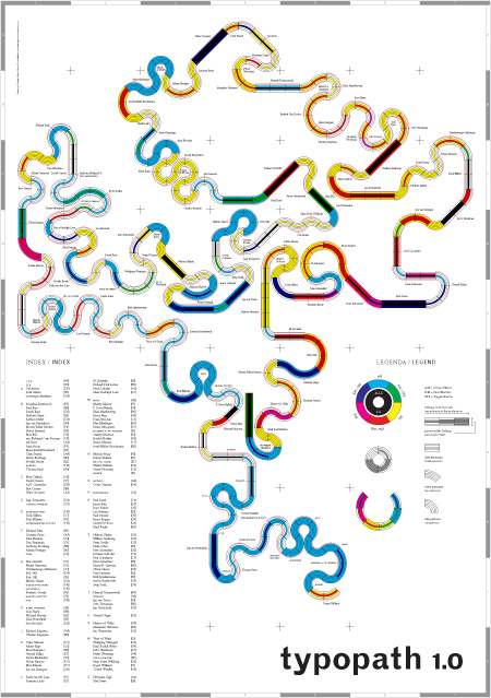
We created a mental map of the Werkplaats Typografie (were we met as students in 1999). It was meant to show our tutors view on 100 typographers from the last five centuries and how far their opinions drifted apart. We made this questionnaire for them to fill out and devised a system to process the data gathered. The resulting design was pretty difficult to read and did not reveal any hidden truths about the school. It looked chaotic and in that sense it was satisfying because it expressed what we felt was the state of that place at that time.
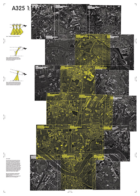
The true value dawned on us some days later. It was not just any nice chaotic shape, it was The Only Possible Shape that could emerge from the data by the rules we set-up earlier. It took years to feel the same surprise again and it is what we’re after ever since. When in 2005 we made a posters series on a highway between Arnhem and the neighbouring city Nijmegen and started processing large amounts of complex quantitative data it felt like coming home.
How consistent has your motivation been over the course of your career? Any notable factors that cause your interest in the field to wain or grow substantially?
I would say consistently very motivated.
What is your favorite type of project to work on and why? Least favorite?
We really dislike rushing things, by which do not mean we like working slow.
We like many numbers and little space better than few numbers and lots of space.
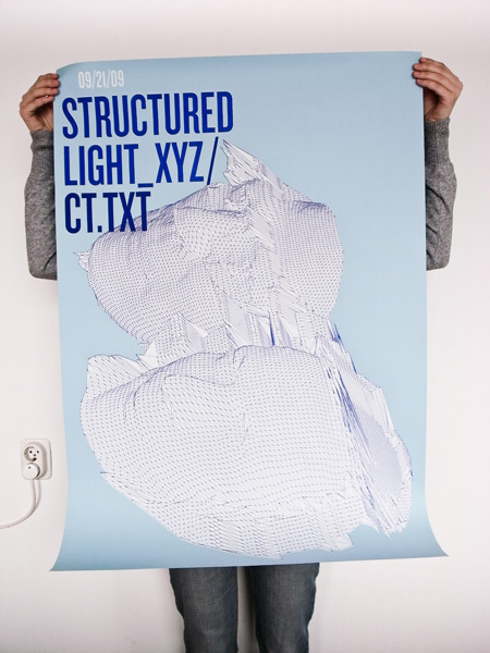
Aside from design, where do you find the most inspiration?
We tend to skip the graphic design section in a book store and are hooked on natural self-organizing systems such as swarms, Penrose tilings, People standing in line, Voronoi patterns, Traffic jams, stock markets, cellular automata and the like.
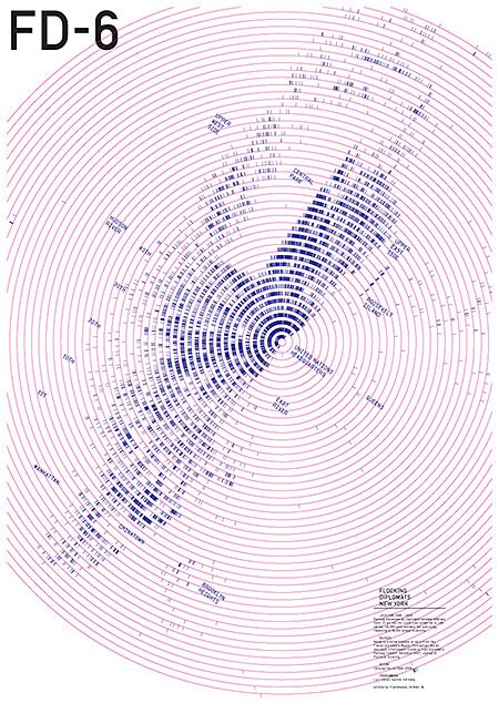
What would be your dream project?
We would love to design movie titles, visualise the Framingham Heart Study, design record sleeves, facade letterings, do one Really Big Corporate Identity and never do one again, design a paper catalogue of all the samples in the Svalbard Global Seed Vault, design induction cooking plate patterns, and get to meet Buckminster Fuller in the afterlife.
Do you prefer daytime or nighttime? (use any metric or criteria you’d like)
We really like time differences: when we say to an American client they get sketches first thing in the morning, it is usually true.
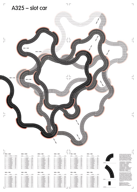
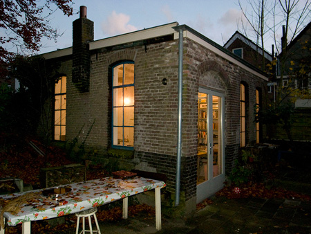
The catalogtree studio

WOW! Just wow! These guys are quite the inspiration!
Very impressive
Really great interview! I was really inspired! I was intrigued by their Form = Behavior philosophy. This is really apparent in all of their work.
Haha! How cool to see Daniel & Joris on iso50! Apart from impressive information designers, they both are great teachers and cool people.
Awesome! Now where do I find images large enough to allow appreciation the data-y goodness?
I am wondering about the nuts and bolts of some of their projects. They mention behaviors and rules. Perhaps some scripting going on in Illustrator? Did they comment on that?
Yeah would love to see some larger images to better appreciate the intricacies. awesome stuff nonetheless.